
Tufte Data Viz
- 196 installs
- 195 repo stars
- Updated February 19, 2026
- caylent/tufte-data-viz
Applies Edward Tufte's data-viz principles when creating or reviewing charts across Recharts, ECharts, Chart.js, matplotlib, Plotly, seaborn, and D3.
About
Enforces Tufte principles like data-ink ratio, direct labeling, and range-frame axes plus modern screen-first standards when generating or reviewing chart code. Developers use it when creating, reviewing, or styling charts, dashboards, or data visualizations across major charting libraries.
- Tufte principles plus accessibility, responsive, dark mode
- Covers Recharts, ECharts, Chart.js, matplotlib, Plotly, D3
Tufte Data Viz by the numbers
- 196 all-time installs (skills.sh)
- Ranked #864 of 2,245 Frontend Development skills by installs in the Skillselion catalog
- Data as of Aug 4, 2026 (Skillselion catalog sync)
npx skills add https://github.com/caylent/tufte-data-viz --skill tufte-data-vizAdd your badge
Show developers this skill is listed on Skillselion. Paste this into your README.

| Installs | 196 |
|---|---|
| repo stars | ★ 195 |
| Last updated | February 19, 2026 |
| Repository | caylent/tufte-data-viz ↗ |
What it does
Applies Edward Tufte's data-viz principles when creating or reviewing charts across Recharts, ECharts, Chart.js, matplotlib, Plotly, seaborn, and D3.
Files
Tufte Data Visualization
Apply Edward Tufte's principles whenever generating or reviewing code that renders data visually. This skill covers chart generation, not slide/presentation design.
Workflow
Follow these steps in order when creating any chart:
Step 1: Identify the message
Before writing code, determine: 1. The key finding or trend the chart must make visible. 2. The comparison context — a baseline, prior period, target, or peer group. A number without context is meaningless. 3. The chart type that best fits the data structure (see Chart type guidance below).
Step 2: Apply universal rules
Review the rules below. Every rule is a default — deviate only when the user explicitly requests otherwise.
Step 3: Apply library-specific config
Use the Library quick reference table to find the essential overrides for the target library. For complete code examples and helper functions, read ONE rule file from rules/ matching the library.
Step 4: Validate
Run through the validation checklist at the bottom of this file before presenting the chart.
---
Universal rules
Rules 1–14 cover static principles; 15–19 extend them for screens; 20–22 address content and formatting.
1. Remove top and right borders
No chart should have top or right axis lines, borders, or spines. The bottom and left axes are sufficient. Top and right lines are pure chartjunk.
2. Direct labels, not legends
Label each data series directly — at the endpoint of a line, on or beside a bar, next to a cluster. Remove the <Legend> component entirely. If there is only one series, the chart title provides that context; no label is needed.
3. No gridlines by default
The default is zero gridlines. For static charts where users need to read precise values, add horizontal-only gridlines at very low opacity (0.08–0.12). For interactive charts, prefer a contextual crosshair on hover instead (see rule 15). Never add vertical gridlines.
4. Range-frame axes
Axis lines should span only the range of the data, not from zero to some arbitrary maximum. The axis starts at (or near) the minimum data value and ends at the maximum.
5. No 3D effects
No perspective, no depth, no shadows on chart elements. Two-dimensional data gets two-dimensional representation.
6. No pie charts unless explicitly requested
Default to a horizontal bar chart sorted by value. If the user explicitly asks for a pie chart: maximum 4 slices, 2D only, start at 12 o'clock, direct percentage labels on each slice.
7. Aspect ratio ~1.5:1
Charts should be approximately 50% wider than tall. Standard sizes: 600x400, 750x500, 900x600. Exception: sparklines and small multiples may be more compact.
8. Gray first, highlight selectively
The default data series color is medium gray (#666). Use a single accent color to highlight the most important series or data point. Never use more than 4 distinct colors. Choose the right palette type: categorical (4-color muted) for unordered groups, sequential (single-hue ramp) for ordered magnitude, diverging (two-hue from center) for deviation from a midpoint. See rules/typography-and-color.md for hex values.
9. Off-white background
Light mode: #fffff8. Dark mode: #151515. Never use pure white (#ffffff) or pure black (#000000).
10. Serif fonts for data
Use serif fonts for data labels, annotations, and chart titles: "ET Book", "Palatino Linotype", Palatino, "Book Antiqua", Georgia, serif. Sans-serif (system-ui, sans-serif) is acceptable only for small axis tick labels (11-12px).
11. No dual y-axes
Two y-axes on one chart create false implied correlations. Use small multiples instead — two charts stacked vertically with shared x-axis.
12. Annotate the notable
If the data contains a peak, trough, inflection point, or event boundary, add a text annotation pointing to it directly on the chart. Place annotations in the nearest clear space — offset from the data point with a short leader line if needed. When multiple annotations compete for space, keep only the most important; move others to a footnote or tooltip.
13. Show comparison context
Include at least one reference element: a reference line (average, target, prior period), a shaded band, or a second series. A chart showing one line with no context fails the "Compared to what?" test.
14. Minimal tooltips
Tooltips should be plain text with the data value and label. No colored background, no border, no arrow pointer, no shadow.
15. Progressive disclosure over static density
Default to the Tufte-clean overview — high data-ink, minimal chrome. Layer details through hover, tap, and click (values, annotations, comparisons). Don't frontload everything onto a single static view. A contextual crosshair on hover replaces permanent gridlines.
16. Accessible by default
3:1 contrast ratio minimum for chart elements against their background; 4.5:1 for text in charts. Never use color as the sole differentiator — pair with shape, pattern, or direct label. Provide a text alternative for every chart (aria-label with key finding, or companion data table). Interactive charts must be keyboard-navigable.
17. Responsive, not just resized
Charts must have a responsive strategy — fluid (percentage width + viewBox), adaptive (breakpoint-based layout changes), or hybrid. At narrow viewports, change chart type or layout (horizontal bars for categories, reduced tick density, abbreviated labels), don't just shrink.
18. Animate to explain, not to decorate
Transitions for data changes (sorting, filtering, time progression) are good — they help the viewer track transformations. Gratuitous entrance animations, bouncing, and decorative motion are chartjunk. Duration: 200–500ms, ease-out. Always respect prefers-reduced-motion.
19. Dark mode as first-class citizen
Design both light and dark palettes intentionally. Never invert colors. Reduce saturation in dark mode (bright colors "vibrate" on dark backgrounds). Respect prefers-color-scheme. Use semantic color tokens (--tufte-bg, --tufte-text, --tufte-series-default) so charts adapt automatically.
20. Titles assert findings
The chart title states the key insight, not the axis description. "Revenue Surged 23% in Q3" not "Revenue by Quarter, 2024". The subtitle can provide context ("vs. prior year, USD millions"). If the data has no clear finding, the chart may not be needed (see rule 22).
21. Format numbers for humans
Abbreviate large numbers: $1.2M not $1,200,000. Use thousand separators for mid-range numbers (12,450 not 12450). Match decimal precision to significance (don't show $4.2391M when $4.2M suffices). Right-align numbers in tables. Use consistent units and state them once (in the axis label or title), not on every data point.
22. Don't chart what a sentence can say
If the data is 1–2 numbers, write a sentence with inline context ("Revenue was $4.2M, up 23% from Q2"). If the data is a simple ranking of 3–5 items, consider a table. Charts earn their space by revealing patterns, trends, or distributions that text and tables cannot. A chart of two bars is almost always worse than a sentence.
---
Library quick reference
The universal rules above are sufficient for most charts. For complete code examples and library-specific helpers, read the appropriate rule file from the rules/ directory in this skill's folder. Only read ONE rule file per task.
| Library | Rule file to read | Essential config (apply even without reading the file) |
|---|---|---|
| Recharts | rules/recharts.md | <CartesianGrid stroke="none" />, remove <Legend />, <YAxis axisLine={false} tickLine={false} />, <Line dot={false} strokeWidth={1.5} /> |
| ECharts | rules/echarts.md | splitLine: { show: false }, legend: { show: false }, grid: { show: false }, use endLabel on series |
| Chart.js | rules/chartjs.md | grid: { display: false }, border: { display: false }, plugins.legend.display: false, use chartjs-plugin-datalabels |
| matplotlib | rules/matplotlib.md | spines['top'].set_visible(False), spines['right'].set_visible(False), spines['bottom'].set_bounds(min, max), font.family: serif |
| Plotly | rules/plotly.md | showgrid=False, showlegend=False, plot_bgcolor='#fffff8', zeroline=False |
| D3/SVG/HTML | rules/svg-html.md | .domain { display: none }, no <rect> backgrounds, stroke-opacity: 0.1 for any gridlines |
---
Chart type guidance
| Type | Key settings |
|---|---|
| Line | 1.5–2px stroke, dot={false} unless <7 points (then r=2), direct label at rightmost point |
| Bar | Prefer horizontal for categories, sort by value descending, direct value labels, #7a7a7a default fill |
| Scatter | Gray dots #999 r=3, highlight key cluster/outlier with accent, regression line if meaningful (dashed, thin) |
| Time series | Label events on chart ("Recession", "Launch"), range-frame x-axis, YoY via opacity (current solid, prior 30%) |
| Small multiples | Same scale ALL panels, shared axis labels (x on bottom row, y on left column), no panel borders |
| Sparklines | ~80x20px, no axes/labels/gridlines, min/max dots r=1.5, embed inline in text or table cells |
| Data tables | No zebra striping, whitespace + thin rules every 3–5 rows, right-align numbers, font-feature-settings: 'onum' 1 |
| Slopegraph | Before/after categories, label both endpoints (value + name), gray default + highlight key slopes |
| Area | Prefer lines. If area: fillOpacity 0.03–0.08, no gradient, direct labels at endpoints |
| Stacked bar | Avoid — use small multiples instead. If forced: sort by total, direct labels per segment, max 4 segments |
| Heatmap | Sequential or diverging palette only, value labels in cells, companion data table for accessibility |
For small multiples, sparklines, and slopegraph implementation patterns, see rules/small-multiples-sparklines.md.
---
Color quick reference
| Token | Light | Dark |
|---|---|---|
| Background | #fffff8 | #151515 |
| Text | #111 | #ddd |
| Text secondary | #666 | #999 |
| Axis/rule | #ccc | #444 |
| Grid (if used) | #eee (8-12% opacity) | #333 |
| Default series | #666 | #999 |
| Highlight | #e41a1c | #fc8d62 |
Categorical (max 4): #4e79a7 steel blue · #f28e2b tangerine · #e15759 coral · #76b7b2 sage
Font stacks in rule 10. For full palettes (sequential, diverging), font loading, and old-style figures, see rules/typography-and-color.md.
---
Anti-pattern detection
When reviewing existing chart code, check for: legends (→ direct labels), pie charts (→ horizontal bars), 3D effects (→ flat 2D), dual y-axes (→ small multiples), heavy gridlines (→ remove or 0.1 opacity), rainbow palettes (→ gray + accent), gauge widgets (→ number + sparkline), gradient fills (→ solid color), rotated labels (→ flip axes or abbreviate), pure white/black backgrounds (→ #fffff8/#151515), hover-only information (→ tap/focus fallback), missing text alternatives (→ aria-label), color-only encoding (→ add shape/pattern).
For the full table with per-library detection patterns and one-liner fixes, see rules/anti-patterns.md.
---
Validation checklist
Before presenting any chart, verify:
- [ ] No top or right borders/spines
- [ ] No Legend component — series labeled directly on the chart
- [ ] Gridlines removed or horizontal-only at opacity <= 0.12
- [ ] Aspect ratio approximately 1.5:1
- [ ] Background is
#fffff8(light) or#151515(dark), not pure white/black - [ ] Serif font for data labels and titles
- [ ] Default series color is gray (
#666); color used only for emphasis - [ ] No 3D effects, no pie chart (unless explicitly requested)
- [ ] Axis lines span only the data range (range-frame)
- [ ] Notable data features annotated directly on chart
- [ ] Comparison context present (reference line, band, or second series)
- [ ] Tooltips are plain text with no decorative styling
- [ ] Interactive elements have tap/click/focus alternatives (no hover-only)
- [ ] Contrast ratios meet 3:1 (elements) / 4.5:1 (text) minimums
- [ ] Chart has a text alternative (aria-label, description, or data table)
- [ ] Animations respect
prefers-reduced-motion - [ ] Charts render usably at 320px and 1440px+ widths
- [ ] Title states the finding, not the axis description
- [ ] Numbers are formatted for readability (abbreviations, separators, consistent precision)
- [ ] A chart is warranted — the data couldn't be communicated as a sentence or table
---
Additional resources
Library rules (read ONE per task): rules/recharts.md, rules/echarts.md, rules/chartjs.md, rules/matplotlib.md, rules/plotly.md, rules/svg-html.md — complete code examples, helpers, and theme registrations.
Cross-cutting (read when specifically needed):
rules/interactive-and-accessible.md— progressive disclosure, WCAG, responsive, animation, dark moderules/typography-and-color.md— font loading, full palette tables, old-style figuresrules/anti-patterns.md— per-library detection heuristics and fixesrules/small-multiples-sparklines.md— layout patterns for small multiples, sparklines, slopegraphs
Working examples in examples/ — one per library, plus an inline SVG sparkline.
"""Generate showcase images for the README."""

import matplotlib
matplotlib.use("Agg")
import matplotlib.pyplot as plt
import numpy as np

# --- Tufte defaults -----------------------------------------------------------

TUFTE_RC = {
    "font.family": "serif",
    "font.serif": ["Palatino", "Palatino Linotype", "Georgia", "DejaVu Serif"],
    "font.size": 12,
    "figure.facecolor": "#fffff8",
    "figure.dpi": 200,
    "axes.facecolor": "#fffff8",
    "axes.edgecolor": "#cccccc",
    "axes.linewidth": 0.5,
    "axes.labelcolor": "#666666",
    "axes.spines.top": False,
    "axes.spines.right": False,
    "axes.grid": False,
    "xtick.color": "#999999",
    "ytick.color": "#999999",
    "xtick.labelsize": 11,
    "ytick.labelsize": 11,
    "xtick.direction": "in",
    "ytick.direction": "in",
    "xtick.major.size": 3,
    "ytick.major.size": 3,
    "xtick.major.width": 0.5,
    "ytick.major.width": 0.5,
    "lines.linewidth": 1.5,
    "savefig.facecolor": "#fffff8",
    "savefig.bbox": "tight",
    "savefig.pad_inches": 0.3,
}

C = {
    "text": "#111111",
    "text2": "#666666",
    "text3": "#999999",
    "gray": "#666666",
    "highlight": "#e41a1c",
    "axis": "#cccccc",
    "cat": ["#4e79a7", "#f28e2b", "#e15759", "#76b7b2"],
}


def tufte_axes(ax, x_data, y_data):
    ax.spines["top"].set_visible(False)
    ax.spines["right"].set_visible(False)
    ax.spines["bottom"].set_bounds(min(x_data), max(x_data))
    ax.spines["left"].set_bounds(min(y_data), max(y_data))
    ax.tick_params(direction="in", length=3, width=0.5)


# ==============================================================================
# Chart 1: Tufte Line Chart
# ==============================================================================

plt.rcParams.update(TUFTE_RC)

months = np.arange(1, 13)
mlabels = ["Jan", "Feb", "Mar", "Apr", "May", "Jun",
           "Jul", "Aug", "Sep", "Oct", "Nov", "Dec"]
revenue = [42, 48, 51, 49, 56, 62, 58, 65, 71, 68, 75, 82]
target  = [40, 42, 44, 46, 48, 50, 52, 54, 56, 58, 60, 62]

fig, ax = plt.subplots(figsize=(9, 6))
ax.plot(months, target, color=C["gray"], linewidth=1, linestyle="--")
ax.plot(months, revenue, color=C["highlight"], linewidth=2)
tufte_axes(ax, months, revenue + target)

# Direct labels
ax.annotate("Revenue", xy=(12, 82), xytext=(8, 0), textcoords="offset points",
            fontsize=12, color=C["highlight"], va="center", fontfamily="serif")
ax.annotate("Target", xy=(12, 62), xytext=(8, 0), textcoords="offset points",
            fontsize=12, color=C["gray"], va="center", fontfamily="serif")

# Annotate peak
ax.annotate("Peak: $82k", xy=(12, 82), xytext=(0, 18), textcoords="offset points",
            fontsize=11, fontstyle="italic", color="#333", fontfamily="serif",
            ha="center", arrowprops=dict(arrowstyle="-", color="#ccc", lw=0.5))

ax.set_xticks(months)
ax.set_xticklabels(mlabels)
ax.set_ylabel("Revenue ($k)", fontsize=12, color=C["text2"])

fig.text(0.125, 0.95, "Revenue Exceeded Target Every Month, Accelerating in H2",
         fontsize=18, fontfamily="serif", color=C["text"])
fig.text(0.125, 0.91, "Monthly revenue vs. target, 2025",
         fontsize=13, fontfamily="serif", color=C["text2"])

plt.tight_layout()
plt.subplots_adjust(top=0.88)
plt.savefig("/Users/ranman/dev/caylent/tufte-data-viz/_docs/tufte-line-chart.png")
plt.close()


# ==============================================================================
# Chart 2: Tufte Horizontal Bar Chart
# ==============================================================================

categories = ["Product A", "Product B", "Product C", "Product D", "Product E"]
values = [42, 38, 27, 19, 12]

fig, ax = plt.subplots(figsize=(9, 5))
bars = ax.barh(categories, values, color=C["gray"], height=0.55)

# Highlight the leader
bars[0].set_color(C["highlight"])

for bar, val in zip(bars, values):
    ax.text(bar.get_width() + 0.5, bar.get_y() + bar.get_height() / 2,
            f"${val}k", va="center", fontsize=12, color=C["text2"], fontfamily="serif")

for spine in ax.spines.values():
    spine.set_visible(False)
ax.set_xticks([])
ax.tick_params(left=False)
ax.invert_yaxis()

fig.text(0.04, 0.95, "Product A Leads With 31% of Total Revenue",
         fontsize=18, fontfamily="serif", color=C["text"])
fig.text(0.04, 0.90, "Revenue by product, sorted by value",
         fontsize=13, fontfamily="serif", color=C["text2"])

plt.tight_layout()
plt.subplots_adjust(top=0.85)
plt.savefig("/Users/ranman/dev/caylent/tufte-data-viz/_docs/tufte-bar-chart.png")
plt.close()


# ==============================================================================
# Chart 3: Before/After Comparison
# ==============================================================================

np.random.seed(42)
x = np.arange(1, 13)
y1 = np.array([20, 25, 22, 30, 28, 35, 33, 40, 38, 42, 45, 50])
y2 = np.array([15, 18, 20, 22, 25, 27, 30, 32, 35, 37, 40, 43])

fig, axes = plt.subplots(1, 2, figsize=(16, 5.5))

# --- BEFORE: Default matplotlib (chartjunk) ---
ax = axes[0]
for param in ["axes.spines.top", "axes.spines.right", "axes.grid"]:
    ax.spines["top"].set_visible(True)
    ax.spines["right"].set_visible(True)
ax.set_facecolor("#ffffff")
ax.grid(True, color="#cccccc", linewidth=0.8, alpha=0.7)
ax.plot(x, y1, "o-", color="#1f77b4", linewidth=2, markersize=6, label="Series A")
ax.plot(x, y2, "s-", color="#ff7f0e", linewidth=2, markersize=6, label="Series B")
ax.legend(loc="upper left", frameon=True, facecolor="white", edgecolor="black")
ax.set_title("Default Chart Style", fontsize=16, fontweight="bold", fontfamily="sans-serif")
ax.set_xlabel("Month", fontsize=12)
ax.set_ylabel("Value", fontsize=12)
ax.set_xticks(x)
ax.set_xticklabels(mlabels, fontsize=9)
ax.spines["top"].set_visible(True)
ax.spines["right"].set_visible(True)
ax.spines["top"].set_color("black")
ax.spines["right"].set_color("black")
ax.spines["bottom"].set_color("black")
ax.spines["left"].set_color("black")
for s in ax.spines.values():
    s.set_linewidth(1)
ax.tick_params(direction="out", length=5, width=1)
fig.text(0.26, 0.02, "BEFORE", fontsize=14, fontfamily="sans-serif",
         color="#cc0000", ha="center", fontweight="bold")

# --- AFTER: Tufte style ---
ax = axes[1]
ax.set_facecolor("#fffff8")
ax.plot(x, y1, color=C["highlight"], linewidth=2)
ax.plot(x, y2, color=C["gray"], linewidth=1.5)
ax.spines["top"].set_visible(False)
ax.spines["right"].set_visible(False)
ax.spines["bottom"].set_bounds(min(x), max(x))
ax.spines["left"].set_bounds(min(y2), max(y1))
ax.spines["bottom"].set_color(C["axis"])
ax.spines["left"].set_color(C["axis"])
ax.spines["bottom"].set_linewidth(0.5)
ax.spines["left"].set_linewidth(0.5)
ax.tick_params(direction="in", length=3, width=0.5, colors=C["text3"])
ax.set_xticks(x)
ax.set_xticklabels(mlabels, fontsize=9, color=C["text3"])
ax.set_ylabel("Value", fontsize=12, color=C["text2"], fontfamily="serif")

# Direct labels
ax.annotate("Series A", xy=(12, 50), xytext=(8, 0), textcoords="offset points",
            fontsize=12, color=C["highlight"], va="center", fontfamily="serif")
ax.annotate("Series B", xy=(12, 43), xytext=(8, 0), textcoords="offset points",
            fontsize=12, color=C["gray"], va="center", fontfamily="serif")

ax.set_title("Tufte Style", fontsize=16, fontweight="normal", fontfamily="serif",
             color=C["text"])
fig.text(0.74, 0.02, "AFTER", fontsize=14, fontfamily="serif",
         color=C["highlight"], ha="center", fontweight="bold")

fig.patch.set_facecolor("#fffff8")
plt.tight_layout()
plt.subplots_adjust(bottom=0.1, wspace=0.25)
plt.savefig("/Users/ranman/dev/caylent/tufte-data-viz/_docs/before-after.png")
plt.close()


# ==============================================================================
# Chart 4: Small Multiples
# ==============================================================================

np.random.seed(7)
regions = ["North", "South", "East", "West"]
data = {r: np.cumsum(np.random.randn(12) * 3 + 2) for r in regions}
global_min = min(min(v) for v in data.values()) - 2
global_max = max(max(v) for v in data.values()) + 2

fig, axes = plt.subplots(1, 4, figsize=(16, 3.5), sharey=True)

for ax, region in zip(axes, regions):
    ax.plot(x, data[region], color=C["gray"], linewidth=1.5)
    ax.set_title(region, fontsize=14, fontfamily="serif", fontweight="normal",
                 color=C["text"], loc="left")
    ax.spines["top"].set_visible(False)
    ax.spines["right"].set_visible(False)
    ax.spines["bottom"].set_color(C["axis"])
    ax.spines["bottom"].set_linewidth(0.5)
    ax.spines["left"].set_color(C["axis"])
    ax.spines["left"].set_linewidth(0.5)
    ax.set_ylim(global_min, global_max)
    ax.tick_params(direction="in", length=3, width=0.5, colors=C["text3"], labelsize=9)
    ax.set_xticks([1, 4, 7, 10])
    ax.set_xticklabels(["Jan", "Apr", "Jul", "Oct"], fontsize=9)

# Only show y-axis label on leftmost
for ax in axes[1:]:
    ax.tick_params(labelleft=False)
    ax.spines["left"].set_visible(False)

fig.patch.set_facecolor("#fffff8")
fig.text(0.08, 0.98, "North and East Outpaced South and West in 2025",
         fontsize=16, fontfamily="serif", color=C["text"], va="top")
plt.tight_layout()
plt.subplots_adjust(top=0.82, wspace=0.1)
plt.savefig("/Users/ranman/dev/caylent/tufte-data-viz/_docs/small-multiples.png")
plt.close()

# ==============================================================================
# Chart 5: Dark Mode Line Chart (Rule 19)
# ==============================================================================

TUFTE_DARK_RC = {
    **TUFTE_RC,
    "figure.facecolor": "#151515",
    "axes.facecolor": "#151515",
    "axes.edgecolor": "#444444",
    "axes.labelcolor": "#999999",
    "xtick.color": "#666666",
    "ytick.color": "#666666",
    "savefig.facecolor": "#151515",
}

CD = {
    "text": "#dddddd",
    "text2": "#999999",
    "text3": "#666666",
    "gray": "#999999",
    "highlight": "#fc8d62",
    "axis": "#444444",
    "cat": ["#6a9fd8", "#f2a860", "#e87a7c", "#8accc7"],
}

plt.rcParams.update(TUFTE_DARK_RC)

fig, ax = plt.subplots(figsize=(9, 6))
ax.plot(months, target, color=CD["gray"], linewidth=1, linestyle="--")
ax.plot(months, revenue, color=CD["highlight"], linewidth=2)
tufte_axes(ax, months, revenue + target)
ax.spines["bottom"].set_color(CD["axis"])
ax.spines["left"].set_color(CD["axis"])

ax.annotate("Revenue", xy=(12, 82), xytext=(8, 0), textcoords="offset points",
            fontsize=12, color=CD["highlight"], va="center", fontfamily="serif")
ax.annotate("Target", xy=(12, 62), xytext=(8, 0), textcoords="offset points",
            fontsize=12, color=CD["gray"], va="center", fontfamily="serif")

ax.annotate("Peak: $82k", xy=(12, 82), xytext=(0, 18), textcoords="offset points",
            fontsize=11, fontstyle="italic", color=CD["text2"], fontfamily="serif",
            ha="center", arrowprops=dict(arrowstyle="-", color=CD["axis"], lw=0.5))

ax.set_xticks(months)
ax.set_xticklabels(mlabels)
ax.set_ylabel("Revenue ($k)", fontsize=12, color=CD["text2"])

fig.text(0.125, 0.95, "Revenue Beat Target Every Month in 2025",
         fontsize=18, fontfamily="serif", color=CD["text"])
fig.text(0.125, 0.91, "Gap widened from 2k in Jan to 20k in Dec, accelerating in H2",
         fontsize=13, fontfamily="serif", color=CD["text2"])

plt.tight_layout()
plt.subplots_adjust(top=0.88)
plt.savefig("/Users/ranman/dev/caylent/tufte-data-viz/_docs/tufte-dark-mode.png")
plt.close()


# ==============================================================================
# Chart 6: Accessible Scatter — Dual Encoding (Rule 16)
# ==============================================================================

plt.rcParams.update(TUFTE_RC)

np.random.seed(99)
groups = {
    "Enterprise":  {"x": np.random.normal(70, 12, 15), "y": np.random.normal(85, 8, 15),
                    "marker": "o", "color": "#4e79a7"},
    "Mid-Market":  {"x": np.random.normal(45, 10, 20), "y": np.random.normal(60, 10, 20),
                    "marker": "s", "color": "#f28e2b"},
    "SMB":         {"x": np.random.normal(25, 8, 25),  "y": np.random.normal(35, 12, 25),
                    "marker": "D", "color": "#76b7b2"},
}

fig, ax = plt.subplots(figsize=(9, 6))

for name, g in groups.items():
    ax.scatter(g["x"], g["y"], marker=g["marker"], c=g["color"],
              s=40, alpha=0.7, edgecolors="none")
    # Direct label at cluster centroid
    cx, cy = np.mean(g["x"]), np.mean(g["y"])
    ax.annotate(name, xy=(cx, cy), xytext=(12, 0), textcoords="offset points",
                fontsize=12, color=g["color"], va="center", fontfamily="serif",
                fontweight="bold")

all_x = np.concatenate([g["x"] for g in groups.values()])
all_y = np.concatenate([g["y"] for g in groups.values()])
tufte_axes(ax, all_x, all_y)

ax.set_xlabel("Deal Cycle (days)", fontsize=12, color=C["text2"])
ax.set_ylabel("Win Rate (%)", fontsize=12, color=C["text2"])

fig.text(0.125, 0.95, "Enterprise Wins Faster and More Often",
         fontsize=18, fontfamily="serif", color=C["text"])
fig.text(0.125, 0.91, "Each shape = segment (accessible without color)",
         fontsize=13, fontfamily="serif", color=C["text2"])

plt.tight_layout()
plt.subplots_adjust(top=0.88)
plt.savefig("/Users/ranman/dev/caylent/tufte-data-viz/_docs/tufte-accessible-scatter.png")
plt.close()


# ==============================================================================
# Chart 7: Light vs Dark Side-by-Side (Rule 19)
# ==============================================================================

fig, axes = plt.subplots(1, 2, figsize=(16, 5.5))

themes = [
    {"bg": "#fffff8", "text": "#111111", "text2": "#666666", "text3": "#999999",
     "gray": "#666666", "highlight": "#e41a1c", "axis": "#cccccc", "label": "Light Mode"},
    {"bg": "#151515", "text": "#dddddd", "text2": "#999999", "text3": "#666666",
     "gray": "#999999", "highlight": "#fc8d62", "axis": "#444444", "label": "Dark Mode"},
]

products = ["Product A", "Product B", "Product C", "Product D", "Product E"]
vals = [42, 38, 27, 19, 12]

for ax, t in zip(axes, themes):
    ax.set_facecolor(t["bg"])
    bars = ax.barh(products, vals, color=t["gray"], height=0.55)
    bars[0].set_color(t["highlight"])

    for bar, val in zip(bars, vals):
        ax.text(bar.get_width() + 0.5, bar.get_y() + bar.get_height() / 2,
                f"${val}k", va="center", fontsize=12, color=t["text2"], fontfamily="serif")

    for spine in ax.spines.values():
        spine.set_visible(False)
    ax.set_xticks([])
    ax.tick_params(left=False, colors=t["text3"])
    ax.set_yticks(range(len(products)))
    ax.set_yticklabels(products, color=t["text2"], fontfamily="serif")
    ax.invert_yaxis()

    ax.set_title(t["label"], fontsize=14, fontfamily="serif", color=t["text2"],
                 fontweight="normal", loc="left", pad=8)

fig.patch.set_facecolor("#fffff8")
# Split background: left half light, right half dark
from matplotlib.patches import Rectangle
fig.patches.append(Rectangle((0.5, 0), 0.5, 1, transform=fig.transFigure,
                              facecolor="#151515", zorder=-1))

fig.text(0.25, 1.0, r"Product A Leads Revenue at $42k",
         fontsize=16, fontfamily="serif", color="#111111", ha="center", va="top")
fig.text(0.75, 1.0, r"Product A Leads Revenue at $42k",
         fontsize=16, fontfamily="serif", color="#dddddd", ha="center", va="top")

plt.tight_layout()
plt.subplots_adjust(top=0.85, wspace=0.3)
plt.savefig("/Users/ranman/dev/caylent/tufte-data-viz/_docs/tufte-light-dark.png")
plt.close()


# ==============================================================================
# Chart 8: Slopegraph — Before/After Comparison
# ==============================================================================

plt.rcParams.update(TUFTE_RC)

slope_data = {
    "Engineering": (35, 42),
    "Sales":       (28, 31),
    "Marketing":   (22, 18),
    "Support":     (15, 20),
    "Design":      (12, 15),
}

fig, ax = plt.subplots(figsize=(6, 7))

for name, (before, after) in slope_data.items():
    change = after - before
    color = C["highlight"] if abs(change) == max(abs(b - a) for a, b in slope_data.values()) else C["gray"]
    lw = 2 if color == C["highlight"] else 1.2
    alpha = 1.0 if color == C["highlight"] else 0.5

    ax.plot([0, 1], [before, after], color=color, linewidth=lw, alpha=alpha)

    # Left labels (before)
    ax.text(-0.08, before, f"{name}  {before}%", ha="right", va="center",
            fontsize=11, color=color, fontfamily="serif", alpha=alpha)
    # Right labels (after)
    ax.text(1.08, after, f"{after}%  {name}", ha="left", va="center",
            fontsize=11, color=color, fontfamily="serif", alpha=alpha)

# Column headers
ax.text(0, max(v[0] for v in slope_data.values()) + 3, "2024", ha="center",
        fontsize=13, color=C["text2"], fontfamily="serif", fontweight="bold")
ax.text(1, max(v[1] for v in slope_data.values()) + 3, "2025", ha="center",
        fontsize=13, color=C["text2"], fontfamily="serif", fontweight="bold")

# Clean axes
for spine in ax.spines.values():
    spine.set_visible(False)
ax.set_xticks([])
ax.set_yticks([])
ax.set_xlim(-0.4, 1.4)

fig.text(0.12, 0.96, "Engineering Headcount Grew Most, Marketing Shrank",
         fontsize=16, fontfamily="serif", color=C["text"])
fig.text(0.12, 0.92, "Team size as % of company, 2024 vs. 2025",
         fontsize=12, fontfamily="serif", color=C["text2"])

plt.tight_layout()
plt.subplots_adjust(top=0.89)
plt.savefig("/Users/ranman/dev/caylent/tufte-data-viz/_docs/tufte-slopegraph.png")
plt.close()


# ==============================================================================
# Chart 9: Sparklines in a Table
# ==============================================================================

np.random.seed(42)
metrics = {
    "Revenue":    np.cumsum(np.random.randn(24) * 2 + 1.5),
    "Users":      np.cumsum(np.random.randn(24) * 1 + 2),
    "Conversion": 4 + np.cumsum(np.random.randn(24) * 0.3),
    "Churn":      3 - np.cumsum(np.random.randn(24) * 0.15 + 0.05),
    "NPS":        50 + np.cumsum(np.random.randn(24) * 2),
}

fig, axes = plt.subplots(len(metrics), 1, figsize=(8, 4.5))

for i, (name, data) in enumerate(metrics.items()):
    ax = axes[i]
    ax.plot(data, color=C["gray"], linewidth=1)

    # Min/max dots
    imin, imax = np.argmin(data), np.argmax(data)
    ax.plot(imin, data[imin], "o", color=C["highlight"], markersize=5)
    ax.plot(imax, data[imax], "o", color=C["cat"][0], markersize=5)

    # Endpoint value
    ax.text(len(data) + 0.5, data[-1], f"{data[-1]:.1f}",
            fontsize=10, color=C["text2"], va="center", fontfamily="serif")

    # Metric name
    ax.text(-1, data[len(data)//2], name, ha="right", va="center",
            fontsize=12, color=C["text"], fontfamily="serif")

    # Strip everything
    for spine in ax.spines.values():
        spine.set_visible(False)
    ax.set_xticks([])
    ax.set_yticks([])
    ax.margins(y=0.2)

    # Thin separator between rows (except last)
    if i < len(metrics) - 1:
        ax.axhline(y=ax.get_ylim()[0], color="#eeeeee", linewidth=0.5,
                   xmin=-0.15, xmax=1.15, clip_on=False)

fig.text(0.5, 1.0, "Key Metrics, Last 24 Months",
         fontsize=16, fontfamily="serif", color=C["text"], ha="center", va="top")
fig.text(0.5, 0.94, "Red dot = min, blue dot = max",
         fontsize=11, fontfamily="serif", color=C["text2"], ha="center", va="top")

fig.patch.set_facecolor("#fffff8")
plt.tight_layout()
plt.subplots_adjust(top=0.85, left=0.18, right=0.92, hspace=0.4)
plt.savefig("/Users/ranman/dev/caylent/tufte-data-viz/_docs/tufte-sparklines.png")
plt.close()


# ==============================================================================
# Chart 10: Tufte Data Table
# ==============================================================================

fig, ax = plt.subplots(figsize=(8, 4))
ax.set_xlim(0, 10)
ax.set_ylim(0, 8)
ax.axis("off")

# Table data
headers = ["Region", "Q1", "Q2", "Q3", "Q4", "Total", "vs. Prior"]
rows = [
    ["North",  "12.4",  "14.1",  "16.8",  "18.2",  "$61.5M",  "+18%"],
    ["South",  "8.1",   "9.3",   "11.2",  "12.8",  "$41.4M",  "+12%"],
    ["East",   "6.2",   "7.4",   "8.9",   "9.1",   "$31.6M",  "+22%"],
    ["West",   "5.8",   "6.1",   "6.5",   "7.0",   "$25.4M",  "+5%"],
]

col_x = [0.3, 2.2, 3.4, 4.6, 5.8, 7.2, 8.8]
header_y = 7.0
row_start_y = 6.0
row_spacing = 1.2

# Headers
for j, h in enumerate(headers):
    align = "left" if j == 0 else "right"
    ax.text(col_x[j], header_y, h, fontsize=11, fontfamily="serif",
            color=C["text2"], ha=align, fontweight="bold")

# Top rule
ax.plot([0.1, 9.6], [header_y - 0.35, header_y - 0.35],
        color=C["text"], linewidth=1, clip_on=False)

for i, row in enumerate(rows):
    y = row_start_y - i * row_spacing

    for j, val in enumerate(row):
        align = "left" if j == 0 else "right"
        color = C["text"]
        fontweight = "normal"

        # Highlight the leader in "vs. Prior"
        if j == 6 and val == "+22%":
            color = C["highlight"]
            fontweight = "bold"

        ax.text(col_x[j], y, val, fontsize=11, fontfamily="serif",
                color=color, ha=align, fontweight=fontweight)

    # Thin rule after every row
    if i < len(rows) - 1:
        ax.plot([0.1, 9.6], [y - 0.5, y - 0.5],
                color="#eeeeee", linewidth=0.5, clip_on=False)

# Bottom rule
bottom_y = row_start_y - (len(rows) - 1) * row_spacing - 0.5
ax.plot([0.1, 9.6], [bottom_y, bottom_y],
        color=C["text"], linewidth=1, clip_on=False)

fig.text(0.06, 0.96, "East Region Grew Fastest at 22% Year-Over-Year",
         fontsize=16, fontfamily="serif", color=C["text"])
fig.text(0.06, 0.90, "Quarterly revenue by region, 2025 (millions USD)",
         fontsize=12, fontfamily="serif", color=C["text2"])

fig.patch.set_facecolor("#fffff8")
plt.tight_layout()
plt.subplots_adjust(top=0.82)
plt.savefig("/Users/ranman/dev/caylent/tufte-data-viz/_docs/tufte-data-table.png")
plt.close()


# ==============================================================================
# Chart 11: Animated Before/After GIF
# ==============================================================================

from matplotlib.animation import FuncAnimation, PillowWriter

x_anim = np.arange(1, 13)
y1_anim = np.array([20, 25, 22, 30, 28, 35, 33, 40, 38, 42, 45, 50])
y2_anim = np.array([15, 18, 20, 22, 25, 27, 30, 32, 35, 37, 40, 43])

# Interpolation helper
def lerp(a, b, t):
    return a + (b - a) * t

def make_frame(t):
    """t in [0, 1]: 0 = 'before' (default), 1 = 'after' (Tufte)."""
    fig_a, ax_a = plt.subplots(figsize=(9, 6))

    # Background
    bg = lerp(np.array([1.0, 1.0, 1.0]), np.array([1.0, 1.0, 248/255]), t)
    fig_a.patch.set_facecolor(bg)
    ax_a.set_facecolor(bg)

    # Grid fades out
    if t < 0.8:
        grid_alpha = lerp(0.7, 0.0, t / 0.8)
        ax_a.grid(True, color="#cccccc", linewidth=0.8, alpha=grid_alpha)

    # Spine visibility fades
    for spine_name in ["top", "right"]:
        spine_alpha = lerp(1.0, 0.0, min(t * 2, 1.0))
        ax_a.spines[spine_name].set_alpha(spine_alpha)
        ax_a.spines[spine_name].set_color("black")

    # Bottom/left spines transition color
    frame_color = lerp(np.array([0, 0, 0]), np.array([0.8, 0.8, 0.8]), t)
    for spine_name in ["bottom", "left"]:
        ax_a.spines[spine_name].set_color(frame_color)
        ax_a.spines[spine_name].set_linewidth(lerp(1.0, 0.5, t))

    # Lines: markers shrink, colors shift
    marker_size = lerp(6, 0, t)
    s1_color = lerp(np.array([0.12, 0.47, 0.71]), np.array([0.89, 0.10, 0.11]), t)
    s2_color = lerp(np.array([1.0, 0.5, 0.05]), np.array([0.4, 0.4, 0.4]), t)

    ax_a.plot(x_anim, y1_anim, color=s1_color, linewidth=2,
             marker="o" if marker_size > 0.5 else None, markersize=marker_size)
    ax_a.plot(x_anim, y2_anim, color=s2_color, linewidth=1.5,
             marker="s" if marker_size > 0.5 else None, markersize=marker_size)

    # Legend fades out, direct labels fade in
    legend_alpha = lerp(1.0, 0.0, min(t * 2, 1.0))
    label_alpha = lerp(0.0, 1.0, max((t - 0.5) * 2, 0.0))

    if legend_alpha > 0.05:
        leg = ax_a.legend(["Series A", "Series B"], loc="upper left",
                         frameon=True, facecolor="white", edgecolor="black")
        leg.set_alpha(legend_alpha)
        for text in leg.get_texts():
            text.set_alpha(legend_alpha)
        leg.get_frame().set_alpha(legend_alpha)

    if label_alpha > 0.05:
        ax_a.annotate("Series A", xy=(12, 50), xytext=(8, 0),
                     textcoords="offset points", fontsize=12, color=s1_color,
                     va="center", fontfamily="serif", alpha=label_alpha)
        ax_a.annotate("Series B", xy=(12, 43), xytext=(8, 0),
                     textcoords="offset points", fontsize=12, color=s2_color,
                     va="center", fontfamily="serif", alpha=label_alpha)

    ax_a.set_xticks(x_anim)
    ax_a.set_xticklabels(mlabels, fontsize=9)
    ax_a.set_ylabel("Value", fontsize=12, color="#666666")
    ax_a.tick_params(direction="in" if t > 0.5 else "out",
                    length=lerp(5, 3, t), width=lerp(1, 0.5, t))

    # Title transitions
    title_font = "sans-serif" if t < 0.5 else "serif"
    title_weight = "bold" if t < 0.5 else "normal"
    fig_a.text(0.12, 0.95,
              "Default Chart Style" if t < 0.3 else
              ("" if t < 0.7 else "Series A Outpaced B by 16% in 2025"),
              fontsize=18 if t > 0.7 else 16, fontfamily=title_font,
              fontweight=title_weight, color="#111111")

    plt.tight_layout()
    plt.subplots_adjust(top=0.88)
    return fig_a

# Generate frames: hold before (1s), transition (2s), hold after (2s) at 15fps
frames_before = 15   # 1s hold
frames_trans = 30    # 2s transition
frames_after = 30    # 2s hold
total_frames = frames_before + frames_trans + frames_after

import io
from PIL import Image

pil_frames = []
for i in range(total_frames):
    if i < frames_before:
        t = 0.0
    elif i < frames_before + frames_trans:
        t = (i - frames_before) / frames_trans
    else:
        t = 1.0

    fig_f = make_frame(t)
    buf = io.BytesIO()
    fig_f.savefig(buf, format="png", dpi=100, bbox_inches="tight")
    plt.close(fig_f)
    buf.seek(0)
    pil_frames.append(Image.open(buf).copy())

# Save as GIF
pil_frames[0].save(
    "/Users/ranman/dev/caylent/tufte-data-viz/_docs/before-after-animated.gif",
    save_all=True,
    append_images=pil_frames[1:],
    duration=int(1000 / 15),  # ~67ms per frame = 15fps
    loop=0,
)


print("Generated all showcase images.")
<!DOCTYPE html>
<html lang="en">
<head>
<meta charset="utf-8">
<meta name="viewport" content="width=device-width, initial-scale=1">
<title>tufte-data-viz - Edward Tufte's Data Visualization Principles for Every Charting Library</title>
<meta name="description" content="Interactive demo of Tufte data visualization principles applied across ECharts, Chart.js, Plotly, and D3.js. See before/after transformations live.">
<!-- ET Book font -->
<style>
@font-face {
font-family: "ET Book";
src: url("https://cdn.jsdelivr.net/gh/edwardtufte/tufte-css@gh-pages/et-book/et-book-roman-line-figures/et-book-roman-line-figures.woff") format("woff");
font-weight: normal;
font-style: normal;
font-display: swap;
}
@font-face {
font-family: "ET Book";
src: url("https://cdn.jsdelivr.net/gh/edwardtufte/tufte-css@gh-pages/et-book/et-book-bold-line-figures/et-book-bold-line-figures.woff") format("woff");
font-weight: bold;
font-style: normal;
font-display: swap;
}
@font-face {
font-family: "ET Book";
src: url("https://cdn.jsdelivr.net/gh/edwardtufte/tufte-css@gh-pages/et-book/et-book-display-italic-old-style-figures/et-book-display-italic-old-style-figures.woff") format("woff");
font-weight: normal;
font-style: italic;
font-display: swap;
}
</style>
<style>
/* ================================================================
CSS Custom Properties — Light / Dark
================================================================ */
:root {
--bg: #fffff8;
--bg-card: #fffff8;
--text-1: #111111;
--text-2: #666666;
--text-3: #999999;
--axis: #cccccc;
--grid: #eeeeee;
--series-default: #666666;
--highlight: #e41a1c;
--border: #e0e0e0;
--code-bg: #f4f4f0;
--toggle-bg: #ddd;
--toggle-thumb: #fff;
--toggle-active: #4e79a7;
--shadow: rgba(0,0,0,0.04);
}
[data-theme="dark"] {
--bg: #151515;
--bg-card: #1a1a1a;
--text-1: #dddddd;
--text-2: #999999;
--text-3: #666666;
--axis: #444444;
--grid: #333333;
--series-default: #999999;
--highlight: #fc8d62;
--border: #333333;
--code-bg: #1e1e1e;
--toggle-bg: #444;
--toggle-thumb: #222;
--toggle-active: #76b7b2;
--shadow: rgba(0,0,0,0.2);
}
/* ================================================================
Reset & Base
================================================================ */
*, *::before, *::after { box-sizing: border-box; margin: 0; padding: 0; }
html {
font-size: 16px;
-webkit-text-size-adjust: 100%;
}
body {
font-family: "ET Book", "Palatino Linotype", Palatino, "Book Antiqua", Georgia, serif;
background: var(--bg);
color: var(--text-1);
line-height: 1.6;
transition: background 0.3s ease, color 0.3s ease;
}
@media (prefers-reduced-motion: reduce) {
*, *::before, *::after {
transition-duration: 0s !important;
animation-duration: 0s !important;
}
}
/* ================================================================
Layout
================================================================ */
.page-wrapper {
max-width: 960px;
margin: 0 auto;
padding: 2rem 1.5rem 3rem;
}
@media (max-width: 600px) {
.page-wrapper { padding: 1.25rem 1rem 2rem; }
}
/* ================================================================
Header
================================================================ */
.site-header {
margin-bottom: 3rem;
padding-bottom: 1.5rem;
border-bottom: 1px solid var(--border);
}
.header-row {
display: flex;
justify-content: space-between;
align-items: flex-start;
gap: 1rem;
flex-wrap: wrap;
}
.site-title {
font-size: 2rem;
font-weight: 400;
letter-spacing: -0.02em;
line-height: 1.2;
}
@media (max-width: 600px) {
.site-title { font-size: 1.5rem; }
}
.site-subtitle {
color: var(--text-2);
font-size: 1.1rem;
margin-top: 0.35rem;
font-style: italic;
max-width: 600px;
}
.install-cmd {
display: inline-block;
margin-top: 1rem;
background: var(--code-bg);
border: 1px solid var(--border);
padding: 0.4rem 0.85rem;
font-family: "SF Mono", "Fira Code", "Fira Mono", Menlo, Consolas, monospace;
font-size: 0.85rem;
color: var(--text-2);
border-radius: 4px;
letter-spacing: -0.01em;
cursor: pointer;
position: relative;
transition: border-color 0.15s ease;
}
.install-cmd:hover {
border-color: var(--text-3);
}
.install-cmd .copy-hint {
display: none;
position: absolute;
top: -1.75rem;
left: 50%;
transform: translateX(-50%);
background: var(--text-1);
color: var(--bg);
font-size: 0.7rem;
padding: 0.15rem 0.5rem;
border-radius: 3px;
white-space: nowrap;
font-family: system-ui, sans-serif;
}
.install-cmd:hover .copy-hint,
.install-cmd:focus .copy-hint {
display: block;
}
.install-cmd.copied .copy-hint {
display: block;
}
/* ================================================================
Dark Mode Toggle
================================================================ */
.theme-toggle {
display: flex;
align-items: center;
gap: 0.5rem;
font-size: 0.85rem;
color: var(--text-3);
font-family: system-ui, sans-serif;
flex-shrink: 0;
}
.theme-toggle-label { cursor: pointer; }
.theme-switch {
position: relative;
width: 44px;
height: 24px;
background: var(--toggle-bg);
border-radius: 12px;
border: none;
cursor: pointer;
transition: background 0.2s ease;
padding: 0;
}
.theme-switch::after {
content: "";
position: absolute;
top: 3px;
left: 3px;
width: 18px;
height: 18px;
background: var(--toggle-thumb);
border-radius: 50%;
transition: transform 0.2s ease;
box-shadow: 0 1px 2px rgba(0,0,0,0.15);
}
.theme-switch[aria-checked="true"] {
background: var(--toggle-active);
}
.theme-switch[aria-checked="true"]::after {
transform: translateX(20px);
}
.theme-switch:focus-visible {
outline: 2px solid var(--toggle-active);
outline-offset: 2px;
}
/* ================================================================
Section Intro
================================================================ */
.section-intro {
margin-bottom: 2.5rem;
max-width: 680px;
}
.section-intro p {
color: var(--text-2);
font-size: 1.05rem;
line-height: 1.7;
margin-bottom: 0.75rem;
}
.section-intro p:last-child { margin-bottom: 0; }
/* ================================================================
Demo Cards
================================================================ */
.demo-card {
margin-bottom: 3rem;
padding-bottom: 2.5rem;
border-bottom: 1px solid var(--border);
}
.demo-card:last-of-type {
border-bottom: none;
margin-bottom: 2rem;
}
.demo-header {
display: flex;
justify-content: space-between;
align-items: flex-start;
gap: 1rem;
margin-bottom: 0.25rem;
flex-wrap: wrap;
}
.demo-title {
font-size: 1.35rem;
font-weight: 400;
line-height: 1.3;
}
.demo-lib {
font-family: system-ui, sans-serif;
font-size: 0.75rem;
color: var(--text-3);
background: var(--code-bg);
padding: 0.15rem 0.5rem;
border-radius: 3px;
text-transform: uppercase;
letter-spacing: 0.05em;
flex-shrink: 0;
margin-top: 0.2rem;
}
.demo-description {
color: var(--text-2);
font-size: 0.95rem;
margin-bottom: 1rem;
max-width: 640px;
font-style: italic;
}
/* Before/After Toggle */
.ba-toggle {
display: inline-flex;
align-items: center;
gap: 0.6rem;
margin-bottom: 1.25rem;
font-family: system-ui, sans-serif;
font-size: 0.8rem;
}
.ba-toggle-label {
color: var(--text-3);
cursor: pointer;
user-select: none;
transition: color 0.15s ease;
}
.ba-toggle-label.active {
color: var(--text-1);
font-weight: 500;
}
.ba-switch {
position: relative;
width: 50px;
height: 26px;
background: var(--toggle-bg);
border-radius: 13px;
border: none;
cursor: pointer;
transition: background 0.2s ease;
padding: 0;
}
.ba-switch::after {
content: "";
position: absolute;
top: 3px;
left: 3px;
width: 20px;
height: 20px;
background: var(--toggle-thumb);
border-radius: 50%;
transition: transform 0.2s ease;
box-shadow: 0 1px 2px rgba(0,0,0,0.15);
}
.ba-switch[aria-checked="true"] {
background: var(--toggle-active);
}
.ba-switch[aria-checked="true"]::after {
transform: translateX(24px);
}
.ba-switch:focus-visible {
outline: 2px solid var(--toggle-active);
outline-offset: 2px;
}
/* Chart containers */
.chart-wrap {
width: 100%;
background: var(--bg-card);
border-radius: 2px;
position: relative;
transition: background 0.3s ease;
}
.chart-container {
width: 100%;
min-height: 300px;
position: relative;
}
@media (max-width: 600px) {
.chart-container { min-height: 250px; }
}
/* ================================================================
Principle Callouts
================================================================ */
.principles {
display: flex;
flex-wrap: wrap;
gap: 0.5rem;
margin-top: 0.75rem;
}
.principle-tag {
font-family: system-ui, sans-serif;
font-size: 0.7rem;
color: var(--text-3);
border: 1px solid var(--border);
padding: 0.15rem 0.45rem;
border-radius: 3px;
letter-spacing: 0.02em;
}
/* ================================================================
Footer
================================================================ */
.site-footer {
margin-top: 2rem;
padding-top: 1.5rem;
border-top: 1px solid var(--border);
font-family: system-ui, sans-serif;
font-size: 0.85rem;
color: var(--text-3);
display: flex;
justify-content: space-between;
align-items: center;
flex-wrap: wrap;
gap: 0.5rem;
}
.site-footer a {
color: var(--text-2);
text-decoration: none;
border-bottom: 1px solid var(--border);
transition: border-color 0.15s ease;
}
.site-footer a:hover {
border-color: var(--text-2);
}
/* ================================================================
D3 Small Multiples Specifics
================================================================ */
.small-multiples-grid {
display: grid;
grid-template-columns: repeat(4, 1fr);
gap: 0.5rem;
}
@media (max-width: 700px) {
.small-multiples-grid {
grid-template-columns: repeat(2, 1fr);
}
}
.sm-panel { position: relative; }
.sm-panel svg {
width: 100%;
height: auto;
display: block;
}
.sm-panel .panel-title {
font-family: "ET Book", Georgia, serif;
font-size: 0.85rem;
color: var(--text-2);
margin-bottom: 0.25rem;
}
.sm-hover-line {
stroke: var(--text-3);
stroke-width: 1;
stroke-dasharray: 3,3;
pointer-events: none;
}
.sm-hover-dot {
pointer-events: none;
}
.sm-tooltip {
position: absolute;
background: var(--bg);
color: var(--text-1);
font-family: system-ui, sans-serif;
font-size: 0.75rem;
padding: 0.25rem 0.4rem;
pointer-events: none;
opacity: 0;
transition: opacity 0.1s ease;
white-space: nowrap;
z-index: 10;
}
/* ================================================================
Utility
================================================================ */
.visually-hidden {
position: absolute;
width: 1px;
height: 1px;
padding: 0;
margin: -1px;
overflow: hidden;
clip: rect(0,0,0,0);
border: 0;
}
</style>
</head>
<body>
<div class="page-wrapper">
<!-- ============================================================
HEADER
============================================================ -->
<header class="site-header">
<div class="header-row">
<div>
<h1 class="site-title">tufte-data-viz</h1>
<p class="site-subtitle">Edward Tufte's data visualization principles, applied across every major charting library.</p>
<code class="install-cmd" role="button" tabindex="0" aria-label="Copy install command: npx skills add caylent/tufte-data-viz" onclick="copyInstall(this)" onkeydown="if(event.key==='Enter')copyInstall(this)">
npx skills add caylent/tufte-data-viz
<span class="copy-hint">Click to copy</span>
</code>
</div>
<div class="theme-toggle">
<span class="theme-toggle-label" id="theme-label">Dark</span>
<button class="theme-switch" role="switch" aria-checked="false" aria-labelledby="theme-label" onclick="toggleTheme()" onkeydown="if(event.key==='Enter'||event.key===' '){event.preventDefault();toggleTheme()}"></button>
</div>
</div>
</header>
<!-- ============================================================
INTRO
============================================================ -->
<div class="section-intro">
<p>Each chart below starts in <strong>default library styling</strong> -- gridlines, legends, bright colors, borders. Toggle to <strong>Tufte styling</strong> to see the transformation: higher data-ink ratio, direct labels, range-frame axes, and honest use of color.</p>
</div>
<!-- ============================================================
DEMO 1: ECHARTS LINE
============================================================ -->
<article class="demo-card" aria-label="ECharts line chart demo">
<div class="demo-header">
<h2 class="demo-title">Revenue Grew Steadily, Surpassing Target by Q4</h2>
<span class="demo-lib">ECharts</span>
</div>
<p class="demo-description">Monthly revenue vs. annual target. Direct end-labels replace the legend, and the axis spans only the data range.</p>
<div class="ba-toggle">
<span class="ba-toggle-label active" id="echarts-before-label">Before</span>
<button class="ba-switch" role="switch" aria-checked="false" aria-label="Toggle between default and Tufte styling for ECharts chart" data-chart="echarts" onclick="toggleBA(this)" onkeydown="if(event.key==='Enter'||event.key===' '){event.preventDefault();toggleBA(this)}"></button>
<span class="ba-toggle-label" id="echarts-after-label">Tufte</span>
</div>
<div class="chart-wrap">
<div id="echarts-container" class="chart-container" style="height:400px" role="img" aria-label="Line chart showing monthly revenue growing from $42K in January to $82K in December, consistently above the target line which grew from $40K to $62K."></div>
</div>
<div class="principles">
<span class="principle-tag">Rule 2: Direct labels</span>
<span class="principle-tag">Rule 3: No gridlines</span>
<span class="principle-tag">Rule 4: Range-frame axes</span>
<span class="principle-tag">Rule 8: Gray + highlight</span>
<span class="principle-tag">Rule 14: Minimal tooltip</span>
</div>
</article>
<!-- ============================================================
DEMO 2: CHART.JS BAR
============================================================ -->
<article class="demo-card" aria-label="Chart.js horizontal bar chart demo">
<div class="demo-header">
<h2 class="demo-title">Product A Leads Revenue, 2.2x the Nearest Competitor</h2>
<span class="demo-lib">Chart.js</span>
</div>
<p class="demo-description">Five products ranked by revenue. The leader is highlighted; value labels replace the axis and legend entirely.</p>
<div class="ba-toggle">
<span class="ba-toggle-label active" id="chartjs-before-label">Before</span>
<button class="ba-switch" role="switch" aria-checked="false" aria-label="Toggle between default and Tufte styling for Chart.js chart" data-chart="chartjs" onclick="toggleBA(this)" onkeydown="if(event.key==='Enter'||event.key===' '){event.preventDefault();toggleBA(this)}"></button>
<span class="ba-toggle-label" id="chartjs-after-label">Tufte</span>
</div>
<div class="chart-wrap">
<div class="chart-container" style="height:300px; position:relative;">
<canvas id="chartjs-container" role="img" aria-label="Horizontal bar chart showing Product A at $42K revenue leading over Product B at $38K, Product C at $27K, Product D at $19K, and Product E at $12K."></canvas>
</div>
</div>
<div class="principles">
<span class="principle-tag">Rule 1: No top/right borders</span>
<span class="principle-tag">Rule 6: Bars, not pie</span>
<span class="principle-tag">Rule 8: Highlight the leader</span>
<span class="principle-tag">Rule 21: Human numbers ($42K)</span>
</div>
</article>
<!-- ============================================================
DEMO 3: PLOTLY SCATTER
============================================================ -->
<article class="demo-card" aria-label="Plotly scatter plot demo">
<div class="demo-header">
<h2 class="demo-title">Enterprise Customers Drive Higher Revenue per Deal</h2>
<span class="demo-lib">Plotly</span>
</div>
<p class="demo-description">Three customer segments plotted by deal size and annual revenue. Annotations at segment centroids replace the legend.</p>
<div class="ba-toggle">
<span class="ba-toggle-label active" id="plotly-before-label">Before</span>
<button class="ba-switch" role="switch" aria-checked="false" aria-label="Toggle between default and Tufte styling for Plotly chart" data-chart="plotly" onclick="toggleBA(this)" onkeydown="if(event.key==='Enter'||event.key===' '){event.preventDefault();toggleBA(this)}"></button>
<span class="ba-toggle-label" id="plotly-after-label">Tufte</span>
</div>
<div class="chart-wrap">
<div id="plotly-container" class="chart-container" style="height:420px" role="img" aria-label="Scatter plot showing three customer segments: Enterprise with high deal sizes around $80-120K and revenue around $400-900K, Mid-Market around $40-70K deals and $150-400K revenue, and SMB with smaller deals under $30K and revenue under $200K."></div>
</div>
<div class="principles">
<span class="principle-tag">Rule 2: Annotation, not legend</span>
<span class="principle-tag">Rule 9: Off-white background</span>
<span class="principle-tag">Rule 16: Dual encoding (shape + color)</span>
</div>
</article>
<!-- ============================================================
DEMO 4: D3 SMALL MULTIPLES
============================================================ -->
<article class="demo-card" aria-label="D3.js small multiples demo">
<div class="demo-header">
<h2 class="demo-title">North America and Europe Grew Fastest in H2</h2>
<span class="demo-lib">D3.js</span>
</div>
<p class="demo-description">Four regional revenue panels sharing a y-scale. Hover links across all panels to compare the same month.</p>
<div class="ba-toggle">
<span class="ba-toggle-label active" id="d3-before-label">Before</span>
<button class="ba-switch" role="switch" aria-checked="false" aria-label="Toggle between default and Tufte styling for D3 chart" data-chart="d3" onclick="toggleBA(this)" onkeydown="if(event.key==='Enter'||event.key===' '){event.preventDefault();toggleBA(this)}"></button>
<span class="ba-toggle-label" id="d3-after-label">Tufte</span>
</div>
<div class="chart-wrap">
<div id="d3-container" class="chart-container" style="min-height:220px">
<div class="small-multiples-grid" id="d3-grid" role="img" aria-label="Small multiples showing quarterly revenue for North America peaking at $90K, Europe at $72K, Asia Pacific at $55K, and Latin America at $32K, all sharing the same y-axis scale for honest comparison."></div>
</div>
</div>
<div class="principles">
<span class="principle-tag">Rule 11: No dual y-axes</span>
<span class="principle-tag">Rule 15: Linked hover</span>
<span class="principle-tag">Rule 17: Responsive grid</span>
</div>
</article>
<!-- ============================================================
FOOTER
============================================================ -->
<footer class="site-footer">
<span>Built with Tufte's principles. No chartjunk was harmed.</span>
<a href="https://github.com/caylent/tufte-data-viz" target="_blank" rel="noopener noreferrer">View on GitHub</a>
</footer>
</div><!-- /.page-wrapper -->
<!-- ================================================================
CDN Libraries
================================================================ -->
<script src="https://cdn.jsdelivr.net/npm/echarts@5/dist/echarts.min.js"></script>
<script src="https://cdn.jsdelivr.net/npm/chart.js@4"></script>
<script src="https://cdn.jsdelivr.net/npm/chartjs-plugin-datalabels@2"></script>
<script src="https://cdn.jsdelivr.net/npm/plotly.js-dist-min@2"></script>
<script src="https://cdn.jsdelivr.net/npm/d3@7"></script>
<script>
/* ================================================================
GLOBAL HELPERS
================================================================ */
function getTheme() {
return document.documentElement.getAttribute('data-theme') === 'dark' ? 'dark' : 'light';
}
function c(light, dark) {
return getTheme() === 'dark' ? dark : light;
}
/* Color tokens */
function colors() {
const dark = getTheme() === 'dark';
return {
bg: dark ? '#151515' : '#fffff8',
bgCard: dark ? '#1a1a1a' : '#fffff8',
text1: dark ? '#dddddd' : '#111111',
text2: dark ? '#999999' : '#666666',
text3: dark ? '#666666' : '#999999',
axis: dark ? '#444444' : '#cccccc',
grid: dark ? '#333333' : '#eeeeee',
series: dark ? '#999999' : '#666666',
highlight:dark ? '#fc8d62' : '#e41a1c',
steel: '#4e79a7',
tangerine:'#f28e2b',
coral: '#e15759',
sage: '#76b7b2',
};
}
const FONT_SERIF = '"ET Book", "Palatino Linotype", Palatino, "Book Antiqua", Georgia, serif';
const FONT_SANS = 'system-ui, -apple-system, sans-serif';
const MONTHS = ['Jan','Feb','Mar','Apr','May','Jun','Jul','Aug','Sep','Oct','Nov','Dec'];
const REVENUE = [42,48,51,49,56,62,58,65,71,68,75,82];
const TARGET = [40,42,44,46,48,50,52,54,56,58,60,62];
/* Track before/after state per chart */
const baState = { echarts: false, chartjs: false, plotly: false, d3: false };
/* Copy install command */
function copyInstall(el) {
navigator.clipboard.writeText('npx skills add caylent/tufte-data-viz').then(() => {
el.querySelector('.copy-hint').textContent = 'Copied!';
el.classList.add('copied');
setTimeout(() => {
el.querySelector('.copy-hint').textContent = 'Click to copy';
el.classList.remove('copied');
}, 1500);
});
}
/* ================================================================
THEME TOGGLE
================================================================ */
function toggleTheme() {
const btn = document.querySelector('.theme-switch');
const isDark = document.documentElement.getAttribute('data-theme') === 'dark';
if (isDark) {
document.documentElement.removeAttribute('data-theme');
btn.setAttribute('aria-checked', 'false');
} else {
document.documentElement.setAttribute('data-theme', 'dark');
btn.setAttribute('aria-checked', 'true');
}
/* Re-render all charts with current before/after state */
renderECharts(baState.echarts);
renderChartJS(baState.chartjs);
renderPlotly(baState.plotly);
renderD3(baState.d3);
}
/* ================================================================
BEFORE/AFTER TOGGLE
================================================================ */
function toggleBA(btn) {
const chart = btn.getAttribute('data-chart');
const isChecked = btn.getAttribute('aria-checked') === 'true';
const newState = !isChecked;
btn.setAttribute('aria-checked', String(newState));
/* Update labels */
const beforeLabel = btn.previousElementSibling;
const afterLabel = btn.nextElementSibling;
if (newState) {
beforeLabel.classList.remove('active');
afterLabel.classList.add('active');
} else {
beforeLabel.classList.add('active');
afterLabel.classList.remove('active');
}
baState[chart] = newState;
if (chart === 'echarts') renderECharts(newState);
if (chart === 'chartjs') renderChartJS(newState);
if (chart === 'plotly') renderPlotly(newState);
if (chart === 'd3') renderD3(newState);
}
/* ================================================================
ECHARTS — Line Chart
================================================================ */
let echartsInstance = null;
function renderECharts(tufte) {
const container = document.getElementById('echarts-container');
if (echartsInstance) { echartsInstance.dispose(); }
echartsInstance = echarts.init(container);
const cl = colors();
let option;
if (!tufte) {
/* ---- DEFAULT (ugly) ---- */
option = {
backgroundColor: c('#ffffff','#1e1e1e'),
legend: {
data: ['Revenue ($K)', 'Target ($K)'],
textStyle: { fontFamily: FONT_SANS, color: cl.text1 }
},
tooltip: {
trigger: 'axis',
backgroundColor: c('#fff','#333'),
borderColor: c('#ccc','#555'),
borderWidth: 1,
textStyle: { fontFamily: FONT_SANS, color: cl.text1, fontSize: 12 }
},
grid: { left: 60, right: 30, top: 60, bottom: 40, show: true, borderColor: cl.grid },
xAxis: {
type: 'category',
data: MONTHS,
axisLine: { lineStyle: { color: cl.text3 } },
axisTick: { show: true },
axisLabel: { fontFamily: FONT_SANS, fontSize: 11, color: cl.text3 },
splitLine: { show: true, lineStyle: { color: cl.grid, type: 'dashed' } }
},
yAxis: {
type: 'value',
min: 0,
max: 100,
axisLine: { show: true, lineStyle: { color: cl.text3 } },
axisTick: { show: true },
axisLabel: { fontFamily: FONT_SANS, fontSize: 11, color: cl.text3 },
splitLine: { show: true, lineStyle: { color: cl.grid, type: 'dashed' } }
},
series: [
{
name: 'Revenue ($K)',
type: 'line',
data: REVENUE,
lineStyle: { width: 2.5, color: '#5470c6' },
itemStyle: { color: '#5470c6' },
symbol: 'circle',
symbolSize: 8
},
{
name: 'Target ($K)',
type: 'line',
data: TARGET,
lineStyle: { width: 2.5, color: '#91cc75' },
itemStyle: { color: '#91cc75' },
symbol: 'circle',
symbolSize: 8
}
]
};
} else {
/* ---- TUFTE ---- */
const revMin = Math.min(...REVENUE);
const revMax = Math.max(...REVENUE);
const tarMin = Math.min(...TARGET);
const tarMax = Math.max(...TARGET);
const yMin = Math.min(revMin, tarMin);
const yMax = Math.max(revMax, tarMax);
option = {
backgroundColor: cl.bg,
legend: { show: false },
tooltip: {
trigger: 'axis',
backgroundColor: 'transparent',
borderWidth: 0,
padding: [4, 8],
textStyle: {
fontFamily: FONT_SANS,
fontSize: 12,
color: cl.text2
},
formatter: function(params) {
let s = '<span style="font-size:12px;color:' + cl.text2 + '">' + params[0].axisValue + '</span>';
params.forEach(function(p) {
s += '<br/><span style="color:' + cl.text2 + ';font-size:12px;">' + p.seriesName + ': $' + p.value + 'K</span>';
});
return s;
},
axisPointer: {
type: 'line',
lineStyle: { color: cl.axis, type: 'dashed', width: 1 }
}
},
grid: { left: 50, right: 90, top: 20, bottom: 40, show: false },
xAxis: {
type: 'category',
data: MONTHS,
axisLine: { lineStyle: { color: cl.axis }, onZero: false },
axisTick: { show: false },
axisLabel: { fontFamily: FONT_SANS, fontSize: 11, color: cl.text3, margin: 10 },
splitLine: { show: false },
boundaryGap: false
},
yAxis: {
type: 'value',
min: yMin - 2,
max: yMax + 2,
axisLine: { show: true, lineStyle: { color: cl.axis } },
axisTick: { show: false },
axisLabel: {
fontFamily: FONT_SANS,
fontSize: 11,
color: cl.text3,
formatter: '${value}K'
},
splitLine: { show: false }
},
series: [
{
name: 'Revenue',
type: 'line',
data: REVENUE,
lineStyle: { width: 2, color: cl.highlight },
itemStyle: { color: cl.highlight },
symbol: 'none',
endLabel: {
show: true,
formatter: 'Revenue',
fontFamily: FONT_SERIF,
fontSize: 13,
color: cl.highlight
},
markPoint: {
data: [
{
name: 'Peak',
coord: [MONTHS[11], 82],
value: '$82K',
symbol: 'circle',
symbolSize: 6,
itemStyle: { color: cl.highlight },
label: { show: false }
}
]
}
},
{
name: 'Target',
type: 'line',
data: TARGET,
lineStyle: { width: 1.5, color: cl.series, type: 'dashed' },
itemStyle: { color: cl.series },
symbol: 'none',
endLabel: {
show: true,
formatter: 'Target',
fontFamily: FONT_SERIF,
fontSize: 13,
color: cl.text3
}
}
]
};
}
echartsInstance.setOption(option);
}
/* ================================================================
CHART.JS — Horizontal Bar
================================================================ */
let chartjsInstance = null;
function renderChartJS(tufte) {
const canvas = document.getElementById('chartjs-container');
if (chartjsInstance) { chartjsInstance.destroy(); }
const cl = colors();
const labels = ['Product A', 'Product B', 'Product C', 'Product D', 'Product E'];
const values = [42, 38, 27, 19, 12];
let config;
if (!tufte) {
/* ---- DEFAULT ---- */
config = {
type: 'bar',
data: {
labels: labels,
datasets: [{
label: 'Revenue ($K)',
data: values,
backgroundColor: ['#5470c6','#91cc75','#fac858','#ee6666','#73c0de'],
borderColor: ['#3b5998','#6fa84d','#d4a730','#c44040','#4da0b8'],
borderWidth: 2
}]
},
options: {
indexAxis: 'y',
responsive: true,
maintainAspectRatio: false,
plugins: {
legend: { display: true, labels: { font: { family: FONT_SANS, size: 12 }, color: cl.text1 } },
datalabels: { display: false },
tooltip: {
backgroundColor: c('#fff','#333'),
titleColor: cl.text1,
bodyColor: cl.text1,
borderColor: c('#ccc','#555'),
borderWidth: 1,
titleFont: { family: FONT_SANS },
bodyFont: { family: FONT_SANS }
}
},
scales: {
x: {
grid: { display: true, color: cl.grid, drawBorder: true },
border: { display: true, color: cl.text3 },
ticks: { font: { family: FONT_SANS, size: 11 }, color: cl.text3 },
beginAtZero: true,
max: 50
},
y: {
grid: { display: true, color: cl.grid, drawBorder: true },
border: { display: true, color: cl.text3 },
ticks: { font: { family: FONT_SANS, size: 12 }, color: cl.text1 }
}
}
},
plugins: [ChartDataLabels]
};
} else {
/* ---- TUFTE ---- */
const barColors = values.map((v, i) => i === 0 ? cl.highlight : cl.series);
config = {
type: 'bar',
data: {
labels: labels,
datasets: [{
data: values,
backgroundColor: barColors,
borderWidth: 0,
borderRadius: 1,
barPercentage: 0.65
}]
},
options: {
indexAxis: 'y',
responsive: true,
maintainAspectRatio: false,
layout: { padding: { right: 10 } },
plugins: {
legend: { display: false },
tooltip: {
enabled: true,
backgroundColor: 'transparent',
titleColor: cl.text2,
bodyColor: cl.text2,
borderWidth: 0,
titleFont: { family: FONT_SANS, size: 12, weight: 'normal' },
bodyFont: { family: FONT_SANS, size: 12 },
displayColors: false,
callbacks: {
title: function(items) { return items[0].label; },
label: function(item) { return '$' + item.raw + 'K'; }
}
},
datalabels: {
anchor: 'end',
align: 'right',
offset: 6,
color: function(ctx) {
return ctx.dataIndex === 0 ? cl.highlight : cl.text2;
},
font: { family: FONT_SERIF, size: 13, weight: '400' },
formatter: function(value) { return '$' + value + 'K'; }
}
},
scales: {
x: {
display: false
},
y: {
grid: { display: false },
border: { display: false },
ticks: {
font: { family: FONT_SERIF, size: 13 },
color: function(ctx) {
return ctx.index === 0 ? cl.text1 : cl.text2;
},
crossAlign: 'far'
}
}
}
},
plugins: [ChartDataLabels]
};
}
chartjsInstance = new Chart(canvas, config);
}
/* ================================================================
PLOTLY — Scatter Plot
================================================================ */
function renderPlotly(tufte) {
const container = document.getElementById('plotly-container');
const cl = colors();
/* Segment data */
const enterprise = {
x: [85,95,110,120,88,105,98,115,92,108],
y: [420,580,750,890,460,680,520,820,490,710],
name: 'Enterprise'
};
const midmarket = {
x: [42,55,48,62,50,58,45,65,52,60],
y: [180,290,220,380,250,340,200,400,260,320],
name: 'Mid-Market'
};
const smb = {
x: [12,18,22,15,25,20,14,28,16,24],
y: [45,80,120,60,150,95,55,170,70,140],
name: 'SMB'
};
function centroid(seg) {
const cx = seg.x.reduce((a,b) => a+b, 0) / seg.x.length;
const cy = seg.y.reduce((a,b) => a+b, 0) / seg.y.length;
return { x: cx, y: cy };
}
let data, layout, config;
if (!tufte) {
/* ---- DEFAULT ---- */
data = [
{
x: enterprise.x, y: enterprise.y, mode: 'markers', name: 'Enterprise',
marker: { size: 10, color: '#5470c6', line: { width: 1, color: '#3b5998' } }
},
{
x: midmarket.x, y: midmarket.y, mode: 'markers', name: 'Mid-Market',
marker: { size: 10, color: '#91cc75', line: { width: 1, color: '#6fa84d' } }
},
{
x: smb.x, y: smb.y, mode: 'markers', name: 'SMB',
marker: { size: 10, color: '#fac858', line: { width: 1, color: '#d4a730' } }
}
];
layout = {
paper_bgcolor: c('#ffffff','#1e1e1e'),
plot_bgcolor: c('#ffffff','#1e1e1e'),
font: { family: FONT_SANS, color: cl.text1 },
showlegend: true,
legend: { x: 0.02, y: 0.98, bgcolor: 'rgba(255,255,255,0.7)', bordercolor: cl.grid, borderwidth: 1 },
xaxis: {
title: 'Deal Size ($K)',
showgrid: true, gridcolor: cl.grid, gridwidth: 1,
zeroline: true, zerolinecolor: cl.grid,
linecolor: cl.text3, linewidth: 1,
tickfont: { size: 11 }
},
yaxis: {
title: 'Annual Revenue ($K)',
showgrid: true, gridcolor: cl.grid, gridwidth: 1,
zeroline: true, zerolinecolor: cl.grid,
linecolor: cl.text3, linewidth: 1,
tickfont: { size: 11 }
},
margin: { l: 65, r: 20, t: 20, b: 50 }
};
} else {
/* ---- TUFTE ---- */
const ec = centroid(enterprise);
const mc = centroid(midmarket);
const sc = centroid(smb);
data = [
{
x: enterprise.x, y: enterprise.y, mode: 'markers', name: 'Enterprise',
marker: { size: 8, color: cl.highlight, symbol: 'circle', opacity: 0.7 },
hovertemplate: '<b>Enterprise</b><br>Deal: $%{x}K<br>Revenue: $%{y}K<extra></extra>'
},
{
x: midmarket.x, y: midmarket.y, mode: 'markers', name: 'Mid-Market',
marker: { size: 8, color: cl.steel, symbol: 'diamond', opacity: 0.7 },
hovertemplate: '<b>Mid-Market</b><br>Deal: $%{x}K<br>Revenue: $%{y}K<extra></extra>'
},
{
x: smb.x, y: smb.y, mode: 'markers', name: 'SMB',
marker: { size: 8, color: cl.series, symbol: 'square', opacity: 0.7 },
hovertemplate: '<b>SMB</b><br>Deal: $%{x}K<br>Revenue: $%{y}K<extra></extra>'
}
];
layout = {
paper_bgcolor: cl.bg,
plot_bgcolor: cl.bg,
font: { family: FONT_SERIF, color: cl.text1 },
showlegend: false,
annotations: [
{ x: ec.x, y: ec.y + 60, text: 'Enterprise', showarrow: false, font: { size: 13, color: cl.highlight, family: FONT_SERIF } },
{ x: mc.x, y: mc.y + 45, text: 'Mid-Market', showarrow: false, font: { size: 13, color: cl.steel, family: FONT_SERIF } },
{ x: sc.x, y: sc.y + 30, text: 'SMB', showarrow: false, font: { size: 13, color: cl.text3, family: FONT_SERIF } }
],
xaxis: {
title: { text: 'Deal Size ($K)', font: { size: 12, color: cl.text3, family: FONT_SANS } },
showgrid: false,
zeroline: false,
linecolor: cl.axis,
linewidth: 1,
tickfont: { size: 11, color: cl.text3, family: FONT_SANS },
range: [5, 130]
},
yaxis: {
title: { text: 'Annual Revenue ($K)', font: { size: 12, color: cl.text3, family: FONT_SANS } },
showgrid: false,
zeroline: false,
linecolor: cl.axis,
linewidth: 1,
tickfont: { size: 11, color: cl.text3, family: FONT_SANS },
range: [0, 950]
},
margin: { l: 65, r: 20, t: 20, b: 50 }
};
}
config = {
responsive: true,
displayModeBar: false
};
Plotly.react(container, data, layout, config);
}
/* ================================================================
D3 — Small Multiples
================================================================ */
const D3_DATA = {
'North America': [55,58,52,60,63,68,65,72,78,82,85,90],
'Europe': [38,42,40,45,48,52,50,55,60,63,68,72],
'Asia Pacific': [22,25,28,30,32,35,33,38,42,45,48,55],
'Latin America': [15,16,18,20,19,22,24,25,27,28,30,32]
};
function renderD3(tufte) {
const grid = document.getElementById('d3-grid');
grid.innerHTML = '';
const cl = colors();
const allValues = Object.values(D3_DATA).flat();
const yMax = Math.max(...allValues);
const yMin = Math.min(...allValues);
/* Responsive dimensions */
const gridEl = grid;
const cols = window.innerWidth > 700 ? 4 : 2;
const panelW = (gridEl.clientWidth - (cols - 1) * 8) / cols;
const aspectRatio = 1.2;
const panelH = panelW / aspectRatio;
const margin = tufte
? { top: 6, right: 8, bottom: 22, left: 30 }
: { top: 6, right: 8, bottom: 22, left: 34 };
const w = panelW - margin.left - margin.right;
const h = panelH - margin.top - margin.bottom;
const regions = Object.keys(D3_DATA);
/* Scales */
const xScale = d3.scaleLinear().domain([0, 11]).range([0, w]);
const yMinScale = tufte ? yMin - 2 : 0;
const yMaxScale = tufte ? yMax + 2 : yMax + 10;
const yScale = d3.scaleLinear().domain([yMinScale, yMaxScale]).range([h, 0]);
const line = d3.line()
.x((d, i) => xScale(i))
.y(d => yScale(d));
const panels = [];
regions.forEach((region, ri) => {
const panel = document.createElement('div');
panel.className = 'sm-panel';
panel.style.position = 'relative';
const title = document.createElement('div');
title.className = 'panel-title';
title.textContent = region;
title.style.color = cl.text2;
title.style.fontFamily = FONT_SERIF;
title.style.fontSize = '0.8rem';
panel.appendChild(title);
const svg = d3.select(panel).append('svg')
.attr('viewBox', `0 0 ${panelW} ${panelH}`)
.attr('preserveAspectRatio', 'xMidYMid meet')
.style('overflow', 'visible');
const g = svg.append('g')
.attr('transform', `translate(${margin.left},${margin.top})`);
if (!tufte) {
/* ---- DEFAULT: gridlines, borders, thick lines ---- */
/* Background rect */
g.append('rect')
.attr('width', w)
.attr('height', h)
.attr('fill', c('#ffffff','#1e1e1e'))
.attr('stroke', cl.grid)
.attr('stroke-width', 1);
/* Horizontal gridlines */
const yTicks = yScale.ticks(4);
yTicks.forEach(t => {
g.append('line')
.attr('x1', 0).attr('x2', w)
.attr('y1', yScale(t)).attr('y2', yScale(t))
.attr('stroke', cl.grid).attr('stroke-width', 1)
.attr('stroke-dasharray', '3,3');
});
/* Vertical gridlines */
[0, 3, 6, 9, 11].forEach(i => {
g.append('line')
.attr('x1', xScale(i)).attr('x2', xScale(i))
.attr('y1', 0).attr('y2', h)
.attr('stroke', cl.grid).attr('stroke-width', 1)
.attr('stroke-dasharray', '3,3');
});
/* Y-axis */
g.append('line')
.attr('x1', 0).attr('x2', 0)
.attr('y1', 0).attr('y2', h)
.attr('stroke', cl.text3).attr('stroke-width', 1);
/* X-axis */
g.append('line')
.attr('x1', 0).attr('x2', w)
.attr('y1', h).attr('y2', h)
.attr('stroke', cl.text3).attr('stroke-width', 1);
/* Y labels */
yTicks.forEach(t => {
g.append('text')
.attr('x', -4).attr('y', yScale(t))
.attr('text-anchor', 'end')
.attr('dominant-baseline', 'middle')
.attr('font-size', '9px')
.attr('font-family', FONT_SANS)
.attr('fill', cl.text3)
.text(t);
});
/* X labels */
[0, 5, 11].forEach(i => {
g.append('text')
.attr('x', xScale(i)).attr('y', h + 14)
.attr('text-anchor', 'middle')
.attr('font-size', '9px')
.attr('font-family', FONT_SANS)
.attr('fill', cl.text3)
.text(MONTHS[i]);
});
/* Line */
g.append('path')
.datum(D3_DATA[region])
.attr('fill', 'none')
.attr('stroke', '#5470c6')
.attr('stroke-width', 2.5)
.attr('d', line);
/* Dots */
D3_DATA[region].forEach((v, i) => {
g.append('circle')
.attr('cx', xScale(i)).attr('cy', yScale(v))
.attr('r', 3)
.attr('fill', '#5470c6')
.attr('stroke', c('#fff','#1e1e1e'))
.attr('stroke-width', 1.5);
});
} else {
/* ---- TUFTE ---- */
/* Minimal y-axis - just range frame */
const regionData = D3_DATA[region];
const regionMin = Math.min(...regionData);
const regionMax = Math.max(...regionData);
g.append('line')
.attr('x1', 0).attr('x2', 0)
.attr('y1', yScale(regionMin)).attr('y2', yScale(regionMax))
.attr('stroke', cl.axis).attr('stroke-width', 1);
/* Range frame x-axis */
g.append('line')
.attr('x1', xScale(0)).attr('x2', xScale(11))
.attr('y1', h).attr('y2', h)
.attr('stroke', cl.axis).attr('stroke-width', 1);
/* Y labels - just min and max */
g.append('text')
.attr('x', -4).attr('y', yScale(regionMin))
.attr('text-anchor', 'end')
.attr('dominant-baseline', 'middle')
.attr('font-size', '9px')
.attr('font-family', FONT_SANS)
.attr('fill', cl.text3)
.text('$' + regionMin + 'K');
g.append('text')
.attr('x', -4).attr('y', yScale(regionMax))
.attr('text-anchor', 'end')
.attr('dominant-baseline', 'middle')
.attr('font-size', '9px')
.attr('font-family', FONT_SANS)
.attr('fill', cl.text3)
.text('$' + regionMax + 'K');
/* X labels */
g.append('text')
.attr('x', xScale(0)).attr('y', h + 14)
.attr('text-anchor', 'start')
.attr('font-size', '9px')
.attr('font-family', FONT_SANS)
.attr('fill', cl.text3)
.text('Jan');
g.append('text')
.attr('x', xScale(11)).attr('y', h + 14)
.attr('text-anchor', 'end')
.attr('font-size', '9px')
.attr('font-family', FONT_SANS)
.attr('fill', cl.text3)
.text('Dec');
/* Line */
g.append('path')
.datum(regionData)
.attr('fill', 'none')
.attr('stroke', ri === 0 ? cl.highlight : cl.series)
.attr('stroke-width', 1.5)
.attr('d', line);
/* End dot + label */
g.append('circle')
.attr('cx', xScale(11)).attr('cy', yScale(regionData[11]))
.attr('r', 2.5)
.attr('fill', ri === 0 ? cl.highlight : cl.series);
/* Hover elements (initially hidden) */
const hoverLine = g.append('line')
.attr('class', 'sm-hover-line')
.attr('y1', 0).attr('y2', h)
.style('display', 'none')
.attr('stroke', cl.text3)
.attr('stroke-width', 1)
.attr('stroke-dasharray', '3,3');
const hoverDot = g.append('circle')
.attr('class', 'sm-hover-dot')
.attr('r', 3)
.attr('fill', ri === 0 ? cl.highlight : cl.series)
.style('display', 'none');
/* Tooltip */
const tooltip = document.createElement('div');
tooltip.className = 'sm-tooltip';
panel.appendChild(tooltip);
}
grid.appendChild(panel);
panels.push({ g, region, panel, svg });
});
if (tufte) {
/* Linked hover across all panels */
const overlay = panels.map(p => {
const rect = p.g.append('rect')
.attr('width', w)
.attr('height', h)
.attr('fill', 'transparent')
.attr('cursor', 'crosshair');
return { rect, ...p };
});
function handleHover(mouseX) {
const idx = Math.round(xScale.invert(mouseX));
const clampedIdx = Math.max(0, Math.min(11, idx));
panels.forEach((p, pi) => {
const val = D3_DATA[p.region][clampedIdx];
const hoverLine = p.g.select('.sm-hover-line');
const hoverDot = p.g.select('.sm-hover-dot');
const tooltip = p.panel.querySelector('.sm-tooltip');
hoverLine
.attr('x1', xScale(clampedIdx))
.attr('x2', xScale(clampedIdx))
.style('display', null);
hoverDot
.attr('cx', xScale(clampedIdx))
.attr('cy', yScale(val))
.style('display', null);
tooltip.textContent = MONTHS[clampedIdx] + ': $' + val + 'K';
tooltip.style.opacity = '1';
/* Position tooltip */
const svgRect = p.panel.querySelector('svg').getBoundingClientRect();
const panelRect = p.panel.getBoundingClientRect();
const scaleX = svgRect.width / panelW;
const tooltipX = margin.left * scaleX + xScale(clampedIdx) * scaleX + (svgRect.left - panelRect.left);
const tooltipY = margin.top * scaleX + yScale(val) * scaleX - 20 + (svgRect.top - panelRect.top);
tooltip.style.left = tooltipX + 'px';
tooltip.style.top = tooltipY + 'px';
tooltip.style.transform = 'translateX(-50%)';
});
}
function handleLeave() {
panels.forEach(p => {
p.g.select('.sm-hover-line').style('display', 'none');
p.g.select('.sm-hover-dot').style('display', 'none');
const tooltip = p.panel.querySelector('.sm-tooltip');
if (tooltip) tooltip.style.opacity = '0';
});
}
overlay.forEach(o => {
o.rect.on('mousemove touchmove', function(event) {
const [mx] = d3.pointer(event, this);
handleHover(mx);
});
o.rect.on('mouseleave touchend', handleLeave);
});
}
}
/* ================================================================
RESPONSIVE RESIZE
================================================================ */
let resizeTimer;
window.addEventListener('resize', function() {
clearTimeout(resizeTimer);
resizeTimer = setTimeout(function() {
if (echartsInstance) echartsInstance.resize();
if (chartjsInstance) chartjsInstance.resize();
/* Plotly auto-resizes with responsive:true */
renderD3(baState.d3);
}, 150);
});
/* ================================================================
INITIAL RENDER
================================================================ */
document.addEventListener('DOMContentLoaded', function() {
/* Check system preference for dark mode */
if (window.matchMedia && window.matchMedia('(prefers-color-scheme: dark)').matches) {
document.documentElement.setAttribute('data-theme', 'dark');
document.querySelector('.theme-switch').setAttribute('aria-checked', 'true');
}
renderECharts(false);
renderChartJS(false);
renderPlotly(false);
renderD3(false);
});
</script>
</body>
</html>
/**
 * Tufte defaults and plugin for Chart.js.
 *
 * Usage:
 *   import { applyTufteDefaults, tuftePlugin, TUFTE } from './chartjs-tufte-plugin';
 *   applyTufteDefaults(Chart);
 *   Chart.register(tuftePlugin);
 */

export const TUFTE = {
  bg: '#fffff8',
  text: '#111',
  textSecondary: '#666',
  textTertiary: '#999',
  axis: '#ccc',
  seriesDefault: '#666',
  highlight: '#e41a1c',
  categorical: ['#4e79a7', '#f28e2b', '#e15759', '#76b7b2'],
  font: '"ET Book", "Palatino Linotype", Palatino, "Book Antiqua", Georgia, serif',
  fontSans: 'system-ui, -apple-system, sans-serif',
};

/**
 * Plugin that paints the off-white background.
 */
export const tuftePlugin = {
  id: 'tufte-background',
  beforeDraw(chart) {
    const { ctx, width, height } = chart;
    ctx.save();
    ctx.fillStyle = TUFTE.bg;
    ctx.fillRect(0, 0, width, height);
    ctx.restore();
  },
};

/**
 * Apply Tufte defaults to Chart.js globally.
 */
export function applyTufteDefaults(Chart) {
  // Colors and fonts
  Chart.defaults.backgroundColor = TUFTE.bg;
  Chart.defaults.color = TUFTE.textTertiary;
  Chart.defaults.font.family = TUFTE.font;
  Chart.defaults.font.size = 12;

  // Remove grid and borders
  Chart.defaults.scale.grid.display = false;
  Chart.defaults.scale.border.display = false;
  Chart.defaults.scale.ticks.padding = 8;

  // Remove legend
  Chart.defaults.plugins.legend.display = false;

  // Minimal tooltip
  Chart.defaults.plugins.tooltip.backgroundColor = 'rgba(255,255,248,0.95)';
  Chart.defaults.plugins.tooltip.titleColor = TUFTE.textSecondary;
  Chart.defaults.plugins.tooltip.bodyColor = TUFTE.text;
  Chart.defaults.plugins.tooltip.borderWidth = 0;
  Chart.defaults.plugins.tooltip.cornerRadius = 2;
  Chart.defaults.plugins.tooltip.padding = 8;
  Chart.defaults.plugins.tooltip.boxPadding = 0;
  Chart.defaults.plugins.tooltip.displayColors = false;
  Chart.defaults.plugins.tooltip.titleFont = {
    family: TUFTE.fontSans,
    size: 11,
  };
  Chart.defaults.plugins.tooltip.bodyFont = {
    family: TUFTE.font,
    size: 13,
  };

  // Line defaults
  Chart.defaults.elements.line.borderWidth = 1.5;
  Chart.defaults.elements.line.tension = 0;
  Chart.defaults.elements.point.radius = 0;
  Chart.defaults.elements.point.hoverRadius = 3;
  Chart.defaults.elements.point.hoverBackgroundColor = TUFTE.text;

  // Bar defaults
  Chart.defaults.elements.bar.borderWidth = 0;
}

/**
 * Example: create a Tufte line chart.
 *
 * Requires: chart.js/auto, chartjs-plugin-datalabels
 */
export function createTufteLineChart(ctx) {
  // Assumes Chart and ChartDataLabels are already registered

  return new Chart(ctx, {
    type: 'line',
    data: {
      labels: ['Jan', 'Feb', 'Mar', 'Apr', 'May', 'Jun'],
      datasets: [
        {
          label: 'Target',
          data: [4000, 4200, 4400, 4600, 4800, 5000],
          borderColor: TUFTE.seriesDefault,
          borderWidth: 1,
          borderDash: [4, 3],
          pointRadius: 0,
          datalabels: {
            display: (ctx) =>
              ctx.dataIndex === ctx.dataset.data.length - 1,
            anchor: 'end',
            align: 'right',
            color: TUFTE.textSecondary,
            font: { family: TUFTE.font, size: 13 },
            formatter: (v, ctx) =>
              `Target: ${v.toLocaleString()}`,
          },
        },
        {
          label: 'Revenue',
          data: [4200, 4800, 5100, 4900, 5600, 6200],
          borderColor: TUFTE.highlight,
          borderWidth: 2,
          pointRadius: 0,
          datalabels: {
            display: (ctx) =>
              ctx.dataIndex === ctx.dataset.data.length - 1,
            anchor: 'end',
            align: 'right',
            color: TUFTE.highlight,
            font: { family: TUFTE.font, size: 13 },
            formatter: (v, ctx) =>
              `Revenue: ${v.toLocaleString()}`,
          },
        },
      ],
    },
    options: {
      responsive: true,
      aspectRatio: 1.5,
      scales: {
        x: {
          grid: { display: false },
          border: { display: true, color: TUFTE.axis, width: 0.5 },
          ticks: {
            color: TUFTE.textTertiary,
            font: { family: TUFTE.fontSans, size: 11 },
          },
        },
        y: {
          grid: { display: false },
          border: { display: false },
          ticks: {
            color: TUFTE.textTertiary,
            font: { family: TUFTE.fontSans, size: 11 },
          },
        },
      },
      plugins: {
        legend: { display: false },
        title: {
          display: true,
          text: 'Monthly Revenue vs. Target',
          align: 'start',
          font: {
            family: TUFTE.font,
            size: 18,
            weight: 'normal',
          },
          color: TUFTE.text,
          padding: { bottom: 16 },
        },
      },
      layout: { padding: { right: 80 } },
    },
  });
}
/**
 * Tufte theme for ECharts.
 *
 * Register once at app initialization, then use with:
 *   echarts.init(dom, 'tufte')
 */

import type { EChartsOption } from 'echarts';

export const tufteTheme = {
  color: ['#666666', '#4e79a7', '#f28e2b', '#e15759', '#76b7b2'],
  backgroundColor: '#fffff8',
  textStyle: {
    fontFamily:
      '"ET Book", "Palatino Linotype", Palatino, "Book Antiqua", Georgia, serif',
    color: '#111',
  },
  title: {
    textStyle: {
      fontSize: 18,
      fontWeight: 'normal' as const,
      color: '#111',
    },
    subtextStyle: {
      fontSize: 13,
      color: '#666',
    },
  },
  line: {
    itemStyle: { borderWidth: 0 },
    lineStyle: { width: 1.5 },
    symbolSize: 0,
    symbol: 'circle',
    smooth: false,
  },
  bar: {
    itemStyle: {
      barBorderWidth: 0,
      barBorderColor: '#ccc',
    },
  },
  categoryAxis: {
    axisLine: { show: true, lineStyle: { color: '#ccc', width: 0.5 } },
    axisTick: { show: false },
    axisLabel: {
      color: '#999',
      fontSize: 11,
      fontFamily: 'system-ui, -apple-system, sans-serif',
    },
    splitLine: { show: false },
  },
  valueAxis: {
    axisLine: { show: false },
    axisTick: { show: false },
    axisLabel: {
      color: '#999',
      fontSize: 11,
      fontFamily: 'system-ui, -apple-system, sans-serif',
    },
    splitLine: { show: false },
  },
  legend: { show: false },
  tooltip: {
    backgroundColor: 'rgba(255,255,248,0.95)',
    borderWidth: 0,
    textStyle: {
      fontSize: 12,
      color: '#333',
      fontFamily: 'system-ui, sans-serif',
    },
    extraCssText: 'box-shadow: none;',
  },
  grid: {
    show: false,
    left: 60,
    right: 80,
    top: 60,
    bottom: 40,
    containLabel: false,
  },
};

/**
 * Example: line chart option using the Tufte theme.
 */
export const exampleLineOption: EChartsOption = {
  title: {
    text: 'Monthly Revenue vs. Target',
    subtext: 'Revenue exceeded target every month, accelerating in Q2',
    left: 'left',
  },
  xAxis: {
    type: 'category',
    data: ['Jan', 'Feb', 'Mar', 'Apr', 'May', 'Jun'],
  },
  yAxis: {
    type: 'value',
    min: 3800,
    max: 6500,
  },
  series: [
    {
      name: 'Target',
      type: 'line',
      data: [4000, 4200, 4400, 4600, 4800, 5000],
      lineStyle: { color: '#999', width: 1, type: 'dashed' },
      itemStyle: { color: '#999' },
      showSymbol: false,
      endLabel: {
        show: true,
        formatter: 'Target: {c}',
        color: '#999',
        fontSize: 13,
        fontFamily:
          '"ET Book", "Palatino Linotype", Palatino, Georgia, serif',
      },
    },
    {
      name: 'Revenue',
      type: 'line',
      data: [4200, 4800, 5100, 4900, 5600, 6200],
      lineStyle: { color: '#e41a1c', width: 2 },
      itemStyle: { color: '#e41a1c' },
      showSymbol: false,
      endLabel: {
        show: true,
        formatter: 'Revenue: {c}',
        color: '#e41a1c',
        fontSize: 13,
        fontFamily:
          '"ET Book", "Palatino Linotype", Palatino, Georgia, serif',
      },
      markPoint: {
        data: [{ type: 'max', name: 'Peak' }],
        symbol: 'circle',
        symbolSize: 6,
        label: {
          show: true,
          position: 'top',
          formatter: 'Peak: {c}',
          fontSize: 12,
          fontStyle: 'italic',
          color: '#333',
        },
        itemStyle: { color: '#e41a1c' },
      },
    },
  ],
};

/**
 * Example: horizontal bar chart option.
 */
export const exampleBarOption: EChartsOption = {
  title: {
    text: 'Revenue by Product',
    left: 'left',
  },
  grid: {
    show: false,
    left: 100,
    right: 80,
    top: 50,
    bottom: 20,
  },
  xAxis: { type: 'value', show: false },
  yAxis: {
    type: 'category',
    data: ['Product E', 'Product D', 'Product C', 'Product B', 'Product A'],
    axisLine: { show: false },
    axisTick: { show: false },
    axisLabel: {
      color: '#111',
      fontSize: 13,
      fontFamily:
        '"ET Book", "Palatino Linotype", Palatino, Georgia, serif',
    },
  },
  series: [
    {
      type: 'bar',
      data: [12000, 19000, 27000, 38000, 42000],
      itemStyle: { color: '#666' },
      barWidth: 20,
      label: {
        show: true,
        position: 'right',
        formatter: (params: any) => `$${(params.value / 1000).toFixed(0)}k`,
        fontSize: 13,
        color: '#666',
        fontFamily:
          '"ET Book", "Palatino Linotype", Palatino, Georgia, serif',
      },
    },
  ],
};
"""
Tufte-styled annotated time series using matplotlib.

Demonstrates: range-frame axes, direct labels (no legend), annotation of peak,
off-white background, serif fonts, no gridlines.
"""

import matplotlib.pyplot as plt
import numpy as np

# --- Tufte rcParams -----------------------------------------------------------

TUFTE_RC = {
    "font.family": "serif",
    "font.serif": ["Palatino", "Palatino Linotype", "Georgia", "DejaVu Serif"],
    "font.size": 12,
    "figure.facecolor": "#fffff8",
    "figure.figsize": (9, 6),
    "figure.dpi": 150,
    "axes.facecolor": "#fffff8",
    "axes.edgecolor": "#cccccc",
    "axes.linewidth": 0.5,
    "axes.labelcolor": "#666666",
    "axes.spines.top": False,
    "axes.spines.right": False,
    "axes.grid": False,
    "xtick.color": "#999999",
    "ytick.color": "#999999",
    "xtick.labelsize": 11,
    "ytick.labelsize": 11,
    "xtick.direction": "in",
    "ytick.direction": "in",
    "xtick.major.size": 3,
    "ytick.major.size": 3,
    "xtick.major.width": 0.5,
    "ytick.major.width": 0.5,
    "lines.linewidth": 1.5,
    "savefig.facecolor": "#fffff8",
    "savefig.bbox": "tight",
}

plt.rcParams.update(TUFTE_RC)

COLORS = {
    "text": "#111111",
    "text_secondary": "#666666",
    "series_default": "#666666",
    "highlight": "#e41a1c",
    "axis": "#cccccc",
}


# --- Helper functions ---------------------------------------------------------

def tufte_axes(ax, x_data, y_data):
    """Apply Tufte range-frame to axes."""
    ax.spines["top"].set_visible(False)
    ax.spines["right"].set_visible(False)
    ax.spines["bottom"].set_bounds(min(x_data), max(x_data))
    ax.spines["left"].set_bounds(min(y_data), max(y_data))
    ax.tick_params(direction="in", length=3, width=0.5)
    return ax


def direct_label(ax, x, y, label, color="#111", offset=(8, 0)):
    """Add a direct label at the last point of a series."""
    ax.annotate(
        label,
        xy=(x[-1], y[-1]),
        xytext=offset,
        textcoords="offset points",
        fontsize=12,
        color=color,
        fontfamily="serif",
        va="center",
    )


# --- Data ---------------------------------------------------------------------

months = np.arange(1, 13)
month_labels = ["Jan", "Feb", "Mar", "Apr", "May", "Jun",
                "Jul", "Aug", "Sep", "Oct", "Nov", "Dec"]
revenue = [42, 48, 51, 49, 56, 62, 58, 65, 71, 68, 75, 82]
target = [40, 42, 44, 46, 48, 50, 52, 54, 56, 58, 60, 62]


# --- Plot ---------------------------------------------------------------------

fig, ax = plt.subplots()

# Target line (gray dashed)
ax.plot(months, target, color=COLORS["series_default"], linewidth=1, linestyle="--")

# Revenue line (highlighted)
ax.plot(months, revenue, color=COLORS["highlight"], linewidth=2)

# Range-frame axes
all_y = revenue + target
tufte_axes(ax, months, all_y)

# Direct labels (not legend)
direct_label(ax, months, revenue, "Revenue", color=COLORS["highlight"])
direct_label(ax, months, target, "Target", color=COLORS["series_default"])

# Annotate the peak
peak_idx = revenue.index(max(revenue))
ax.annotate(
    f"Peak: ${revenue[peak_idx]}k",
    xy=(months[peak_idx], revenue[peak_idx]),
    xytext=(0, 20),
    textcoords="offset points",
    fontsize=11,
    fontstyle="italic",
    color="#333",
    fontfamily="serif",
    ha="center",
    arrowprops=dict(arrowstyle="-", color="#ccc", lw=0.5),
)

# Axis labels
ax.set_xticks(months)
ax.set_xticklabels(month_labels)
ax.set_ylabel("Revenue ($k)", fontsize=12, color=COLORS["text_secondary"])

# Title
fig.text(
    0.12, 0.95,
    "Revenue Exceeded Target Every Month, Accelerating in H2",
    fontsize=18, fontfamily="serif", color=COLORS["text"],
)
fig.text(
    0.12, 0.91,
    "Monthly revenue vs. target, 2025",
    fontsize=13, fontfamily="serif", color=COLORS["text_secondary"],
)

plt.tight_layout()
plt.subplots_adjust(top=0.88)
plt.savefig("tufte-line-chart.png", dpi=150)
plt.show()
"""
Tufte-styled charts using Plotly with a reusable template.

Demonstrates: custom Plotly template, no legend, direct annotations,
off-white background, serif fonts, minimal tooltip.
"""

import plotly.graph_objects as go
import plotly.io as pio

# --- Register Tufte template -------------------------------------------------

tufte_template = go.layout.Template(
    layout=go.Layout(
        font=dict(
            family='"Palatino Linotype", Palatino, Georgia, serif',
            size=13,
            color="#111",
        ),
        paper_bgcolor="#fffff8",
        plot_bgcolor="#fffff8",
        title=dict(
            font=dict(size=20, color="#111"),
            x=0.0,
            xanchor="left",
        ),
        showlegend=False,
        xaxis=dict(
            showgrid=False,
            zeroline=False,
            showline=True,
            linewidth=0.5,
            linecolor="#ccc",
            tickfont=dict(family="system-ui, sans-serif", size=11, color="#999"),
            ticks="inside",
            ticklen=3,
            tickwidth=0.5,
        ),
        yaxis=dict(
            showgrid=False,
            zeroline=False,
            showline=False,
            tickfont=dict(family="system-ui, sans-serif", size=11, color="#999"),
            ticks="inside",
            ticklen=3,
            tickwidth=0.5,
        ),
        margin=dict(l=60, r=100, t=80, b=50),
        hoverlabel=dict(
            bgcolor="rgba(255,255,248,0.9)",
            bordercolor="rgba(0,0,0,0)",
            font=dict(family="system-ui, sans-serif", size=12, color="#333"),
        ),
    )
)

pio.templates["tufte"] = tufte_template
pio.templates.default = "tufte"

TUFTE = {
    "series_default": "#666",
    "highlight": "#e41a1c",
    "text_secondary": "#666",
}


# --- Example 1: Line chart with direct labels --------------------------------

months = ["Jan", "Feb", "Mar", "Apr", "May", "Jun"]
revenue = [4200, 4800, 5100, 4900, 5600, 6200]
target = [4000, 4200, 4400, 4600, 4800, 5000]

fig = go.Figure()

# Target line (gray dashed)
fig.add_trace(go.Scatter(
    x=months, y=target, mode="lines",
    line=dict(color=TUFTE["series_default"], width=1, dash="dash"),
    hovertemplate="%{y:$,.0f}<extra>Target</extra>",
))

# Revenue line (highlighted)
fig.add_trace(go.Scatter(
    x=months, y=revenue, mode="lines",
    line=dict(color=TUFTE["highlight"], width=2),
    hovertemplate="%{y:$,.0f}<extra>Revenue</extra>",
))

# Direct labels at endpoints
fig.add_annotation(
    x=months[-1], y=revenue[-1],
    text=f"  Revenue: ${revenue[-1]:,}",
    showarrow=False, xanchor="left",
    font=dict(size=13, color=TUFTE["highlight"]),
)
fig.add_annotation(
    x=months[-1], y=target[-1],
    text=f"  Target: ${target[-1]:,}",
    showarrow=False, xanchor="left",
    font=dict(size=13, color=TUFTE["text_secondary"]),
)

# Annotate peak
peak_idx = revenue.index(max(revenue))
fig.add_annotation(
    x=months[peak_idx], y=revenue[peak_idx],
    text=f"Peak: ${revenue[peak_idx]:,}",
    showarrow=True, arrowhead=0, arrowwidth=0.5, arrowcolor="#ccc",
    ax=0, ay=-30,
    font=dict(size=12, color="#333", family='"Palatino Linotype", Georgia, serif'),
)

fig.update_layout(
    title="Monthly Revenue vs. Target",
    width=750, height=500,
)

fig.write_html("tufte-plotly-line.html")
fig.show()


# --- Example 2: Horizontal bar chart -----------------------------------------

import plotly.express as px
import pandas as pd

df = pd.DataFrame({
    "product": ["Product A", "Product B", "Product C", "Product D", "Product E"],
    "revenue": [42000, 38000, 27000, 19000, 12000],
}).sort_values("revenue")

fig2 = px.bar(
    df, x="revenue", y="product", orientation="h",
    text="revenue",
    color_discrete_sequence=[TUFTE["series_default"]],
)

fig2.update_traces(
    texttemplate="$%{text:,.0f}",
    textposition="outside",
    textfont=dict(
        family='"Palatino Linotype", Georgia, serif',
        size=13,
        color=TUFTE["text_secondary"],
    ),
)

fig2.update_layout(
    title="Revenue by Product",
    xaxis=dict(visible=False),
    yaxis=dict(
        showline=False,
        tickfont=dict(size=13, color="#111"),
    ),
    width=750, height=350,
)

fig2.write_html("tufte-plotly-bar.html")
fig2.show()
/**
 * Tufte-styled horizontal bar chart using Recharts.
 *
 * Demonstrates: horizontal layout, sorted by value, direct value labels,
 * hidden X-axis (values are on bars), no legend, no gridlines.
 */

import React from 'react';
import {
  ResponsiveContainer,
  BarChart,
  Bar,
  XAxis,
  YAxis,
  LabelList,
} from 'recharts';

const TUFTE = {
  bg: '#fffff8',
  text: '#111',
  textSecondary: '#666',
  textTertiary: '#999',
  seriesDefault: '#7a7a7a',
  highlight: '#e41a1c',
  font: '"ET Book", "Palatino Linotype", Palatino, "Book Antiqua", Georgia, serif',
};

const data = [
  { name: 'Product A', value: 42000 },
  { name: 'Product B', value: 38000 },
  { name: 'Product C', value: 27000 },
  { name: 'Product D', value: 19000 },
  { name: 'Product E', value: 12000 },
].sort((a, b) => b.value - a.value);

export function ProductChart() {
  return (
    <div style={{ background: TUFTE.bg, padding: '24px 16px 16px' }}>
      <h3
        style={{
          fontFamily: TUFTE.font,
          fontWeight: 400,
          fontSize: 18,
          color: TUFTE.text,
          margin: '0 0 16px 0',
        }}
      >
        Revenue by Product
      </h3>

      <ResponsiveContainer width="100%" height={data.length * 48 + 32}>
        <BarChart
          data={data}
          layout="vertical"
          margin={{ top: 0, right: 80, bottom: 0, left: 0 }}
        >
          {/* Hidden — values are directly on bars */}
          <XAxis type="number" hide />

          <YAxis
            type="category"
            dataKey="name"
            width={90}
            tickLine={false}
            axisLine={false}
            tick={{
              fontSize: 13,
              fill: TUFTE.text,
              fontFamily: TUFTE.font,
            }}
          />

          <Bar
            dataKey="value"
            fill={TUFTE.seriesDefault}
            barSize={20}
            radius={[0, 2, 2, 0]}
          >
            <LabelList
              dataKey="value"
              position="right"
              fill={TUFTE.textSecondary}
              fontSize={13}
              fontFamily={TUFTE.font}
              formatter={(v: number) => `$${(v / 1000).toFixed(0)}k`}
            />
          </Bar>
        </BarChart>
      </ResponsiveContainer>
    </div>
  );
}
/**
 * Tufte-styled line chart using Recharts.
 *
 * Demonstrates: no gridlines, no legend, direct labels, range-frame Y-axis,
 * off-white background, serif fonts, annotation of notable data point.
 */

import React from 'react';
import {
  ResponsiveContainer,
  LineChart,
  Line,
  XAxis,
  YAxis,
  CartesianGrid,
  Tooltip,
  ReferenceLine,
  ReferenceDot,
} from 'recharts';

const TUFTE = {
  bg: '#fffff8',
  text: '#111',
  textSecondary: '#666',
  textTertiary: '#999',
  axis: '#ccc',
  seriesDefault: '#666',
  highlight: '#e41a1c',
  font: '"ET Book", "Palatino Linotype", Palatino, "Book Antiqua", Georgia, serif',
  fontSans: 'system-ui, -apple-system, sans-serif',
};

const data = [
  { month: 'Jan', revenue: 4200, target: 4000 },
  { month: 'Feb', revenue: 4800, target: 4200 },
  { month: 'Mar', revenue: 5100, target: 4400 },
  { month: 'Apr', revenue: 4900, target: 4600 },
  { month: 'May', revenue: 5600, target: 4800 },
  { month: 'Jun', revenue: 6200, target: 5000 },
];

const TufteTooltip = ({ active, payload, label }: any) => {
  if (!active || !payload?.length) return null;
  return (
    <div
      style={{
        fontFamily: TUFTE.font,
        fontSize: 13,
        color: TUFTE.text,
        background: 'none',
        border: 'none',
        padding: 0,
      }}
    >
      <div style={{ color: TUFTE.textSecondary, fontSize: 11 }}>{label}</div>
      {payload.map((p: any) => (
        <div key={p.dataKey}>
          {p.name}: <strong>${p.value.toLocaleString()}</strong>
        </div>
      ))}
    </div>
  );
};

export function RevenueChart() {
  const peakIdx = data.reduce(
    (maxI, d, i) => (d.revenue > data[maxI].revenue ? i : maxI),
    0,
  );

  return (
    <div style={{ background: TUFTE.bg, padding: '24px 16px 16px' }}>
      <h3
        style={{
          fontFamily: TUFTE.font,
          fontWeight: 400,
          fontSize: 18,
          color: TUFTE.text,
          margin: '0 0 4px 48px',
        }}
      >
        Monthly Revenue vs. Target
      </h3>
      <p
        style={{
          fontFamily: TUFTE.font,
          fontSize: 13,
          color: TUFTE.textSecondary,
          margin: '0 0 16px 48px',
        }}
      >
        Revenue exceeded target every month, accelerating in Q2
      </p>

      <ResponsiveContainer width="100%" aspect={1.5}>
        <LineChart
          data={data}
          margin={{ top: 8, right: 100, bottom: 8, left: 8 }}
        >
          <CartesianGrid stroke="none" />

          <XAxis
            dataKey="month"
            tickLine={false}
            axisLine={{ stroke: TUFTE.axis, strokeWidth: 0.5 }}
            tick={{
              fontSize: 12,
              fill: TUFTE.textTertiary,
              fontFamily: TUFTE.fontSans,
            }}
          />

          <YAxis
            tickLine={false}
            axisLine={false}
            tick={{
              fontSize: 12,
              fill: TUFTE.textTertiary,
              fontFamily: TUFTE.fontSans,
            }}
            domain={['dataMin - 200', 'dataMax + 400']}
          />

          <Tooltip
            content={<TufteTooltip />}
            cursor={{ stroke: TUFTE.axis, strokeWidth: 0.5 }}
          />

          {/* Target line: gray dashed */}
          <Line
            type="monotone"
            dataKey="target"
            stroke={TUFTE.seriesDefault}
            strokeWidth={1}
            strokeDasharray="4 3"
            dot={false}
            name="Target"
          />

          {/* Revenue line: highlighted */}
          <Line
            type="monotone"
            dataKey="revenue"
            stroke={TUFTE.highlight}
            strokeWidth={2}
            dot={false}
            name="Revenue"
          />

          {/* Direct labels at right edge (no Legend component) */}
          <ReferenceLine
            y={data[data.length - 1].revenue}
            stroke="none"
            label={{
              value: `Revenue: $${data[data.length - 1].revenue.toLocaleString()}`,
              position: 'right',
              fill: TUFTE.highlight,
              fontSize: 13,
              fontFamily: TUFTE.font,
            }}
          />
          <ReferenceLine
            y={data[data.length - 1].target}
            stroke="none"
            label={{
              value: `Target: $${data[data.length - 1].target.toLocaleString()}`,
              position: 'right',
              fill: TUFTE.textSecondary,
              fontSize: 13,
              fontFamily: TUFTE.font,
            }}
          />

          {/* Annotate the peak */}
          <ReferenceDot
            x={data[peakIdx].month}
            y={data[peakIdx].revenue}
            r={3}
            fill={TUFTE.highlight}
            stroke="none"
            label={{
              value: `Peak: $${data[peakIdx].revenue.toLocaleString()}`,
              position: 'top',
              fill: TUFTE.text,
              fontSize: 12,
              fontFamily: TUFTE.font,
              offset: 12,
            }}
          />
        </LineChart>
      </ResponsiveContainer>
    </div>
  );
}
MIT License

Copyright (c) 2026 Caylent

Permission is hereby granted, free of charge, to any person obtaining a copy
of this software and associated documentation files (the "Software"), to deal
in the Software without restriction, including without limitation the rights
to use, copy, modify, merge, publish, distribute, sublicense, and/or sell
copies of the Software, and to permit persons to whom the Software is
furnished to do so, subject to the following conditions:

The above copyright notice and this permission notice shall be included in all
copies or substantial portions of the Software.

THE SOFTWARE IS PROVIDED "AS IS", WITHOUT WARRANTY OF ANY KIND, EXPRESS OR
IMPLIED, INCLUDING BUT NOT LIMITED TO THE WARRANTIES OF MERCHANTABILITY,
FITNESS FOR A PARTICULAR PURPOSE AND NONINFRINGEMENT. IN NO EVENT SHALL THE
AUTHORS OR COPYRIGHT HOLDERS BE LIABLE FOR ANY CLAIM, DAMAGES OR OTHER
LIABILITY, WHETHER IN AN ACTION OF CONTRACT, TORT OR OTHERWISE, ARISING FROM,
OUT OF OR IN CONNECTION WITH THE SOFTWARE OR THE USE OR OTHER DEALINGS IN THE
SOFTWARE.
tufte-data-viz
An agent skill that applies Edward Tufte's data visualization principles when generating charts, plots, and graphs. Produces clean, honest, high-data-ink-ratio visualizations across multiple charting libraries — extended with modern screen-first standards for accessibility, responsiveness, and interactivity.
Fair warning
This skill is opinionated by design. It will remove your gridlines, delete your legends, reject your pie charts, and insist on serif fonts. It enforces a specific visual philosophy — Tufte's — not a neutral one. If you want total creative freedom over your chart styling, this is not the skill for you. If you want every chart to come out clean, honest, and readable without thinking about it, read on.
Install
npx skills add caylent/tufte-data-vizBefore & After
The same data, default styling vs. Tufte principles applied:
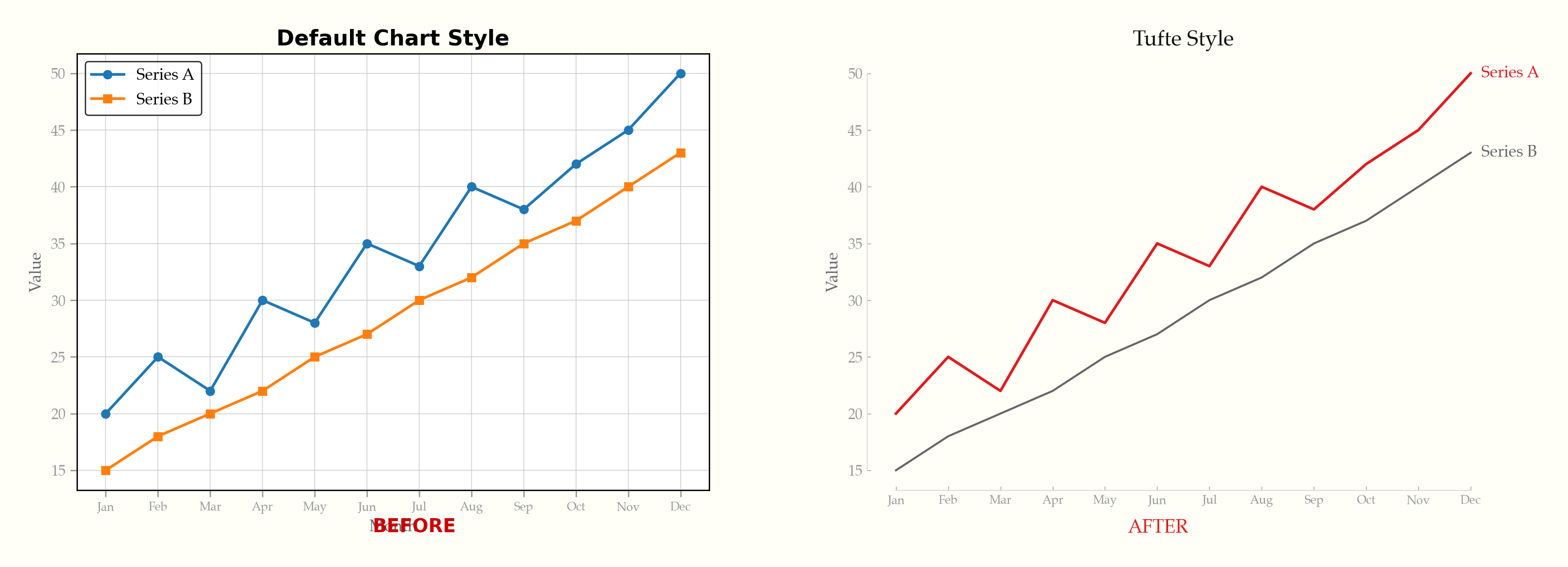
See it happen live — gridlines fade, legends become direct labels, chartjunk dissolves:
Interactive Demo
[Try the live demo](https://caylent.github.io/tufte-data-viz/) — toggle between default and Tufte styling across ECharts, Chart.js, Plotly, and D3.js. Includes dark mode.
Examples
Line chart — direct labels, range-frame axes, annotation
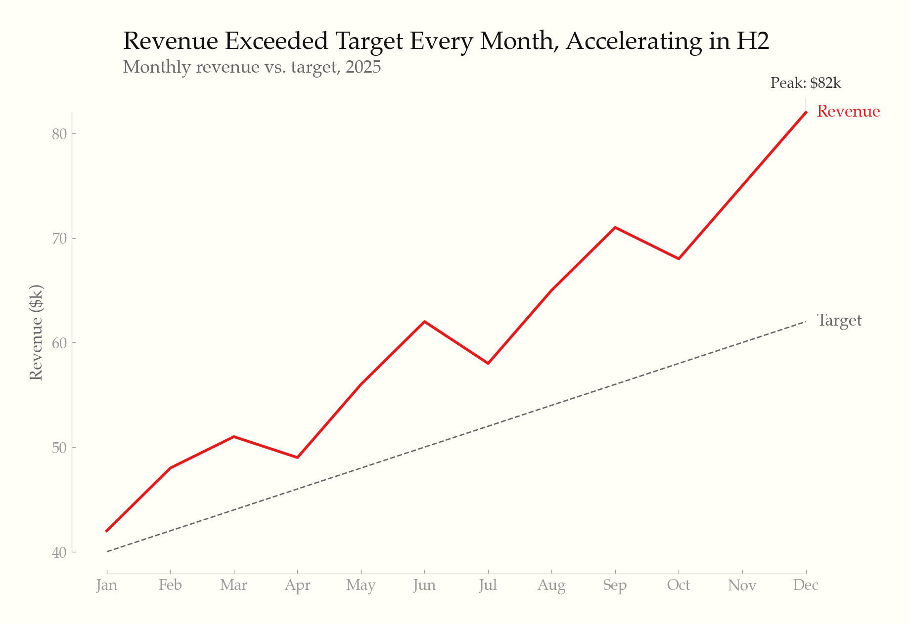
Horizontal bar chart — sorted by value, highlighted leader
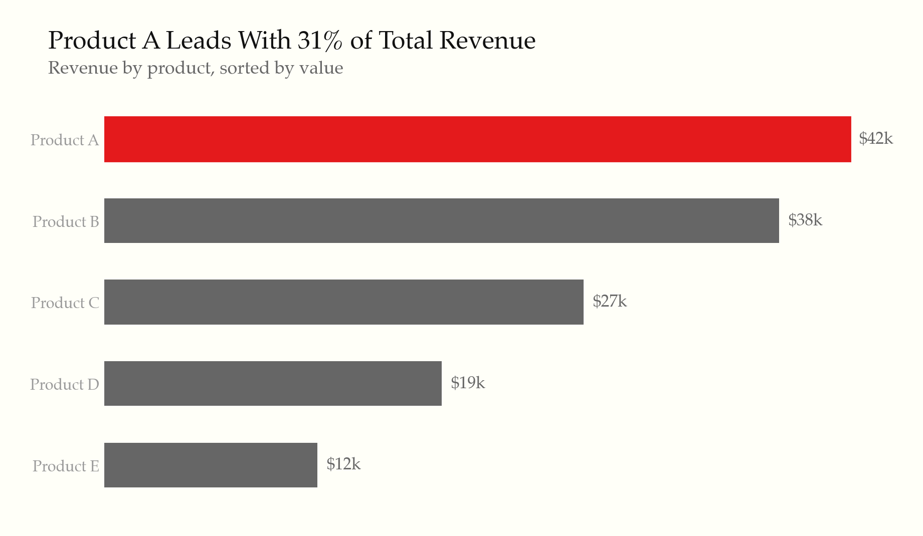
Slopegraph — before/after comparison
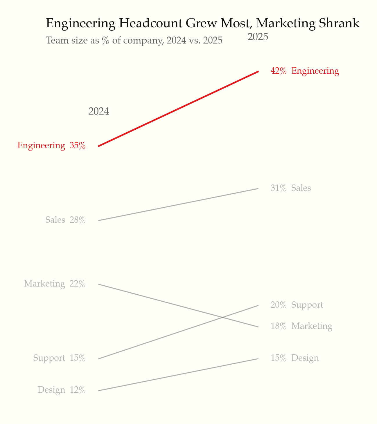
Small multiples — shared scale, minimal chrome
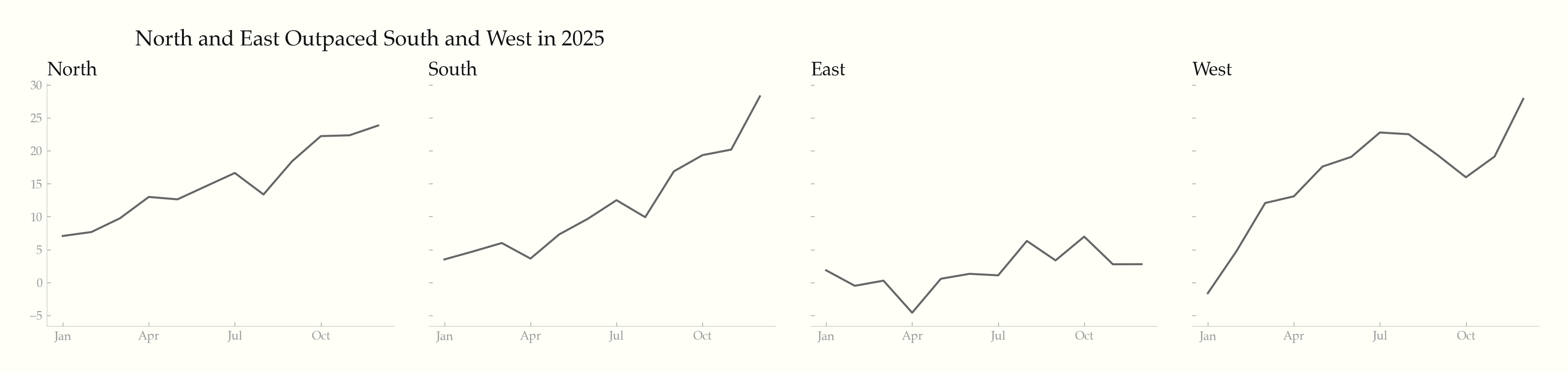
Sparklines — word-sized charts with min/max markers
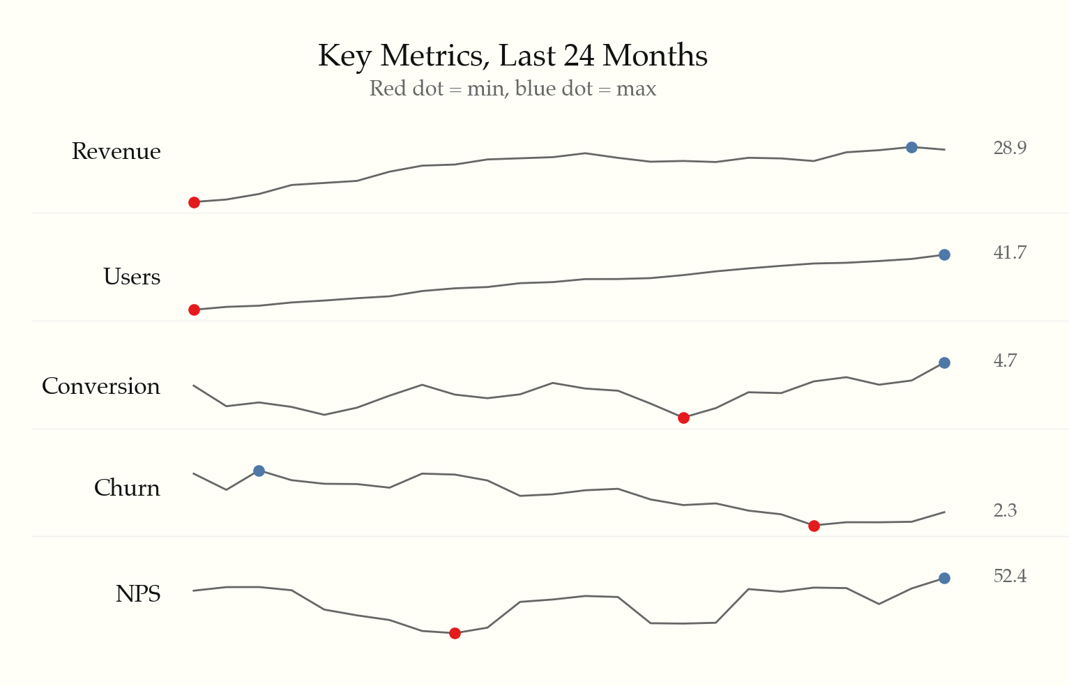
Data table — whitespace, thin rules, highlighted outlier
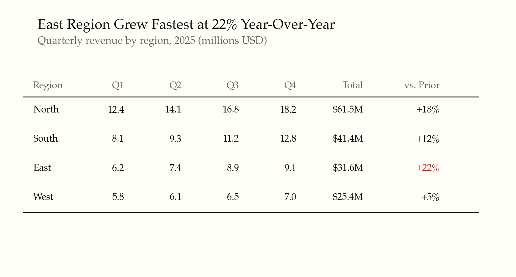
Dark mode — intentional palette, not inverted
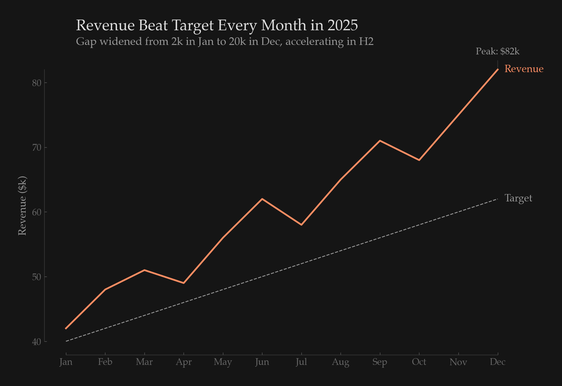
Accessible scatter — dual-encoded with shape + color
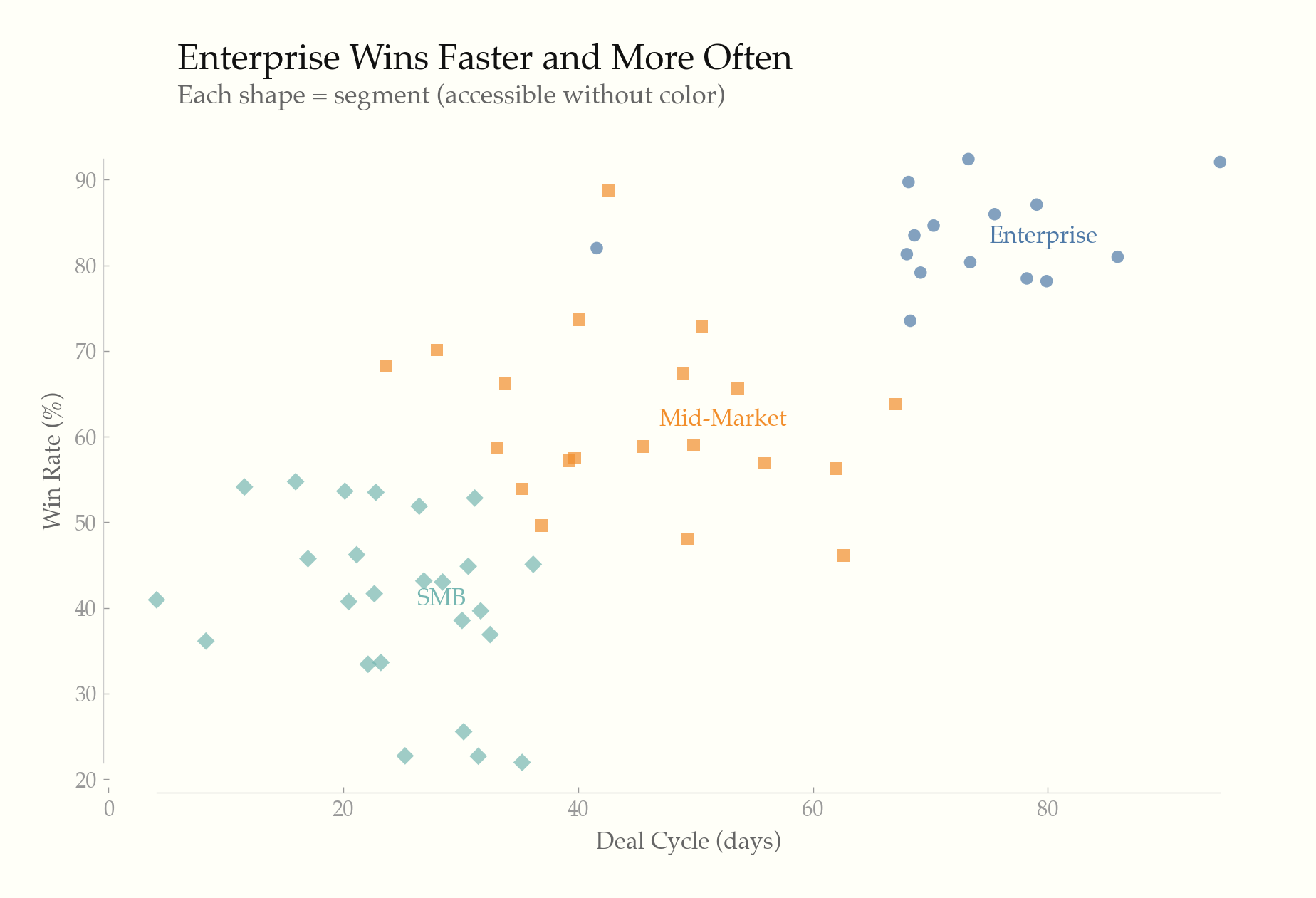
Light & dark — same chart, both themes
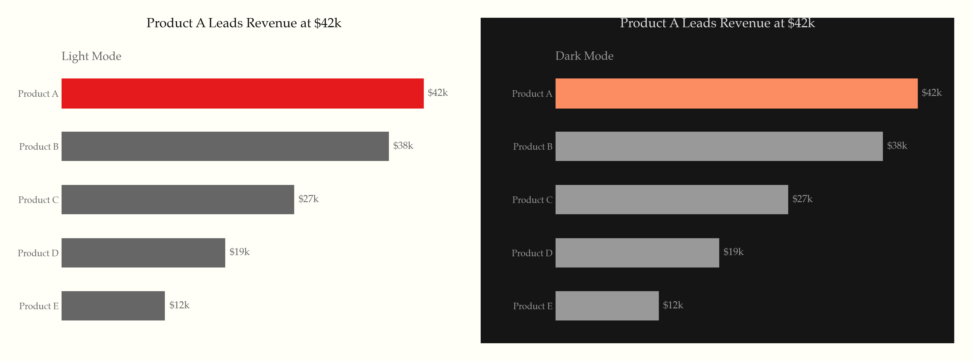
What it does
22 universal rules applied to every chart, organized in three tiers:
Static principles (rules 1–14) — the Tufte foundation:
- Maximize data-ink ratio — remove gridlines, borders, legends, and decoration that don't convey data
- Direct labeling, range-frame axes, no 3D, no pie charts (unless forced), no dual y-axes
- Serif typography, off-white backgrounds, gray as primary color with selective highlighting
- Annotate notable features, show comparison context, minimal tooltips
Screen-first principles (rules 15–19) — modern interactive contexts:
- Progressive disclosure (overview first, details on hover/tap/click)
- WCAG accessibility (contrast ratios, dual encoding, keyboard nav, screen reader text alternatives)
- Responsive design (fluid/adaptive strategies, touch targets, mobile-adapted chart types)
- Purposeful animation (data transitions only, respect
prefers-reduced-motion) - Intentional dark mode (semantic color tokens, never invert, reduce saturation)
Content & formatting (rules 20–22) — what Tufte assumed but never codified:
- Titles assert findings ("Revenue Surged 23%"), not axis descriptions
- Numbers formatted for humans ($1.2M, thousand separators, matched precision)
- Don't chart what a sentence or table can say better
Supported libraries
| Library | Rule file | Language |
|---|---|---|
| Recharts | rules/recharts.md | React/JSX |
| ECharts | rules/echarts.md | JavaScript |
| Chart.js | rules/chartjs.md | JavaScript |
| matplotlib | rules/matplotlib.md | Python |
| Plotly | rules/plotly.md | Python/JS |
| D3.js / SVG / HTML | rules/svg-html.md | Web |
Additional references
rules/interactive-and-accessible.md— progressive disclosure, accessibility, responsive, animation, dark moderules/typography-and-color.md— font stacks, palettes, hex valuesrules/anti-patterns.md— common violations and one-liner fixesrules/small-multiples-sparklines.md— small multiples, sparklines, slopegraphs
Based on
- The Visual Display of Quantitative Information (1983)
- Envisioning Information (1990)
- Visual Explanations (1997)
- Beautiful Evidence (2006)
License
MIT
Anti-Patterns: Detection and Fixes
Quick reference
| Anti-pattern | Why it fails | Fix |
|---|---|---|
| Pie chart | Humans are poor at comparing angles and areas. Two slices of 28% and 32% look identical. | Horizontal bar chart, sorted by value descending. |
| 3D effects | Perspective distorts relative sizes. Back bars appear smaller than front bars of equal value. | Remove all 3D. Flat 2D only. |
| Dual y-axes | Implies correlation between two series that may not exist. Scale manipulation can make any two lines appear correlated. | Two stacked charts sharing the same x-axis (small multiples). |
| Legend box | Forces eyes to shuttle between the legend and the data. Increases cognitive load by ~40%. | Direct labels at the endpoint or on the data element itself. |
| Heavy gridlines | Compete with data for visual attention. Create a "cage" that imprisons the data. | Remove entirely, or horizontal-only at opacity 0.08–0.12. |
| Rainbow palette | No natural ordering. Creates false category boundaries. Inaccessible to 8% of males (colorblind). | Gray default + single accent, or 4-color muted palette. |
| Gauge/speedometer | Uses enormous screen area for a single number. No trend, no context, no comparison. | Single large number + sparkline + comparison text. |
| Zebra-striped table | Alternating row colors create moire vibration. The stripes become louder than the data. | Whitespace + thin horizontal rules every 3–5 rows. |
| Gradient fills | Add no information. Distract from data values. Make it harder to read precise heights. | Solid flat color (muted gray or accent). |
| Rotated axis labels | 45° or 90° text is hard to read. Forces head-tilting. | Horizontal bar chart (flip axes), or abbreviate labels. |
| Truncated y-axis | Starting y-axis above zero exaggerates differences. A 2% change looks like a 50% swing. | Include zero, or use a clear axis break indicator and note. |
| Decorative borders | Box around chart is pure chartjunk. Adds zero information. | Remove entirely. Let whitespace define the chart boundary. |
| Area chart with high opacity | Filled areas at 50%+ opacity obscure overlapping series and add visual weight that distorts perception. | Use lines only, or area with opacity 0.03–0.08. |
| Exploded pie slices | Pulling slices apart makes comparison even harder than standard pie. | Don't. Use a bar chart. |
| Data point markers on every point | Large circles on 50+ data points create a confetti effect that obscures the trend. | dot={false} or markers only at notable points (min, max, endpoint). |
| Thick axis lines | Heavy 2-3px axis lines draw attention away from the data. The 1+1=3 effect creates phantom visual weight. | 0.5–1px axis lines, or remove entirely if ticks provide orientation. |
| Hover-only information | Touch and keyboard users can never access it. Violates WCAG. | Tap/click/focus fallback for all hover content. |
| Missing text alternative | Screen readers announce nothing. The chart is invisible to blind users. | Add aria-label with key finding + data summary, or companion data table. |
| Color as sole differentiator | 8% of males have color vision deficiency. Series become indistinguishable. | Add shape, dash pattern, or direct label as second channel. |
| Gratuitous entrance animation | Chart "building" on load delays comprehension and is chartjunk in motion. | Remove, or gate behind prefers-reduced-motion check. |
| Fixed pixel width | Chart overflows or becomes unreadable on mobile. | Use percentage/viewBox width or breakpoint-based layout. |
Per-library detection patterns
Recharts
PATTERN                              FIX
<Legend />                          → Remove entirely; add direct labels
<CartesianGrid />                   → <CartesianGrid stroke="none" /> or remove
<Pie> or <PieChart>                 → <BarChart layout="vertical">
fill="url(#gradient...)"           → fill="#666" (solid gray)
<YAxis yAxisId="right"...>          → Two separate <LineChart> in a flex column
stroke="#..." (bright/loud color)   → stroke="#666" (gray) unless it's the highlight series
<Area fillOpacity={0.3+}            → <Line> or <Area fillOpacity={0.05}>
ECharts
PATTERN                              FIX
type: 'pie'                         → type: 'bar' with horizontal orientation
splitLine: { show: true }           → splitLine: { show: false }
legend: { show: true }              → legend: { show: false } + label on series
grid: { borderWidth: N }            → grid: { show: false }
series.areaStyle: { opacity: 0.3+ } → Remove or opacity: 0.05
visualMap with rainbow colors        → Muted single-hue sequential palette
Chart.js
PATTERN                              FIX
type: 'pie' / 'doughnut'           → type: 'bar' with indexAxis: 'y'
grid: { display: true }            → grid: { display: false }
border: { display: true } on scale  → border: { display: false }
plugins.legend.display: true        → display: false + chartjs-plugin-datalabels
backgroundColor: 'rgba(R,G,B,0.5)' → 'rgba(102,102,102,0.8)' (gray)
matplotlib
PATTERN                              FIX
plt.pie(...)                        → plt.barh(...) sorted by value
ax.legend()                         → ax.annotate() at each line endpoint
ax.grid(True)                       → ax.grid(False) or ax.grid(axis='y', alpha=0.1)
fig.patch.set_facecolor('white')    → fig.patch.set_facecolor('#fffff8')
plt.xticks(rotation=45)            → Use plt.barh() or abbreviate tick labels
ax.set_frame_on(True)              → Remove top/right spines + range-frame
Plotly
PATTERN                              FIX
go.Pie(...)                         → go.Bar(orientation='h', ...)
fig.update_layout(showlegend=True)  → showlegend=False + add annotations at endpoints
xaxis=dict(showgrid=True)          → showgrid=False
plot_bgcolor='white'               → plot_bgcolor='#fffff8'
template='plotly'                   → Use custom Tufte template
The "Can I remove it?" test
For each non-data element, ask: "If I delete this, does the chart lose information?"
- Gridlines: Usually no. The data points themselves show position.
- Legend: No, if you label directly.
- Axis title: Sometimes no — if the chart title already specifies the axis ("Monthly Revenue in USD").
- Top/right borders: Always no.
- Background color other than off-white: Always no (decoration).
- Tick marks: Maybe — keep if needed for reading precision, remove if axis line is sufficient.
- Tooltip border/background: Always no.
If the answer is "no," remove it. If the answer is "maybe," try removing it and see if the chart still communicates.
Related skills
 Vercel React Best PracticesAutomatically apply Vercel’s official React and Next.js performance rules during code generation and review.587k29.6kVercel Composition PatternsGenerate and refactor React components that stay maintainable as complexity grows without boolean prop explosion.267k29.6k
 ShadcnAdd, compose, search, fix, and style production-grade React components directly from source without leaving their editor.257k120k
 Develop UserscriptsCorrectly write, debug, and package userscripts for Tampermonkey and ScriptCat with proper metadata, GM APIs, and runtime decisions.224k72
 Minimalist UiGenerate clean, editorial-style web interfaces with warm monochrome palettes, typographic hierarchy, bento grids and flat components that feel premium and utilita212k69.4kImage To CodeConvert high-fidelity design images into production-ready, visually accurate frontend code that avoids generic AI design pitfalls.177k69.4k