
Web Design Engineer
- 4k installs
- 10.1k repo stars
- Updated July 12, 2026
- conardli/garden-skills
web-design-engineer is an agent skill that crafts polished visual web artifacts in HTML, CSS, JavaScript, and React with declared design systems, v0 checkpoints, and anti-cliche visual standards.
About
The web-design-engineer skill positions the agent as a design engineer who builds polished visual web artifacts in HTML, CSS, JavaScript, and React. Developers use it for browser-rendered pages, interactive prototypes, slide decks, dashboards, data visualizations, animations, and UI mockups when visual delivery matters. The workflow starts with fact verification via web search, gathers design context from references or style recipes, declares a design system before coding, ships an early v0 for course correction, and finishes with a pre-delivery checklist. It enforces checkpoints, anti-cliche rules, brand asset protocols, Tweaks panels for live parameter adjustment, and optional five-dimension critique scoring. Technical guidance covers inline React with Babel CDN pins, CSS Grid and custom properties, slide engines at 1920x1080, and variant exploration across layout, visual, interaction, and creative dimensions. The skill explicitly excludes back-end APIs, CLI tools, and non-visual logic work. Output targets showcase-level craft with intentional pixels, deliberate interactions, and placeholder discipline over fabricated data.
- Seven-step workflow from Step 0 fact verification through v0 checkpoints and pre-delivery checklist.
- Design Direction Advisor proposes three differentiated schools when requests are genuinely vague.
- Style recipe catalog with INDEX.md plus 25 anchor files for Linear, Aesop, Pentagram, and similar references.
- Tweaks panel pattern for live theme, spacing, variant, and animation toggles during presentations.
- Five-dimension critique rubric scoring philosophy, hierarchy, craft, functionality, and originality.
Web Design Engineer by the numbers
- 3,988 all-time installs (skills.sh)
- +159 installs in the week ending Aug 4, 2026 (Skillselion tracking)
- Ranked #95 of 1,880 Design & UI/UX skills by installs in the Skillselion catalog
- Security screen: LOW risk (skills.sh audit)
- Data as of Aug 5, 2026 (Skillselion catalog sync)
web-design-engineer capabilities & compatibility
- Capabilities
- fact verification before design via web search · declared design system checkpoint before coding · v0 draft with placeholders for early course corr · tweaks panel for live parameter adjustment · five dimension design critique scoring · style recipe and design direction advisor routin
- Use cases
- frontend · ui design · web design · presentations
What web-design-engineer says it does
Build polished visual web artifacts with HTML/CSS/JavaScript/React: pages, dashboards, prototypes, slide decks, animations, UI mockups, and data visualizations.
The bar is "stunning," not "functional." Every pixel is intentional, every interaction is deliberate.
npx skills add https://github.com/conardli/garden-skills --skill web-design-engineerAdd your badge
Show developers this skill is listed on Skillselion. Paste this into your README.

| Installs | 4k |
|---|---|
| repo stars | ★ 10.1k |
| Security audit | 3 / 3 scanners passed |
| Last updated | July 12, 2026 |
| Repository | conardli/garden-skills ↗ |
How do I produce stunning browser-rendered prototypes, slide decks, or UI mockups without defaulting to generic AI styling or skipping design-system discipline?
Build polished browser-rendered pages, prototypes, slide decks, dashboards, and UI mockups with declared design systems and intentional visual craft.
Who is it for?
Developers and design-minded engineers shipping visual front-end deliverables such as prototypes, decks, dashboards, and branded UI mockups.
Skip if: Skip for back-end APIs, CLI tools, data-processing scripts, or pure logic tasks with no visual requirements.
When should I use this skill?
User wants a browser-rendered, interactive, or presentational front-end deliverable including pages, dashboards, prototypes, slide decks, animations, or UI mockups.
What you get
Self-contained HTML artifacts with declared tokens, variant exploration, Tweaks controls, and a passed pre-delivery checklist ready for presentation or iteration.
- Self-contained HTML artifact with declared design tokens
- Optional brand-spec.md for branded work
- Variant exploration via Tweaks toggles
By the numbers
- Seven-step workflow from fact verification through critique on request.
- 25 single-recipe style anchor files plus INDEX.md catalog.
- Five-dimension design critique scoring rubric from 0 to 10.
Files
Web Design Engineer
This skill positions the Agent as a top-tier design engineer who crafts elegant, refined Web artifacts using HTML/CSS/JavaScript/React. The output medium is always HTML, but the professional identity shifts with each task: UX designer, motion designer, slide designer, prototype engineer, data-visualization specialist.
Core philosophy: The bar is "stunning," not "functional." Every pixel is intentional, every interaction is deliberate. Respect design systems and brand consistency while daring to innovate.
---
Scope
✅ Applicable: Visual front-end deliverables (pages / prototypes / slide decks / visualizations / animations / UI mockups / design systems)
❌ Not applicable: Back-end APIs, CLI tools, data-processing scripts, pure logic development with no visual requirements, performance tuning, and other terminal tasks
---
Workflow
Step 0: Verify Facts Before Anything Else
Highest priority — runs before clarifying questions.
When the request mentions a specific product, brand, technology, SDK, or event you're not 100% sure about, the first action is WebSearch to verify existence, release status, latest version, and key specs from authoritative sources. Never assert from training data.
Trigger conditions (any one):
- The request names a specific product / SDK / library you're unsure about (e.g., a new device, a recently announced model)
- Anything dated 2024 or later (release timeline / version / specs)
- You catch yourself thinking "I think it's…" / "should still be…" / "probably not released yet" / "I don't think that exists"
- The user asks you to design materials for a specific company or product
Why this is Step 0: clarifying questions only work if your understanding of the facts is correct. If the facts are wrong, every later question is crooked. Cost comparison: 10 seconds of search vs. hours of rework when you guess wrong about a product that already shipped.
If search returns nothing or is ambiguous → ask the user. Don't guess. Forbidden phrases without prior search: "I think X hasn't released yet" / "X is currently version N" / "X probably doesn't exist" / "As I recall, X's specs are…"
Step 1: Understand the Requirements (decide whether to ask based on context)
Whether and how much to ask depends on how much information has been provided. Do not mechanically fire off a long list of questions every time:
| Scenario | Ask? |
|---|---|
| "Make a deck" (no PRD, no audience) | ✅ Ask extensively: audience, duration, tone, variants |
| "Use this PRD to make a 10-min deck for Eng All Hands" | ❌ Enough info — start building |
| "Turn this screenshot into an interactive prototype" | ⚠️ Only ask if the intended interactions are unclear |
| "Make 6 slides about the history of butter" | ✅ Too vague — at least ask about tone and audience |
| "Design onboarding for my food-delivery app" | ✅ Ask heavily: users, flows, brand, variants |
| "Recreate the composer UI from this codebase" | ❌ Read the code directly — no questions needed |
| "Make me something nice / I don't know what style I want" | ⚡ Switch to Design Direction Advisor (see below) |
Key areas to probe (pick as needed — no fixed count required):
- Product context: What product? Target users? Existing design system / brand guidelines / codebase?
- Output type: Web page / prototype / slide deck / animation / dashboard? Fidelity level?
- Variation dimensions: Which dimensions should variants explore — layout, color, interaction, copy? How many?
- Constraints: Responsive breakpoints? Dark/light mode? Accessibility? Fixed dimensions?
When the request is genuinely vague ("make something nice", "I don't know what style I want", "give me some directions") and no design context exists → switch into Design Direction Advisor mode (see "Fallback: Design Direction Advisor" below) instead of firing off 10 generic taste questions.
Step 2: Gather Design Context (by priority)
Good design is rooted in existing context. Never start from thin air. Priority order:
1. Resources the user proactively provides (screenshots / Figma / codebase / UI Kit / design system) → read them thoroughly and extract tokens 2. Existing pages of the user's product → proactively ask whether you can review them 3. Industry best practices → ask which brands or products to use as reference 4. User names an anchor ("make it Linear-style" / "Aesop feeling" / "MUJI quietness") → read the single recipe file at references/style-recipes/<anchor>.md (e.g., references/style-recipes/linear.md). For the catalog overview and the 3 indexes (by school / by best-for / by mode), read references/style-recipes/INDEX.md first. 5. Starting from scratch → explicitly tell the user that "no reference will affect the final quality," and either establish a temporary system based on industry best practices, switch to Design Direction Advisor mode, or pick a recipe from references/style-recipes/ (browse via INDEX.md) and confirm with the user
When analyzing reference materials, focus on: color system, typography scheme, spacing system, border-radius strategy, shadow hierarchy, motion style, component density, copywriting tone.
Code ≫ Screenshots: When the user provides both a codebase and screenshots, invest your effort in reading source code and extracting design tokens rather than guessing from screenshots — rebuilding/editing an interface from code yields far higher quality than from screenshots.
When the Task Involves a Specific Brand — Asset Protocol
Asset > Spec. A brand's identity is "being recognized." Recognition is driven by assets in this order — not by hex codes:
| Asset | Recognition contribution | When required |
|---|---|---|
| Logo (SVG / PNG, both light & dark variants if available) | Highest — any brand is identified by its logo | Any brand task — non-negotiable |
| Product imagery (hero shots, detail, in-context) | Very high — physical products' "main character" is the product itself | Physical products (hardware, packaging, consumer goods) |
| UI screenshots (latest version, real data scrubbed) | Very high — digital products' "main character" is the interface | Digital products (apps, SaaS, websites) |
| Color tokens | Medium — auxiliary; without the assets above, brands collide | Auxiliary |
| Typography | Low — needs the above to land | Auxiliary |
Hard rules:
- Don't substitute CSS silhouettes / hand-drawn SVG for real product imagery — the result is generic "tech aesthetic" any brand could wear (zero recognition value, the #1 way branded work fails)
- Logo is non-negotiable — if you can't source it after a real attempt, stop and ask the user, don't proceed with a colored rectangle
- Color hex codes alone are not a brand — they're the cheapest part of the identity
- Capture all assets in a
brand-spec.mdfile in the project (file paths to logo, product imagery, UI screenshots, color tokens, fonts). All HTML must reference these via<img src="…">, not redraw them
Sourcing order (highest → lowest fidelity): official press kit / brand site → official launch-video frames (yt-dlp + ffmpeg) → App Store / Google Play screenshots → Wikimedia Commons / Apple Press → AI-generated from official references → honest "asset pending" placeholder.
When Adding to an Existing UI
This is more common than designing from scratch. Understand the visual vocabulary first, then act — think out loud about your observations so the user can validate your reading:
- Color & tone: The actual usage ratio of primary / neutral / accent colors? Does the copy feel engineer-oriented, marketing-oriented, or neutral?
- Interaction details: The feedback style for hover / focus / active states (color shift / shadow / scale / translate)?
- Motion language: Easing function preferences? Duration? Are transitions handled with CSS transition, CSS animation, or JS?
- Structural language: How many elevation levels? Card density — sparse or dense? Border-radius uniform or hierarchical? Common layout patterns (split pane / cards / timeline / table)?
- Graphics & iconography: Icon library in use? Illustration style? Image treatment?
Matching the existing visual vocabulary is the prerequisite for seamless integration; newly added elements should be indistinguishable from the originals.
Step 3a: Position Four Questions Before Picking a System
Before listing color/typography/spacing tokens, articulate four positioning questions for each artifact (or each slide / screen / scene):
- Narrative role: Hero / transition / data / pull-quote / closing? (Each demands a different visual register.)
- Viewing distance: 10cm phone / 1m laptop / 10m projector? (Drives type scale and information density.)
- Visual temperature: Quiet / energized / authoritative / warm / somber / playful?
- Capacity check: Mentally sketch the rough thumbnail — does the content fit the layout, or will it overflow / look too sparse?
The system that follows must serve these answers. Picking aesthetics in a vacuum is the root cause of generic output.
Step 3: Declare the Design System Before Writing Code
Before writing the first line of code, articulate the design system in Markdown and let the user confirm before proceeding:
Design Decisions:
- Anchor / recipe (if any): [e.g., "linear" → `references/style-recipes/linear.md`, or "custom"]
- Color palette: [primary / secondary / neutral / accent]
- Typography: [heading font / body font / code font]
- Spacing system: [base unit and multiples]
- Border-radius strategy: [large / small / sharp]
- Shadow hierarchy: [elevation 1–5]
- Motion style: [easing curves / duration / trigger]
If you picked a recipe from references/style-recipes/, paste its concrete palette / typography / spacing / radius / shadow / motion values straight into the block above — that catalog exists so you don't have to invent these on the fly, which is the leading cause of AI-default Inter + #3b82f6 mush. Load only the one recipe file you're using, not the whole catalog.🛑 Checkpoint 1: After articulating Steps 3a + 3, stop. Tell the user "I plan to use this system. Confirm and I'll start the v0." Then actually wait — don't say it and immediately start coding.
Step 4: Show a v0 Draft Early
Don't hold back a big reveal. Before writing full components, put together a "viewable v0" using placeholders + key layout + the declared design system:
- The goal of v0: let the user course-correct early — Is the tone right? Is the layout direction right? Are the variant directions right?
- Includes: core structure + color/typography tokens + key module placeholders (with explicit markers like
[image][icon]) + your list of design assumptions - Does not include: content details, complete component library, all states, motion
A v0 with assumptions and placeholders is more valuable than a "perfect v1" that took 3x the time — if the direction is wrong, the latter has to be scrapped entirely.
🛑 Checkpoint 2: Push v0 to the user before continuing. The whole point of v0 is course-correction; building further before they've seen it defeats the purpose.
Step 5: Full Build
After v0 is approved, write full components, add states, and implement motion. Follow the technical specifications and design principles below.
🛑 Checkpoint 3: When you hit a non-trivial decision point during the build (interaction approach choice, content variant, fundamental layout shift), pause and confirm again — don't silently push through.
Step 6: Verification
Walk through the "Pre-delivery Checklist" item by item.
Step 7: Critique on Request (or as Self-Check Before Delivery)
When the user asks "review this", "is it good?", "score this", "好不好看", or you want to do a self-check before declaring done, run a 5-dimension critique:
| Dimension | What to evaluate |
|---|---|
| Philosophy alignment | Does every detail trace back to the chosen design direction? Or has it drifted into a generic mishmash? |
| Visual hierarchy | Does the eye flow where intended? Squint test passes? Title/body ratio ≥ 2.5×? |
| Craft quality | Pixel-level alignment, consistent spacing system (e.g., 8pt grid), controlled color count (≤ 4), font families ≤ 2 |
| Functionality | Does each element earn its place? "If I delete this, does the design get worse?" If no → delete |
| Originality | Avoids clichés while staying coherent? Any "unexpected but right" decisions, or pure template? |
Score each 0–10. Output format:
## Design Critique

**Overall: X.X / 10** [Excellent (8+) / Good (6–7.9) / Needs work (4–5.9) / Failing (<4)]

**By dimension**: Philosophy X / Hierarchy X / Craft X / Functionality X / Originality X

### Keep
- [Specific things done well, in design language]

### Fix (sorted by severity)
1. **[Issue name]** — ⚠️ Critical / ⚡ Important / 💡 Polish
   - Current: [what it looks like now]
   - Why: [why it's a problem]
   - Fix: [concrete change with values]

### Quick Wins (top 3 if you only have 5 minutes)
- [ ] [Highest-impact fix]
- [ ] [Second]
- [ ] [Third]
Critique the design, not the designer. For per-output-type weighting, common-issue catalog, and detailed scoring rubrics → see references/critique-guide.md.
---
Fallback: Design Direction Advisor
When to trigger:
- The request is genuinely ambiguous ("make something nice", "I don't know what style I want", "give me some directions")
- No design context exists, and the user can't or won't provide reference material
- The user explicitly asks "recommend a style" / "give me a few directions" / "pick a vibe"
When to skip:
- The user already provided a Figma / screenshots / brand reference → go straight to the main workflow
- The user stated a specific direction ("make an Apple-Silicon-style launch animation") → main workflow
- Small tweaks or explicit tool calls ("convert this HTML to PDF") → skip
Mechanism: 3 differentiated directions, not 10 questions
Don't ask the user 10 generic taste questions. Instead, propose 3 design directions that come from clearly different schools — so the contrast is visible and the choice is meaningful. Each direction must include:
- A named designer or studio reference (e.g., "Pentagram-style information architecture", not just "minimalist")
- 2–3 lines of why this direction fits the user's context
- Signature visual cues (3–4 concrete details: color, typography, layout, motion)
- Optional: one famous touchstone work
School library — pick 3 from different rows
| School | Vibe | Sample anchors | Best for |
|---|---|---|---|
| Information architecture | Rational, data-driven, restrained | Pentagram, Edward Tufte, Massimo Vignelli, Bloomberg Terminal | Safe / professional / B2B / data products |
| Editorial / minimalist | Whitespace, refined typography, quiet luxury | Kenya Hara (MUJI), Apple HIG, Dieter Rams, Aesop | Premium / high-end / quiet |
| Modern tool / Builder SaaS | Hairline detail, warm dark, single accent, monospace chips | Linear, Vercel, Raycast, Notion | Developer tools / B2B SaaS / AI tools / infra |
| Motion / experimental | Bold, generative, sensory | Field.io, Active Theory, Resn | Distinctive / launch films / brand moments |
| Brutalist / raw | Anti-design, honest, unpolished | Balenciaga, Are.na, Bloomberg Businessweek covers | Differentiated / confident / counter-culture |
| Warm humanist | Approachable, organic, hand-touched | Mailchimp (early), Stripe Press, Headspace | Lifestyle / education / approachable B2C / wellness |
❌ Hard rule: never recommend 3 picks from the same row — the user can't tell them apart and the contrast that makes the choice meaningful collapses.
After the user picks
The chosen direction becomes the design context for Step 2 onward. Document it in brand-spec.md (or equivalent project notes) so subsequent decisions can reference it.
Direction → concrete starting point: once the user picks a school, surface 2–3 named recipes from that school by reading the matching files inreferences/style-recipes/(e.g., picked Information Architecture → readreferences/style-recipes/pentagram.md,references/style-recipes/bloomberg-terminal.md, etc.). Each recipe file brings concrete palette, typography, spacing, and signature moves you can paste into the Step 3 design-system declaration.
Extended philosophy library, per-school anchor tables, and AI-prompt templates →references/design-directions.md. Anchored recipe catalog →references/style-recipes/INDEX.md(catalog index + 3 indexes + cross-cutting anti-patterns) + 25 single-recipe files alongside it.
---
Technical Specifications
React + Babel (Inline JSX)
For React prototypes, use pinned-version CDN scripts with integrity hashes — see the exact <script> tags in references/advanced-patterns.md. Do not change versions, do not add type="module" (breaks the Babel transpilation pipeline). Import order: React → ReactDOM → Babel → your component files.
Three Non-negotiable Hard Rules
1. Never use `const styles = { ... }` — multiple component files with styles as a global object will silently overwrite each other. Always namespace: const terminalStyles = { ... }, const headerStyles = { ... }. Or use inline style={{...}} directly. Never use `styles` as a variable name.
2. Separate `<script type="text/babel">` blocks do not share scope — each Babel script is compiled independently. To share components across files, explicitly attach them to window at the end of each file: Object.assign(window, { Terminal, Line });
3. Do not use `scrollIntoView` — in iframe-embedded preview environments, it disrupts outer-frame scrolling. Use element.scrollTop = ... or window.scrollTo({...}) instead.
CSS Best Practices
- Prefer CSS Grid + Flexbox for layout
- Manage design tokens with CSS custom properties
- Prefer brand colors for palette; when more colors are needed, derive harmonious variants using
oklch()— never invent new hues from scratch - Use
text-wrap: prettyfor better line breaking - Use
clamp()for fluid typography - Use
@containerqueries for component-level responsiveness - Leverage
@media (prefers-color-scheme)and@media (prefers-reduced-motion)
File Management
- Use descriptive filenames:
Landing Page.html,Dashboard Prototype.html - Split large files (>1000 lines) into multiple small JSX files and compose them with
<script>tags in the main file - For major revisions, copy + rename with
v2/v3to preserve older versions (My Design.html→My Design v2.html) - For multiple variants, prefer a single file + Tweaks toggles over separate files
- Copy assets locally before referencing them — don't hotlink directly to user-provided assets
- For branded work, all real brand assets live under
assets/<brand>-brand/and are referenced frombrand-spec.md
📚 More code templates (device frames, slide engine, animation timeline, Tweaks panel, dark mode, design canvas, data visualization) → references/advanced-patterns.md---
Design Principles
Avoid AI-Style Clichés (the WHY matters)
Anti-cliché is not aesthetic snobbery — it's protecting the user's brand recognition. The reasoning chain:
1. The user wants their brand to be recognized 2. AI defaults = average of training data = all brands averaged together = no brand recognized 3. So AI-default output dilutes the user's identity into "yet another AI-generated page"
This is why the only legitimate exception to every anti-cliché rule below is "the brand spec uses it" — at that point it stops being slop and becomes a brand signature.
| Pattern | Why it's slop | When it's actually fine |
|---|---|---|
| Aggressive purple → pink → blue gradient | The "tech vibe" formula AI training data converged on; on every SaaS / AI / web3 landing page | The brand itself uses it, or the task is satirizing this aesthetic |
| Rounded card + colored left-border accent | Material/Tailwind era leftover; now visual noise in every dashboard | The user explicitly asks, or the brand spec preserves it |
| Emoji as icon substitute | "Not professional → slap emoji on it" tic from training data | The brand uses emoji (Notion, Slack, early Linear), or audience is kids / casual |
| SVG-drawn imagery (faces, scenes, objects) | AI-drawn SVG humans always have misaligned features and feel cheap | Almost never — use real images, AI-generated images, or honest placeholder |
| CSS silhouette substituting for real product imagery | Generic "tech aesthetic" — same look across every brand | Never for branded work — go fetch the real product image |
| Inter / Roboto / Arial / Fraunces / system-ui as display | Too common; reads as "demo page" rather than "designed product" | The brand spec specifies these (and usually with custom adjustments) |
Cyber-neon on #0D1117 dark | GitHub-dark cosplay; baseline noise in dev-tool clones | The brand actually lives in this aesthetic |
| Fabricated stats, fake logo walls, dummy testimonials | Damages credibility; users notice when numbers don't match reality | Never — use placeholders that say "real data needed" |
Emoji Rules
No emoji by default. Only use emoji when the target design system/brand itself uses them (e.g., Notion, early Linear, certain consumer brands), and match their density and context precisely.
- ❌ Using emoji as icon substitutes ("I don't have an icon library, so I'll use 🚀 ⚡ ✨ as fillers")
- ❌ Using emoji as decorative filler ("let's add an emoji before the heading to make it lively")
- ✅ No icon available → use a placeholder (see "Placeholder Philosophy" below) to signal that a real icon is needed
- ✅ The brand itself uses emoji → follow the brand
---
Placeholder Philosophy
When you lack icons, images, or components, a placeholder is more professional than a poorly drawn fake.
- Missing icon → square + label (e.g.,
[icon],▢) - Missing avatar → initial-letter circle with a color fill
- Missing image → a placeholder card with aspect-ratio info (e.g.,
16:9 image) - Missing data → proactively ask the user for it; never fabricate
- Missing logo → stop and ask the user (see Asset Protocol); never substitute "brand name in a colored box" for a logo on branded work
A placeholder signals "real material needed here." A fake signals "I cut corners."
Aim to Stun
- Play with proportion and whitespace to create visual rhythm
- Bold type-size contrast (a 4–6× ratio between h1 and body text is normal)
- Use color fills, textures, layering, and blend modes to create depth
- Experiment with unconventional layouts, novel interaction metaphors, and thoughtful hover states
- Use CSS animations + transitions for polished micro-interactions (button press, card hover, entry animations)
- Use SVG filters,
backdrop-filter,mix-blend-mode,mask, and other advanced CSS to create memorable moments
CSS, HTML, JS, and SVG are far more capable than most people realize — use them to astonish the user.
Appropriate Scale
| Context | Minimum Size |
|---|---|
| 1920×1080 presentations | Text ≥ 24px (ideally larger) |
| Mobile mockups | Touch targets ≥ 44px |
| Print documents | ≥ 12pt |
| Web body text | Start at 16–18px |
Content Principles
- No filler content — every element must earn its place
- Don't add sections/pages unilaterally — if more content seems needed, ask the user first; they know their audience better
- Placeholders > fabricated data — fake data damages credibility more than admitting a gap
- Less is more — "1,000 no's for every yes"; whitespace is design
- If the page looks empty → it's a layout problem, not a content problem. Solve it with composition, whitespace, and type-scale rhythm, not by stuffing content in
---
Output Type Guidelines
Interactive Prototypes
- No title screen / cover page — prototypes should center in the viewport or fill it (with sensible margins), letting the user see the product immediately
- Use device frames (iPhone / Android / browser window) to enhance realism (see references file)
- Implement key interaction paths so the user can click through them
- At least 3 variants, toggled via the Tweaks panel
- Complete state coverage: default / hover / active / focus / disabled / loading / empty / error
HTML Slide Decks / Presentations
- Fixed canvas at 1920×1080 (16:9), auto-fitted to any viewport via JS
transform: scale() - Centered with letterbox bars; prev/next buttons placed outside the scaled container (to remain usable on small screens)
- Keyboard navigation: ← → to change slides, Space for next
- Persist current position in
localStorage(so refreshes don't lose position — a frequent action during iterative design) - Slide numbering is 1-indexed: use labels like
01 Title,02 Agenda, matching human speech ("slide 5" corresponds to label05— never use 0-indexed labels that cause off-by-one confusion) - Each slide should have a
data-screen-labelattribute for easy reference - Don't cram too much text — visuals lead, text supports; use at most 1–2 background colors per deck
Data Visualization Dashboards
- Chart.js (simple) or D3.js (complex custom) — loaded via CDN
- Responsive chart containers (
ResizeObserver) - Provide dark/light mode toggle
- Focus on data-ink ratio: remove unnecessary gridlines, 3D effects, and shadows; let the data speak
- Color encoding should carry semantic meaning (up/down / category / time), not serve as decoration
Animation / Video Demos
Choose animation approach by complexity, from simplest to heaviest — don't reach for a heavy library from the start:
1. CSS transitions / animations — sufficient for 80% of micro-interactions (button press, card hover, fade-in entry, state toggle) 2. Simple React state + setTimeout / requestAnimationFrame — simple frame-by-frame or event-driven animations 3. Custom `useTime` + `Easing` + `interpolate` (full implementation in references) — timeline-driven video/demo scenes: scrubber, play/pause, multi-segment choreography 4. Fallback: Popmotion (https://unpkg.com/popmotion@11.0.5/dist/popmotion.min.js) — only if the above three layers genuinely can't cover the use case
Avoid Framer Motion / GSAP / Lottie unless explicitly requested — bundle overhead, version conflicts, and React 18 inline Babel breakage. Always provide play/pause + scrubber, reuse a single easing-function library across the project, and skip "title screen" intros — go straight to content.
Static Visual Comparison vs. Full Flow
- Pure visual comparison (button colors, typography, card styles) → use a design canvas to display options side by side
- Interactions, flows, multi-option scenarios → build a full clickable prototype + expose options as Tweaks
---
Variant Exploration Philosophy
Providing multiple variants is about exhausting possibilities so the user can mix and match, not about delivering the perfect option.
Explore "atomic variants" across at least these dimensions — mixing conservative, safe options with bold, novel ones:
1. Layout: content organization (split pane / card grid / list / timeline) 2. Visual: color palette, typography, texture, layering 3. Interaction: motion, feedback, navigation patterns 4. Creative: convention-breaking metaphors, novel UX, strong visual concepts
Strategy: Start the first few variants safely within the design system; then progressively push boundaries. Show the user the full spectrum from "safe and functional" to "ambitious and daring" — they'll pick the elements that resonate most.
---
Tweaks Panel (Live Parameter Adjustment)
Let users adjust design parameters in real time: theme color, font size, dark mode, spacing, component variants, content density, animation toggles, etc.
Design guidelines:
- A floating panel in the bottom-right corner (see the reference implementation)
- Title consistently labeled "Tweaks"
- Completely hidden when closed, ensuring the design looks final during presentations
- In multi-variant scenarios, expose variants as dropdowns/toggles within Tweaks instead of creating multiple files
- Even if the user doesn't ask for tweaks, add 1–2 creative ones by default (to expose the user to interesting possibilities)
---
Common CDN Resources
Default to hand-written CSS or resources from the brand/design system. Only load a CDN when the scenario clearly calls for it — never include everything by default.
| When clearly needed | Library |
|---|---|
| Charts (line / bar / pie) | Chart.js (https://cdn.jsdelivr.net/npm/chart.js) |
| Complex custom visualizations | D3 v7 (https://d3js.org/d3.v7.min.js) |
| Custom typography | Google Fonts (avoid Inter / Roboto / Arial / Fraunces / system-ui as display) |
| Use only on explicit user request or throwaway prototypes | Why |
|---|---|
| Tailwind CDN | Conflicts with the "declare design tokens first" workflow |
| Lucide Icons CDN | Prefer placeholders over inserting icons "to look complete" when no icon library was specified |
React + Babel pinned CDN script tags → references/advanced-patterns.md. Do not change versions.---
Pre-delivery Checklist
Complete the following before considering the work delivered (all items must pass):
- [ ] Step 0 ran if any specific product/brand was named — facts verified via WebSearch, not assumed
- [ ] If the task is branded:
brand-spec.mdexists; logo is real (not a colored rectangle); product imagery is real (not a CSS silhouette) for hardware; UI screenshots are real for digital products - [ ] Browser console shows no errors, no warnings
- [ ] Renders correctly on target devices/viewports (responsive web → mobile / tablet / desktop; mobile prototype → target device; slide decks/video with fixed dimensions → scaling container adapts without distortion)
- [ ] Interactive components (buttons, links, inputs, cards, etc.) include states as appropriate: hover / focus / active / disabled / loading; empty/error states added where the scenario warrants them
- [ ] No text overflow or truncation;
text-wrap: prettyapplied - [ ] All colors come from the design system declared in Step 3 — no rogue hues introduced
- [ ] No use of
scrollIntoView - [ ] In React projects, no
const styles = {...}; cross-file components exported viaObject.assign(window, {...}) - [ ] No AI clichés (purple-pink gradients, emoji abuse, left-border accent cards, Inter/Roboto) — unless the brand spec explicitly uses them
- [ ] No filler content, no fabricated data
- [ ] Semantic naming, clean structure, easy to modify later
- [ ] Visual quality at Dribbble / Behance showcase level
---
Collaborating with the User
- Show work-in-progress early: a v0 with assumptions + placeholders is more valuable than a polished v1 — the user can course-correct sooner
- Explain decisions using design language ("I tightened the spacing to create a tool-like feel"), not technical language
- When user feedback is ambiguous, proactively ask for clarification — don't guess
- Offer plenty of variants and creative options so the user sees the boundaries of what's possible
- When summarizing, only mention important caveats and next steps — don't recap what you did; the code speaks for itself
- Honor checkpoints: when you say "I'll wait for your confirmation," actually wait — don't say it and immediately keep working
---
References Routing
Read on demand based on task type — don't preload everything:
| Task | Read |
|---|---|
| Slide engine, device frames, Tweaks panel, animation timeline, design canvas, dark mode, data viz, oklch color system, font recommendations | references/advanced-patterns.md |
| Vague request → recommend 3 design directions; extended philosophy library + per-direction visual recipes + AI-prompt templates | references/design-directions.md |
| User named an anchor ("Linear-style" / "Aesop feeling") → load only that one file | references/style-recipes/<anchor>.md (e.g., linear.md, aesop.md) |
| Browse the recipe catalog / compare options after Direction Advisor picks a school | references/style-recipes/INDEX.md (3 indexes + cross-cutting anti-patterns; then read 1–3 specific recipe files) |
| Critique mode — detailed scoring rubrics, per-output-type weighting, common-issue catalog (top 10) | references/critique-guide.md |
{
  "name": "web-design-engineer",
  "version": "1.2.2",
  "category": "Design / Frontend",
  "description": "Build high-quality visual Web artifacts using HTML/CSS/JavaScript/React — landing pages, dashboards, interactive prototypes, slide decks, animations, UI mockups, and data visualizations — with a six-step design workflow and an anti-cliché design system.",
  "homepage": "https://github.com/ConardLi/garden-skills/tree/main/skills/web-design-engineer",
  "compat": [
    "claude-code",
    "claude-ai",
    "cursor",
    "codex-cli",
    "gemini-cli",
    "opencode"
  ]
}
Web Design Engineer Skill
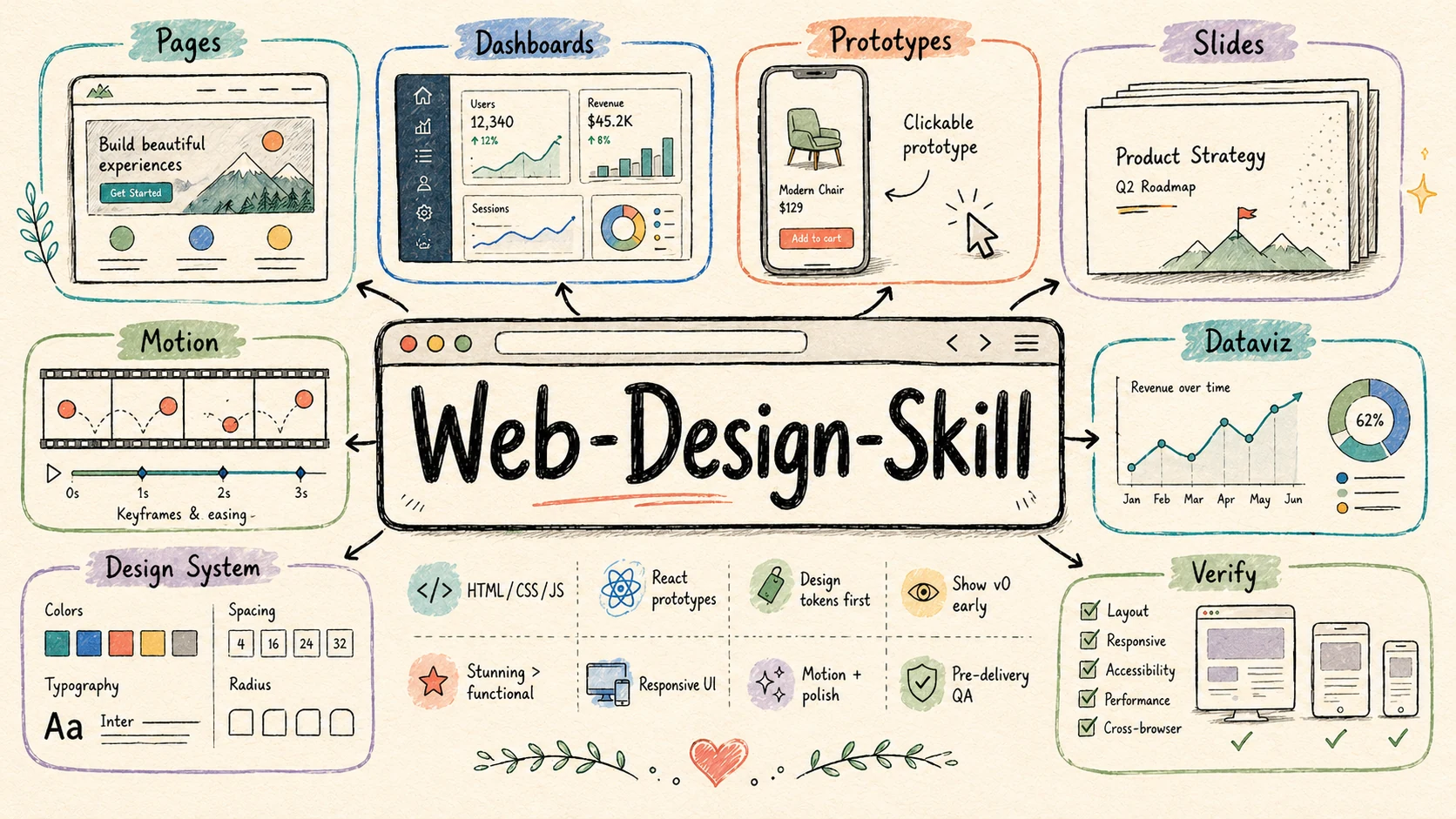
An AI agent skill that transforms AI-generated web pages from "functional" to "stunning."
中文文档 · Back to collection root
---
What Is This?
This is a reusable Skill (structured system prompt) for AI coding agents — such as Claude Code, Cursor, and other tools that support the SKILL.md format — that dramatically improves the design quality of AI-generated HTML/CSS/JavaScript artifacts.
It distills the core design philosophy from Claude Design's system prompt into an open, portable, and customizable skill file that you can drop into any project.
The Problem
Modern LLMs can already produce functional web pages from simple prompts. But their output tends to converge on the same aesthetic: Inter font, blue primary buttons, purple-pink gradients, large-radius cards, emoji as icons, fabricated testimonials. Technically correct, visually generic.
The Solution
This skill injects design taste into the AI's decision-making process through:
- Anti-cliché rules — an explicit blocklist of overused AI design patterns
- Design system declaration — forces the AI to articulate color, typography, spacing, and motion choices before writing code
- oklch color theory — perceptually uniform color derivation instead of random hex guessing
- Curated font & color pairings — high-quality starting points that replace the default Inter + #3b82f6
- Placeholder philosophy — honest
[icon]markers instead of poorly drawn SVG fakes - Structured workflow — six-step process from requirements → context → design system → v0 draft → full build → verification
---
Quick Start
For Claude Code / Cursor / AI Agents
Copy this skill folder into your project:
your-project/
├── .agents/skills/web-design-engineer/   # or .claude/skills/web-design-engineer/
│   ├── SKILL.md                          # Main skill file
│   └── references/
│       ├── advanced-patterns.md          # Code template library (slide engine, device frames, motion timelines, data viz)
│       ├── design-directions.md          # Design Direction Advisor (6 schools, differentiated 3-pick recommendation)
│       ├── style-recipes/                # 25 anchored style recipes — one .md file per anchor, loaded on demand
│       │   ├── INDEX.md                   #   Catalog index + 3 cross-indexes + cross-cutting anti-patterns
│       │   ├── linear.md / aesop.md / pentagram.md / ...    #   25 single-recipe files
│       └── critique-guide.md             # 5-dimension scoring rubric + common issues catalog
└── ...
Or use the Claude Code plugin marketplace from the collection root — see the top-level README.
The agent will automatically pick up the skill when your request involves visual/interactive front-end work.
What It Covers
| Output Type | Examples |
|---|---|
| Web pages & landing pages | Marketing sites, product pages, portfolios |
| Interactive prototypes | Clickable app mockups with device frames |
| Slide decks | HTML presentations (1920×1080, keyboard nav) |
| Data visualizations | Dashboards with Chart.js or D3.js |
| Animations | CSS/JS motion design, timeline-driven demos |
| Design systems | Token exploration, component variants |
---
How It Works
The Six-Step Workflow
1. Understand requirements  →  Ask only when information is insufficient
2. Gather design context    →  Code > screenshots; never start from nothing
3. Declare design system    →  Colors, fonts, spacing, motion — in Markdown, before code
4. Show v0 draft early      →  Placeholders + layout + tokens; let the user course-correct
5. Full build               →  Components, states, motion; pause at key decision points
6. Verify                   →  Pre-delivery checklist; no console errors, no rogue hues
Key Design Principles
Anti-AI-cliché checklist. The skill explicitly bans:
- Purple-pink-blue gradient backgrounds
- Left-border accent cards
- Inter / Roboto / Arial / Fraunces / system-ui fonts
- Emoji as icon substitutes
- Fabricated stats, fake logo walls, dummy testimonials
oklch color system. Colors are derived in the perceptually uniform oklch space. Same lightness values actually look the same brightness to the human eye — unlike HSL, where yellow-at-50% looks much brighter than blue-at-50%.
Curated starting points. Six pre-validated color × font pairings for common use cases:
| Style | Color | Fonts | Use Case |
|---|---|---|---|
| Modern tech | Blue-violet | Space Grotesk + Inter | SaaS, dev tools |
| Elegant editorial | Warm brown | Newsreader + Outfit | Content, blogs |
| Premium brand | Near-black | Sora + Plus Jakarta Sans | Luxury, finance |
| Lively consumer | Coral | Plus Jakarta Sans + Outfit | E-commerce, social |
| Minimal professional | Teal-blue | Outfit + Space Grotesk | Dashboards, B2B |
| Artisan warmth | Caramel | Caveat + Newsreader | Food, education |
Anchored style-recipe library (25 named recipes, progressively loaded). When the user names an anchor ("Linear-style", "Aesop feeling", "Pentagram-grade type"), the agent reads only the matching file at references/style-recipes/<anchor>.md (~50 lines). The catalog index, 3 cross-indexes, and cross-cutting anti-patterns live in references/style-recipes/INDEX.md (~150 lines). The full catalog is never loaded at once. The 25 recipes are spread across 7 schools (the 6 Direction-Advisor schools plus a Specialty / Genre school reachable only via direct anchor names):
| School | Recipes |
|---|---|
| Editorial / Minimalist | apple-hig · muji-kenya-hara · aesop · dieter-rams-braun · monocle-magazine |
| Information Architecture | pentagram · vignelli-swiss-helvetica · bloomberg-terminal · tufte-dataink · nyt-the-daily |
| Modern Tool / Builder SaaS | linear · vercel-mesh · raycast · notion-pre-ai |
| Motion / Experimental | field-io · active-theory · resn-storytelling |
| Brutalist / Raw | are-na · bloomberg-businessweek-turley · balenciaga-post-2017 |
| Warm Humanist | mailchimp-freddie · stripe-press · headspace-meditation |
| Specialty / Genre | y2k-retrofuturism · mid-century-modern |
---
Style Recipe Gallery
The skill ships 25 named recipes, each tied to a real brand, studio, or designer. Every recipe has a working, full-page artefact in the demo gallery — not a shared template, not a thumbnail mood-board, but the form each recipe was actually designed for: an apothecary product page for Aesop, a trading workstation for Bloomberg Terminal, a Saul-Bass poster for Mid-Century, a Y2K portal for Retrofuturism. Browse by school below, pick the one whose vibe matches your brief, or read the spec file at references/style-recipes/<recipe>.md. Click any preview to open the full-resolution 2:1 frame.
Frames are real artefacts rendered by the live React + Vite gallery at `demo/web-design-engineer-demo` — same fonts, same palettes, same signature moves as the recipe spec. Each demo is in src/recipes/<id>.tsx.Editorial / Minimalist · 5 recipes
Whitespace, refined typography, quiet luxury — the apothecary, the museum catalogue, the hardware product page.
<table> <tr> <td align="center" width="50%"> <a href="https://cdn.jsdelivr.net/gh/ConardLi/assets@main/imgs/web-design/apple-hig.webp"><img src="https://cdn.jsdelivr.net/gh/ConardLi/assets@main/imgs/web-design/apple-hig.webp" alt="apple-hig preview" /></a> <br /><strong><code>apple-hig</code></strong> <br /><sub>SF Pro Display, generous whitespace, soft elevation — the Apple Store voice</sub> <br /><sub><b>Best for</b> · hardware product pages · device launches · premium consumer tech</sub> </td> <td align="center" width="50%"> <a href="https://cdn.jsdelivr.net/gh/ConardLi/assets@main/imgs/web-design/muji-kenya-hara.webp"><img src="https://cdn.jsdelivr.net/gh/ConardLi/assets@main/imgs/web-design/muji-kenya-hara.webp" alt="muji-kenya-hara preview" /></a> <br /><strong><code>muji-kenya-hara</code></strong> <br /><sub>Emptiness as canvas, ash & paper, every object photographed in air</sub> <br /><sub><b>Best for</b> · object catalogues · houseware brands · slow-living storefronts</sub> </td> </tr> <tr> <td align="center" width="50%"> <a href="https://cdn.jsdelivr.net/gh/ConardLi/assets@main/imgs/web-design/aesop.webp"><img src="https://cdn.jsdelivr.net/gh/ConardLi/assets@main/imgs/web-design/aesop.webp" alt="aesop preview" /></a> <br /><strong><code>aesop</code></strong> <br /><sub>Warm chamois, sage & amber, serif copy that reads like a literary magazine</sub> <br /><sub><b>Best for</b> · apothecary product pages · beauty & wellness · independent retailers</sub> </td> <td align="center" width="50%"> <a href="https://cdn.jsdelivr.net/gh/ConardLi/assets@main/imgs/web-design/dieter-rams-braun.webp"><img src="https://cdn.jsdelivr.net/gh/ConardLi/assets@main/imgs/web-design/dieter-rams-braun.webp" alt="dieter-rams-braun preview" /></a> <br /><strong><code>dieter-rams-braun</code></strong> <br /><sub>Ten principles, monochrome grids, technical orthographics — function as form</sub> <br /><sub><b>Best for</b> · industrial-design archives · hardware specs · brand-principle pages</sub> </td> </tr> <tr> <td align="center" width="50%"> <a href="https://cdn.jsdelivr.net/gh/ConardLi/assets@main/imgs/web-design/monocle-magazine.webp"><img src="https://cdn.jsdelivr.net/gh/ConardLi/assets@main/imgs/web-design/monocle-magazine.webp" alt="monocle-magazine preview" /></a> <br /><strong><code>monocle-magazine</code></strong> <br /><sub>Cosmopolitan briefings, navy & coral, footnoted curiosity</sub> <br /><sub><b>Best for</b> · magazine contents · city & travel briefings · lifestyle journals</sub> </td> <td align="center" width="50%" valign="middle"> <br /> <strong>Best when the brief says</strong> <br /><sub>"refined" · "premium" · "quiet" · "editorial" · "less is more"</sub> <br /><br /> <sub>See specs in <a href="./references/style-recipes/">style-recipes/</a></sub> <br /><br /> </td> </tr> </table>
Information Architecture · 5 recipes
Rational, data-driven, restrained — wayfinding, terminals, footnoted essays, the newspaper of record.
<table> <tr> <td align="center" width="50%"> <a href="https://cdn.jsdelivr.net/gh/ConardLi/assets@main/imgs/web-design/pentagram.webp"><img src="https://cdn.jsdelivr.net/gh/ConardLi/assets@main/imgs/web-design/pentagram.webp" alt="pentagram preview" /></a> <br /><strong><code>pentagram</code></strong> <br /><sub>One bold typeface used as artwork, grid as scaffold, ink + ground only</sub> <br /><sub><b>Best for</b> · identity specimens · type-led portfolios · gallery announcements</sub> </td> <td align="center" width="50%"> <a href="https://cdn.jsdelivr.net/gh/ConardLi/assets@main/imgs/web-design/vignelli-swiss-helvetica.webp"><img src="https://cdn.jsdelivr.net/gh/ConardLi/assets@main/imgs/web-design/vignelli-swiss-helvetica.webp" alt="vignelli-swiss-helvetica preview" /></a> <br /><strong><code>vignelli-swiss-helvetica</code></strong> <br /><sub>Helvetica at every size, six primary colours, the NYC Subway diagram</sub> <br /><sub><b>Best for</b> · wayfinding & transit · public-info posters · brand-system specimens</sub> </td> </tr> <tr> <td align="center" width="50%"> <a href="https://cdn.jsdelivr.net/gh/ConardLi/assets@main/imgs/web-design/bloomberg-terminal.webp"><img src="https://cdn.jsdelivr.net/gh/ConardLi/assets@main/imgs/web-design/bloomberg-terminal.webp" alt="bloomberg-terminal preview" /></a> <br /><strong><code>bloomberg-terminal</code></strong> <br /><sub>Amber on navy-black, mono everywhere, density over comfort</sub> <br /><sub><b>Best for</b> · trading dashboards · ops consoles · power-user dense tools</sub> </td> <td align="center" width="50%"> <a href="https://cdn.jsdelivr.net/gh/ConardLi/assets@main/imgs/web-design/tufte-dataink.webp"><img src="https://cdn.jsdelivr.net/gh/ConardLi/assets@main/imgs/web-design/tufte-dataink.webp" alt="tufte-dataink preview" /></a> <br /><strong><code>tufte-dataink</code></strong> <br /><sub>Sparklines in body copy, small multiples, no chartjunk</sub> <br /><sub><b>Best for</b> · data narratives · research write-ups · academic essays</sub> </td> </tr> <tr> <td align="center" width="50%"> <a href="https://cdn.jsdelivr.net/gh/ConardLi/assets@main/imgs/web-design/nyt-the-daily.webp"><img src="https://cdn.jsdelivr.net/gh/ConardLi/assets@main/imgs/web-design/nyt-the-daily.webp" alt="nyt-the-daily preview" /></a> <br /><strong><code>nyt-the-daily</code></strong> <br /><sub>Cheltenham over Imperial, dateline above all, the gravity of the broadsheet</sub> <br /><sub><b>Best for</b> · news features · podcast hubs · long-form journalism</sub> </td> <td align="center" width="50%" valign="middle"> <br /> <strong>Best when the brief says</strong> <br /><sub>"data-heavy" · "wayfinding" · "dense" · "rational" · "of record"</sub> <br /><br /> <sub>See specs in <a href="./references/style-recipes/">style-recipes/</a></sub> <br /><br /> </td> </tr> </table>
Modern Tool / Builder SaaS · 4 recipes
Hairline detail, warm dark, single accent — the developer-tool aesthetic of the late 2020s.
<table> <tr> <td align="center" width="50%"> <a href="https://cdn.jsdelivr.net/gh/ConardLi/assets@main/imgs/web-design/linear.webp"><img src="https://cdn.jsdelivr.net/gh/ConardLi/assets@main/imgs/web-design/linear.webp" alt="linear preview" /></a> <br /><strong><code>linear</code></strong> <br /><sub>Warm dark, hairline borders, purple flicks of accent, shortcut chips</sub> <br /><sub><b>Best for</b> · dev-tool landing pages · issue / project SaaS · API & infra products</sub> </td> <td align="center" width="50%"> <a href="https://cdn.jsdelivr.net/gh/ConardLi/assets@main/imgs/web-design/vercel-mesh.webp"><img src="https://cdn.jsdelivr.net/gh/ConardLi/assets@main/imgs/web-design/vercel-mesh.webp" alt="vercel-mesh preview" /></a> <br /><strong><code>vercel-mesh</code></strong> <br /><sub>Pure black, geometric mesh gradient, Geist Sans, command-line clarity</sub> <br /><sub><b>Best for</b> · deploy / runtime tools · framework launches · technical hero pages</sub> </td> </tr> <tr> <td align="center" width="50%"> <a href="https://cdn.jsdelivr.net/gh/ConardLi/assets@main/imgs/web-design/raycast.webp"><img src="https://cdn.jsdelivr.net/gh/ConardLi/assets@main/imgs/web-design/raycast.webp" alt="raycast preview" /></a> <br /><strong><code>raycast</code></strong> <br /><sub>Glass card on red-tinted void, keyboard-first, condensed list cells</sub> <br /><sub><b>Best for</b> · command palettes · launcher apps · keyboard-driven tooling</sub> </td> <td align="center" width="50%"> <a href="https://cdn.jsdelivr.net/gh/ConardLi/assets@main/imgs/web-design/notion-pre-ai.webp"><img src="https://cdn.jsdelivr.net/gh/ConardLi/assets@main/imgs/web-design/notion-pre-ai.webp" alt="notion-pre-ai preview" /></a> <br /><strong><code>notion-pre-ai</code></strong> <br /><sub>Off-white pages, drag-handle dots, casual emoji headings, callouts everywhere</sub> <br /><sub><b>Best for</b> · workspace docs · internal wikis · friendly productivity apps</sub> </td> </tr> </table>
Motion / Experimental · 3 recipes
Bold, generative, sensory — when the brief asks for "cinematic", "WebGL", or "award-bait".
<table> <tr> <td align="center" width="50%"> <a href="https://cdn.jsdelivr.net/gh/ConardLi/assets@main/imgs/web-design/field-io.webp"><img src="https://cdn.jsdelivr.net/gh/ConardLi/assets@main/imgs/web-design/field-io.webp" alt="field-io preview" /></a> <br /><strong><code>field-io</code></strong> <br /><sub>Particle systems behind editorial type, code-art aesthetic, dark studio</sub> <br /><sub><b>Best for</b> · creative-tech studios · generative-art case studies · WebGL portfolios</sub> </td> <td align="center" width="50%"> <a href="https://cdn.jsdelivr.net/gh/ConardLi/assets@main/imgs/web-design/active-theory.webp"><img src="https://cdn.jsdelivr.net/gh/ConardLi/assets@main/imgs/web-design/active-theory.webp" alt="active-theory preview" /></a> <br /><strong><code>active-theory</code></strong> <br /><sub>WebGL ambitions, full-bleed type, candy colours over deep black</sub> <br /><sub><b>Best for</b> · cinematic product launches · campaign sites · award-bait microsites</sub> </td> </tr> <tr> <td align="center" width="50%"> <a href="https://cdn.jsdelivr.net/gh/ConardLi/assets@main/imgs/web-design/resn-storytelling.webp"><img src="https://cdn.jsdelivr.net/gh/ConardLi/assets@main/imgs/web-design/resn-storytelling.webp" alt="resn-storytelling preview" /></a> <br /><strong><code>resn-storytelling</code></strong> <br /><sub>Surreal, lush, every frame a tableau, headlines on textured noise</sub> <br /><sub><b>Best for</b> · narrative scrolls · entertainment / IP sites · agency reels</sub> </td> <td align="center" width="50%" valign="middle"> <br /> <strong>Best when the brief says</strong> <br /><sub>"cinematic" · "WebGL" · "experiential" · "Awwwards-grade"</sub> <br /><br /> <sub>See specs in <a href="./references/style-recipes/">style-recipes/</a></sub> <br /><br /> </td> </tr> </table>
Brutalist / Raw · 3 recipes
Anti-design, honest, unpolished — the system-default web, tabloid covers, anti-luxury luxury.
<table> <tr> <td align="center" width="50%"> <a href="https://cdn.jsdelivr.net/gh/ConardLi/assets@main/imgs/web-design/are-na.webp"><img src="https://cdn.jsdelivr.net/gh/ConardLi/assets@main/imgs/web-design/are-na.webp" alt="are-na preview" /></a> <br /><strong><code>are-na</code></strong> <br /><sub>System fonts on purpose, browser-default blue links, the honest web</sub> <br /><sub><b>Best for</b> · research channels · indie communities · anti-design content tools</sub> </td> <td align="center" width="50%"> <a href="https://cdn.jsdelivr.net/gh/ConardLi/assets@main/imgs/web-design/bloomberg-businessweek-turley.webp"><img src="https://cdn.jsdelivr.net/gh/ConardLi/assets@main/imgs/web-design/bloomberg-businessweek-turley.webp" alt="bloomberg-businessweek-turley preview" /></a> <br /><strong><code>bloomberg-businessweek-turley</code></strong> <br /><sub>Yellow caution + black ink, type as collage, hand-cut headlines</sub> <br /><sub><b>Best for</b> · editorial covers · opinion pieces · campaign posters</sub> </td> </tr> <tr> <td align="center" width="50%"> <a href="https://cdn.jsdelivr.net/gh/ConardLi/assets@main/imgs/web-design/balenciaga-post-2017.webp"><img src="https://cdn.jsdelivr.net/gh/ConardLi/assets@main/imgs/web-design/balenciaga-post-2017.webp" alt="balenciaga-post-2017 preview" /></a> <br /><strong><code>balenciaga-post-2017</code></strong> <br /><sub>All caps, broken grids, deadpan product on white, anti-luxury luxury</sub> <br /><sub><b>Best for</b> · fashion collections · drop announcements · contrarian luxury</sub> </td> <td align="center" width="50%" valign="middle"> <br /> <strong>Best when the brief says</strong> <br /><sub>"raw" · "honest" · "anti-design" · "tabloid" · "uncomfortable"</sub> <br /><br /> <sub>See specs in <a href="./references/style-recipes/">style-recipes/</a></sub> <br /><br /> </td> </tr> </table>
Warm Humanist · 3 recipes
Approachable, organic, hand-touched — small-business cheerleader, hand-bound book, daily reset.
<table> <tr> <td align="center" width="50%"> <a href="https://cdn.jsdelivr.net/gh/ConardLi/assets@main/imgs/web-design/mailchimp-freddie.webp"><img src="https://cdn.jsdelivr.net/gh/ConardLi/assets@main/imgs/web-design/mailchimp-freddie.webp" alt="mailchimp-freddie preview" /></a> <br /><strong><code>mailchimp-freddie</code></strong> <br /><sub>Cavendish yellow, hand-drawn doodles, conversational copy, the SMB cheerleader</sub> <br /><sub><b>Best for</b> · onboarding flows · SMB marketing tools · friendly consumer apps</sub> </td> <td align="center" width="50%"> <a href="https://cdn.jsdelivr.net/gh/ConardLi/assets@main/imgs/web-design/stripe-press.webp"><img src="https://cdn.jsdelivr.net/gh/ConardLi/assets@main/imgs/web-design/stripe-press.webp" alt="stripe-press preview" /></a> <br /><strong><code>stripe-press</code></strong> <br /><sub>Cream paper, GT Super, hand-bound luxury, ideas as objects</sub> <br /><sub><b>Best for</b> · book detail pages · long-form essays · publisher / press sites</sub> </td> </tr> <tr> <td align="center" width="50%"> <a href="https://cdn.jsdelivr.net/gh/ConardLi/assets@main/imgs/web-design/headspace-meditation.webp"><img src="https://cdn.jsdelivr.net/gh/ConardLi/assets@main/imgs/web-design/headspace-meditation.webp" alt="headspace-meditation preview" /></a> <br /><strong><code>headspace-meditation</code></strong> <br /><sub>Orange suns, rounded blobs, hand-illustrated calm, a daily reset</sub> <br /><sub><b>Best for</b> · meditation & wellness · habit / mood apps · cosy consumer cards</sub> </td> <td align="center" width="50%" valign="middle"> <br /> <strong>Best when the brief says</strong> <br /><sub>"friendly" · "approachable" · "human" · "cosy" · "hand-touched"</sub> <br /><br /> <sub>See specs in <a href="./references/style-recipes/">style-recipes/</a></sub> <br /><br /> </td> </tr> </table>
Specialty / Genre · 2 recipes
Period-coded, decade-coded, theme-coded — only reachable by direct anchor name.
<table> <tr> <td align="center" width="50%"> <a href="https://cdn.jsdelivr.net/gh/ConardLi/assets@main/imgs/web-design/y2k-retrofuturism.webp"><img src="https://cdn.jsdelivr.net/gh/ConardLi/assets@main/imgs/web-design/y2k-retrofuturism.webp" alt="y2k-retrofuturism preview" /></a> <br /><strong><code>y2k-retrofuturism</code></strong> <br /><sub>Chrome bevels, frosted glass, lava blobs, MSN-blue everywhere</sub> <br /><sub><b>Best for</b> · Y2K nostalgia · early-web portals · gen-Z brand stunts</sub> </td> <td align="center" width="50%"> <a href="https://cdn.jsdelivr.net/gh/ConardLi/assets@main/imgs/web-design/mid-century-modern.webp"><img src="https://cdn.jsdelivr.net/gh/ConardLi/assets@main/imgs/web-design/mid-century-modern.webp" alt="mid-century-modern preview" /></a> <br /><strong><code>mid-century-modern</code></strong> <br /><sub>Mustard, brick, cyan; cut-paper geometry; the optimism of 1957</sub> <br /><sub><b>Best for</b> · poster homages · cultural events · vintage-print brand voice</sub> </td> </tr> </table>
Run the gallery yourself
cd demo/web-design-engineer-demo
npm install && npm run dev    # http://localhost:5181/
Hash-routed URLs (#/linear, #/aesop, …) deep-link to any recipe. Press H to toggle the recipe HUD, Esc to return to the gallery. See the demo's own README for layout details.
---
Before & after: skill on / off
The repository's `demo/web-design-demo/` directory contains side-by-side comparisons of pages generated with and without this skill, using identical prompts. Open `demo/web-design-demo/demo2/index.html` for a side-by-side viewer.
Demo 1: Space Exploration Museum
Prompt: "Build a homepage for a fictional 'Space Exploration Museum' — full-screen hero, 4 exhibition sections, a timeline with 6+ milestones, a booking CTA, and a footer. Deep, immersive, cosmic feel."
| Without Skill | With Skill | |
|---|---|---|
| File | demo/web-design-demo/demo2/demo1.html | demo/web-design-demo/demo2/demo1-with-skill.html |
| Color system | Hardcoded hex values (#7cf0ff, #b388ff) | oklch-based token system with CSS custom properties |
| Typography | Orbitron + Noto Serif SC | Instrument Serif + Space Grotesk + JetBrains Mono |
| Layout | Standard landing-page structure | Editorial magazine-style layout with grid compositions |
| Details | Heavy glow effects, neon gradients | Restrained palette, typographic hierarchy, decorative data elements |
| Overall feel | Enthusiastic junior designer | Experienced design director |
Demo 2: Photographer Portfolio
Prompt: "Build a homepage for an independent photographer's portfolio."
| With Skill | |
|---|---|
| File | demo/web-design-demo/demo2/demo2-with-skill.html |
| Character | Creates a fictional Nordic photographer "Mira Høst" with a complete visual identity |
| Color | Paper-warm light (#f2efe8) + ink-dark (#161513) — extremely restrained two-tone palette |
| Typography | Instrument Serif (display) + Space Grotesk (UI) with extensive italic usage |
| Layout | Magazine-editorial structure with numbered sections, asymmetric grids, side rails |
| Motion | Slow Ken Burns on hero image (24s cycle), film-grain texture overlay |
| Navigation | mix-blend-mode: difference masthead — seamless across light/dark sections |
The original Claude Design system prompt that inspired this skill is preserved at `dist/prompt/claude-design-system-prompt.md`.
---
Background
This skill is inspired by the system prompt of Claude Design, Anthropic's visual design product launched in April 2026. Claude Design's system prompt (~420 lines) encodes a sophisticated set of design principles, anti-patterns, and workflow constraints that make its output consistently high-quality.
This project extracts and refines those core ideas into a portable skill that works with any AI coding agent — giving you Claude-Design-level design taste without the product lock-in or usage limits.
Key additions beyond the original Claude Design prompt:
- Design system declaration step — forces the AI to articulate design tokens in natural language before coding
- v0 draft strategy — a concrete methodology for showing work-in-progress early
- Extended anti-cliché list — additional patterns identified from real-world AI output
- Placeholder philosophy — a complete framework for handling missing assets professionally
- Color × font pairing table — six validated visual system starting points
- Design Direction Advisor — six-school conversational tool for vague requests, with explicit handoff to the recipe library
- 25-recipe anchored style library — each recipe tied to a real brand / studio / designer with concrete copy-able values; defends against AI-default mush
- Advanced pattern library — ready-to-use code templates for common UI patterns
---
License
MIT
Web Design Engineer Skill
一个让 AI 生成网页从"能用"进阶到"惊艳"的 Agent 技能。
English · 返回集合首页
---
这是什么?
这是一个面向 AI 编程代理(如 Claude Code、Cursor 以及其他支持 SKILL.md 格式的工具)的可复用 Skill(结构化系统提示词),能显著提升 AI 生成的 HTML/CSS/JavaScript 产物的设计品质。
它将 Claude Design 系统提示词中的核心设计理念提炼为一个开放、可移植、可自定义的技能文件,可以直接放进任何项目中使用。
问题
现代大语言模型已经能根据简单的提示词生成功能完整的网页。但它们的输出总是趋向同一种审美:Inter 字体、蓝色主按钮、紫粉渐变、大圆角卡片、emoji 充当图标、编造的好评数据。技术上没问题,视觉上千篇一律。
解决方案
这个 Skill 通过以下方式将设计品位注入 AI 的决策过程:
- 反俗套规则 —— 一份明确的 AI 设计雷区清单
- 设计系统宣告 —— 强制 AI 在写代码之前,先用自然语言说清配色、字体、间距和动效选择
- oklch 色彩理论 —— 基于感知均匀色彩空间的配色派生,取代随机 hex 值
- 精选字体 × 配色组合 —— 高品质起点,替代默认的 Inter + #3b82f6
- 占位符哲学 —— 用诚实的
[icon]标记代替拙劣的 SVG 假图 - 结构化工作流 —— 从需求理解 → 上下文获取 → 设计系统宣告 → v0 草稿 → 完整构建 → 验证的六步流程
---
快速上手
用于 Claude Code / Cursor / AI Agent
将本 Skill 目录复制到你的项目中:
your-project/
├── .agents/skills/web-design-engineer/   # 或 .claude/skills/web-design-engineer/
│   ├── SKILL.md                          # 主技能文件
│   └── references/
│       ├── advanced-patterns.md          # 代码模板库(slide engine / 设备框架 / 动效时间线 / 数据可视化)
│       ├── design-directions.md          # 设计方向顾问(6 学派,差异化 3 选 1 推荐)
│       ├── style-recipes/                # 25 套有 anchor 的风格配方(按需读单文件,每个 anchor 一个 .md)
│       │   ├── INDEX.md                   #   目录索引 + 3 张索引表 + 跨配方反模式
│       │   ├── linear.md / aesop.md / pentagram.md / ...    #   25 个独立 recipe 文件
│       └── critique-guide.md             # 5 维评分细则 + 常见问题清单
└── ...
也可以从集合首页通过 Claude Code 插件市场一键安装 —— 参见根目录 README。
当你的请求涉及可视化/交互式前端工作时,Agent 会自动启用此技能。
覆盖范围
| 输出类型 | 示例 |
|---|---|
| 网页 & 落地页 | 营销页面、产品页、作品集 |
| 交互式原型 | 带设备框架的可点击 App 模型 |
| 幻灯片 | HTML 演示文稿(1920×1080,键盘导航) |
| 数据可视化 | 基于 Chart.js 或 D3.js 的仪表盘 |
| 动画 | CSS/JS 动效设计,时间线驱动的演示 |
| 设计系统 | Token 探索、组件变体 |
---
工作原理
六步工作流
1. 理解需求          →  信息充足就干活,信息不足才提问
2. 获取设计上下文    →  代码 > 截图;不要从空气中开始
3. 宣告设计系统      →  配色、字体、间距、动效 —— 用 Markdown 说明,写代码之前
4. 尽早展示 v0       →  占位符 + 布局 + token;让用户提前纠偏
5. 完整构建          →  组件、状态、动效;在关键决策点暂停确认
6. 验证              →  交付前清单;无控制台错误,无私自新增色相
核心设计原则
反 AI 俗套清单。 Skill 明确禁止以下模式:
- 紫粉蓝渐变背景
- 带左侧彩色边框的卡片
- Inter / Roboto / Arial / Fraunces / system-ui 字体
- 用 emoji 充当图标
- 编造的数据、假 logo 墙、虚假好评
oklch 色彩系统。 在感知均匀的 oklch 色彩空间中派生颜色。相同的亮度值在人眼中看起来确实一样亮——HSL 做不到这一点,HSL 中亮度 50% 的黄色看起来比亮度 50% 的蓝色亮得多。
精选起点。 六套经过验证的配色 × 字体组合,覆盖常见场景:
| 风格 | 主色 | 字体组合 | 适用场景 |
|---|---|---|---|
| 现代科技感 | 蓝紫 | Space Grotesk + Inter | SaaS、开发者工具 |
| 优雅杂志风 | 暖棕 | Newsreader + Outfit | 内容平台、博客 |
| 高端品牌 | 近黑 | Sora + Plus Jakarta Sans | 奢侈品、金融 |
| 活泼消费 | 珊瑚 | Plus Jakarta Sans + Outfit | 电商、社交 |
| 极简专业 | 青蓝 | Outfit + Space Grotesk | 仪表盘、B2B |
| 手作温度 | 焦糖 | Caveat + Newsreader | 餐饮、教育 |
风格配方库(25 套有 anchor,渐进式加载)。 当用户点名"Linear 风" / "Aesop 风" / "Pentagram 级排版"时,Agent 只需读 references/style-recipes/<anchor>.md 单个文件(约 50 行);目录索引、3 张索引表、跨配方反模式都在 references/style-recipes/INDEX.md(约 150 行)。整个目录从不一次性加载。25 套配方分布在 7 个学派(Direction Advisor 的 6 学派 + 一个只能通过直接点名 anchor 触达的 Specialty / Genre 学派):
| 学派 | 配方 |
|---|---|
| Editorial / 极简 | apple-hig · muji-kenya-hara · aesop · dieter-rams-braun · monocle-magazine |
| 信息架构 | pentagram · vignelli-swiss-helvetica · bloomberg-terminal · tufte-dataink · nyt-the-daily |
| 现代工具 / Builder SaaS | linear · vercel-mesh · raycast · notion-pre-ai |
| 动效 / 实验 | field-io · active-theory · resn-storytelling |
| 粗粝 / Brutalist | are-na · bloomberg-businessweek-turley · balenciaga-post-2017 |
| 温暖人文 | mailchimp-freddie · stripe-press · headspace-meditation |
| 特定风格 / 年代 | y2k-retrofuturism · mid-century-modern |
---
风格配方画廊
Skill 自带 25 套有名字的配方,每套都对应到真实的品牌、工作室或设计师。目录中的每个配方都在 demo 画廊里有一个完整的整页作品 —— 不是共用模板、不是缩略图情绪板,而是每套配方本来就该长成的那种东西:Aesop 是药剂师产品页、Bloomberg Terminal 是交易工作站、Mid-Century 是 Saul Bass 海报、Y2K 是世纪之交的门户网站。按学派浏览下方卡片,挑一套气质契合你 brief 的配方,或者直接读 references/style-recipes/<recipe>.md 的 spec 文件。点击任意预览图打开完整分辨率的 2:1 大图。
所有截图都是来自 `demo/web-design-engineer-demo` 这个 React + Vite 画廊的真实渲染 —— 字体、配色、签名手法都和 spec 文件里一致。每个 demo 位于 src/recipes/<id>.tsx。Editorial / 极简 · 5 套
留白、考究的排版、安静的奢华 —— 药剂师、博物馆图录、硬件产品页。
<table> <tr> <td align="center" width="50%"> <a href="https://cdn.jsdelivr.net/gh/ConardLi/assets@main/imgs/web-design/apple-hig.webp"><img src="https://cdn.jsdelivr.net/gh/ConardLi/assets@main/imgs/web-design/apple-hig.webp" alt="apple-hig preview" /></a> <br /><strong><code>apple-hig</code></strong> <br /><sub>SF Pro Display、慷慨留白、柔和阴影 —— Apple Store 的语气</sub> <br /><sub><b>适合</b> · 硬件产品页 · 设备发布 · 高端消费电子</sub> </td> <td align="center" width="50%"> <a href="https://cdn.jsdelivr.net/gh/ConardLi/assets@main/imgs/web-design/muji-kenya-hara.webp"><img src="https://cdn.jsdelivr.net/gh/ConardLi/assets@main/imgs/web-design/muji-kenya-hara.webp" alt="muji-kenya-hara preview" /></a> <br /><strong><code>muji-kenya-hara</code></strong> <br /><sub>空作为画布、灰与纸、器物悬浮在空气中拍摄</sub> <br /><sub><b>适合</b> · 器物目录 · 家居品牌 · 慢生活店铺</sub> </td> </tr> <tr> <td align="center" width="50%"> <a href="https://cdn.jsdelivr.net/gh/ConardLi/assets@main/imgs/web-design/aesop.webp"><img src="https://cdn.jsdelivr.net/gh/ConardLi/assets@main/imgs/web-design/aesop.webp" alt="aesop preview" /></a> <br /><strong><code>aesop</code></strong> <br /><sub>暖驼黄、鼠尾草 & 琥珀,衬线正文像文学杂志</sub> <br /><sub><b>适合</b> · 药剂师产品页 · 美妆 & 健康 · 独立零售</sub> </td> <td align="center" width="50%"> <a href="https://cdn.jsdelivr.net/gh/ConardLi/assets@main/imgs/web-design/dieter-rams-braun.webp"><img src="https://cdn.jsdelivr.net/gh/ConardLi/assets@main/imgs/web-design/dieter-rams-braun.webp" alt="dieter-rams-braun preview" /></a> <br /><strong><code>dieter-rams-braun</code></strong> <br /><sub>十大设计原则、灰阶网格、技术正投影 —— 功能即形式</sub> <br /><sub><b>适合</b> · 工业设计档案 · 硬件 spec · 品牌原则页</sub> </td> </tr> <tr> <td align="center" width="50%"> <a href="https://cdn.jsdelivr.net/gh/ConardLi/assets@main/imgs/web-design/monocle-magazine.webp"><img src="https://cdn.jsdelivr.net/gh/ConardLi/assets@main/imgs/web-design/monocle-magazine.webp" alt="monocle-magazine preview" /></a> <br /><strong><code>monocle-magazine</code></strong> <br /><sub>世界主义简报、深海蓝与珊瑚色、脚注式好奇心</sub> <br /><sub><b>适合</b> · 杂志目录 · 城市 / 旅行简报 · 生活方式期刊</sub> </td> <td align="center" width="50%" valign="middle"> <br /> <strong>当 brief 里出现这些词</strong> <br /><sub>"考究" · "高端" · "安静" · "编辑感" · "少即是多"</sub> <br /><br /> <sub>spec 文件在 <a href="./references/style-recipes/">style-recipes/</a></sub> <br /><br /> </td> </tr> </table>
信息架构 · 5 套
理性、数据驱动、克制 —— 指示系统、交易终端、脚注长文、报纸头版的重量。
<table> <tr> <td align="center" width="50%"> <a href="https://cdn.jsdelivr.net/gh/ConardLi/assets@main/imgs/web-design/pentagram.webp"><img src="https://cdn.jsdelivr.net/gh/ConardLi/assets@main/imgs/web-design/pentagram.webp" alt="pentagram preview" /></a> <br /><strong><code>pentagram</code></strong> <br /><sub>一种大字体即艺术品、网格作骨架、仅墨色与底色</sub> <br /><sub><b>适合</b> · 标识样本 · 字体主导的作品集 · 画廊公告</sub> </td> <td align="center" width="50%"> <a href="https://cdn.jsdelivr.net/gh/ConardLi/assets@main/imgs/web-design/vignelli-swiss-helvetica.webp"><img src="https://cdn.jsdelivr.net/gh/ConardLi/assets@main/imgs/web-design/vignelli-swiss-helvetica.webp" alt="vignelli-swiss-helvetica preview" /></a> <br /><strong><code>vignelli-swiss-helvetica</code></strong> <br /><sub>全字号 Helvetica、六种主色、纽约地铁信号图</sub> <br /><sub><b>适合</b> · 公共指示 & 交通 · 公共信息海报 · 品牌系统样本</sub> </td> </tr> <tr> <td align="center" width="50%"> <a href="https://cdn.jsdelivr.net/gh/ConardLi/assets@main/imgs/web-design/bloomberg-terminal.webp"><img src="https://cdn.jsdelivr.net/gh/ConardLi/assets@main/imgs/web-design/bloomberg-terminal.webp" alt="bloomberg-terminal preview" /></a> <br /><strong><code>bloomberg-terminal</code></strong> <br /><sub>深海军蓝底上的琥珀色、全等宽、密度高于舒适</sub> <br /><sub><b>适合</b> · 交易仪表盘 · 运维控制台 · 高密度专业工具</sub> </td> <td align="center" width="50%"> <a href="https://cdn.jsdelivr.net/gh/ConardLi/assets@main/imgs/web-design/tufte-dataink.webp"><img src="https://cdn.jsdelivr.net/gh/ConardLi/assets@main/imgs/web-design/tufte-dataink.webp" alt="tufte-dataink preview" /></a> <br /><strong><code>tufte-dataink</code></strong> <br /><sub>段落内嵌微图、小型多重图、零图表杂质</sub> <br /><sub><b>适合</b> · 数据叙事 · 研究报告 · 学术长文</sub> </td> </tr> <tr> <td align="center" width="50%"> <a href="https://cdn.jsdelivr.net/gh/ConardLi/assets@main/imgs/web-design/nyt-the-daily.webp"><img src="https://cdn.jsdelivr.net/gh/ConardLi/assets@main/imgs/web-design/nyt-the-daily.webp" alt="nyt-the-daily preview" /></a> <br /><strong><code>nyt-the-daily</code></strong> <br /><sub>Cheltenham 衬线压在 Imperial 之上、日期线居首、宽幅报纸的重量</sub> <br /><sub><b>适合</b> · 新闻特稿 · 播客中枢 · 长篇深度报道</sub> </td> <td align="center" width="50%" valign="middle"> <br /> <strong>当 brief 里出现这些词</strong> <br /><sub>"数据密集" · "指示系统" · "高密度" · "理性" · "权威感"</sub> <br /><br /> <sub>spec 文件在 <a href="./references/style-recipes/">style-recipes/</a></sub> <br /><br /> </td> </tr> </table>
现代工具 / Builder SaaS · 4 套
发丝级细节、暖色暗夜、单一点缀色 —— 2020 年代后期的开发者工具美学。
<table> <tr> <td align="center" width="50%"> <a href="https://cdn.jsdelivr.net/gh/ConardLi/assets@main/imgs/web-design/linear.webp"><img src="https://cdn.jsdelivr.net/gh/ConardLi/assets@main/imgs/web-design/linear.webp" alt="linear preview" /></a> <br /><strong><code>linear</code></strong> <br /><sub>暖色调暗夜、发丝边、紫色点缀、键盘快捷键芯片</sub> <br /><sub><b>适合</b> · 开发者工具落地页 · Issue / 项目 SaaS · API & 基础设施产品</sub> </td> <td align="center" width="50%"> <a href="https://cdn.jsdelivr.net/gh/ConardLi/assets@main/imgs/web-design/vercel-mesh.webp"><img src="https://cdn.jsdelivr.net/gh/ConardLi/assets@main/imgs/web-design/vercel-mesh.webp" alt="vercel-mesh preview" /></a> <br /><strong><code>vercel-mesh</code></strong> <br /><sub>纯黑、几何网格渐变、Geist Sans、命令行式清晰</sub> <br /><sub><b>适合</b> · 部署 / 运行时工具 · 框架发布 · 技术 hero 页</sub> </td> </tr> <tr> <td align="center" width="50%"> <a href="https://cdn.jsdelivr.net/gh/ConardLi/assets@main/imgs/web-design/raycast.webp"><img src="https://cdn.jsdelivr.net/gh/ConardLi/assets@main/imgs/web-design/raycast.webp" alt="raycast preview" /></a> <br /><strong><code>raycast</code></strong> <br /><sub>红光雾里的玻璃卡片、键盘优先、紧凑列表行</sub> <br /><sub><b>适合</b> · 命令面板 · launcher 应用 · 键盘驱动型工具</sub> </td> <td align="center" width="50%"> <a href="https://cdn.jsdelivr.net/gh/ConardLi/assets@main/imgs/web-design/notion-pre-ai.webp"><img src="https://cdn.jsdelivr.net/gh/ConardLi/assets@main/imgs/web-design/notion-pre-ai.webp" alt="notion-pre-ai preview" /></a> <br /><strong><code>notion-pre-ai</code></strong> <br /><sub>米白页面、拖拽点、随性 emoji 标题、随处可见的提示条</sub> <br /><sub><b>适合</b> · 工作区文档 · 内部 Wiki · 友好的生产力应用</sub> </td> </tr> </table>
动态 / 实验 · 3 套
张扬、生成式、感官 —— brief 里写"电影感""WebGL""能拿 Awwwards"的时候。
<table> <tr> <td align="center" width="50%"> <a href="https://cdn.jsdelivr.net/gh/ConardLi/assets@main/imgs/web-design/field-io.webp"><img src="https://cdn.jsdelivr.net/gh/ConardLi/assets@main/imgs/web-design/field-io.webp" alt="field-io preview" /></a> <br /><strong><code>field-io</code></strong> <br /><sub>粒子系统衬着编辑式字体、代码艺术美学、暗色工作室</sub> <br /><sub><b>适合</b> · 创意科技工作室 · 生成艺术案例 · WebGL 作品集</sub> </td> <td align="center" width="50%"> <a href="https://cdn.jsdelivr.net/gh/ConardLi/assets@main/imgs/web-design/active-theory.webp"><img src="https://cdn.jsdelivr.net/gh/ConardLi/assets@main/imgs/web-design/active-theory.webp" alt="active-theory preview" /></a> <br /><strong><code>active-theory</code></strong> <br /><sub>WebGL 野心、全屏字、深黑底上的糖果色</sub> <br /><sub><b>适合</b> · 电影感产品发布 · 战役站 · 冲奖型微型站点</sub> </td> </tr> <tr> <td align="center" width="50%"> <a href="https://cdn.jsdelivr.net/gh/ConardLi/assets@main/imgs/web-design/resn-storytelling.webp"><img src="https://cdn.jsdelivr.net/gh/ConardLi/assets@main/imgs/web-design/resn-storytelling.webp" alt="resn-storytelling preview" /></a> <br /><strong><code>resn-storytelling</code></strong> <br /><sub>超现实、浓郁、每帧都是布景、标题压在噪点纹理上</sub> <br /><sub><b>适合</b> · 叙事滚动 · 娱乐 / IP 站 · 工作室作品集</sub> </td> <td align="center" width="50%" valign="middle"> <br /> <strong>当 brief 里出现这些词</strong> <br /><sub>"电影感" · "WebGL" · "沉浸式" · "Awwwards 级"</sub> <br /><br /> <sub>spec 文件在 <a href="./references/style-recipes/">style-recipes/</a></sub> <br /><br /> </td> </tr> </table>
粗野 / Brutalist · 3 套
反设计、诚实、未抛光 —— 系统默认的网页、小报封面、反奢侈的奢侈。
<table> <tr> <td align="center" width="50%"> <a href="https://cdn.jsdelivr.net/gh/ConardLi/assets@main/imgs/web-design/are-na.webp"><img src="https://cdn.jsdelivr.net/gh/ConardLi/assets@main/imgs/web-design/are-na.webp" alt="are-na preview" /></a> <br /><strong><code>are-na</code></strong> <br /><sub>刻意的系统字体、浏览器默认蓝色链接、诚实的网页</sub> <br /><sub><b>适合</b> · 研究型频道 · 独立社区 · 反设计内容工具</sub> </td> <td align="center" width="50%"> <a href="https://cdn.jsdelivr.net/gh/ConardLi/assets@main/imgs/web-design/bloomberg-businessweek-turley.webp"><img src="https://cdn.jsdelivr.net/gh/ConardLi/assets@main/imgs/web-design/bloomberg-businessweek-turley.webp" alt="bloomberg-businessweek-turley preview" /></a> <br /><strong><code>bloomberg-businessweek-turley</code></strong> <br /><sub>警示黄 + 黑墨、字体作拼贴、手工剪切式标题</sub> <br /><sub><b>适合</b> · 编辑封面 · 评论文章 · 战役式海报</sub> </td> </tr> <tr> <td align="center" width="50%"> <a href="https://cdn.jsdelivr.net/gh/ConardLi/assets@main/imgs/web-design/balenciaga-post-2017.webp"><img src="https://cdn.jsdelivr.net/gh/ConardLi/assets@main/imgs/web-design/balenciaga-post-2017.webp" alt="balenciaga-post-2017 preview" /></a> <br /><strong><code>balenciaga-post-2017</code></strong> <br /><sub>全大写、破碎网格、白底冷面产品、反奢侈的奢侈</sub> <br /><sub><b>适合</b> · 时装系列 · drop 公告 · 逆向思考的奢侈品牌</sub> </td> <td align="center" width="50%" valign="middle"> <br /> <strong>当 brief 里出现这些词</strong> <br /><sub>"粗粝" · "诚实" · "反设计" · "小报感" · "不舒服"</sub> <br /><br /> <sub>spec 文件在 <a href="./references/style-recipes/">style-recipes/</a></sub> <br /><br /> </td> </tr> </table>
温暖人文 · 3 套
平易近人、有机、手工感 —— 小生意的拉拉队长、手工装帧的书、每日重置。
<table> <tr> <td align="center" width="50%"> <a href="https://cdn.jsdelivr.net/gh/ConardLi/assets@main/imgs/web-design/mailchimp-freddie.webp"><img src="https://cdn.jsdelivr.net/gh/ConardLi/assets@main/imgs/web-design/mailchimp-freddie.webp" alt="mailchimp-freddie preview" /></a> <br /><strong><code>mailchimp-freddie</code></strong> <br /><sub>Cavendish 黄、手绘涂鸦、对话式文案 —— 小生意的拉拉队长</sub> <br /><sub><b>适合</b> · 引导流程 · 中小企业营销工具 · 友好的消费类应用</sub> </td> <td align="center" width="50%"> <a href="https://cdn.jsdelivr.net/gh/ConardLi/assets@main/imgs/web-design/stripe-press.webp"><img src="https://cdn.jsdelivr.net/gh/ConardLi/assets@main/imgs/web-design/stripe-press.webp" alt="stripe-press preview" /></a> <br /><strong><code>stripe-press</code></strong> <br /><sub>奶白纸、GT Super、手工装帧式奢华、思想作器物</sub> <br /><sub><b>适合</b> · 书籍详情页 · 长篇散文 · 出版社 / 出版品牌站</sub> </td> </tr> <tr> <td align="center" width="50%"> <a href="https://cdn.jsdelivr.net/gh/ConardLi/assets@main/imgs/web-design/headspace-meditation.webp"><img src="https://cdn.jsdelivr.net/gh/ConardLi/assets@main/imgs/web-design/headspace-meditation.webp" alt="headspace-meditation preview" /></a> <br /><strong><code>headspace-meditation</code></strong> <br /><sub>橙色太阳、圆润色团、手绘平静感、每日重置</sub> <br /><sub><b>适合</b> · 冥想 & 健康 · 习惯 / 情绪应用 · 温馨的消费类卡片</sub> </td> <td align="center" width="50%" valign="middle"> <br /> <strong>当 brief 里出现这些词</strong> <br /><sub>"友好" · "亲切" · "人情味" · "温馨" · "手工感"</sub> <br /><br /> <sub>spec 文件在 <a href="./references/style-recipes/">style-recipes/</a></sub> <br /><br /> </td> </tr> </table>
类型 / 流派 · 2 套
时代编码、十年编码、主题编码 —— 只能通过直接 anchor 名字唤起。
<table> <tr> <td align="center" width="50%"> <a href="https://cdn.jsdelivr.net/gh/ConardLi/assets@main/imgs/web-design/y2k-retrofuturism.webp"><img src="https://cdn.jsdelivr.net/gh/ConardLi/assets@main/imgs/web-design/y2k-retrofuturism.webp" alt="y2k-retrofuturism preview" /></a> <br /><strong><code>y2k-retrofuturism</code></strong> <br /><sub>铬合金倒角、磨砂玻璃、熔岩色块、随处可见的 MSN 蓝</sub> <br /><sub><b>适合</b> · Y2K 怀旧 · 早期网络门户 · Z 世代品牌大型整活</sub> </td> <td align="center" width="50%"> <a href="https://cdn.jsdelivr.net/gh/ConardLi/assets@main/imgs/web-design/mid-century-modern.webp"><img src="https://cdn.jsdelivr.net/gh/ConardLi/assets@main/imgs/web-design/mid-century-modern.webp" alt="mid-century-modern preview" /></a> <br /><strong><code>mid-century-modern</code></strong> <br /><sub>芥末黄、砖红、青蓝;剪纸式几何;1957 年的乐观主义</sub> <br /><sub><b>适合</b> · 海报致敬 · 文化活动 · 复古印刷品牌语调</sub> </td> </tr> </table>
自己跑画廊
cd demo/web-design-engineer-demo
npm install && npm run dev    # http://localhost:5181/
Hash 路由 URL(#/linear、#/aesop、…)可深链到任意配方。按 H 切换配方 HUD,Esc 返回画廊。布局细节见 demo 自己的 README。
---
启用前后对比:Skill 开 / 关
仓库的 `demo/web-design-demo/` 目录包含使用相同提示词、分别在有 Skill 和无 Skill 条件下生成的页面对比。打开 `demo/web-design-demo/demo2/index.html` 查看对比展示页。
Demo 1:太空探索博物馆
提示词: "帮我做一个'太空探索博物馆'的线上展览首页——全屏 Hero、4 个核心展览介绍、一个至少 6 个节点的时间线、参观预约 CTA、页脚。整体风格要沉浸感强、有宇宙的深邃感。"
| 无 Skill | 有 Skill | |
|---|---|---|
| 文件 | demo/web-design-demo/demo2/demo1.html | demo/web-design-demo/demo2/demo1-with-skill.html |
| 色彩系统 | 硬编码 hex 值(#7cf0ff, #b388ff) | 基于 oklch 的 token 系统,使用 CSS 自定义属性 |
| 字体 | Orbitron + Noto Serif SC | Instrument Serif + Space Grotesk + JetBrains Mono |
| 布局 | 标准落地页结构 | 杂志编辑式布局,grid 组合排版 |
| 细节 | 大量发光效果、霓虹渐变 | 克制的色彩方案、字体层级、装饰性数据元素 |
| 整体感受 | 热情的初级设计师 | 有经验的设计总监 |
Demo 2:摄影师作品集
提示词: "帮我做一个独立摄影师的个人作品集网站首页。"
| 有 Skill | |
|---|---|
| 文件 | demo/web-design-demo/demo2/demo2-with-skill.html |
| 角色塑造 | 虚构了北欧摄影师 "Mira Høst",设计了一整套视觉身份 |
| 配色 | 暖纸色浅底(#f2efe8)+ 墨色深文(#161513)—— 极度克制的双色调 |
| 字体 | Instrument Serif(展示标题)+ Space Grotesk(界面), 大量使用斜体 |
| 布局 | 杂志编排式结构,编号分节、不对称网格、侧边竖排文字 |
| 动效 | Hero 图片的慢速 Ken Burns 动画(24秒周期),胶片噪点纹理叠加 |
| 导航 | mix-blend-mode: difference 顶栏 —— 在深浅背景间无缝过渡 |
启发本 Skill 的 Claude Design 原始系统提示词保留在 `dist/prompt/claude-design-system-prompt.md`。
---
背景
此 Skill 的灵感来自 Claude Design 的系统提示词。Claude Design 是 Anthropic 于 2026 年 4 月推出的视觉设计产品。其系统提示词(约 420 行)编码了一套精密的设计原则、反模式和工作流约束,使其输出保持稳定的高品质。
本项目将这些核心理念提取并精炼为一个可移植的 Skill,适用于任何 AI 编程代理——让你获得 Claude Design 级别的设计品位,同时摆脱产品锁定和用量限制。
相比 Claude Design 原始提示词的主要新增内容:
- 设计系统宣告步骤 —— 强制 AI 在编码前用自然语言说明设计 token
- v0 草稿策略 —— 一套具体的方法论,确保尽早展示半成品
- 扩展的反俗套清单 —— 从真实 AI 输出中识别出的额外模式
- 占位符哲学 —— 一套完整的框架,专业地处理缺失素材
- 配色 × 字体配对表 —— 六套经过验证的视觉系统起点
- 设计方向顾问 —— 模糊需求场景的 6 学派差异化 3 选 1 推荐机制,且显式接入到 recipe 库做落地
- 25 套有 anchor 的风格配方库 —— 每套绑定一个真实品牌 / studio / 设计师,含可粘贴的具体值;用来抵御 AI 默认味
- 高级模式库 —— 常见 UI 模式的即用代码模板
---
许可证
MIT
Advanced Reference: Component Patterns & Code Templates
This file contains advanced patterns and code templates to reference when implementing specific tasks.
Table of Contents
1. Responsive Slide Engine 2. Device Simulation Frames 3. Tweaks Panel Implementation 4. Animation Timeline Engine 5. Design Canvas (Multi-option Comparison) 6. Dark Mode Toggle 7. Data Visualization Templates
---
Responsive Slide Engine
For building fixed-size presentations that auto-fit to any viewport.
Key conventions:
- Internal arrays use 0-indexed, but numbers displayed to the user are always 1-indexed
- Each
<section class="slide">getsdata-screen-label="01 Title",data-screen-label="02 Agenda", etc. for easy reference - Control buttons go outside the
.stagescaled container to ensure usability on small screens
<style>
  * { margin: 0; padding: 0; box-sizing: border-box; }
  body {
    background: #000;
    display: flex;
    align-items: center;
    justify-content: center;
    height: 100vh;
    overflow: hidden;
    font-family: system-ui, sans-serif;
  }
  .stage {
    width: 1920px;
    height: 1080px;
    position: relative;
    transform-origin: center center;
  }
  .slide {
    position: absolute;
    inset: 0;
    display: none;
    padding: 80px;
  }
  .slide.active { display: flex; }
  .controls {
    position: fixed;
    bottom: 20px;
    left: 50%;
    transform: translateX(-50%);
    display: flex;
    gap: 12px;
    z-index: 1000;
  }
  .controls button {
    padding: 8px 16px;
    border: none;
    border-radius: 6px;
    background: rgba(255,255,255,0.15);
    color: white;
    cursor: pointer;
    font-size: 14px;
  }
  .slide-counter {
    position: fixed;
    bottom: 20px;
    right: 20px;
    color: rgba(255,255,255,0.6);
    font-size: 14px;
  }
</style>

<script>
  // Auto-fit scaling
  function scaleStage() {
    const stage = document.querySelector('.stage');
    const scaleX = window.innerWidth / 1920;
    const scaleY = window.innerHeight / 1080;
    const scale = Math.min(scaleX, scaleY);
    stage.style.transform = `scale(${scale})`;
  }
  window.addEventListener('resize', scaleStage);
  scaleStage();

  // Slide navigation
  let current = parseInt(localStorage.getItem('slideIndex') || '0');
  const slides = document.querySelectorAll('.slide');

  function showSlide(n) {
    current = Math.max(0, Math.min(n, slides.length - 1));
    slides.forEach((s, i) => s.classList.toggle('active', i === current));
    localStorage.setItem('slideIndex', current);
    // Display 1-indexed to user, store 0-indexed internally
    document.querySelector('.slide-counter').textContent = `${current + 1} / ${slides.length}`;
  }

  document.addEventListener('keydown', e => {
    if (e.key === 'ArrowRight' || e.key === ' ') showSlide(current + 1);
    if (e.key === 'ArrowLeft') showSlide(current - 1);
  });

  showSlide(current);
</script>
---
Device Simulation Frames
iPhone Frame
const IPhoneFrame = ({ children, title = "App" }) => (
  <div style={{
    width: 390,
    height: 844,
    borderRadius: 48,
    border: '12px solid #1a1a1a',
    overflow: 'hidden',
    position: 'relative',
    boxShadow: '0 25px 50px -12px rgba(0,0,0,0.25)',
    background: '#fff'
  }}>
    {/* Status bar */}
    <div style={{
      height: 54,
      display: 'flex',
      alignItems: 'center',
      justifyContent: 'space-between',
      padding: '0 24px',
      fontSize: 14,
      fontWeight: 600
    }}>
      <span>9:41</span>
      <div style={{
        width: 126,
        height: 34,
        background: '#1a1a1a',
        borderRadius: 20,
        position: 'absolute',
        left: '50%',
        transform: 'translateX(-50%)',
        top: 8
      }} />
      <span>⚡ 📶</span>
    </div>
    {/* Content */}
    <div style={{ height: 'calc(100% - 54px)', overflow: 'auto' }}>
      {children}
    </div>
    {/* Home indicator */}
    <div style={{
      position: 'absolute',
      bottom: 8,
      left: '50%',
      transform: 'translateX(-50%)',
      width: 134,
      height: 5,
      background: '#1a1a1a',
      borderRadius: 3
    }} />
  </div>
);
Browser Window Frame
const BrowserFrame = ({ children, url = "https://example.com", title = "Page" }) => (
  <div style={{
    borderRadius: 12,
    overflow: 'hidden',
    boxShadow: '0 25px 50px -12px rgba(0,0,0,0.25)',
    border: '1px solid #e5e5e5'
  }}>
    {/* Title bar */}
    <div style={{
      background: '#f5f5f5',
      padding: '12px 16px',
      display: 'flex',
      alignItems: 'center',
      gap: 12,
      borderBottom: '1px solid #e5e5e5'
    }}>
      <div style={{ display: 'flex', gap: 8 }}>
        <div style={{ width: 12, height: 12, borderRadius: '50%', background: '#ff5f57' }} />
        <div style={{ width: 12, height: 12, borderRadius: '50%', background: '#febc2e' }} />
        <div style={{ width: 12, height: 12, borderRadius: '50%', background: '#28c840' }} />
      </div>
      <div style={{
        flex: 1,
        background: '#fff',
        borderRadius: 6,
        padding: '6px 12px',
        fontSize: 13,
        color: '#666',
        border: '1px solid #e0e0e0'
      }}>
        {url}
      </div>
    </div>
    {/* Content */}
    <div style={{ background: '#fff' }}>
      {children}
    </div>
  </div>
);
---
Tweaks Panel Implementation
const TweaksPanel = ({ config, onChange, visible }) => {
  if (!visible) return null;

  return (
    <div style={{
      position: 'fixed',
      bottom: 20,
      right: 20,
      width: 280,
      background: 'rgba(24, 24, 27, 0.95)',
      backdropFilter: 'blur(12px)',
      borderRadius: 12,
      padding: 16,
      color: '#fff',
      fontSize: 13,
      zIndex: 9999,
      boxShadow: '0 20px 60px rgba(0,0,0,0.3)',
      border: '1px solid rgba(255,255,255,0.1)'
    }}>
      <div style={{ fontWeight: 600, marginBottom: 12, fontSize: 14 }}>Tweaks</div>

      {Object.entries(config).map(([key, value]) => (
        <div key={key} style={{ marginBottom: 12 }}>
          <label style={{ display: 'block', marginBottom: 4, opacity: 0.7 }}>
            {key}
          </label>
          {typeof value === 'boolean' ? (
            <input
              type="checkbox"
              checked={value}
              onChange={e => onChange({ ...config, [key]: e.target.checked })}
            />
          ) : typeof value === 'number' ? (
            <input
              type="range"
              min="0"
              max="100"
              value={value}
              onChange={e => onChange({ ...config, [key]: Number(e.target.value) })}
              style={{ width: '100%' }}
            />
          ) : value.startsWith('#') ? (
            <input
              type="color"
              value={value}
              onChange={e => onChange({ ...config, [key]: e.target.value })}
            />
          ) : (
            <input
              type="text"
              value={value}
              onChange={e => onChange({ ...config, [key]: e.target.value })}
              style={{
                width: '100%',
                background: 'rgba(255,255,255,0.1)',
                border: '1px solid rgba(255,255,255,0.2)',
                borderRadius: 4,
                padding: '4px 8px',
                color: '#fff'
              }}
            />
          )}
        </div>
      ))}
    </div>
  );
};
---
Animation Timeline Engine
const useTime = (duration = 5000) => {
  const [time, setTime] = React.useState(0);
  const [playing, setPlaying] = React.useState(true);
  const frameRef = React.useRef();
  const startRef = React.useRef();

  React.useEffect(() => {
    if (!playing) return;
    const animate = (timestamp) => {
      if (!startRef.current) startRef.current = timestamp;
      const elapsed = (timestamp - startRef.current) % duration;
      setTime(elapsed / duration); // 0 to 1
      frameRef.current = requestAnimationFrame(animate);
    };
    frameRef.current = requestAnimationFrame(animate);
    return () => cancelAnimationFrame(frameRef.current);
  }, [playing, duration]);

  return { time, playing, setPlaying };
};

const Easing = {
  linear: t => t,
  easeInOut: t => t < 0.5 ? 2 * t * t : -1 + (4 - 2 * t) * t,
  easeOut: t => 1 - Math.pow(1 - t, 3),
  easeIn: t => t * t * t,
  spring: t => 1 - Math.pow(Math.E, -6 * t) * Math.cos(8 * t)
};

const interpolate = (t, from, to, easing = Easing.easeInOut) => {
  const progress = easing(Math.max(0, Math.min(1, t)));
  return from + (to - from) * progress;
};

// Usage example:
// const { time } = useTime(3000);
// const opacity = interpolate(time, 0, 1);
// const x = interpolate(time, -100, 0, Easing.spring);
---
Design Canvas
For displaying multiple design options side by side for comparison:
const DesignCanvas = ({ options, columns = 3 }) => (
  <div style={{
    display: 'grid',
    gridTemplateColumns: `repeat(${columns}, 1fr)`,
    gap: 24,
    padding: 40,
    background: '#f8f9fa',
    minHeight: '100vh'
  }}>
    {options.map((option, i) => (
      <div key={i} style={{
        background: '#fff',
        borderRadius: 12,
        overflow: 'hidden',
        boxShadow: '0 1px 3px rgba(0,0,0,0.1)'
      }}>
        <div style={{
          padding: '12px 16px',
          borderBottom: '1px solid #eee',
          fontSize: 13,
          fontWeight: 600,
          color: '#666'
        }}>
          Option {String.fromCharCode(65 + i)}: {option.label}
        </div>
        <div style={{ padding: 16 }}>
          {option.content}
        </div>
      </div>
    ))}
  </div>
);
---
Dark Mode Toggle
const ThemeProvider = ({ children }) => {
  const [dark, setDark] = React.useState(
    window.matchMedia('(prefers-color-scheme: dark)').matches
  );

  const theme = dark ? {
    bg: '#0a0a0b',
    surface: '#18181b',
    border: '#27272a',
    text: '#fafafa',
    textMuted: '#a1a1aa',
    primary: '#3b82f6'
  } : {
    bg: '#ffffff',
    surface: '#f4f4f5',
    border: '#e4e4e7',
    text: '#18181b',
    textMuted: '#71717a',
    primary: '#2563eb'
  };

  return (
    <ThemeContext.Provider value={{ theme, dark, setDark }}>
      <div style={{ background: theme.bg, color: theme.text, minHeight: '100vh' }}>
        {children}
      </div>
    </ThemeContext.Provider>
  );
};
---
Data Visualization Templates
Chart.js Quick Start
<canvas id="myChart" width="800" height="400"></canvas>
<script src="https://cdn.jsdelivr.net/npm/chart.js"></script>
<script>
  const ctx = document.getElementById('myChart').getContext('2d');
  new Chart(ctx, {
    type: 'line', // bar, pie, doughnut, radar, etc.
    data: {
      labels: ['Jan', 'Feb', 'Mar', 'Apr', 'May', 'Jun'],
      datasets: [{
        label: 'Revenue',
        data: [12, 19, 3, 5, 2, 3],
        borderColor: '#3b82f6',
        backgroundColor: 'rgba(59, 130, 246, 0.1)',
        tension: 0.4,
        fill: true
      }]
    },
    options: {
      responsive: true,
      plugins: {
        legend: { display: false }
      },
      scales: {
        y: { beginAtZero: true, grid: { color: '#f0f0f0' } },
        x: { grid: { display: false } }
      }
    }
  });
</script>
---
Color System Best Practices
Use oklch to define a harmonious color system:
:root {
  /* oklch-based color system */
  --primary-h: 250;  /* hue */
  --primary: oklch(0.55 0.25 var(--primary-h));
  --primary-light: oklch(0.75 0.15 var(--primary-h));
  --primary-dark: oklch(0.35 0.2 var(--primary-h));

  /* Neutrals */
  --gray-50: oklch(0.98 0.002 250);
  --gray-100: oklch(0.96 0.004 250);
  --gray-200: oklch(0.92 0.006 250);
  --gray-300: oklch(0.87 0.008 250);
  --gray-400: oklch(0.71 0.01 250);
  --gray-500: oklch(0.55 0.014 250);
  --gray-600: oklch(0.45 0.014 250);
  --gray-700: oklch(0.37 0.014 250);
  --gray-800: oklch(0.27 0.014 250);
  --gray-900: oklch(0.21 0.014 250);
}
---
Font Recommendations (Non-default Choices)
⚠️ These are experience-based suggestions, not hard rules.
- Always prefer fonts already specified by the brand or design system; only refer to this table when the user hasn't provided any font scheme.
- The only hard rule: Avoid Inter / Roboto / Arial / Fraunces / system-ui — fonts overused by AI-generated content that instantly signal "this was assembled by AI."
- When choosing fonts, focus on "personality fit" rather than "what's trendy." The table below lists common high-quality choices, not an exhaustive list.
| Use Case | Recommendation | Google Fonts Name |
|---|---|---|
| Modern headings | Plus Jakarta Sans | Plus+Jakarta+Sans |
| Elegant body text | Outfit | Outfit |
| Technical feel | Space Grotesk | Space+Grotesk |
| Premium brand | Sora | Sora |
| Editorial feel | Newsreader | Newsreader |
| Handwritten style | Caveat | Caveat |
| Monospace / code | JetBrains Mono | JetBrains+Mono |
<link href="https://fonts.googleapis.com/css2?family=Plus+Jakarta+Sans:wght@400;500;600;700;800&display=swap" rel="stylesheet">---
Color × Font Pairing Reference
⚠️ These are experience-based pairing suggestions, not hard rules. When you have absolutely no design context, pick one as a starting point — it's far better than starting from Inter + #3b82f6.
Once the user provides a brand / design system / reference site, drop this table immediately and follow their materials.
For quickly establishing a visual system with personality:
| Style | Primary Color (oklch) | Font Pairing | Best For |
|---|---|---|---|
| Modern tech | oklch(0.55 0.25 250) blue-violet | Space Grotesk + Inter | SaaS, dev tools, AI products |
| Elegant editorial | oklch(0.35 0.10 30) warm brown | Newsreader + Outfit | Content platforms, blogs, editorial |
| Premium brand | oklch(0.20 0.02 250) near-black | Sora + Plus Jakarta Sans | Luxury, consulting, finance |
| Lively consumer | oklch(0.70 0.20 30) coral | Plus Jakarta Sans + Outfit | E-commerce, lifestyle, social |
| Minimal professional | oklch(0.50 0.15 200) teal-blue | Outfit + Space Grotesk | Data products, dashboards, B2B |
| Artisan warmth | oklch(0.55 0.15 80) caramel | Caveat (decorative) + Newsreader | Food & beverage, education, creative |
Avoid these combos:
- ❌ Inter + Roboto + blue buttons (peak AI aesthetic)
- ❌ Fraunces + purple-pink gradients (overused)
- ❌ More than three font families (visual chaos)
Critique Mode — Detailed Reference
Read this when running Step 7 of the workflow (user asked for review, or self-check before delivery). The main SKILL.md already covers the 5 dimensions and output format. This file provides scoring rubrics, per-output-type weighting, and the common-issue catalog.
Critique the design, not the designer. Be specific, actionable, and grounded in design language — not vague taste claims.
---
The Five Dimensions — Detailed Rubrics
1. Philosophy Alignment
How well does every detail trace back to the chosen design direction (Pentagram-style information architecture, Kenya Hara-style minimalism, etc.)?
| Score | Standard |
|---|---|
| 9–10 | Every detail embodies the chosen philosophy; nothing reads as "borrowed from elsewhere" |
| 7–8 | Direction is correct, signature traits land, 1–2 minor drift moments |
| 5–6 | Intent visible, but mixed-in foreign elements dilute purity (e.g., "minimalism" with 6 cards per row) |
| 3–4 | Surface mimicry only; the underlying values aren't understood |
| 1–2 | No discernible relationship to any stated direction |
What to look for:
- Are signature moves of the chosen designer/studio actually present?
- Do color, type, layout, motion all agree on the same philosophy?
- Any "self-contradicting" elements? (Picked Kenya Hara then crammed the page full → contradiction)
2. Visual Hierarchy
Does the eye flow where the designer intends?
| Score | Standard |
|---|---|
| 9–10 | Eye flows naturally along the intended path; zero friction reading the information |
| 7–8 | Primary/secondary clear; 1–2 spots where hierarchy is muddy |
| 5–6 | Title vs. body distinguishable, but middle layers (subtitles, captions) collapse together |
| 3–4 | Information sits flat with no clear entry point |
| 1–2 | Chaotic — viewer doesn't know where to look first |
What to look for:
- Title vs. body size ratio ≥ 2.5× (ideally 4–6× for hero)?
- Color / weight / size building 3–4 clear levels?
- Whitespace actively guiding the eye?
- Squint test: squint at the screen — is the hierarchy still legible?
3. Craft Quality
Pixel-level execution: alignment, spacing, color discipline.
| Score | Standard |
|---|---|
| 9–10 | Pixel-perfect; alignment, spacing, color all flawless |
| 7–8 | Refined overall; 1–2 minor alignment or spacing issues |
| 5–6 | Basically aligned, but spacing is inconsistent and color use is unsystematic |
| 3–4 | Obvious alignment errors, chaotic spacing, too many colors |
| 1–2 | Sloppy — looks like a draft |
What to look for:
- Consistent spacing system (8pt grid: 8 / 16 / 24 / 32 / 48 / 64)?
- Same-class elements use identical spacing?
- Color count controlled (typically ≤ 4 — primary + accent + neutral scale + 1 emphasis)?
- Font families ≤ 2 (1 display + 1 body)?
- Edges align precisely?
4. Functionality
Does each element earn its place?
| Score | Standard |
|---|---|
| 9–10 | Every element serves a goal; zero redundancy |
| 7–8 | Function-led overall, with minor decoration that could be cut |
| 5–6 | Usable, but obvious decorative elements compete for attention |
| 3–4 | Form > function; users have to work to find information |
| 1–2 | Decoration drowns the content's ability to communicate |
What to look for:
- The deletion test: "If I delete this element, does the design get worse?" If no → delete
- Is the CTA / key information in the most prominent position?
- Anything added "because it looked good"?
- Is the information density appropriate for the medium? (PPT sparse; PDF can be denser; landing page conversion-focused)
5. Originality
Avoids clichés while staying coherent within the philosophy.
| Score | Standard |
|---|---|
| 9–10 | Refreshing; finds a unique expression within the chosen philosophy |
| 7–8 | Has its own ideas; not template-by-numbers |
| 5–6 | Average; reads as a template execution |
| 3–4 | Heavy use of clichés (gradient orbs for "AI", chat bubbles for "conversation") |
| 1–2 | Pure template / stock-asset assembly |
What to look for:
- Has it avoided the AI-slop list (purple gradients, emoji icons, left-border accent cards, Inter as display)?
- Is there at least one "unexpected but right" decision?
- Any element that screams "made by AI"?
---
Per-Output-Type Weighting
Different outputs need different priorities. When scoring, weight these dimensions higher for each context:
| Output type | Most important | Secondary | Can relax |
|---|---|---|---|
| Landing page / marketing site | Functionality, Visual hierarchy | Originality | — (must be all-around) |
| Dashboard / data product | Functionality, Craft quality | Visual hierarchy | Originality (clarity wins) |
| HTML slide deck | Visual hierarchy, Functionality | Craft | Originality (legibility wins) |
| Mobile app prototype | Functionality, Craft | Visual hierarchy | Philosophy alignment (usability wins) |
| Brand launch animation / hero film | Originality, Visual hierarchy | Philosophy | Functionality (it's the moment, not the form) |
| Editorial / portfolio | Originality, Philosophy | Visual hierarchy | Functionality (vibe matters most) |
| Documentation site | Functionality, Visual hierarchy | Craft | Originality (find-the-answer wins) |
| Interactive prototype for user testing | Functionality, Visual hierarchy | Craft | Originality (testing the flow, not the look) |
---
Common Issues — Top 10 Catalog
Use these as a checklist when running a critique. Each entry has the issue, why it matters, and the fix.
1. AI-tech cliché
Issue: Gradient orbs, digital rain, blue circuit boards, robot faces Why it's a problem: Audience is exhausted by these — your product becomes indistinguishable Fix: Use abstract metaphors instead of literal symbols (e.g., a "conversation" metaphor instead of a chat bubble icon)
2. Insufficient type-size hierarchy
Issue: Title and body are too similar in size (< 2.5×) Why: Users can't find key information quickly Fix: Title at least 3× body (16px body → 48–64px title; for hero, 6× is normal)
3. Too many colors
Issue: 5+ colors in use without a clear primary/secondary structure Why: Visual chaos; weak brand identity Fix: Limit to 1 primary + 1 secondary + 1 accent + grayscale; everything else has to justify itself
4. Inconsistent spacing
Issue: Element spacing chosen ad-hoc with no system Why: Reads as unprofessional; visual rhythm broken Fix: Adopt an 8pt grid (only use spacing values from {8, 16, 24, 32, 48, 64, 96})
5. Insufficient whitespace
Issue: Every region is filled with content Why: Cognitive overload reduces information transfer; dense ≠ informative Fix: Whitespace should be at least 40% of total area (60%+ for minimalist)
6. Too many fonts
Issue: 3+ font families in use Why: Visual noise; weakens unity Fix: At most 2 (1 display + 1 body); use weight and size variation for richness
7. Inconsistent alignment
Issue: Mixed left-, center-, and right-aligned blocks Why: Breaks visual order Fix: Pick one alignment (typically left) and apply globally; centered alignment only for hero / pull-quote moments
8. Decoration eclipses content
Issue: Background patterns / gradients / shadows steal focus from primary content Why: Inverts the priority — users came for information, not for decoration Fix: Apply the deletion test: "if I remove this decoration, does the design get worse?" If no → remove
9. Cyber-neon overuse
Issue: Dark navy #0D1117 + neon-glow accents Why: This is the GitHub-dark / "AI dev tool" cliché — every clone looks the same Fix: Pick a more distinctive palette; if dark mode is mandatory, choose a non-default base (deep warm gray, near-black with hint of color)
10. Information density mismatched to medium
Issue: A wall of text on a slide; 10 elements crammed into a social cover Why: Different media have different optimal density Fix:
- Slides: 1 core idea per page
- Cover image: 1 visual focal point
- Infographic: layered (overview → detail)
- PDF / docs: can be dense, but needs clear navigation
---
Output Template (copy this when delivering a critique)
## Design Critique

**Overall: X.X / 10** [Excellent (8+) / Good (6–7.9) / Needs work (4–5.9) / Failing (<4)]

**By dimension**:
- Philosophy alignment: X / 10 — [one-sentence reason]
- Visual hierarchy: X / 10 — [one-sentence reason]
- Craft quality: X / 10 — [one-sentence reason]
- Functionality: X / 10 — [one-sentence reason]
- Originality: X / 10 — [one-sentence reason]

### Keep
- [Specific things done well, in design language — not "the colors are nice", say "the muted terracotta against warm off-white reads as confident and editorial"]

### Fix (sorted by severity)

**1. [Issue name]** — ⚠️ Critical / ⚡ Important / 💡 Polish
- Current: [what it looks like now]
- Why: [why it's a problem, anchored in a principle above]
- Fix: [concrete change with specific values — "increase title size from 32px to 56px", not "make titles bigger"]

**2. [Issue name]** — ⚠️ / ⚡ / 💡
…

### Quick Wins (top 3 if you only have 5 minutes)
- [ ] [Highest-impact change that takes the least time]
- [ ] [Second]
- [ ] [Third]
---
Critique Anti-Patterns
❌ Vague taste claims: "the colors are off" → bad. "The accent saturation is too high — at oklch(0.65 0.25 25) it competes with the primary; reduce to 0.18 chroma to subordinate it" → good.
❌ Praise without specifics: "looks great!" provides zero learning. Always say what is great and why.
❌ Mixing severity: putting a critical hierarchy bug next to a polish-level color tweak in the same list. Always sort by ⚠️ → ⚡ → 💡.
❌ More than 7 fix items: cognitive overload. If there are more, group them — "five spacing inconsistencies" as one item, not five.
❌ Critiquing without grounding: every "Fix" should reference a principle (hierarchy, craft, philosophy, etc.) so the user understands the why, not just the what.
❌ Critiquing the designer instead of the design: "you didn't think this through" is unhelpful and not the agent's role. "This element doesn't earn its place — consider removing" is the right framing.
Design Direction Advisor — Extended Reference
Read this when the request is vague ("make something nice", "I don't know what style I want") and no design context exists. The main SKILL.md already covers the mechanism (3 differentiated directions, named designer references, hard rule against same-school picks). This file provides the school taxonomy — six high-level philosophical lenses, each with named anchors and the sample copy you use to recommend it.
Terminology lock: this file deals in schools (six high-level lenses) and anchors (named studios / brands / designers per school). The companion folderstyle-recipes/contains 25 recipe files — one file per anchor — with concrete, ready-to-paste configurations. When a user picks a school here, hand them off to the recipe files in that school for concrete palette / typography / spacing values. Load only the recipe files you actually need; the catalog index is atstyle-recipes/INDEX.md.
---
How to Use This File
1. Read the user's request and the four positioning questions (narrative role / viewing distance / visual temperature / capacity) 2. Pick 3 schools from different rows below that genuinely fit the user's context 3. Recommend each with: named designer/studio + 2–3 lines of "why this fits you" + 3–4 signature visual cues + (optional) one famous touchstone work 4. Wait for the user to pick one (or remix two) 5. After the user picks a school → read 2–3 recipe files from `style-recipes/` in that school (e.g., picked Information Architecture → read style-recipes/pentagram.md + style-recipes/bloomberg-terminal.md + style-recipes/tufte-dataink.md). The recipe files carry the concrete values; this file does not duplicate them. 6. The chosen recipe becomes the design context — write it into brand-spec.md and proceed to the main workflow
---
The Six Schools (1 of 3 must come from each different row)
1. Information Architecture
Vibe: Rational, data-driven, restrained, hierarchy-led Best for: Safe / professional / B2B / data products / institutional Why it works: Treats the page as a system of typographic and grid relationships. The "design" disappears so the information speaks.
| Anchor | What to borrow |
|---|---|
| Pentagram (Paula Scher, Michael Bierut) | Bold typography as image; identity through type relationships; sparing color use |
| Edward Tufte | Maximum data-ink ratio; small multiples; smallest sufficient difference |
| Massimo Vignelli | Helvetica-style restraint; strict grid; 6 typefaces is enough for a lifetime |
| Bloomberg Terminal | Mission-critical density; amber-on-near-black; monospaced data |
| NYT / Broadsheet editorial | Multi-deck hierarchy; serif headlines; place-rich photography |
Concrete starting points (each is a single file in style-recipes/ — read one): `pentagram` · `vignelli-swiss-helvetica` · `bloomberg-terminal` · `tufte-dataink` · `nyt-the-daily` — each carries the palette, typography, spacing, and signature moves to paste straight into Step 3.
Sample copy when recommending:
"Pentagram-style information architecture — your dashboard becomes a system of typographic relationships rather than a UI. Headlines do the heavy visual lifting; everything else recedes. Best when you want institutional credibility and your data is the hero."
---
2. Editorial / Minimalist
Vibe: Whitespace, refined typography, quiet luxury, considered Best for: Premium / high-end / quiet / lifestyle / prestige B2C Why it works: Treats whitespace as the primary design material. The reader/viewer gets room to breathe; restraint reads as confidence.
| Anchor | What to borrow |
|---|---|
| Kenya Hara (MUJI) | Whiteness as a value; ex-formation; emptiness as fullness |
| Apple HIG / Marketing | Generous negative space; hero product on white; one-thought-per-screen |
| Dieter Rams (Braun) | "Less but better"; honest materials; functional decoration is a contradiction |
| Aesop | Cream/sage palette; serif copy as conversation; product as protagonist |
| Monocle | Magazine-grade kicker / headline / dek hierarchy; international considered |
Concrete starting points (each is a single file in style-recipes/ — read one): `apple-hig` · `muji-kenya-hara` · `aesop` · `dieter-rams-braun` · `monocle-magazine` — each carries the palette, typography, spacing, and signature moves to paste straight into Step 3.
Sample copy when recommending:
"Kenya Hara-style editorial minimalism — the page is mostly whitespace, with one serif headline carrying emotional weight and the product anchored in a single hero shot. Best when premium positioning matters more than feature density."
---
3. Motion / Experimental
Vibe: Bold, generative, sensory, kinetic, technical Best for: Distinctive / launch films / brand moments / awwwards-style / tech storytelling Why it works: Movement and surprise are the brand. Static screenshots can't capture the experience.
| Anchor | What to borrow |
|---|---|
| Field.io | Generative type and form; data-driven motion; the page is a system that makes itself |
| Active Theory | WebGL hero moments; physics-driven interactions; cinematic transitions |
| Resn | Storytelling through scroll; payoff for exploration; surprise is the reward |
Concrete starting points (each is a single file in style-recipes/ — read one): `field-io` · `active-theory` · `resn-storytelling` — each carries the palette, typography, spacing, and signature moves to paste straight into Step 3.
Note: Vercel / Linear marketing pages use motion as restraint, not as the show — they live in the Modern Tool / Builder SaaS school below, not here. Reach for this school only when motion is genuinely the brand.
Sample copy when recommending:
"Field.io-style motion-led identity — the page generates itself in front of the visitor through choreographed scroll-driven sequences. Best when the launch moment matters and your audience will share clips. Note: this is the most labor-intensive of the three; budget accordingly."
---
4. Brutalist / Raw
Vibe: Anti-design, honest, unpolished, confrontational Best for: Differentiated / confident / counter-culture / publishing / artist platforms Why it works: Ugly-on-purpose reads as authentic in a sea of polished AI defaults. The lack of consensus aesthetic is the aesthetic.
| Anchor | What to borrow |
|---|---|
| Are.na | Raw HTML feel; system fonts on purpose; content > chrome |
| Bloomberg Businessweek covers (Richard Turley era) | Typographic violence; magazine grid abused; copy as image |
| Balenciaga (post-2017) | Default browser styling weaponized; hero text in Helvetica at absurd scale |
| Craigslist (yes, really) | Information density without apology; everything is a link |
Concrete starting points (each is a single file in style-recipes/ — read one): `are-na` · `bloomberg-businessweek-turley` · `balenciaga-post-2017` — each carries the palette, typography, spacing, and signature moves to paste straight into Step 3.
Sample copy when recommending:
"Are.na/Bloomberg-style brutalism — system fonts, harsh type contrast, no rounded corners, no shadows. Confrontational on purpose. Best when you're a strong contrarian voice and want to repel the crowd that wants 'modern SaaS.' Warning: half-measures here look broken, not bold."
---
5. Warm Humanist
Vibe: Approachable, organic, hand-touched, friendly without being childish Best for: Lifestyle / education / approachable B2C / community products / health Why it works: Conveys that real humans made this for real humans. Counters the "robot wrote my landing page" perception.
| Anchor | What to borrow |
|---|---|
| Mailchimp (early Freddie era) | Hand-drawn marks; warm illustration; personality in microcopy |
| Stripe Press | Editorial serif + warm palette + tactile object photography |
| Studio Dumbar | Identity through movement and personality, not through restraint |
| Headspace / Calm | Soft pastels, rounded everything, breathing-pace motion |
Concrete starting points (each is a single file in style-recipes/ — read one): `mailchimp-freddie` · `stripe-press` · `headspace-meditation` — each carries the palette, typography, spacing, and signature moves to paste straight into Step 3.
Note: Notion (pre-AI era) borrows from this school's friendly tone but lives in the Modern Tool / Builder SaaS school below — it's a tool first, warmth second.
Sample copy when recommending:
"Stripe Press / early Mailchimp warmth — humanist serifs, cream palette, illustrations that feel hand-touched. Best when you want trust and approachability over institutional polish. Tone is 'friend who happens to be expert,' not 'expert addressing client.'"
---
6. Modern Tool / Builder SaaS
Vibe: Quiet luxury for tools, hairline detail, warm dark + monospace accents Best for: Developer tools, B2B SaaS, AI tools, infrastructure / platform products, productivity apps Why it works: Confident restraint reads as "made by people who use tools," not "made by marketers." Hairline borders, monospace shortcut chips, and a single accent color signal craft-led culture without shouting. This is the most under-served school in AI-default output — every model wants to reach for the purple-pink-blue gradient instead.
| Anchor | What to borrow |
|---|---|
| Linear | Hairline 1px borders, warm dark ground, selective purple accent < 5% of pixels, keyboard-first chips |
| Vercel (recent) | Black + white precision broken by one feathered gradient mesh; deploy-log realism in the hero |
| Raycast | Glassy command-palette as hero; per-extension color dots used as small accents |
| Notion (pre-AI era) | Friendly serif headlines + emoji-as-icon on cream surfaces; structure first, warmth second |
Concrete starting points (each is a single file in style-recipes/ — read one): `linear` · `vercel-mesh` · `raycast` · `notion-pre-ai` — each carries the palette, typography, spacing, and signature moves to paste straight into Step 3.
Sample copy when recommending:
"Linear-style modern-tool aesthetic — warm dark ground, hairline 1px borders, a single purple accent used on less than 5% of pixels, monospace shortcut chips. Best when your audience is technical and 'serious but designed' matters more than 'fun and accessible.' This is the recipe that defends most directly against AI-default Inter + blue button + 16px-radius output."
---
When the User Picks (or Remixes)
Common user responses:
- "I'll go with #2." → Direction confirmed. Write it into
brand-spec.md. Proceed to Step 2 with this as design context. - "I like A's color but C's layout." → Confirm the remix in writing ("So: minimalist editorial palette + motion-led layout choreography. Right?"), then proceed.
- "None of these feel right — show me more." → Ask one targeted question to narrow ("Are you closer to formal/institutional or playful/expressive?"), then offer 3 fresh directions from rows you didn't show before.
- "I don't know, you pick." → Pick the safest one (usually Editorial / Minimalist), state your reasoning, and propose a 5-minute v0 to validate before committing.
---
AI-Prompt Templates (when generating imagery to support a direction)
Format: [philosophy DNA] + [content description] + [technical params]
✅ Good (specific characteristics):
"Kenya Hara-influenced minimalism with 80% whitespace, single muted terracotta (#C04A1A) accent, GT Sectra serif headline, single product hero on warm off-white (#F2EFE8) ground, soft top-down lighting, 3:2 aspect"
❌ Bad (style names without DNA):
"minimalist style, premium feel, high quality"
Always include:
- Color HEX (not "warm" / "cool")
- Aspect ratio and dimensions
- Composition rules (rule-of-thirds, centered, asymmetric)
- What to avoid (e.g., "no purple gradient, no emoji, no rounded cards")
Each recipe file in style-recipes/ ships a pre-written AI prompt seed tuned to that recipe's DNA — start from the one you're using rather than writing prompts from scratch.---
Anti-Patterns in Direction Recommendation
❌ Recommending 3 picks from the same row — the user can't tell them apart; the entire point of "differentiated directions" collapses
❌ Recommending "minimalism" / "modern" / "clean" as the direction name — these are not directions, they are AI-default words. Always anchor on a named designer/studio.
❌ Recommending without any "why this fits you" — the user wanted guidance, not a multiple-choice quiz. Each option must explain its fit to their context (audience, purpose, budget, brand maturity).
❌ Showing 5+ directions — choice paralysis. 3 is the sweet spot. If the first 3 all miss, ask one narrowing question and offer 3 fresh ones.
❌ Asking the user to score each direction 1–10 — that's offloading the recommendation back to them. Make a recommendation; the user will agree or push back.
active-theory — Active Theory (Cinematic WebGL)
- School: Motion / Experimental
- Vibe: Cinematic web experiences, WebGL heroes, physical-feeling interaction
- Best for: Brand launch sites, game / entertainment products, "experience marketing" pieces
- Touchstone: activetheory.net, NASA / Apple WWDC dev portals they've made, Doritos / movie tie-in launches
Palette
- Often a single dramatic hue from the project's content — black + one signature color from the brand or film
- High contrast — deep black + bright accent
- Tinted neutrals — never plain gray; gray-with-cast (cool blue cast for sci-fi, warm amber for cinematic)
Typography
- Display: a strong grotesque or a custom display face built for the campaign — Druk, Editorial New, ABC Diatype Mono
- Body type secondary — most content rides over imagery; less reading, more witnessing
- All-caps display common, with very tight or very open tracking depending on tone
Spacing: cinematic — content sits centered or in unexpected corners against a full-bleed canvas
Radius: 0
Shadow: from WebGL lighting, not CSS
Motion: feature-film-grade. Camera moves through a 3D space. Physics-driven debris / particles. The page is a stage.
Signature moves
- A full-screen WebGL hero scene that the user moves through (scroll = camera path)
- Real-time physics or particle systems responding to cursor / device tilt
- Carefully art-directed transitions between scenes (not generic fades)
- Sound design integrated (subtle ambient audio that ducks during text passages)
- A single moment of maximum impact — the recipe builds toward one payoff frame
Avoid
- Many small WebGL moments (one big set-piece is the recipe, not five small ones)
- Trying to ship a content-heavy site this way (cinematic recipes work for marketing moments, not docs)
- Reaching for off-the-shelf Three.js demos (this recipe demands hand-crafted scenes — generic WebGL reads as cheap)
AI prompt seed
Cinematic VFX still, single dramatic moment from a sci-fi launch film, key light from one direction, deep shadows, single brand-accent hue floating in the scene, particle debris in air, 2.39:1 aspect.
Don't use when
- Performance / accessibility constraints rule out heavy WebGL
- The product is utilitarian (this recipe is for moments, not for daily use)
- The build budget is sub-3-weeks
---
Same school — Motion / Experimental: `field-io` · `resn-storytelling`
Browse all 25 recipes: INDEX.md
Related skills
 Frontend DesignGenerate distinctive, production-grade frontend interfaces and components that avoid generic AI aesthetics.716k165k
 Web Design GuidelinesAutomatically audit frontend code against the latest Vercel Web Interface Guidelines for consistency, accessibility, and UX quality.498k29.6k
 Lark WhiteboardGenerate valid Lark Whiteboard (Feishu Board) documents with correctly placed connectors, automatic routing, and proper schema compliance directly from agent inst389k16k
 Sleek Design Mobile AppsGenerate mobile app screens and UI from plain English descriptions using the Sleek.design API.315k476
 Design Taste FrontendOverride generic LLM frontend output with intentional, metric-driven UI/UX taste.301k69.4k
 Ui Ux Pro MaxGet instant, high-quality UI/UX decisions, component recommendations, style guidance, and code improvements across web and mobile projects.290k112k
Forks & variants (1)
Web Design Engineer has 1 known copy in the catalog totaling 257 installs. They canonicalize to this original listing.
- conardli - 257 installs
How it compares
Visual design-engineering workflow, not a generic code-generation shortcut for non-visual tasks.
FAQ
What does web-design-engineer produce?
Polished HTML, CSS, JavaScript, and React artifacts such as pages, prototypes, slide decks, dashboards, animations, and UI mockups rendered in the browser.
When should I use web-design-engineer?
When the deliverable must be visual and browser-rendered, not when the task is back-end, CLI, or non-visual coding work.
Does web-design-engineer require a design reference?
It can start from user-provided Figma, screenshots, codebases, or style recipes, and switches to Design Direction Advisor mode when the request is genuinely vague.
Is Web Design Engineer safe to install?
skills.sh reports 3 of 3 security scanners passed. Review the Security Audits panel on this page before installing in production.