
Hig
- 413 installs
- 297 repo stars
- Updated August 4, 2026
- vabole/apple-skills
hig is an agent skill that applies Apple Human Interface Guidelines to iOS, iPadOS, macOS, and watchOS UI design for developers who need platform-native screens, navigation, and interaction patterns.
About
hig is an agent skill from vabole/apple-skills that encodes Apple Human Interface Guidelines for designing and building native Apple platform interfaces. The skill helps developers choose correct navigation models, control sizing, typography, spacing, accessibility patterns, and platform-specific interaction behaviors across iOS, iPadOS, macOS, and watchOS before or during UI implementation. Developers reach for hig when building SwiftUI or UIKit screens, macOS app panels, or watchOS complications that must feel native and pass App Store design expectations. It reduces rework by aligning layout and interaction decisions with Apple's documented HIG principles during the frontend build phase rather than after design review.
- Platform-specific layout and navigation rules
- Typography, color, and materials guidance
- Accessibility and Dynamic Type expectations
- Component and gesture conventions
- Review checklist against official HIG
Hig by the numbers
- 413 all-time installs (skills.sh)
- +15 installs in the week ending Aug 5, 2026 (Skillselion tracking)
- Ranked #672 of 1,880 Design & UI/UX skills by installs in the Skillselion catalog
- Data as of Aug 5, 2026 (Skillselion catalog sync)
npx skills add https://github.com/vabole/apple-skills --skill higAdd your badge
Show developers this skill is listed on Skillselion. Paste this into your README.

| Installs | 413 |
|---|---|
| repo stars | ★ 297 |
| Last updated | August 4, 2026 |
| Repository | vabole/apple-skills ↗ |
How do you apply Apple HIG to SwiftUI screens?
Apply Apple Human Interface Guidelines when designing iOS, iPadOS, macOS, and watchOS screens, navigation, and interaction patterns before or during UI buildout.
Who is it for?
iOS, iPadOS, macOS, or watchOS developers implementing SwiftUI or UIKit UIs who want native Apple design compliance.
Skip if: Web-only React projects or Android developers who do not target Apple platforms.
When should I use this skill?
A developer is designing or coding Apple platform screens, navigation, or controls and needs HIG-aligned guidance.
What you get
HIG-aligned screen specs, navigation structure, and interaction pattern recommendations
- HIG-aligned UI spec
- navigation and control recommendations
Files
Human Interface Guidelines Reference
Comprehensive reference for designing interfaces that follow Apple's Human Interface Guidelines.
Downloaded Reference Files
All key HIG documentation is available locally (grep-friendly):
Getting Started
| File | Content | Size |
|---|---|---|
| hig-index.md | Full HIG table of contents | 11KB |
| designing-for-ios.md | iOS design principles | 5KB |
Foundations
| File | Content | Size |
|---|---|---|
| app-icons.md | App icon design guidelines | 14KB |
| color.md | Color usage and system colors | 17KB |
| typography.md | Fonts, text styles, Dynamic Type | 17KB |
| layout.md | Layout principles, safe areas | 21KB |
| materials.md | Materials, blur effects, vibrancy | 14KB |
| motion.md | Animation principles | 9KB |
| accessibility.md | Accessibility best practices | 19KB |
| sf-symbols.md | SF Symbols usage | 21KB |
Patterns
| File | Content | Size |
|---|---|---|
| onboarding.md | Onboarding flows | 6KB |
| modality.md | Modal presentations | 7KB |
| launching.md | App launch experience | 6KB |
| feedback.md | User feedback patterns | 5KB |
| playing-haptics.md | Haptic feedback | 10KB |
| searching.md | Search patterns | 7KB |
| settings.md | Settings patterns | 7KB |
Components - Navigation
| File | Content | Size |
|---|---|---|
| tab-bars.md | Tab bar design | 11KB |
| navigation-bars.md | Navigation bar patterns | 17KB |
| toolbars.md | Toolbar design | 17KB |
| sidebars.md | Sidebar patterns | 8KB |
Components - Presentation
| File | Content | Size |
|---|---|---|
| sheets.md | Sheet presentations | 11KB |
| alerts.md | Alert dialogs | 10KB |
| action-sheets.md | Action sheets | 4KB |
| menus.md | Menu design | 14KB |
Components - Controls
| File | Content | Size |
|---|---|---|
| buttons.md | Button styles and usage | 17KB |
| lists-and-tables.md | List and table patterns | 9KB |
| toggles.md | Toggle/switch design | 9KB |
| pickers.md | Picker controls | 6KB |
| sliders.md | Slider controls | 6KB |
| steppers.md | Stepper controls | 2KB |
| text-fields.md | Text input fields | 6KB |
Searching the Docs
# Find color guidance
grep -i "semantic" color.md

# Find button styles
grep -i "bordered" buttons.md

# Find haptic patterns
grep -i "notification" playing-haptics.md

# Browse the full HIG index
grep -i "navigation" hig-index.md
Fetching More Docs
1. Search this skill's local .md files first. 2. If the topic is not here, check the other installed Apple skills you have available by their names, descriptions, or SKILL.md frontmatter, then grep their local files. This is faster and uses less context than fetching new docs from the internet. 3. If no installed skill has the page, use the relevant Human Interface Guidelines path with the sosumi.ai Markdown mirror. For example, /design/human-interface-guidelines/buttons maps to https://sosumi.ai/design/human-interface-guidelines/buttons.
Common HIG Doc Paths
| Topic | URL Path |
|---|---|
| Full Index | human-interface-guidelines |
| iOS Design | human-interface-guidelines/designing-for-ios |
| iPadOS Design | human-interface-guidelines/designing-for-ipados |
| macOS Design | human-interface-guidelines/designing-for-macos |
| App Icons | human-interface-guidelines/app-icons |
| Color | human-interface-guidelines/color |
| Typography | human-interface-guidelines/typography |
| Layout | human-interface-guidelines/layout |
| Accessibility | human-interface-guidelines/accessibility |
| SF Symbols | human-interface-guidelines/sf-symbols |
| Buttons | human-interface-guidelines/buttons |
| Tab Bars | human-interface-guidelines/tab-bars |
| Navigation Bars | human-interface-guidelines/navigation-bars |
| Sheets | human-interface-guidelines/sheets |
| Alerts | human-interface-guidelines/alerts |
Quick Reference
Button Styles (iOS)
- Plain - Text only, minimal visual weight
- Gray - Gray background, for secondary actions
- Tinted - Tinted background with accent color
- Filled - Solid background, for primary actions
- Bordered - Outlined with border
- Bordered Prominent - Filled background, high prominence
Haptic Feedback Types
- Selection - Light tap for selection changes
- Impact - Light/medium/heavy/rigid/soft for collisions
- Notification - Success/warning/error for outcomes
Safe Areas
- Always respect safe areas for content
- Extend backgrounds edge-to-edge
- Place interactive elements within safe areas
Sources
Apple Documentation
WWDC Sessions
Navigation: Human Interface Guidelines
article
Accessibility
Accessible user interfaces empower everyone to have a great experience with your app or game.
When you design for accessibility, you reach a larger audience and create a more inclusive experience. An accessible interface allows people to experience your app or game regardless of their capabilities or how they use their devices. Accessibility makes information and interactions available to everyone. An accessible interface is:
- Intuitive. Your interface uses familiar and consistent interactions that make tasks straightforward to perform.
- Perceivable. Your interface doesn’t rely on any single method to convey information. People can access and interact with your content, whether they use sight, hearing, speech, or touch.
- Adaptable. Your interface adapts to how people want to use their device, whether by supporting system accessibility features or letting people personalize settings.
As you design your app, audit the accessibility of your interface. Use Accessibility Inspector to highlight accessibility issues with your interface and to understand how your app represents itself to people using system accessibility features. You can also communicate how accessible your app is on the App Store using Accessibility Nutrition Labels. To learn more about how to evaluate and indicate accessibility feature support, see Accessibility Nutrition Labels in App Store Connect help.
Vision

The people who use your interface may be blind, color blind, or have low vision or light sensitivity. They may also be in situations where lighting conditions and screen brightness affect their ability to interact with your interface.
Support larger text sizes. Make sure people can adjust the size of your text or icons to make them more legible, visible, and comfortable to read. Ideally, give people the option to enlarge text by at least 200 percent (or 140 percent in watchOS apps). Your interface can support font size enlargement either through custom UI, or by adopting Dynamic Type. Dynamic Type is a systemwide setting that lets people adjust the size of text for comfort and legibility. For more guidance, see Supporting Dynamic Type.
Use recommended defaults for custom type sizes. Each platform has different default and minimum sizes for system-defined type styles to promote readability. If you’re using custom type styles, follow the recommended defaults.
| Platform | Default size | Minimum size |
|---|---|---|
| iOS, iPadOS | 17 pt | 11 pt |
| macOS | 13 pt | 10 pt |
| tvOS | 29 pt | 23 pt |
| visionOS | 17 pt | 12 pt |
| watchOS | 16 pt | 12 pt |
Bear in mind that font weight can also impact how easy text is to read. If you’re using a custom font with a thin weight, aim for larger than the recommended sizes to increase legibility. For more guidance, see Typography.


Strive to meet color contrast minimum standards. To ensure all information in your app is legible, it’s important that there’s enough contrast between foreground text and icons and background colors. Two popular standards of measure for color contrast are the Web Content Accessibility Guidelines (WCAG) and the Accessible Perceptual Contrast Algorithm (APCA). Use standard contrast calculators to ensure your UI meets acceptable levels. Accessibility Inspector uses the following values from WCAG Level AA as guidance in determining whether your app’s colors have an acceptable contrast.
| Text size | Text weight | Minimum contrast ratio |
|---|---|---|
| Up to 17 pts | All | 4.5:1 |
| 18 pts | All | 3:1 |
| All | Bold | 3:1 |
If your app doesn’t provide this minimum contrast by default, ensure it at least provides a higher contrast color scheme when the system setting Increase Contrast is turned on. If your app supports Dark Mode, make sure to check the minimum contrast in both light and dark appearances.




Prefer system-defined colors. These colors have their own accessible variants that automatically adapt when people adjust their color preferences, such as enabling Increase Contrast or toggling between the light and dark appearances. For guidance, see Color.
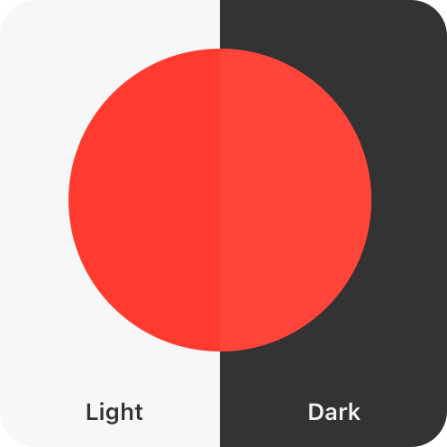
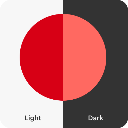
Convey information with more than color alone. Some people have trouble differentiating between certain colors and shades. For example, people who are color blind may have particular difficulty with pairings such as red-green and blue-orange. Offer visual indicators, like distinct shapes or icons, in addition to color to help people perceive differences in function and changes in state. Consider allowing people to customize color schemes such as chart colors or game characters so they can personalize your interface in a way that’s comfortable for them.


Describe your app’s interface and content for VoiceOver. VoiceOver is a screen reader that lets people experience your app’s interface without needing to see the screen. For more guidance, see VoiceOver.
Hearing

The people who use your interface may be deaf or hard of hearing. They may also be in noisy or public environments.
Support text-based ways to enjoy audio and video. It’s important that dialogue and crucial information about your app or game isn’t communicated through audio alone. Depending on the context, give people different text-based ways to experience their media, and allow people to customize the visual presentation of that text:
- Captions give people the textual equivalent of audible information in video or audio-only content. Captions are great for scenarios like game cutscenes and video clips where text synchronizes live with the media.
- Subtitles allow people to read live onscreen dialogue in their preferred language. Subtitles are great for TV shows and movies.
- Audio descriptions are interspersed between natural pauses in the main audio of a video and supply spoken narration of important information that’s presented only visually.
- Transcripts provide a complete textual description of a video, covering both audible and visual information. Transcripts are great for longer-form media like podcasts and audiobooks where people may want to review content as a whole or highlight the transcript as media is playing.
For developer guidance, see Selecting subtitles and alternative audio tracks.
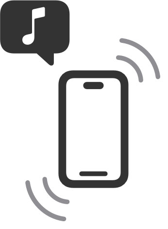
Use haptics in addition to audio cues. If your interface conveys information through audio cues — such as a success chime, error sound, or game feedback — consider pairing that sound with matching haptics for people who can’t perceive the audio or have their audio turned off. In iOS and iPadOS, you can also use Music Haptics and Audio graphs to let people experience music and infographics through vibration and texture. For guidance, see Playing haptics.
Augment audio cues with visual cues. This is especially important for games and spatial apps where important content might be taking place off screen. When using audio to guide people towards a specific action, also add in visual indicators that point to where you want people to interact.
Mobility

Ensure your interface offers a comfortable experience for people with limited dexterity or mobility.
Offer sufficiently sized controls. Controls that are too small are hard for many people to interact with and select. Strive to meet the recommended minimum control size for each platform to ensure controls and menus are comfortable for all when tapping and clicking.
| Platform | Default control size | Minimum control size |
|---|---|---|
| iOS, iPadOS | 44x44 pt | 28x28 pt |
| macOS | 28x28 pt | 20x20 pt |
| tvOS | 66x66 pt | 56x56 pt |
| visionOS | 60x60 pt | 28x28 pt |
| watchOS | 44x44 pt | 28x28 pt |
Consider spacing between controls as important as size. Include enough padding between elements to reduce the chance that someone taps the wrong control. In general, it works well to add about 12 points of padding around elements that include a bezel. For elements without a bezel, about 24 points of padding works well around the element’s visible edges.


Support simple gestures for common interactions. For many people, with or without disabilities, complex gestures can be challenging. For interactions people do frequently in your app or game, use the simplest gesture possible — avoid custom multifinger and multihand gestures — so repetitive actions are both comfortable and easy to remember.
Offer alternatives to gestures. Make sure your UI’s core functionality is accessible through more than one type of physical interaction. Gestures can be less comfortable for people who have limited dexterity, so offer onscreen ways to achieve the same outcome. For example, if you use a swipe gesture to dismiss a view, also make a button available so people can tap or use an assistive device.
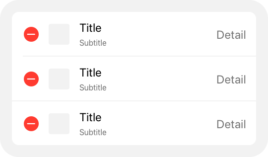
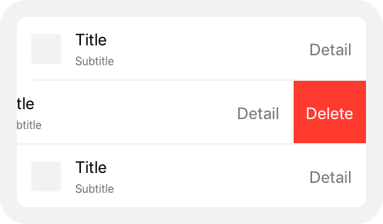
Let people use Voice Control to give guidance and enter information verbally. With Voice Control, people can interact with their devices entirely by speaking commands. They can perform gestures, interact with screen elements, dictate and edit text, and more. To ensure a smooth experience, label interface elements appropriately. For developer guidance, see Voice Control.
Integrate with Siri and Shortcuts to let people perform tasks using voice alone. When your app supports Siri and Shortcuts, people can automate the important and repetitive tasks they perform regularly. They can initiate these tasks from Siri, the Action button on their iPhone or Apple Watch, and shortcuts on their Home Screen or in Control Center. For guidance, see Siri.
Support mobility-related assistive technologies. Features like VoiceOver, AssistiveTouch, Full Keyboard Access, Pointer Control, and Switch Control offer alternative ways for people with low mobility to interact with their devices. Conduct testing and verify that your app or game supports these technologies, and that your interface elements are appropriately labeled to ensure a great experience. For more information, see Performing accessibility testing for your app.
Speech

Apple’s accessibility features help people with speech disabilities and people who prefer text-based interactions to communicate effectively using their devices.
Let people use the keyboard alone to navigate and interact with your app. People can turn on Full Keyboard Access to navigate apps using their physical keyboard. The system also defines accessibility keyboard shortcuts and a wide range of other keyboard shortcuts that many people use all the time. Avoid overriding system-defined keyboard shortcuts and evaluate your app to ensure it works well with Full Keyboard Access. For additional guidance, see Keyboards. For developer guidance, see Support Full Keyboard Access in your iOS app.
Support Switch Control. Switch Control is an assistive technology that lets people control their devices through separate hardware, game controllers, or sounds such as a click or a pop. People can perform actions like selecting, tapping, typing, and drawing when your app or game supports the ability to navigate using Switch Control. For developer guidance, see Switch Control.
Cognitive

When you minimize complexity in your app or game, all people benefit.
Keep actions simple and intuitive. Ensure that people can navigate your interface using easy-to-remember and consistent interactions. Prefer system gestures and behaviors people are already familiar with over creating custom gestures people must learn and retain.
Minimize use of time-boxed interface elements. Views and controls that auto-dismiss on a timer can be problematic for people who need longer to process information, and for people who use assistive technologies that require more time to traverse the interface. Prefer dismissing views with an explicit action.
Consider offering difficulty accommodations in games. Everyone has their own way of playing and enjoying games. To support a variety of cognitive abilities, consider adding the ability to customize the difficulty level of your game, such as offering options for people to reduce the criteria for successfully completing a level, adjust reaction time, or enable control assistance.
Let people control audio and video playback. Avoid autoplaying audio and video content without also providing controls to start and stop it. Make sure these controls are discoverable and easy to act upon, and consider global settings that let people opt out of auto-playing all audio and video. For developer guidance, see Animated images and isVideoAutoplayEnabled.
Allow people to opt out of flashing lights in video playback. People might want to avoid bright, frequent flashes of light in the media they consume. A Dim Flashing Lights setting allows the system to calculate, mitigate, and inform people about flashing lights in a piece of media. If your app supports video playback, ensure that it responds appropriately to the Dim Flashing Lights setting. For developer guidance, see Flashing lights.
Be cautious with fast-moving and blinking animations. When you use these effects in excess, it can be distracting, cause dizziness, and in some cases even result in epileptic episodes. People who are prone to these effects can turn on the Reduce Motion accessibility setting. When this setting is active, ensure your app or game responds by reducing automatic and repetitive animations, including zooming, scaling, and peripheral motion. Other best practices for reducing motion include:
- Tightening animation springs to reduce bounce effects
- Tracking animations directly with people’s gestures
- Avoiding animating depth changes in z-axis layers
- Replacing transitions in x-, y-, and z-axes with fades to avoid motion
- Avoiding animating into and out of blurs
Optimize your app’s UI for Assistive Access. Assistive Access is an accessibility feature in iOS and iPadOS that allows people with cognitive disabilities to use a streamlined version of your app. Assistive Access sets a default layout and control presentation for apps that reduces cognitive load, such as the following layout of the Camera app.
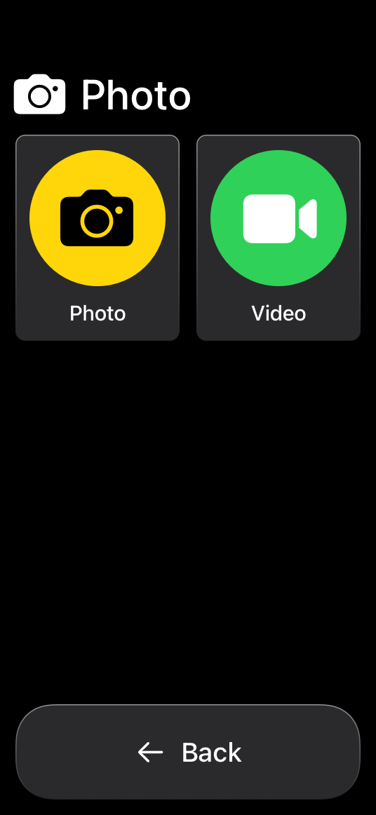
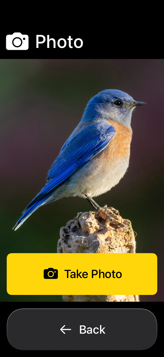
To optimize your app for this mode, use the following guidelines when Assistive Access is turned on:
- Identify the core functionality of your app and consider removing noncritical workflows and UI elements.
- Break up multistep workflows so people can focus on a single interaction per screen.
- Always ask for confirmation twice whenever people perform an action that’s difficult to recover from, such a deleting a file.
For developer guidance, see Assistive Access.
Platform considerations
No additional considerations for iOS, iPadOS, macOS, tvOS, or watchOS.
visionOS
visionOS offers a variety of accessibility features people can use to interact with their surroundings in ways that are comfortable and work best for them, including head and hand Pointer Control, and a Zoom feature.
Pointer Control (hand)
Pointer Control (head)
Zoom
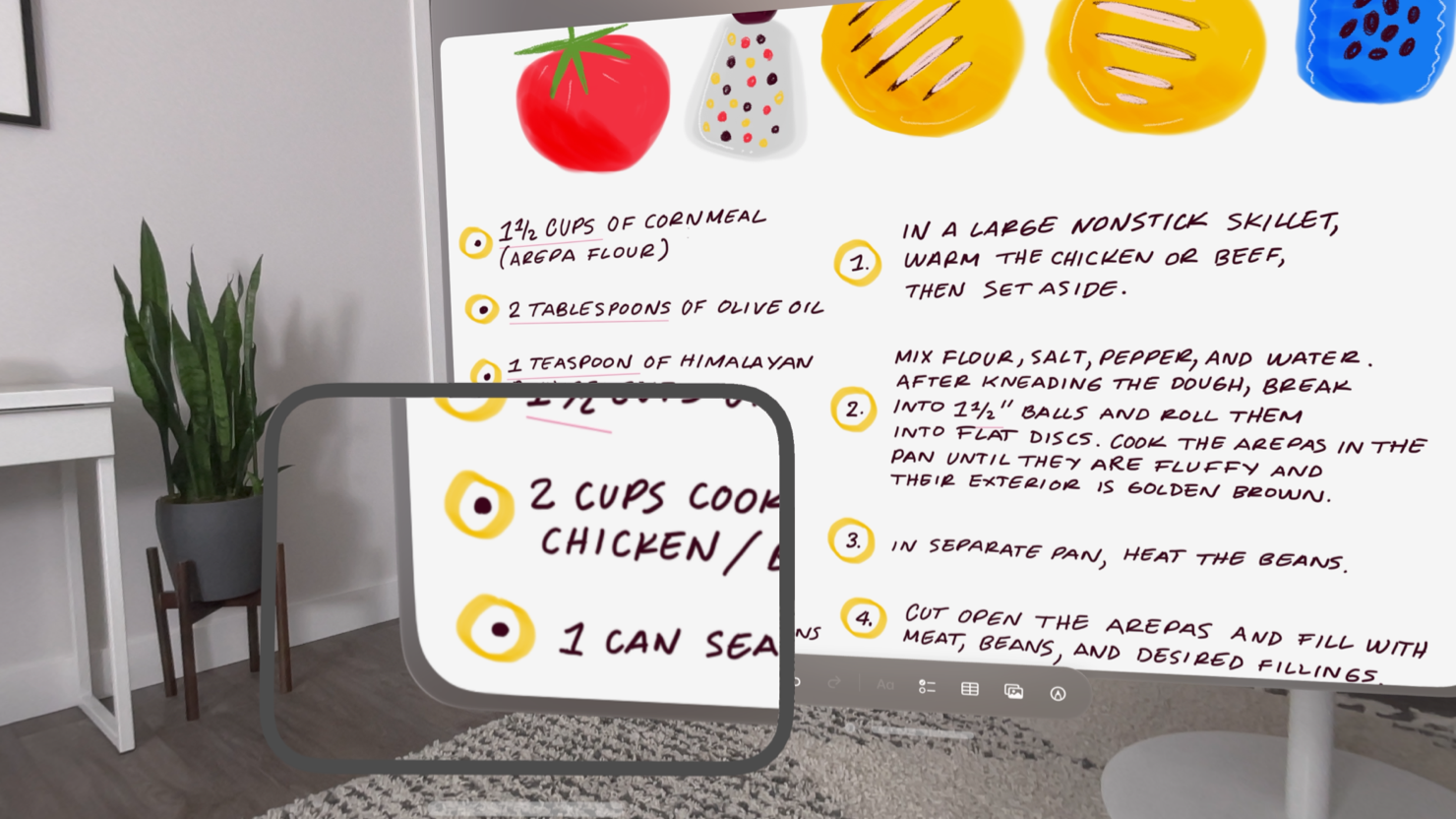
Prioritize comfort. The immersive nature of visionOS means that interfaces, animations, and interactions have a greater chance of causing motion sickness, and visual and ergonomic discomfort for people. To ensure the most comfortable experience, consider these tips:
- Keep interface elements within a person’s field of view. Prefer horizontal layouts to vertical ones that might cause neck strain, and avoid demanding the viewer’s attention in different locations in quick succession.
- Reduce the speed and intensity of animated objects, particularly in someone’s peripheral vision.
- Be gentle with camera and video motion, and avoid situations where someone may feel like the world around them is moving without their control.
- Avoid anchoring content to the wearer’s head, which may make them feel stuck and confined, and also prevent them from using assistive technologies like Pointer Control.
- Minimize the need for large and repetitive gestures, as these can become tiresome and may be difficult depending on a person’s surroundings.
For additional guidance, see Create accessible spatial experiences and Design considerations for vision and motion.
Resources
Related
Developer documentation
Overview of Accessibility Nutrition Labels
Videos
- Principles of inclusive app design - Discover how understanding disability can help you create better apps for everyone. Find out how to make your apps more inclusive by supporting multiple types of interaction, providing customization, and adopting accessibility APIs.
- Evaluate your app for Accessibility Nutrition Labels - Use Accessibility Nutrition Labels on your App Store product page to highlight the accessibility features supported by your app. You’ll learn how to evaluate your app’s accessibility features — such as VoiceOver, Larger Text, Captions, and more — and choose accurate and informative Accessibility Nutrition Labels. You’ll also find out how to approach accessibility throughout the design phase.
- Catch up on accessibility in SwiftUI - SwiftUI makes it easy to build amazing experiences that are accessible to everyone. We’ll discover how assistive technologies understand and navigate your app through the rich accessibility elements provided by SwiftUI. We’ll also discuss how you can further customize these experiences by providing more information about your app’s content and interactions by using accessibility modifiers.
Change log
| Date | Changes |
|---|---|
| June 9, 2025 | Added guidance and links for Assistive Access, Switch Control, and Accessibility Nutrition Labels. |
| March 7, 2025 | Expanded and refined all guidance. Moved Dynamic Type guidance to the Typography page, and moved VoiceOver guidance to a new VoiceOver page. |
| June 10, 2024 | Added a link to Apple’s Unity plug-ins for supporting Dynamic Type. |
| December 5, 2023 | Updated visionOS Zoom lens artwork. |
| June 21, 2023 | Updated to include guidance for visionOS. |
---
Extracted from Apple DocC JSON by apple-skills tooling. This is unofficial content. All Human Interface Guidelines belong to Apple Inc.
Accessibility videos
Source: https://developer.apple.com/design/human-interface-guidelines/accessibility
Video links extracted from the Apple DocC page. These are kept out of the main doc to avoid bloating default agent context.
- A recording of a person's hand using Pointer Control to interact with content in an app's visionOS window. A line with a pointer at the end extends from the person's hand. It changes position within the field of view as the person moves their hand. Poster: Poster image Alt: A recording of a person's hand using Pointer Control to interact with content in an app's visionOS window. A line with a pointer at the end extends from the person's hand. It changes position within the field of view as the person moves their hand.
- A recording of someone using Pointer Control to interact with content in an app's visionOS window. The person isn't visible in the recording. Only the pointer is visible. It's centered in the field of view, and the person uses their head movement to position content beneath the pointer. Poster: Poster image Alt: A recording of someone using Pointer Control to interact with content in an app's visionOS window. The person isn't visible in the recording. Only the pointer is visible. It's centered in the field of view, and the person uses their head movement to position content beneath the pointer.
Navigation: Human Interface Guidelines
article
Action sheets
An action sheet is a modal view that presents choices related to an action people initiate.
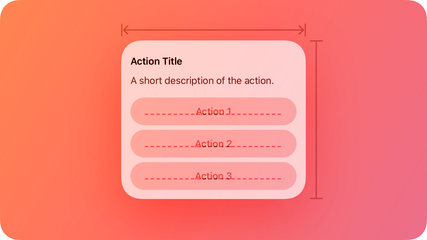
Developer note: When you use SwiftUI, you can offer action sheet functionality in all platforms by specifying a presentation modifier for a confirmation dialog. If you use UIKit, you use the UIAlertController.Style.actionSheet to display an action sheet in iOS, iPadOS, and tvOS.
Best practices
Use an action sheet — not an alert — to offer choices related to an intentional action. For example, when people cancel the message they’re editing in Mail on iPhone, an action sheet provides two choices: delete the draft, or save the draft. Although an alert can also help people confirm or cancel an action that has destructive consequences, it doesn’t provide additional choices related to the action. More importantly, an alert is usually unexpected, generally telling people about a problem or a change in the current situation that might require them to act. For guidance, see Alerts.
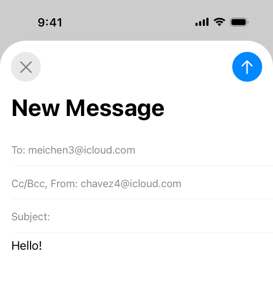
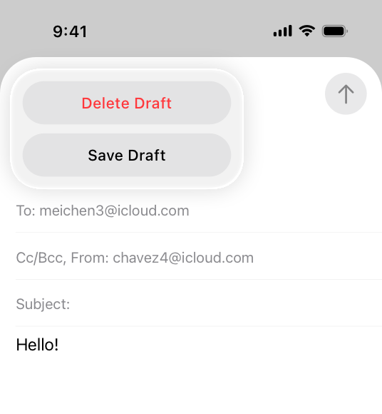
Use action sheets sparingly. Action sheets give people important information and choices, but they interrupt the current task to do so. To encourage people to pay attention to action sheets, avoid using them more than necessary.
Aim to keep titles short enough to display on a single line. A long title is difficult to read quickly and might get truncated or require people to scroll.
Provide a message only if necessary. In general, the title — combined with the context of the current action — provides enough information to help people understand their choices.
If necessary, provide a Cancel button that lets people reject an action that might destroy data. Place the Cancel button at the bottom of the action sheet (or in the upper-left corner of the sheet in watchOS). A SwiftUI confirmation dialog includes a Cancel button by default.
Make destructive choices visually prominent. Use the destructive style for buttons that perform destructive actions, and place these buttons at the top of the action sheet where they tend to be most noticeable. For developer guidance, see destructive (SwiftUI) or UIAlertAction.Style.destructive (UIKit).
Platform considerations
No additional considerations for macOS or tvOS. Not supported in visionOS.
iOS, iPadOS
Use an action sheet — not a menu — to provide choices related to an action. People are accustomed to having an action sheet appear when they perform an action that might require clarifying choices. In contrast, people expect a menu to appear when they choose to reveal it.
Avoid letting an action sheet scroll. The more buttons an action sheet has, the more time and effort it takes for people to make a choice. Also, scrolling an action sheet can be hard to do without inadvertently tapping a button.
watchOS
The system-defined style for action sheets includes a title, an optional message, a Cancel button, and one or more additional buttons. The appearance of this interface is different depending on the device.
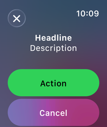
Each button has an associated style that conveys information about the button’s effect. There are three system-defined button styles:
| Style | Meaning |
|---|---|
| Default | The button has no special meaning. |
| Destructive | The button destroys user data or performs a destructive action in the app. |
| Cancel | The button dismisses the view without taking any action. |
Avoid displaying more than four buttons in an action sheet, including the Cancel button. When there are fewer buttons onscreen, it’s easier for people to view all their options at once. Because the Cancel button is required, aim to provide no more than three additional choices.
Resources
Related
Developer documentation
confirmationDialog(_:isPresented:titleVisibility:actions:)-46zbb) — SwiftUI
UIAlertController.Style.actionSheet — UIKit
---
Extracted from Apple DocC JSON by apple-skills tooling. This is unofficial content. All Human Interface Guidelines belong to Apple Inc.
Navigation: Human Interface Guidelines
article
Activity views
An activity view — often called a share sheet — presents a range of tasks that people can perform in the current context.
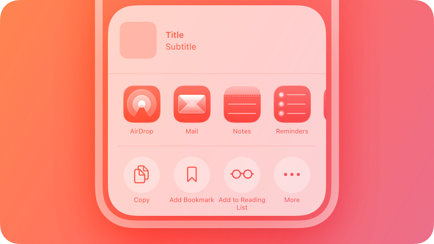
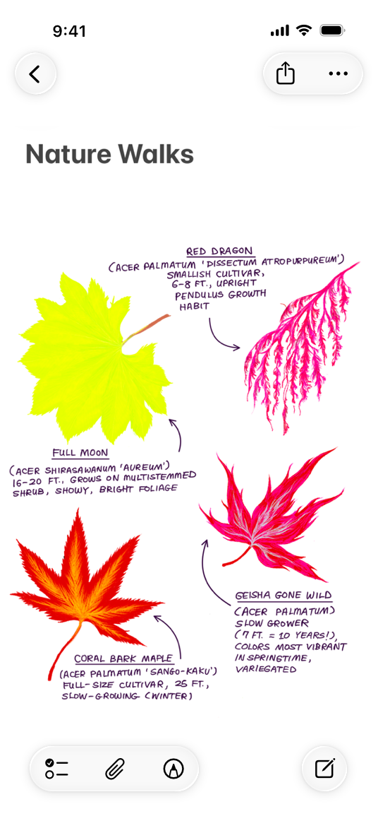
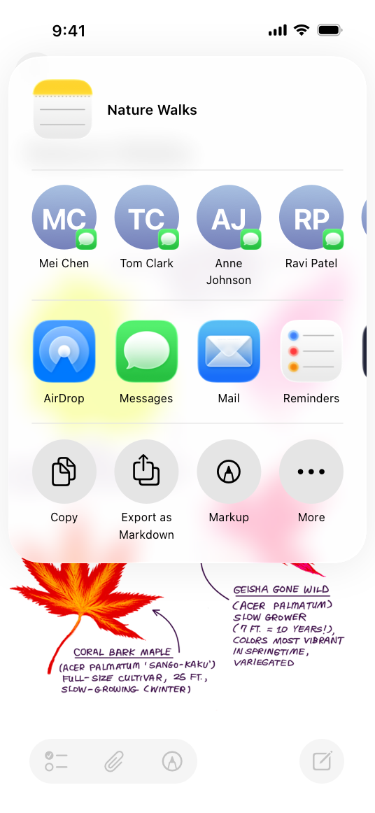
Activity views present sharing activities like messaging and actions like Copy and Print, in addition to quick access to frequently used apps. People typically reveal a share sheet by choosing an Action button while viewing a page or document, or after they’ve selected an item. An activity view can appear as a sheet or a popover, depending on the device and orientation.
You can provide app-specific activities that can appear in a share sheet when people open it within your app or game. For example, Photos provides app-specific actions like Copy Photo, Add to Album, and Adjust Location. By default, the system lists app-specific actions before actions — such as Add to Files or AirPlay — that are available in multiple apps or throughout the system. People can edit the list of actions to ensure that it displays the ones they use most and to add new ones.
You can also create app extensions to provide custom share and action activities that people can use in other apps. (An app extension is code you provide that people can install and use outside of your app.) For example, you might create a custom share activity that people can install to help them share a webpage with a specific social media service. Even though macOS doesn’t provide an activity view, you can create share and action app extensions that people can use on a Mac. For guidance, see Share and action extensions.
Best practices
Avoid creating duplicate versions of common actions that are already available in the activity view. For example, providing a duplicate Print action is unnecessary and confusing because people wouldn’t know how to distinguish your action from the system-provided one. If you need to provide app-specific functionality that’s similar to an existing action, give it a custom title. For example, if you let people use custom formatting to print a bank transaction, use a title that helps people understand what your print activity does, like “Print Transaction.”
Consider using a symbol to represent your custom activity. SF Symbols provides a comprehensive set of configurable symbols you can use to communicate items and concepts in an activity view. If you need to create a custom interface icon, center it in an area measuring about 70x70 pixels. For guidance, see Icons.
Write a succinct, descriptive title for each custom action you provide. If a title is too long, the system wraps it and may truncate it. Prefer a single verb or a brief verb phrase that clearly communicates what the action does. Avoid including your company or product name in an action title. In contrast, the share sheet displays the title of a share activity — typically a company name — below the icon that represents it.
Make sure activities are appropriate for the current context. Although you can’t reorder system-provided tasks in an activity view, you can exclude tasks that aren’t applicable to your app. For example, if it doesn’t make sense to print from within your app, you can exclude the Print activity. You can also identify which custom tasks to show at any given time.
Use the Share button to display an activity view. People are accustomed to accessing system-provided activities when they choose the Share button. Avoid confusing people by providing an alternative way to do the same thing.
Share and action extensions
Share extensions give people a convenient way to share information from the current context with apps, social media accounts, and other services. Action extensions let people initiate content-specific tasks — like adding a bookmark, copying a link, editing an inline image, or displaying selected text in another language — without leaving the current context.
The system presents share and action extensions differently depending on the platform:
- In iOS and iPadOS, share and action extensions are displayed in the share sheet that appears when people choose an Action button.
- In macOS, people access share extensions by clicking a Share button in the toolbar or choosing Share in a context menu. People can access an action extension by holding the pointer over certain types of embedded content — like an image they add to a Mail compose window — clicking a toolbar button, or choosing a quick action in a Finder window.
If necessary, create a custom interface that feels familiar to people. For a share extension, prefer the system-provided composition view because it provides a consistent sharing experience that people already know. For an action extension, include your app name. If you need to present an interface, include elements of your app’s interface to help people understand that your extension and your app are related.
Streamline and limit interaction. People appreciate extensions that let them perform a task in just a few steps. For example, a share extension might immediately post an image to a social media account with a single tap or click.
Avoid placing a modal view above your extension. By default, the system displays an extension within a modal view. While it might be necessary to display an alert above an extension, avoid displaying additional modal views.
If necessary, provide an image that communicates the purpose of your extension. A share extension automatically uses your app icon, helping give people confidence that your app provided the extension. For an action extension, prefer using a symbol or creating an interface icon that clearly identifies the task.
Use your main app to denote the progress of a lengthy operation. An activity view dismisses immediately after people complete the task in your share or action extension. If a task is time-consuming, continue it in the background, and give people a way to check the status in your main app. Although you can use a notification to tell people about a problem, don’t notify them simply because the task completes.
Platform considerations
No additional considerations for iOS, iPadOS, or visionOS. Not supported in macOS, tvOS, or watchOS.
Resources
Related
Developer documentation
UIActivityViewController — UIKit
UIActivity — UIKit
App Extension Support — Foundation
Videos
- Design for Collaboration with Messages - Discover how you can design great collaboration experiences using Apple platforms. We’ll show you how to combine the Share Sheet, live editing notifications, Messages, FaceTime, and your app’s existing collaboration features to help people connect and collaborate effortlessly.
---
Extracted from Apple DocC JSON by apple-skills tooling. This is unofficial content. All Human Interface Guidelines belong to Apple Inc.
Navigation: Human Interface Guidelines
article
Alerts
An alert gives people critical information they need right away.
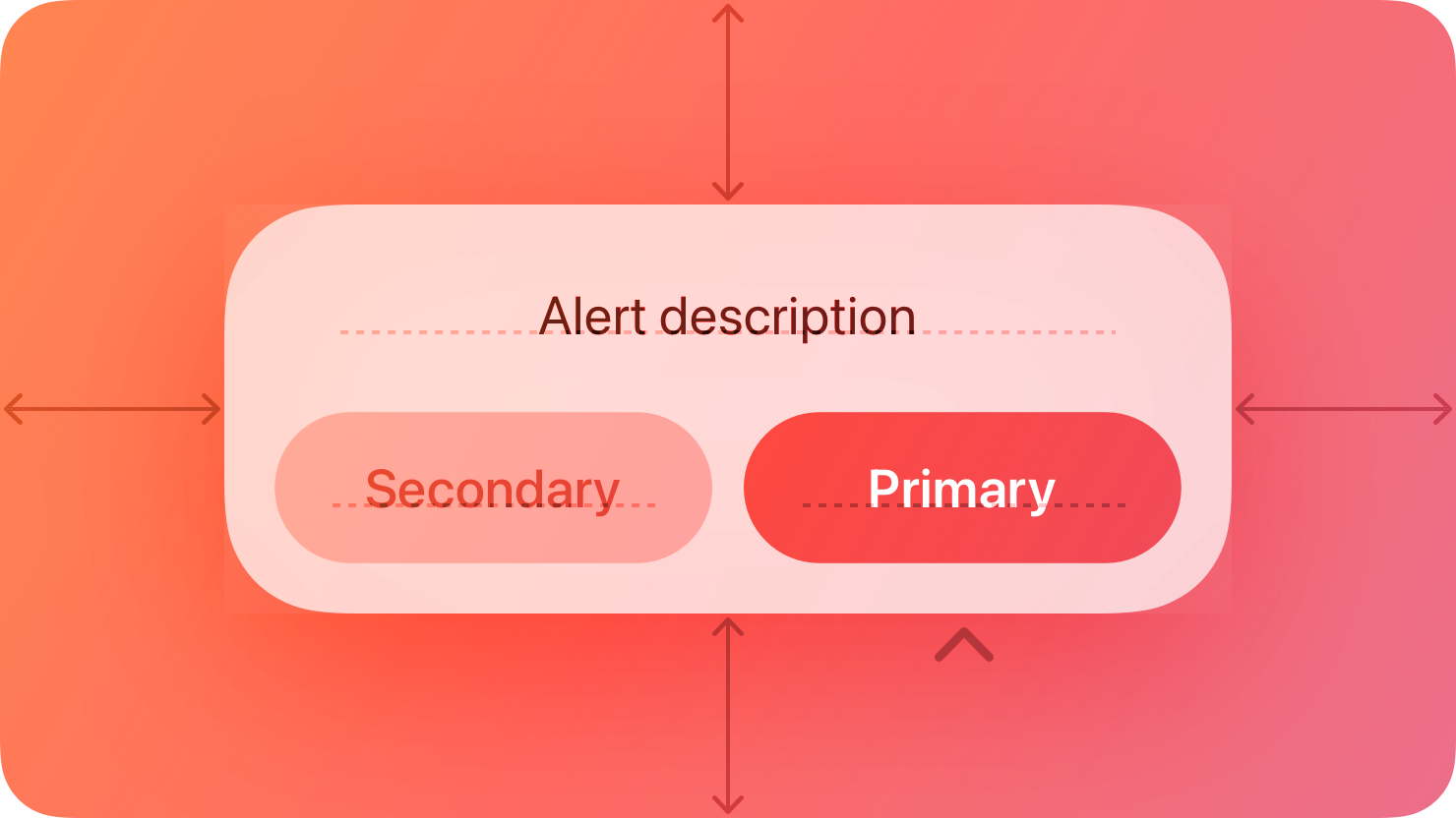
For example, an alert can tell people about a problem, warn them when their action might destroy data, and give them an opportunity to confirm a purchase or another important action they initiated.
Best practices
Use alerts sparingly. Alerts give people important information, but they interrupt the current task to do so. Encourage people to pay attention to your alerts by making certain that each one offers only essential information and useful actions.
Avoid using an alert merely to provide information. People don’t appreciate an interruption from an alert that’s informative, but not actionable. If you need to provide only information, prefer finding an alternative way to communicate it within the relevant context. For example, when a server connection is unavailable, Mail displays an indicator that people can choose to learn more.
Avoid displaying alerts for common, undoable actions, even when they’re destructive. For example, you don’t need to alert people about data loss every time they delete an email or file because they do so with the intention of discarding data, and they can undo the action. In comparison, when people take an uncommon destructive action that they can’t undo, it’s important to display an alert in case they initiated the action accidentally.
Avoid showing an alert when your app starts. If you need to inform people about new or important information the moment they open your app, design a way to make the information easily discoverable. If your app detects a problem at startup, like no network connection, consider alternative ways to let people know. For example, you could show cached or placeholder data and a nonintrusive label that describes the problem.
Anatomy
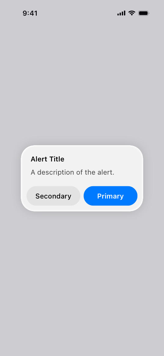
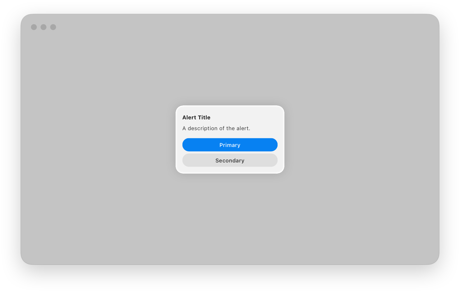
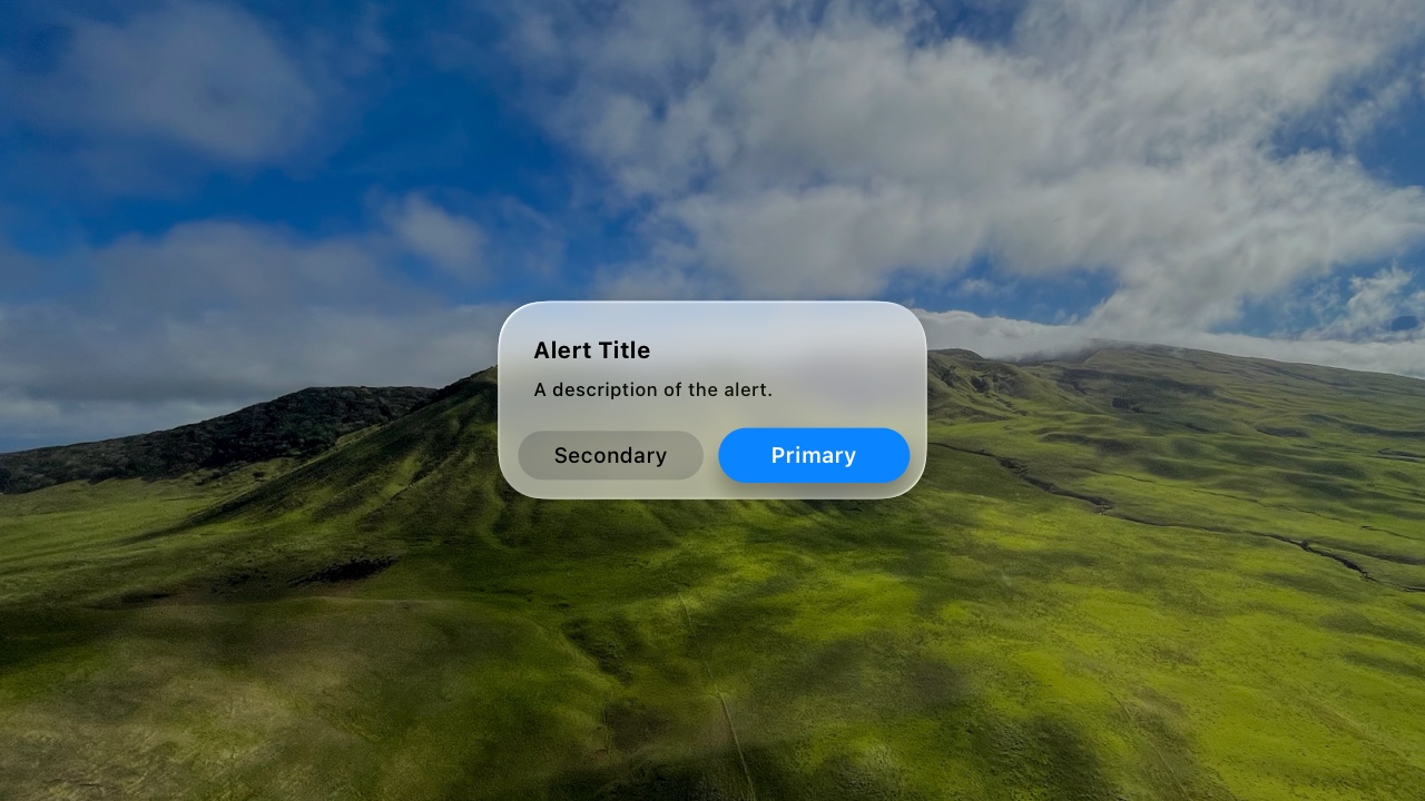
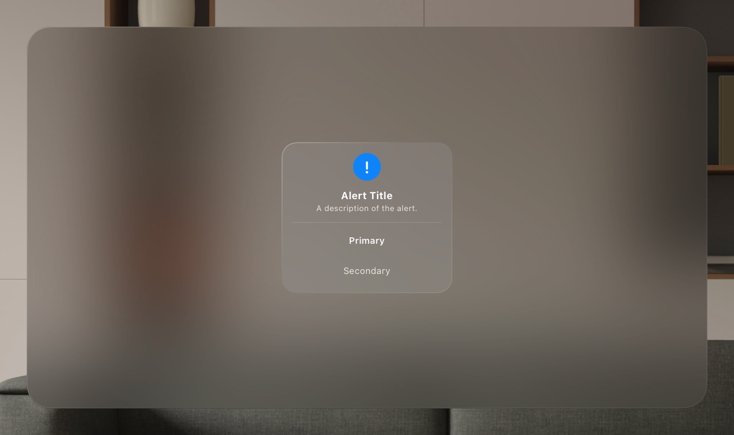
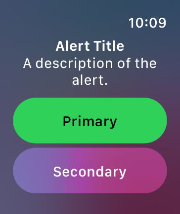
An alert is a modal view that can look different in different platforms and devices.
iOS
macOS
tvOS
visionOS
watchOS
Content
In all platforms, alerts display a title, optional informative text, and up to three buttons. On some platforms, alerts can include additional elements.
- In iOS, iPadOS, macOS, and visionOS, an alert can include a text field.
- Alerts in macOS and visionOS can include an icon and an accessory view.
- macOS alerts can add a suppression Checkboxes and a Help buttons.
In all alert copy, be direct, and use a neutral, approachable tone. Alerts often describe problems and serious situations, so avoid being oblique or accusatory, or masking the severity of the issue.
Write a title that clearly and succinctly describes the situation. You need to help people quickly understand the situation, so be complete and specific, without being verbose. As much as possible, describe what happened, the context in which it happened, and why. Avoid writing a title that doesn’t convey useful information — like “Error” or “Error 329347 occurred” — but also avoid overly long titles that wrap to more than two lines. If the title is a complete sentence, use sentence-style capitalization and appropriate ending punctuation. If the title is a sentence fragment, use title-style capitalization, and don’t add ending punctuation.
Include informative text only if it adds value. If you need to add an informative message, keep it as short as possible, using complete sentences, sentence-style capitalization, and appropriate punctuation.
Avoid explaining alert buttons. If your alert text and button titles are clear, you don’t need to explain what the buttons do. In rare cases where you need to provide guidance on choosing a button, use a term like choose to account for people’s current device and interaction method, and refer to a button using its exact title without quotes. For guidance, see Buttons.
If supported, include a text field only if you need people’s input to resolve the situation. For example, you might need to present a secure text field to receive a password.
Buttons
Create succinct, logical button titles. Aim for a one- or two-word title that describes the result of selecting the button. Prefer verbs and verb phrases that relate directly to the alert text — for example, “View All,” “Reply,” or “Ignore.” In informational alerts only, you can use “OK” for acceptance, avoiding “Yes” and “No.” Always use “Cancel” to title a button that cancels the alert’s action. As with all button titles, use sentence-style capitalization and no ending punctuation.
Avoid using OK as the default button title unless the alert is purely informational. The meaning of “OK” can be unclear even in alerts that ask people to confirm that they want to do something. For example, does “OK” mean “OK, I want to complete the action” or “OK, I now understand the negative results my action would have caused”? A specific button title like “Erase,” “Convert,” “Clear,” or “Delete” helps people understand the action they’re taking.
Place buttons where people expect. In general, place the button people are most likely to choose on the trailing side in a row of buttons or at the top in a stack of buttons. Always place the default button on the trailing side of a row or at the top of a stack. Cancel buttons are typically on the leading side of a row or at the bottom of a stack.
Use the destructive style to identify a button that performs a destructive action people didn’t deliberately choose. For example, when people deliberately choose a destructive action — such as Empty Trash — the resulting alert doesn’t apply the destructive style to the Empty Trash button because the button performs the person’s original intent. In this scenario, the convenience of pressing Return to confirm the deliberately chosen Empty Trash action outweighs the benefit of reaffirming that the button is destructive. In contrast, people appreciate an alert that draws their attention to a button that can perform a destructive action they didn’t originally intend.
If there’s a destructive action, include a Cancel button to give people a clear, safe way to avoid the action. Always use the title “Cancel” for a button that cancels an alert’s action. Note that you don’t want to make a Cancel button the default button. If you want to encourage people to read an alert and not just automatically press Return to dismiss it, avoid making any button the default button. Similarly, if you must display an alert with a single button that’s also the default, use a Done button, not a Cancel button.
Provide alternative ways to cancel an alert when it makes sense. In addition to choosing a Cancel button, people appreciate using keyboard shortcuts or other quick ways to cancel an onscreen alert. For example:
| Action | Platform |
|---|---|
| Exit to the Home Screen | iOS, iPadOS |
| Pressing Escape (Esc) or Command-Period (.) on an attached keyboard | iOS, iPadOS, macOS, visionOS |
| Pressing Menu on the remote | tvOS |
Platform considerations
No additional considerations for tvOS or watchOS.
iOS, iPadOS
Use an action sheet — not an alert — to offer choices related to an intentional action. For example, when people cancel the Mail message they’re editing, an action sheet provides three choices: delete the edits (or the entire draft), save the draft, or return to editing. Although an alert can also help people confirm or cancel an action that has destructive consequences, it doesn’t provide additional choices related to the action. For guidance, see Action sheets.
When possible, avoid displaying an alert that scrolls. Although an alert might scroll if the text size is large enough, be sure to minimize the potential for scrolling by keeping alert titles short and including a brief message only when necessary.
macOS
macOS automatically displays your app icon in an alert, but you can supply an alternative icon or symbol. In addition, macOS lets you:
- Configure repeating alerts to let people suppress subsequent occurrences of the same alert.
- Append a custom view if it’s necessary to provide additional information (for developer guidance, see accessoryView).
- Include a Help button that opens your help documentation (see Help buttons).
Use a caution symbol sparingly. Using a caution symbol like exclamationmark.triangle too frequently in your alerts diminishes its significance. Use the symbol only when extra attention is really needed, as when confirming an action that might result in unexpected loss of data. Don’t use the symbol for tasks whose only purpose is to overwrite or remove data, such as a save or empty trash.
visionOS
When your app is running in the Shared Space, visionOS displays an alert in front of the app’s window, slightly forward along the z-axis.
If someone moves a window without dismissing its alert, the alert remains anchored to the window. If your app is running in a Full Space, the system displays the alert centered in the wearer’s Field of view.
If you need to display an accessory view in a visionOS alert, create a view that has a maximum height of 154 pt and a 16-pt corner radius.
Resources
Related
Developer documentation
alert(_:isPresented:actions:)-1bkka) — SwiftUI
UIAlertController — UIKit
NSAlert — AppKit
Change log
| Date | Changes |
|---|---|
| February 2, 2024 | Enhanced guidance for using default and Cancel buttons. |
| September 12, 2023 | Added anatomy artwork for visionOS. |
| June 21, 2023 | Updated to include guidance for visionOS. |
---
Extracted from Apple DocC JSON by apple-skills tooling. This is unofficial content. All Human Interface Guidelines belong to Apple Inc.
Alerts videos
Source: https://developer.apple.com/design/human-interface-guidelines/alerts
Video links extracted from the Apple DocC page. These are kept out of the main doc to avoid bloating default agent context.
- A video of an alert in the Freeform app running in the Shared Space in visionOS. When the video plays, someone chooses to permanently delete a recently deleted Freeform board. An alert then appears in front of the Freeform window to ask for confirmation. Poster: Poster image Alt: A video of an alert in the Freeform app running in the Shared Space in visionOS. When the video plays, someone chooses to permanently delete a recently deleted Freeform board. An alert then appears in front of the Freeform window to ask for confirmation.
- A video of an alert in the Freeform app running in the Shared Space in visionOS. When the video plays, someone chooses to permanently delete a recently deleted Freeform board. An alert then appears in front of the Freeform window to ask for confirmation. The alert is not dismissed and remains anchored to the Freeform window as it’s moved around the Shared Space. Poster: Poster image Alt: A video of an alert in the Freeform app running in the Shared Space in visionOS. When the video plays, someone chooses to permanently delete a recently deleted Freeform board. An alert then appears in front of the Freeform window to ask for confirmation. The alert is not dismissed and remains anchored to the Freeform window as it’s moved around the Shared Space.
Navigation: Human Interface Guidelines
article
App icons
A unique, memorable icon expresses your app’s or game’s purpose and personality and helps people recognize it at a glance.

Your app icon is a crucial aspect of your app’s or game’s branding and user experience. It appears on the Home Screen and in key locations throughout the system, including search results, notifications, system settings, and share sheets. A well-designed app icon conveys your app’s or game’s identity clearly and consistently across all Apple platforms.

Layer design
Although you can provide a flattened image for your icon, layers give you the most control over how your icon design is represented. A layered app icon comes together to produce a sense of depth and vitality. On each platform, the system applies visual effects that respond to the environment and people’s interactions.
iOS, iPadOS, macOS, and watchOS app icons include a background layer and one or more foreground layers that coalesce to create dimensionality. These icons take on Liquid Glass attributes like specular highlights, frostiness, and translucency, which respond to changes in lighting and, in iOS and iPadOS, device movement.
tvOS app icons use between two and five layers to create a sense of dynamism as people bring them into focus. When focused, the app icon elevates to the foreground in response to someone’s finger movement on their remote, and gently sways while the surface illuminates. The separation between layers and the use of transparency produce a feeling of depth during the parallax effect.
A visionOS app icon includes a background layer and one or two layers on top, producing a three-dimensional object that subtly expands when people view it. The system enhances the icon’s visual dimensionality by adding shadows that convey a sense of depth between layers and by using the alpha channel of the upper layers to create an embossed appearance.
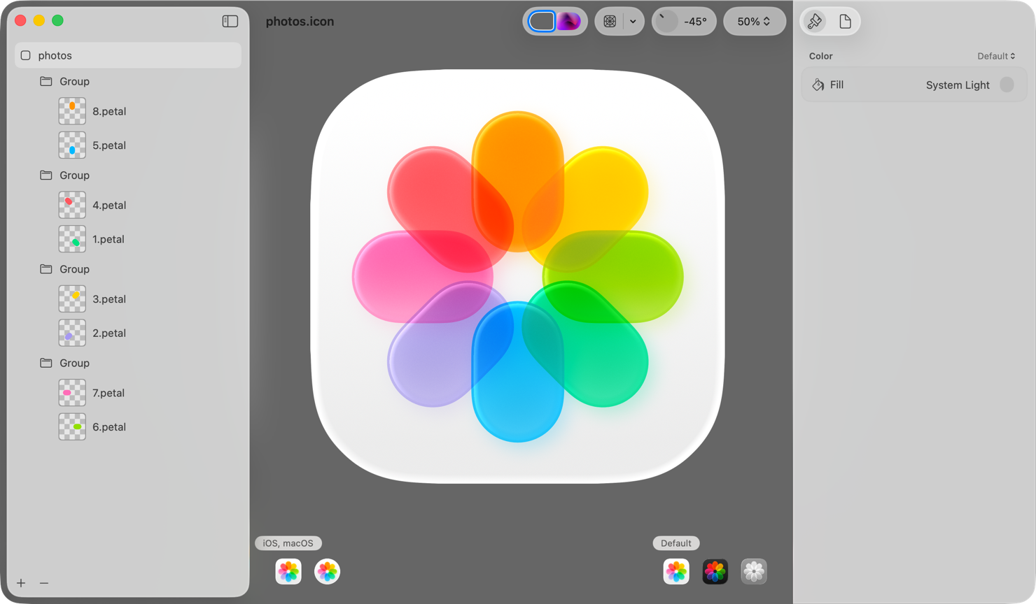
You use your favorite design tool to craft the individual foreground layers of your app icon. For iOS, iPadOS, macOS, and watchOS icons, you then import your icon layers into Icon Composer, a design tool included with Xcode and available from the Apple Developer website. In Icon Composer, you define the background layer for your icon, adjust your foreground layer placement, apply visual effects like transparency, define default, dark, clear, and tinted appearance variants, and export your icon for use in Xcode. For additional guidance, see Creating your app icon using Icon Composer.
For tvOS and visionOS app icons, you add your icon layers directly to an image stack in Xcode to form your complete icon. For developer guidance, see Configuring your app icon using an asset catalog.
Prefer clearly defined edges in foreground layers. To ensure system-drawn highlights and shadows look best, avoid soft and feathered edges on foreground layer shapes.
Vary opacity in foreground layers to increase the sense of depth and liveliness. For example, the Photos icon separates its centerpiece into multiple layers that contain translucent pieces, bringing greater dynamism to the design. Importing fully opaque layers and adjusting transparency in Icon Composer lets you preview and make adjustments to your design based on how transparency and system effects impact one another.
Design a background that both stands out and emphasizes foreground content. Subtle top-to-bottom, light-to-dark gradients tend to respond well to system lighting effects. Icon Composer supports solid colors and gradients for background layers, making it unnecessary to import custom background images in most cases. If you do import a background layer, make sure it’s full-bleed and opaque.
Prefer vector graphics when bringing layers into Icon Composer. Unlike raster images, vector graphics (such as SVG or PDF) scale gracefully and appear crisp at any size. Outline artwork and convert text to outline in your design. For mesh gradients and raster artwork, prefer PNG format because it’s a lossless image format.
Icon shape
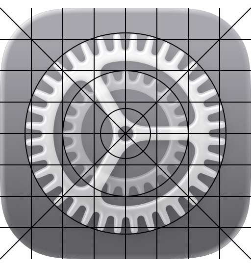
An app icon’s shape varies based on a platform’s visual language. In iOS, iPadOS, and macOS, icons are square, and the system applies masking to produce rounded corners that precisely match the curvature of other rounded interface elements throughout the system and the bezel of the physical device itself. In tvOS, icons are rectangular, also with concentric edges. In visionOS and watchOS, icons are square and the system applies circular masking.
iOS, iPadOS, macOS
tvOS
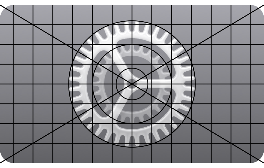
visionOS, watchOS
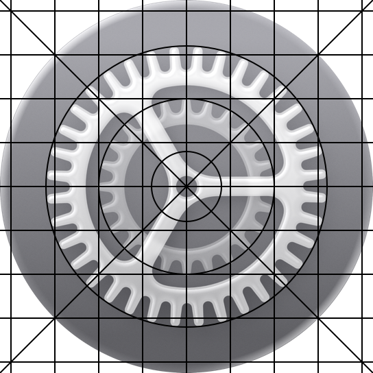
Produce appropriately shaped, unmasked layers. The system masks all layer edges to produce an icon’s final shape. For iOS, iPadOS, and macOS icons, provide square layers so the system can apply rounded corners. For visionOS and watchOS, provide square layers so the system can create the circular icon shape. For tvOS, provide rectangular layers so the system can apply rounded corners. Providing layers with pre-defined masking negatively impacts specular highlight effects and makes edges look jagged.
Keep primary content centered to avoid truncation when the system adjusts corners or applies masking. Pay particular attention to centering content in visionOS and watchOS icons. To help with icon placement, use the grids in the app icon production templates, which you can find in Apple Design Resources.
Design
Embrace simplicity in your icon design. Simple icons tend to be easiest for people to understand and recognize. An icon with fine visual features might look busy when rendered with system-provided shadows and highlights, and details may be hard to discern at smaller sizes. Find a concept or element that captures the essence of your app or game, make it the core idea of your icon, and express it in a simple, unique way with a minimal number of shapes. Prefer a simple background, such as a solid color or gradient, that puts the emphasis on your primary design — you don’t need to fill the entire icon canvas with content.
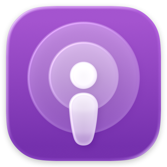
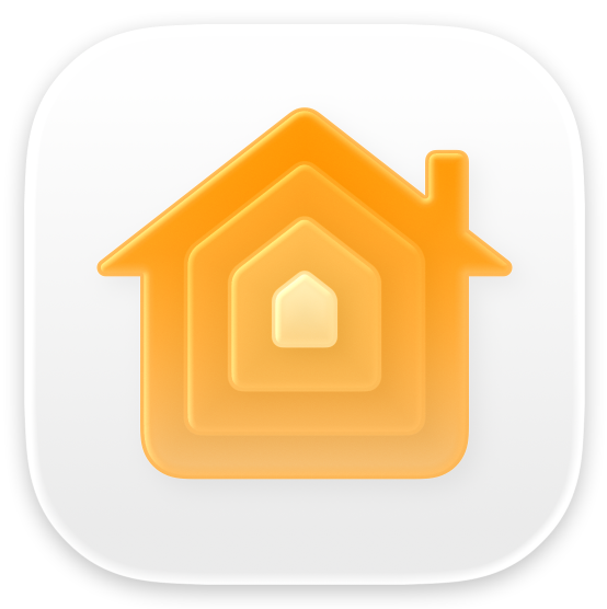
Provide a visually consistent icon design across all the platforms your app supports. A consistent design helps people quickly find your app wherever it appears and prevents people from mistaking your app for multiple apps.
Consider basing your icon design around filled, overlapping shapes. Overlapping solid shapes in the foreground, particularly when paired with transparency and blurring, can give an icon a sense of depth.


Include text only when it’s essential to your experience or brand. Text in icons doesn’t support accessibility or localization, is often too small to read easily, and can make an icon appear cluttered. In some contexts, your app name already appears nearby, making it redundant to display the name within the icon itself. Although displaying a mnemonic like the first letter of your app’s name can help people recognize your app or game, avoid including nonessential words that tell people what to do with it — like “Watch” or “Play” — or context-specific terms like “New” or “For visionOS.” If you include text in a tvOS app icon, make sure it’s above other layers so it’s not cropped by the parallax effect.
Prefer illustrations to photos and avoid replicating UI components. Photos are full of details that don’t work well when displayed in different appearances, viewed at small sizes, or split into layers. Instead of using photos, create a graphic representation of the content that emphasizes the features you want people to notice. Similarly, if your app has an interface that people recognize, don’t just replicate standard UI components or use app screenshots in your icon.
Don’t use replicas of Apple hardware products. Apple products are copyrighted and can’t be reproduced in your app icons.
Visual effects
Let the system handle blurring and other visual effects. The system dynamically applies visual effects to your app icon layers, so there’s no need to include specular highlights, drop shadows between layers, beveled edges, blurs, glows, and other effects. In addition to interfering with system-provided effects, custom effects are static, whereas the system supplies dynamic ones. If you do include custom visual effects on your icon layers, use them intentionally and test carefully with Icon Composer, in Simulator, or on device to make sure they appear as expected and don’t conflict with system effects.
Create layer groupings to apply effects to multiple layers at once. System effects typically occur on individual layers. If it makes sense for your design, however, you can group several layers together in Icon Composer or your design tool so effects occur at the group level.
Appearances
In iOS, iPadOS, and macOS, people can choose whether their Home Screen app icons are default, dark, clear, or tinted in appearance. For example, someone may want to personalize their app icon appearance to complement their wallpaper. You can design app icon variants for every appearance variant, and the system automatically generates variants you don’t provide.
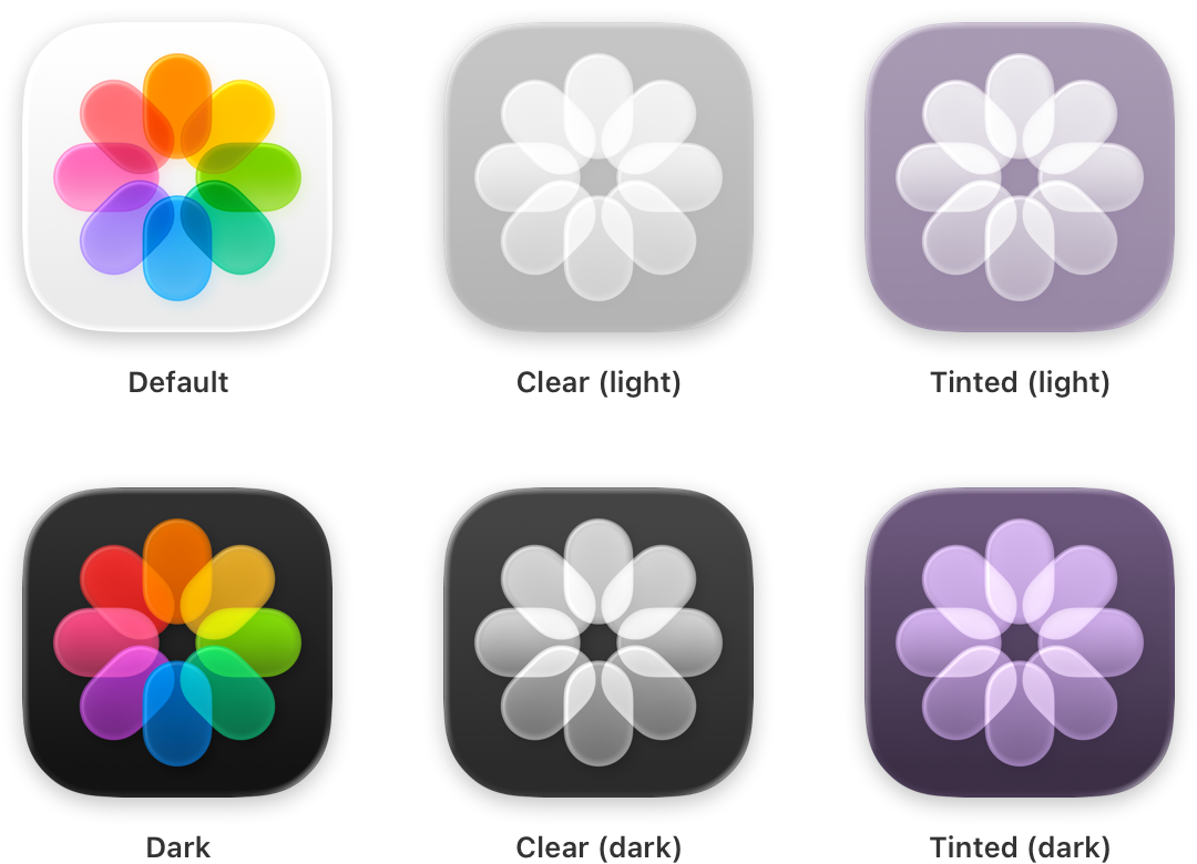
Keep your icon’s features consistent across appearances. To create a seamless experience, keep your icon’s core visual features the same in the default, dark, clear, and tinted appearances. Avoid creating custom icon variants that swap elements in and out with each variant, which may make it harder for people to find your app when they switch appearances.
Design dark and tinted icons that feel at home beside system app icons and widgets. You can preserve the color palette of your default icon, but be mindful that dark icons are more subdued, and clear and tinted icons are even more so. A great app icon is visible, legible, and recognizable, regardless of its appearance variant.
Use your light app icon as the basis for your dark icon. Choose complementary colors that reflect the default design, and avoid excessively bright images. Color backgrounds generally offer the greatest contrast in dark icons. For guidance, see Dark Mode.
Consider offering alternate app icons. In iOS, iPadOS, tvOS, and compatible apps running in visionOS, it’s possible to let people visit your app’s settings to choose an alternate version of your app icon. For example, a sports app might offer icons for different teams, letting someone choose their favorite. If you offer this capability, make sure each icon you design remains closely related to your content and experience. Avoid creating one someone might mistake for another app.
Note: Alternate app icons in iOS and iPadOS require their own dark, clear, and tinted variants. As with your default app icon, all alternate and variant icons are subject to app review and must adhere to the App Review Guidelines.
Platform considerations
No additional considerations for iOS, iPadOS, or macOS.
tvOS
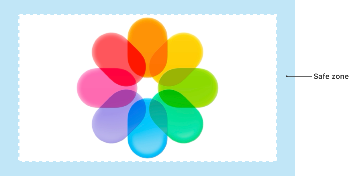
Include a safe zone to ensure the system doesn’t crop your content. When someone focuses your app icon, the system may crop content around the edges as the icon scales and moves. To ensure that your icon’s content is always visible, keep a safe zone around it. Be aware that the safe zone can vary, depending on the image size, layer depth, and motion, and the system crops foreground layers more than background layers.
visionOS
Avoid adding a shape that’s intended to look like a hole or concave area to the background layer. The system-added shadow and specular highlights can make such a shape stand out instead of recede.
watchOS
Avoid using black for your icon’s background. Lighten a black background so the icon doesn’t blend into the display background.
Specifications
The layout, size, style, and appearances of app icons vary by platform.
| Platform | Layout shape | Icon shape after system masking | Layout size | Style | Appearances |
|---|---|---|---|---|---|
| iOS, iPadOS, macOS | Square | Rounded rectangle (square) | 1024x1024 px | Layered | Default, dark, clear light, clear dark, tinted light, tinted dark |
| tvOS | Rectangle (landscape) | Rounded rectangle (rectangular) | 800x480 px | Layered (Parallax) | N/A |
| visionOS | Square | Circular | 1024x1024 px | Layered (3D) | N/A |
| watchOS | Square | Circular | 1088x1088 px | Layered | N/A |
The system automatically scales your icon to produce smaller variants that appear in certain locations, such as Settings and notifications.
App icons support the following color spaces:
- sRGB (color)
- Gray Gamma 2.2 (grayscale)
- Display P3 (wide-gamut color in iOS, iPadOS, macOS, tvOS, and watchOS only)
Resources
Related
Developer documentation
Creating your app icon using Icon Composer
Configuring your app icon using an asset catalog
Videos
- Say hello to the new look of app icons - Get an overview of the new app icon appearances for iOS, iPadOS, and macOS, including light and dark tints, and clear options. Learn how to use frostiness and translucency to make your app icon more vibrant, dynamic, and expressive, and find out how to ensure your icon works well with specular highlights.
- Create icons with Icon Composer - Learn how to use Icon Composer to make updated app icons for iOS, iPadOS, macOS, and watchOS. Find out how to export assets from your design tool of choice, add them to Icon Composer, apply real-time glass properties and other effects, and preview and adjust for different platforms and appearance modes.
Change log
| Date | Changes |
|---|---|
| June 9, 2025 | Updated guidance to reflect layered icons, consistency across platforms, and best practices for Liquid Glass. |
| June 10, 2024 | Added guidance for creating dark and tinted app icon variants for iOS and iPadOS. |
| January 31, 2024 | Clarified platform availability for alternate app icons. |
| June 21, 2023 | Updated to include guidance for visionOS. |
| September 14, 2022 | Added specifications for Apple Watch Ultra. |
---
Extracted from Apple DocC JSON by apple-skills tooling. This is unofficial content. All Human Interface Guidelines belong to Apple Inc.
App icons videos
Source: https://developer.apple.com/design/human-interface-guidelines/app-icons
Video links extracted from the Apple DocC page. These are kept out of the main doc to avoid bloating default agent context.
- iOS app icon Poster: Poster image Alt: An animation of the Podcasts app icon for iOS. As the animation plays, the icon rotates to the side and expands to show how layers are separated. It then collapses and returns to its original position.
- tvOS app icon Poster: Poster image Alt: An animation of the Photos app icon in tvOS moving to show the parallax effect.
- visionOS app icon Poster: Poster image Alt: An animation of the Photos app icon in visionOS moving to show the parallax effect.
Navigation: Human Interface Guidelines
article
Buttons
A button initiates an instantaneous action.
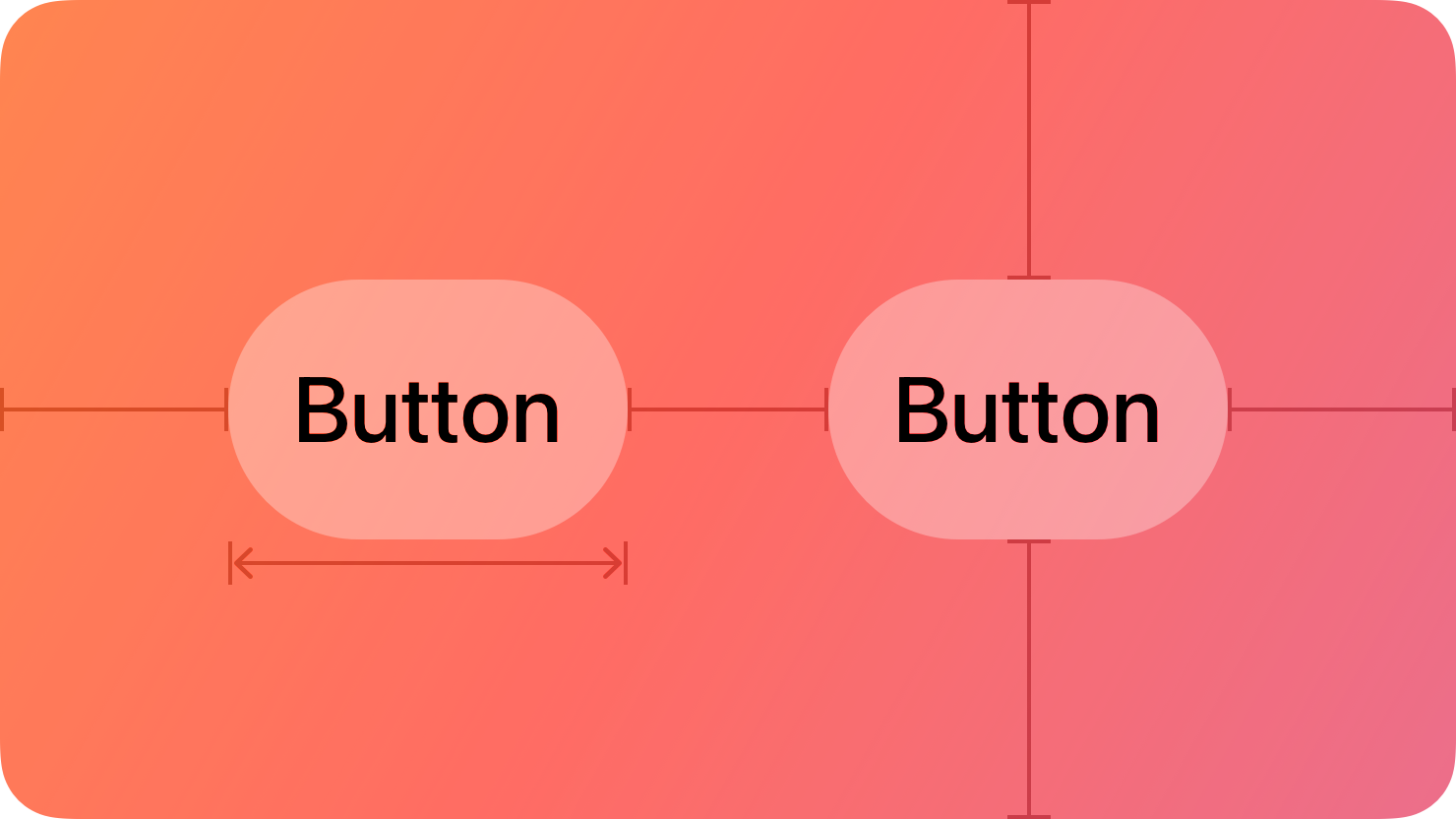
Versatile and highly customizable, buttons give people simple, familiar ways to do tasks in your app. In general, a button combines three attributes to clearly communicate its function:
- Style. A visual style based on size, color, and shape.
- Content. A symbol (or icon), text label, or both that a button displays to convey its purpose.
- Role. A system-defined role that identifies a button’s semantic meaning and can affect its appearance.
There are also many button-like components that have distinct appearances and behaviors for specific use cases, like Toggles, Pop-up buttons, and Segmented controls.
Best practices
When buttons are instantly recognizable and easy to understand, an app tends to feel intuitive and well designed.
Make buttons easy for people to use. It’s essential to include enough space around a button so that people can visually distinguish it from surrounding components and content. Giving a button enough space is also critical for helping people select or activate it, regardless of the method of input they use. As a general rule, a button needs a hit region of at least 44x44 pt — in visionOS, 60x60 pt — to ensure that people can select it easily, whether they use a fingertip, a pointer, their eyes, or a remote.
Always include a press state for a custom button. Without a press state, a button can feel unresponsive, making people wonder if it’s accepting their input.
Style
System buttons offer a range of styles that support customization while providing built-in interaction states, accessibility support, and appearance adaptation. Different platforms define different styles that help you communicate hierarchies of actions in your app.
In general, use a button that has a prominent visual style for the most likely action in a view. To draw people’s attention to a specific button, use a prominent button style so the system can apply an accent color to the button’s background. Buttons that use color tend to be the most visually distinctive, helping people quickly identify the actions they’re most likely to use. Keep the number of prominent buttons to one or two per view. Presenting too many prominent buttons increases cognitive load, requiring people to spend more time considering options before making a choice.
Use style — not size — to visually distinguish the preferred choice among multiple options. When you use buttons of the same size to offer two or more options, you signal that the options form a coherent set of choices. By contrast, placing two buttons of different sizes near each other can make the interface look confusing and inconsistent. If you want to highlight the preferred or most likely option in a set, use a more prominent button style for that option and a less prominent style for the remaining ones.
Avoid applying a similar color to button labels and content layer backgrounds. If your app already has bright, colorful content in the content layer, prefer using the default monochromatic appearance of button labels. For more guidance, see Liquid Glass color.
Content
Ensure that each button clearly communicates its purpose. Depending on the platform, a button can contain a symbol (or icon), a text label, or both to help people understand what it does.
Note: In macOS and visionOS, the system displays a tooltip after people hover over a button for a moment. A tooltip displays a brief phrase that explains what a button does; for guidance, see Offering help.
Try to associate familiar actions with familiar icons. For example, people can predict that a button containing the square.and.arrow.up symbol will help them perform share-related activities. If it makes sense to use an icon in your button, consider using an existing or customized SF Symbols. For a list of symbols that represent common actions, see Standard icons.
Consider using text when a short label communicates more clearly than an icon. To use text, write a few words that succinctly describe what the button does. Using title-style capitalization, consider starting the label with a verb to help convey the button’s action — for example, a button that lets people add items to their shopping cart might use the label “Add to Cart.”
Role
A system button can have one of the following roles:
- Normal. No specific meaning.
- Primary. The button is the default button — the button people are most likely to choose.
- Cancel. The button cancels the current action.
- Destructive. The button performs an action that can result in data destruction.
A button’s role can have additional effects on its appearance. For example, a primary button uses an app’s accent color, whereas a destructive button uses the system red color.
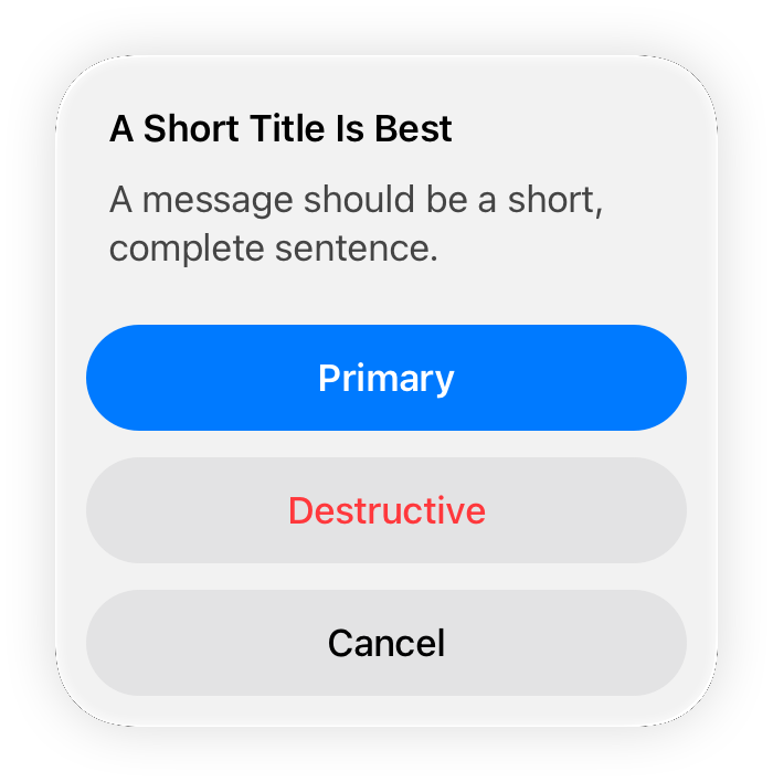
Assign the primary role to the button people are most likely to choose. When a primary button responds to the Return key, it makes it easy for people to quickly confirm their choice. In addition, when the button is in a temporary view — like a Sheets, an editable view, or an Alerts — assigning it the primary role means that the view can automatically close when people press Return.
Don’t assign the primary role to a button that performs a destructive action, even if that action is the most likely choice. Because of its visual prominence, people sometimes choose a primary button without reading it first. Help people avoid losing content by assigning the primary role to nondestructive buttons.
Platform considerations
No additional considerations for tvOS.
iOS, iPadOS
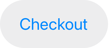
Configure a button to display an activity indicator when you need to provide feedback about an action that doesn’t instantly complete. Displaying an activity indicator within a button can save space in your user interface while clearly communicating the reason for the delay. To help clarify what’s happening, you can also configure the button to display a different label alongside the activity indicator. For example, the label “Checkout” could change to “Checking out…” while the activity indicator is visible. When a delay occurs after people click or tap your configured button, the system displays the activity indicator next to the original or alternative label, hiding the button image, if there is one.

macOS
Several specific button types are unique to macOS.
Push buttons
The standard button type in macOS is known as a push button. You can configure a push button to display text, a symbol, an icon, or an image, or a combination of text and image content. Push buttons can act as the default button in a view and you can tint them.
Use a flexible-height push button only when you need to display tall or variable height content. Flexible-height buttons support the same configurations as regular push buttons — and they use the same corner radius and content padding — so they look consistent with other buttons in your interface. If you need to present a button that contains two lines of text or a tall icon, use a flexible-height button; otherwise, use a standard push button. For developer guidance, see NSButton.BezelStyle.flexiblePush.
Append a trailing ellipsis to the title when a push button opens another window, view, or app. Throughout the system, an ellipsis in a control title signals that people can provide additional input. For example, the Edit buttons in the AutoFill pane of Safari Settings include ellipses because they open other views that let people modify autofill values.
Consider supporting spring loading. On systems with a Magic Trackpad, spring loading lets people activate a button by dragging selected items over it and force clicking — that is, pressing harder — without dropping the selected items. After force clicking, people can continue dragging the items, possibly to perform additional actions.
Square buttons
A square button (also known as a gradient button) initiates an action related to a view, like adding or removing rows in a table.
Square buttons contain symbols or icons — not text — and you can configure them to behave like push buttons, toggles, or pop-up buttons. The buttons appear in close proximity to their associated view — usually within or beneath it — so people know which view the buttons affect.
Use square buttons in a view, not in the window frame. Square buttons aren’t intended for use in toolbars or status bars. If you need a button in a toolbar, use a toolbar item.
Prefer using a symbol in a square button. SF Symbols provides a wide range of symbols that automatically receive appropriate coloring in their default state and in response to user interaction.
Avoid using labels to introduce square buttons. Because square buttons are closely connected with a specific view, their purpose is generally clear without the need for descriptive text.
For developer guidance, see NSButton.BezelStyle.smallSquare.
Help buttons
A help button appears within a view and opens app-specific help documentation.
Help buttons are circular, consistently sized buttons that contain a question mark. For guidance on creating help documentation, see Offering help.
Use the system-provided help button to display your help documentation. People are familiar with the appearance of the standard help button and know that choosing it opens help content.
When possible, open the help topic that’s related to the current context. For example, the help button in the Rules pane of Mail settings opens the Mail User Guide to a help topic that explains how to change these settings. If no specific help topic applies directly to the current context, open the top level of your app’s help documentation when people choose a help button.
Include no more than one help button per window. Multiple help buttons in the same context make it hard for people to predict the result of clicking one.
Position help buttons where people expect to find them. Use the following locations for guidance.
| View style | Help button location |
|---|---|
| Dialog with dismissal buttons (like OK and Cancel) | Lower corner, opposite to the dismissal buttons and vertically aligned with them |
| Dialog without dismissal buttons | Lower-left or lower-right corner |
| Settings window or pane | Lower-left or lower-right corner |
Use a help button within a view, not in the window frame. For example, avoid placing a help button in a toolbar or status bar.
Avoid displaying text that introduces a help button. People know what a help button does, so they don’t need additional descriptive text.
Image buttons
An image button appears in a view and displays an image, symbol, or icon. You can configure an image button to behave like a push button, toggle, or pop-up button.
Use an image button in a view, not in the window frame. For example, avoid placing an image button in a toolbar or status bar. If you need to use an image as a button in a toolbar, use a toolbar item. See Toolbars.
Include about 10 pixels of padding between the edges of the image and the button edges. An image button’s edges define its clickable area even when they aren’t visible. Including padding ensures that a click registers correctly even if it’s not precisely within the image. In general, avoid including a system-provided border in an image button; for developer guidance, see isBordered.
If you need to include a label, position it below the image button. For related guidance, see Labels.
visionOS
A visionOS button typically includes a visible background that can help people see it, and the button plays sound to provide feedback when people interact with it.
There are three standard button shapes in visionOS. Typically, an icon-only button uses a circle shape, a text-only button uses a roundedRectangle or capsule shape, and a button that includes both an icon and text uses the capsule shape.
visionOS buttons use different visual styles to communicate four different interaction states.




Note: In visionOS, buttons don’t support custom hover effects.
In addition to the four states shown above, a button can also reveal a tooltip when people look at it for a brief time. In general, buttons that contain text don’t need to display a tooltip because the button’s descriptive label communicates what it does.
In visionOS, buttons can have the following sizes.
| Shape | Mini (28 pt) | Small (32 pt) | Regular (44 pt) | Large (52 pt) | Extra large (64 pt) |
|---|---|---|---|---|---|
| Circular | !A checkmark denoting availability. | !A checkmark denoting availability. | !A checkmark denoting availability. | !A checkmark denoting availability. | !A checkmark denoting availability. |
| Capsule (text only) | !A checkmark denoting availability. | !A checkmark denoting availability. | !A checkmark denoting availability. | ||
| Capsule (text and icon) | !A checkmark denoting availability. | !A checkmark denoting availability. | |||
| Rounded rectangle | !A checkmark denoting availability. | !A checkmark denoting availability. | !A checkmark denoting availability. |
Prefer buttons that have a discernible background shape and fill. It tends to be easier for people to see a button when it’s enclosed in a shape that uses a contrasting background fill. The exception is a button in a toolbar, context menu, alert, or Ornaments where the shape and material of the larger component make the button comfortably visible. The following guidelines can help you ensure that a button looks good in different contexts:
- When a button appears on top of a glass visionOS, use the thin material as the button’s background.
- When a button appears floating in space, use the visionOS for its background.
Avoid creating a custom button that uses a white background fill and black text or icons. The system reserves this visual style to convey the toggled state.
In general, prefer circular or capsule-shape buttons. People’s eyes tend to be drawn toward the corners in a shape, making it difficult to keep looking at the shape’s center. The more rounded a button’s shape, the easier it is for people to look steadily at it. When you need to display a button by itself, prefer a capsule-shape button.
Provide enough space around a button to make it easy for people to look at it. Aim to place buttons so their centers are always at least 60 pts apart. If your buttons measure 60 pts or larger, add 4 pts of padding around them to keep the hover effect from overlapping. Also, it’s usually best to avoid displaying small or mini buttons in a vertical stack or horizontal row.
Choose the right shape if you need to display text-labeled buttons in a stack or row. Specifically, prefer the rounded-rectangle shape in a vertical stack of buttons and prefer the capsule shape in a horizontal row of buttons.
Use standard controls to take advantage of the audible feedback sounds people already know. Audible feedback is especially important in visionOS, because the system doesn’t play haptics.
watchOS
watchOS displays all inline buttons using the capsule button shape. When you place a button inline with content, it gains a material effect that contrasts with the background to ensure legibility.
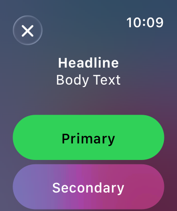
Use a toolbar to place buttons in the corners. The system automatically moves the time and title to accommodate toolbar buttons. The system also applies the Liquid Glass appearance to toolbar buttons, providing a clear visual distinction from the content beneath them.
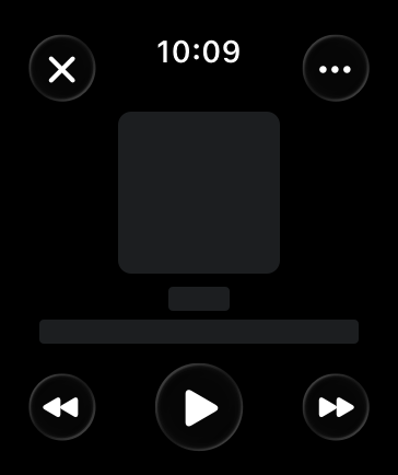
Prefer buttons that span the width of the screen for primary actions in your app. Full-width buttons look better and are easier for people to tap. If two buttons must share the same horizontal space, use the same height for both, and use images or short text titles for each button’s content.
Use toolbar buttons to provide either navigation to related areas or contextual actions for the view’s content. These buttons provide access to additional information or secondary actions for the view’s content.
Use the same height for vertical stacks of one- and two-line text buttons. As much as possible, use identical button heights for visual consistency.
Resources
Related
Developer documentation
Button — SwiftUI
UIButton — UIKit
NSButton — AppKit
Change log
| Date | Changes |
|---|---|
| December 16, 2025 | Updated guidance for Liquid Glass. |
| June 9, 2025 | Updated guidance for button styles and content. |
| February 2, 2024 | Noted that visionOS buttons don’t support custom hover effects. |
| December 5, 2023 | Clarified some terminology and guidance for buttons in visionOS. |
| June 21, 2023 | Updated to include guidance for visionOS. |
| June 5, 2023 | Updated guidance for using buttons in watchOS. |
---
Extracted from Apple DocC JSON by apple-skills tooling. This is unofficial content. All Human Interface Guidelines belong to Apple Inc.
Buttons videos
Source: https://developer.apple.com/design/human-interface-guidelines/buttons
Video links extracted from the Apple DocC page. These are kept out of the main doc to avoid bloating default agent context.
- A recording showing the top portion of a window in visionOS. The window contains several buttons, including a 'More' button, which receives the hover effect. The button is selected and a menu containing additional options appears. Poster: Poster image Alt: A recording showing the top portion of a window in visionOS. The window contains several buttons, including a 'More' button, which receives the hover effect. The button is selected and a menu containing additional options appears.
- An animation showing a tooltip appearing beneath a visionOS button. Poster: Poster image Alt: An animation showing a tooltip appearing beneath a visionOS button.
Navigation: Human Interface Guidelines
article
Designing for iOS
People depend on their iPhone to help them stay connected, play games, view media, accomplish tasks, and track personal data in any location and while on the go.
As you begin designing your app or game for iOS, start by understanding the following fundamental device characteristics and patterns that distinguish the iOS experience. Using these characteristics and patterns to inform your design decisions can help you provide an app or game that iPhone users appreciate.
Display. iPhone has a medium-size, high-resolution display.
Ergonomics. People generally hold their iPhone in one or both hands as they interact with it, switching between landscape and portrait orientations as needed. While people are interacting with the device, their viewing distance tends to be no more than a foot or two.
Inputs. Multi-Touch gestures, virtual keyboards, and voice control let people perform actions and accomplish meaningful tasks while they’re on the go. In addition, people often want apps to use their personal data and input from the device’s gyroscope and accelerometer, and they may also want to participate in spatial interactions.
App interactions. Sometimes, people spend just a minute or two checking on event or social media updates, tracking data, or sending messages. At other times, people can spend an hour or more browsing the web, playing games, or enjoying media. People typically have multiple apps open at the same time, and they appreciate switching frequently among them.
System features. iOS provides several features that help people interact with the system and their apps in familiar, consistent ways.
Best practices
Great iPhone experiences integrate the platform and device capabilities that people value most. To help your design feel at home in iOS, prioritize the following ways to incorporate these features and capabilities.
- Help people concentrate on primary tasks and content by limiting the number of onscreen controls while making secondary details and actions discoverable with minimal interaction.
- Adapt seamlessly to appearance changes — like device orientation, Dark Mode, and Dynamic Type — letting people choose the configurations that work best for them.
- Support interactions that accommodate the way people usually hold their device. For example, it tends to be easier and more comfortable for people to reach a control when it’s located in the middle or bottom area of the display, so it’s especially important let people swipe to navigate back or initiate actions in a list row.
- With people’s permission, integrate information available through platform capabilities in ways that enhance the experience without asking people to enter data. For example, you might accept payments, provide security through biometric authentication, or offer features that use the device’s location.
Resources
Related
Developer documentation
Videos
- Meet Liquid Glass - Liquid Glass unifies Apple platform design language while providing a more dynamic and expressive user experience. Get to know the design principles of Liquid Glass, explore its core optical and physical properties, and learn where to use it and why.
- Get to know the new design system - Dive deeper into the new design system to explore key changes to visual design, information architecture, and core system components. Learn how the system reshapes the relationship between interface and content, enabling you to create designs that are dynamic, harmonious, and consistent across devices, screen sizes, and input modes.
---
Extracted from Apple DocC JSON by apple-skills tooling. This is unofficial content. All Human Interface Guidelines belong to Apple Inc.
Navigation: Human Interface Guidelines
article
Feedback
Feedback helps people know what’s happening, discover what they can do next, understand the results of actions, and avoid mistakes.
Providing clear, consistent feedback as people interact with your app or game can make it feel intuitive and encourage deeper exploration. Feedback can communicate several different things, such as:
- The current status of something
- The success or failure of an important task or action
- A warning about an action that can have negative consequences
- An opportunity to correct a mistake or problematic situation
The most effective feedback tends to match the significance of the information to the way it’s delivered. For example, it often works well to display status information in a passive way so that people can view it when they need it. In contrast, a warning about possible data loss needs to interrupt people so they have a chance to avoid the problem.
Best practices
Make sure all feedback is accessible. When you use multiple ways to provide feedback, you reach more people and give them the opportunity to receive the feedback in ways that work for them. For example, when you provide feedback using color, text, sound, and haptics, people can receive it whether they silence their device, look away from the screen, or use VoiceOver. (For guidance on providing haptic feedback, see Playing haptics.)
Consider integrating status feedback into your interface. When status feedback is available near the items it describes, people get important information without having to take action or leave their current context. For example, Mail in iOS and iPadOS describes the most recent update and displays the number of unread messages in the toolbar of the mailbox screen, making the information unobtrusive but easy for people to check when they’re interested.
Use alerts to deliver critical — and ideally actionable — information. By design, alerts disrupt the current context, so you need to match the importance of the information to the level of interruption. Alerts can lose their impact if you use them too often or to deliver unimportant information. For guidance, see Alerts.
Warn people when they initiate a task that can cause data loss that’s unexpected and irreversible. In contrast, don’t warn people when data loss is the expected result of their action. For example, the Finder doesn’t warn people every time they throw away a file because deleting the file is the expected result.
When it makes sense, confirm that a significant action or task has completed. For example, people appreciate getting feedback that confirms a successful Apple Pay transaction. It’s generally best to reserve this type of confirmation for activities that are sufficiently important — because people typically expect their action or task to succeed, they only need to know when it doesn’t.
Show people when a command can’t be carried out and help them understand why. For example, if people request directions without specifying a destination, Maps tells them that it can’t provide directions to and from the same location.
Platform considerations
No additional considerations for iOS, iPadOS, macOS, tvOS, or visionOS.
watchOS
Avoid displaying an indeterminate progress indicator — such as a loading indicator — in a watchOS app. An animated indicator can make people think they need to continue paying attention to the display, which isn’t a good user experience. To provide a better experience, reassure people that they’ll receive a notification when the process completes.
Resources
Related
Developer documentation
Animation and haptics — UIKit
Videos
- Designing Fluid Interfaces - Discover the techniques used to create the fluid gestural interface of iPhone X. Learn how to design with gestures and motion that feel intuitive and natural, making your app a delight to use.
- Essential Design Principles - Design principles are the key to understanding how design serves human needs for safety, meaning, achievement and beauty. Learn what these principles are and how they can help you design more welcoming, understandable, empowering and gratifying user experiences.
---
Extracted from Apple DocC JSON by apple-skills tooling. This is unofficial content. All Human Interface Guidelines belong to Apple Inc.
Navigation: Human Interface Guidelines
article
Home Screen quick actions
Home Screen quick actions give people a way to perform app-specific actions from the Home Screen.
People can get a menu of available quick actions when they touch and hold an app icon (on a 3D Touch device, people can press on the icon with increased pressure to see the menu). For example, Mail includes quick actions that open the Inbox or the VIP mailbox, initiate a search, and create a new message. In addition to app-specific actions, a Home Screen quick action menu also lists items for removing the app and editing the Home Screen.
Each Home Screen quick action includes a title, an interface icon on the left or right (depending on your app’s position on the Home Screen), and an optional subtitle. The title and subtitle are always left-aligned in left-to-right languages. Your app can even dynamically update its quick actions when new information is available. For example, Messages provides quick actions for opening your most recent conversations.
Best practices
Create quick actions for compelling, high-value tasks. For example, Maps lets people search near their current location or get directions home without first opening the Maps app. People tend to expect every app to provide at least one useful quick action; you can provide a total of four.
Avoid making unpredictable changes to quick actions. Dynamic quick actions are a great way to keep actions relevant. For example, it may make sense to update quick actions based on the current location or recent activities in your app, time of day, or changes in settings. Make sure that actions change in ways that people can predict.
For each quick action, provide a succinct title that instantly communicates the results of the action. For example, titles like “Directions Home,” “Create New Contact,” and “New Message” can help people understand what happens when they choose the action. If you need to give more context, provide a subtitle too. Mail uses subtitles to indicate whether there are unread messages in the Inbox and VIP folder. Don’t include your app name or any extraneous information in the title or subtitle, keep the text short to avoid truncation, and take localization into account as you write the text.
Provide a familiar interface icon for each quick action. Prefer using SF Symbols to represent actions. For a list of icons that represent common actions, see Standard icons; for additional guidance, see Menus.
If you design your own interface icon, use the Quick Action Icon Template that’s included with Apple Design Resources for iOS and iPadOS.
Don’t use an emoji in place of a symbol or interface icon. Emojis are full color, whereas quick action symbols are monochromatic and change appearance in Dark Mode to maintain contrast.
Platform considerations
No additional considerations for iOS or iPadOS. Not supported in macOS, tvOS, visionOS, or watchOS.
Resources
Related
Developer documentation
Add Home Screen quick actions — UIKit
---
Extracted from Apple DocC JSON by apple-skills tooling. This is unofficial content. All Human Interface Guidelines belong to Apple Inc.
Materials videos
Source: https://developer.apple.com/design/human-interface-guidelines/materials
Video links extracted from the Apple DocC page. These are kept out of the main doc to avoid bloating default agent context.
- A recording of the Music app window in visionOS. The window uses the glass material and adapts as the viewing angle and lighting change. Poster: Poster image Alt: A recording of the Music app window in visionOS. The window uses the glass material and adapts as the viewing angle and lighting change.
Scroll views videos
Source: https://developer.apple.com/design/human-interface-guidelines/scroll-views
Video links extracted from the Apple DocC page. These are kept out of the main doc to avoid bloating default agent context.
- A recording showing a scroll indicator on a long page in the Notes app. As the viewer drags the page quickly, the indicator shows tick marks that match the scrolling speed. Poster: Poster image Alt: A recording showing a scroll indicator on a long page in the Notes app. As the viewer drags the page quickly, the indicator shows tick marks that match the scrolling speed.
Sheets videos
Source: https://developer.apple.com/design/human-interface-guidelines/sheets
Video links extracted from the Apple DocC page. These are kept out of the main doc to avoid bloating default agent context.
- A recording showing a sheet opening above a blank window in visionOS. Poster: Poster image Alt: A recording showing a sheet opening above a blank window in visionOS.
Tab bars videos
Source: https://developer.apple.com/design/human-interface-guidelines/tab-bars
Video links extracted from the Apple DocC page. These are kept out of the main doc to avoid bloating default agent context.
- A recording showing a closeup of a tab bar along the side of an app's window in visionOS. The tab bar includes only symbols. The currently selected tab receives the hover effect, showing that someone is looking at it, and the bar expands to display both symbols and labels. Poster: Poster image Alt: A recording showing a closeup of a tab bar along the side of an app's window in visionOS. The tab bar includes only symbols. The currently selected tab receives the hover effect, showing that someone is looking at it, and the bar expands to display both symbols and labels.
Related skills
 Frontend DesignGenerate distinctive, production-grade frontend interfaces and components that avoid generic AI aesthetics.716k165k
 Web Design GuidelinesAutomatically audit frontend code against the latest Vercel Web Interface Guidelines for consistency, accessibility, and UX quality.498k29.6k
 Lark WhiteboardGenerate valid Lark Whiteboard (Feishu Board) documents with correctly placed connectors, automatic routing, and proper schema compliance directly from agent inst389k16k
 Sleek Design Mobile AppsGenerate mobile app screens and UI from plain English descriptions using the Sleek.design API.315k476
 Design Taste FrontendOverride generic LLM frontend output with intentional, metric-driven UI/UX taste.301k69.4k
 Ui Ux Pro MaxGet instant, high-quality UI/UX decisions, component recommendations, style guidance, and code improvements across web and mobile projects.290k112k
How it compares
Use hig for Apple-native HIG compliance instead of generic web design or Material Design skills.
FAQ
Which platforms does hig cover?
hig applies Apple Human Interface Guidelines to iOS, iPadOS, macOS, and watchOS, helping developers design native navigation, controls, typography, and interaction patterns for SwiftUI and UIKit implementations.
When should I invoke hig?
Invoke hig during frontend build when designing or coding Apple platform screens, before App Store review, so navigation, controls, spacing, and accessibility follow documented Human Interface Guidelines.