
Ios Liquid Glass
- 438 installs
- 297 repo stars
- Updated August 4, 2026
- vabole/apple-skills
ios-liquid-glass is a Claude Code skill that guides Apple Liquid Glass material implementation so iOS developers who adopt system-adaptive depth and motion can build legible SwiftUI and UIKit interfaces on current releas
About
ios-liquid-glass is an agent skill from vabole/apple-skills focused on Apple's Liquid Glass design language—materials, depth layers, and motion that adapt to system context. Developers use it when implementing glass-like surfaces in SwiftUI or UIKit while preserving text legibility, frame performance, and accessibility on modern iOS versions. The skill emphasizes system-adaptive behavior so custom chrome respects platform conventions instead of static blur overlays. Reach for it when redesigning navigation bars, sheets, or controls to match current Apple HIG glass treatments without regressing scroll performance or contrast.
- Maps Liquid Glass layers to SwiftUI and UIKit APIs
- Handles vibrancy, blur, and depth without harming contrast
- Respects Reduce Transparency and accessibility settings
- Coordinates motion with system animation curves
- Keeps navigation bars and sheets visually consistent
Ios Liquid Glass by the numbers
- 438 all-time installs (skills.sh)
- +16 installs in the week ending Aug 5, 2026 (Skillselion tracking)
- Ranked #647 of 1,880 Design & UI/UX skills by installs in the Skillselion catalog
- Data as of Aug 5, 2026 (Skillselion catalog sync)
npx skills add https://github.com/vabole/apple-skills --skill ios-liquid-glassAdd your badge
Show developers this skill is listed on Skillselion. Paste this into your README.

| Installs | 438 |
|---|---|
| repo stars | ★ 297 |
| Last updated | August 4, 2026 |
| Repository | vabole/apple-skills ↗ |
How do you implement Liquid Glass in SwiftUI?
Implement Apple Liquid Glass materials, depth, and motion in SwiftUI/UIKit while keeping legibility, performance, and system-adaptive behavior on modern iOS releases.
Who is it for?
iOS developers updating apps to Apple's Liquid Glass HIG patterns in SwiftUI or UIKit on recent iOS releases.
Skip if: Cross-platform React Native or Flutter teams that cannot adopt native Apple material APIs directly.
When should I use this skill?
User asks to add Liquid Glass effects, glass materials, or system-adaptive depth and motion on iOS.
What you get
SwiftUI or UIKit views using Liquid Glass materials with depth, motion, and legibility-safe styling on modern iOS.
- glass-styled SwiftUI views
- UIKit material configurations
- performance-aware layout guidance
Files
iOS Liquid Glass Design
Create distinctive, Apple Design Award-worthy iOS applications using the Liquid Glass design system. This skill pushes beyond generic implementations toward memorable, polished interfaces that feel genuinely designed—not AI-generated.
When to Use
- Building new iOS screens, views, or components
- Implementing navigation (tabs, toolbars, sheets)
- Designing with Liquid Glass materials
- Creating app icons with Icon Composer
- Any SwiftUI/UIKit work targeting iOS 26+
Design Philosophy: Elevated, Not Average
Before writing code, commit to a distinctive aesthetic direction:
1. Purpose: What problem does this interface solve? Who uses it? 2. Tone: What feeling should it evoke? (calm, playful, premium, editorial, utilitarian, bold) 3. Inspiration: Which Apple apps set the bar? (Notes, Weather, Health, Fitness, Apple TV) 4. Differentiation: What makes this memorable? What's the "one thing" users will notice? 5. Glass Philosophy: Is glass framing content or competing with it?
The Three Principles
| Principle | Description |
|---|---|
| Hierarchy | Controls float above content. Glass frames, never obscures. Content is king. |
| Harmony | Software design aligns with hardware. Concentric corners. Fluid gestures. |
| Consistency | Adapt fluidly across iPhone, iPad, Mac. Same identity, contextual expression. |
Anti-Patterns: What to Avoid
These are hallmarks of generic AI-generated iOS design:
- Boring solid backgrounds with no depth or atmosphere
- System fonts everywhere without typographic intention
- Cookie-cutter tab bars with no personality or purpose
- Purple/indigo gradients on white—the quintessential AI slop
- Flat, lifeless interactions without haptics or animation
- Glass on everything instead of intentional placement
- Ignoring the content layer by applying glass where it doesn't belong
- Generic card layouts without context-specific design
- Accessibility as afterthought instead of built-in from day one
Liquid Glass Core API
Basic Glass Effect
import SwiftUI

// Simple glass application
Text("Action")
    .padding()
    .glassEffect() // .regular variant, .capsule shape

// With explicit parameters
Button("Confirm") { }
    .padding()
    .glassEffect(.regular, in: RoundedRectangle(cornerRadius: 12), isEnabled: true)
Glass Variants
| Variant | Use Case |
|---|---|
.regular | Toolbars, nav bars, tab bars, standard controls |
.clear | Floating controls over media (photos, maps, video) |
.identity | Conditional disable: glassEffect(isActive ? .regular : .identity) |
Glass Modifiers
// Semantic tinting (for primary actions only)
.glassEffect(.regular.tint(.accentColor))

// Interactive behaviors (scaling, shimmer, touch illumination)
.glassEffect(.regular.interactive())

// Combined
.glassEffect(.regular.tint(.blue).interactive())
Custom Shapes
// Standard shapes
.glassEffect(.regular, in: .capsule)
.glassEffect(.regular, in: .circle)
.glassEffect(.regular, in: RoundedRectangle(cornerRadius: 16))

// Container-concentric (matches device/container corners)
.glassEffect(.regular, in: .rect(cornerRadius: .containerConcentric))
GlassEffectContainer & Morphing
Container Setup
Glass cannot sample other glass. Use containers for multiple glass elements:
GlassEffectContainer(spacing: 30) {
    HStack(spacing: 20) {
        ForEach(actions) { action in
            Button(action.title, systemImage: action.icon) { }
                .frame(width: 44, height: 44)
                .glassEffect(.regular.interactive())
        }
    }
}
Morphing Transitions
struct ExpandableActions: View {
    @State private var isExpanded = false
    @Namespace private var namespace

    var body: some View {
        GlassEffectContainer(spacing: 30) {
            VStack(spacing: 30) {
                if isExpanded {
                    ActionButton(icon: "rotate.right")
                        .glassEffectID("rotate", in: namespace)
                }

                HStack(spacing: 30) {
                    if isExpanded {
                        ActionButton(icon: "slider.horizontal.3")
                            .glassEffectID("adjust", in: namespace)
                    }

                    Button {
                        withAnimation(.bouncy) { isExpanded.toggle() }
                    } label: {
                        Image(systemName: isExpanded ? "xmark" : "plus")
                            .frame(width: 56, height: 56)
                    }
                    .glassEffect(.regular.tint(.accentColor).interactive())
                    .glassEffectID("toggle", in: namespace)

                    if isExpanded {
                        ActionButton(icon: "crop")
                            .glassEffectID("crop", in: namespace)
                    }
                }

                if isExpanded {
                    ActionButton(icon: "wand.and.stars")
                        .glassEffectID("enhance", in: namespace)
                }
            }
        }
    }
}
Navigation Patterns
Tab Bar (Floating)
TabView {
    Tab("Home", systemImage: "house") {
        HomeView()
    }

    Tab("Search", systemImage: "magnifyingglass") {
        SearchView()
    }

    Tab("Profile", systemImage: "person") {
        ProfileView()
    }
}
// Tab bar now floats, reacts to background, collapses on scroll
Toolbar with Grouping
.toolbar {
    ToolbarItemGroup(placement: .topBarTrailing) {
        Button("Edit", systemImage: "pencil") { }
        Button("Share", systemImage: "square.and.arrow.up") { }
    }

    ToolbarSpacer(.flexible, placement: .topBarTrailing)

    ToolbarItem(placement: .topBarTrailing) {
        Button("Done", systemImage: "checkmark") { }
            .tint(.accentColor)
    }
}
Sheets with Morphing
struct ContentView: View {
    @State private var showSettings = false
    @Namespace private var namespace

    var body: some View {
        NavigationStack {
            ContentView()
                .toolbar {
                    ToolbarItem(placement: .topBarTrailing) {
                        Button("Settings", systemImage: "gear") {
                            showSettings = true
                        }
                        .matchedTransitionSource(id: "settings", in: namespace)
                    }
                }
                .sheet(isPresented: $showSettings) {
                    SettingsView()
                        .navigationTransition(.zoom(sourceID: "settings", in: namespace))
                        .presentationDetents([.medium, .large])
                }
        }
    }
}
Typography That Speaks
Don't default to system fonts everywhere. Create typographic hierarchy:
// Display fonts for headers
Text("Dashboard")
    .font(.largeTitle.bold())
    .foregroundStyle(.primary)

// Secondary information
Text("Last updated 5 min ago")
    .font(.subheadline)
    .foregroundStyle(.secondary)

// Consider custom fonts for brand identity
Text("Premium")
    .font(.custom("PlayfairDisplay-Bold", size: 32))
Font Recommendations
| Use Case | Options |
|---|---|
| Display | SF Pro Display, New York, custom serif |
| Body | SF Pro Text (system), custom sans |
| Technical | SF Mono, custom monospace |
| Editorial | New York, custom serif with character |
Color with Intention
System Integration
// Semantic colors that adapt
.foregroundStyle(.primary)
.foregroundStyle(.secondary)
.background(.background)

// Accent with purpose
.tint(.accentColor)
Dominant + Accent
Don't distribute color evenly. Choose:
- One dominant that defines the brand/mood
- Sharp accents for actions and highlights
- Neutral base for content readability
Dark Mode First
Dark mode often produces more distinctive results. Design dark, then adapt to light.
Animation Philosophy
Bouncy is the New Default
withAnimation(.bouncy) {
    isExpanded.toggle()
}

// With parameters
withAnimation(.bouncy(duration: 0.5, extraBounce: 0.2)) {
    state = newState
}
Key Animation Moments
| Moment | Treatment |
|---|---|
| Button press | Scale to 0.95, spring back |
| State change | Morph, don't swap |
| List appear | Staggered fade-in |
| Sheet present | Zoom from source |
| Error | Shake with haptic |
SF Symbols Draw Animations
Image(systemName: "checkmark.circle")
    .symbolEffect(.drawOn, value: isComplete)

Image(systemName: "heart.fill")
    .symbolEffect(.bounce, value: isFavorite)
Haptics: The Invisible Polish
import UIKit

// Impact feedback
let generator = UIImpactFeedbackGenerator(style: .medium)
generator.impactOccurred()

// Selection feedback
let selection = UISelectionFeedbackGenerator()
selection.selectionChanged()

// Success/error
let notification = UINotificationFeedbackGenerator()
notification.notificationOccurred(.success)
When to Use Haptics
- Button presses (light impact)
- Toggle changes (selection changed)
- Pull to refresh (light impact)
- Error states (error notification)
- Success confirmations (success notification)
- Slider thumb movement (selection changed)
Accessibility: Built-In, Not Bolt-On
Automatic Glass Adaptations
Glass automatically adapts to:
- Reduce Transparency: More frosting
- Increase Contrast: Stark borders
- Reduce Motion: Tones down animation
Manual Checks
@Environment(\.accessibilityReduceTransparency) var reduceTransparency
@Environment(\.accessibilityReduceMotion) var reduceMotion

var animation: Animation? {
    reduceMotion ? nil : .bouncy
}
Essentials
- Minimum 44x44pt touch targets
- Clear accessibility labels
- Dynamic Type support
- VoiceOver testing
Quality Checklist
Before considering UI complete:
- [ ] Glass applied only to navigation layer (not content)
- [ ] Haptics on all meaningful interactions
- [ ] Spring/bouncy animations (not linear)
- [ ] SF Symbols (not emojis or random icons)
- [ ] Dark mode tested and polished
- [ ] Typography hierarchy clear and intentional
- [ ] Colors are purposeful, not default blue
- [ ] Morphing transitions where applicable
- [ ] Loading states animated
- [ ] Empty states designed
- [ ] Error states helpful and styled
- [ ] Accessibility settings respected
Inspiration: Award-Winning Patterns
From 2025 Apple Design Award winners:
Delight
- Surprising interactions that reward exploration
- Meaningful animations that enhance understanding
- Playful details creating emotional connection
Innovation
- Novel use of Apple technologies
- Thoughtfully crafted yet accessible UI
- Real-time features that feel magical
Inclusivity
- VoiceOver support from day one
- Dynamic Type throughout
- Multiple input methods
Visuals
- Rich, detailed environments
- Consistent visual language
- Intentional depth and color
Reference
For official Apple documentation links, WWDC session IDs, and API quick reference tables, see reference.md.
The Mandate
Remember: The goal is an app worthy of an Apple Design Award—an app that feels genuinely designed, not generated. Every interface should have:
1. A point of view - A clear aesthetic direction 2. Intentional details - Nothing accidental 3. Emotional resonance - Users feel something 4. Technical excellence - Smooth, performant, accessible
Don't settle for "working." Push for memorable.
Navigation: Technologyoverviews
article
Adopting Liquid Glass
Find out how to bring the new material to your app.
Overview
If you have an existing app, adopting Liquid Glass doesn’t mean reinventing your app from the ground up. Start by building your app in the latest version of Xcode to see the changes. As you review your app, use the following sections to understand the scope of changes and learn how you can adopt these best practices in your interface.
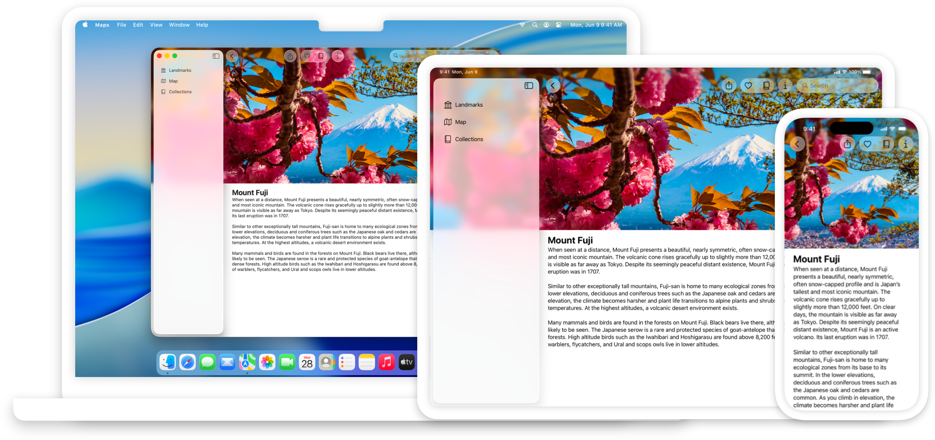
See your app with Liquid Glass
If your app uses standard components from SwiftUI, UIKit, or AppKit, your interface picks up the latest look and feel on the latest platform releases for iOS, iPadOS, macOS, tvOS, and watchOS. In Xcode, build your app with the latest SDKs, and run it on the latest platform releases to see the changes in your interface.
Visual refresh
Interfaces across Apple platforms feature a new dynamic Materials called Liquid Glass, which combines the optical properties of glass with a sense of fluidity. This material forms a distinct functional layer for controls and navigation elements. It affects how the interface looks, feels, and moves, adapting in response to a variety of factors to help bring focus to the underlying content.
Leverage system frameworks to adopt Liquid Glass automatically. In system frameworks, standard components like bars, sheets, popovers, and controls automatically adopt this material. System frameworks also dynamically adapt these components in response to factors like element overlap and focus state. Take advantage of this material with minimal code by using standard components from SwiftUI, UIKit, and AppKit.
Reduce your use of custom backgrounds in controls and navigation elements. Any custom backgrounds and appearances you use in these elements might overlay or interfere with Liquid Glass or other effects that the system provides, such as the scroll edge effect. Make sure to check any custom backgrounds in elements like split views, tab bars, and toolbars. Prefer to remove custom effects and let the system determine the background appearance, especially for the following elements:
SwiftUI
UIKit
AppKit
Test your interface with a variety of display and accessibility settings. Translucency and fluid morphing animations contribute to the look and feel of Liquid Glass, but can adapt to people’s needs. For example, people can choose a preferred look for Liquid Glass in their device’s settings, or turn on accessibility settings that reduce transparency or motion in the interface. These settings can remove or modify certain effects. If you use standard components from system frameworks, this experience adapts automatically. Ensure you test your app’s custom elements, colors, and animations with different configurations of these settings.
Avoid overusing Liquid Glass effects. If you apply Liquid Glass effects to a custom control, do so sparingly. Liquid Glass seeks to bring attention to the underlying content, and overusing this material in multiple custom controls can provide a subpar user experience by distracting from that content. Limit these effects to the most important functional elements in your app. To learn more, read Applying Liquid Glass to custom views.
SwiftUI
UIKit
AppKit
App icons
App icons take on a design that’s dynamic and expressive. Updates to the icon grid result in a standardized iconography that’s visually consistent across devices and concentric with hardware and other elements across the system. App icons now contain layers, which dynamically respond to lighting and other visual effects the system provides. iOS, iPadOS, and macOS all now offer default (light), dark, clear, and tinted appearance variants, empowering people to personalize the look and feel of their Home Screen.
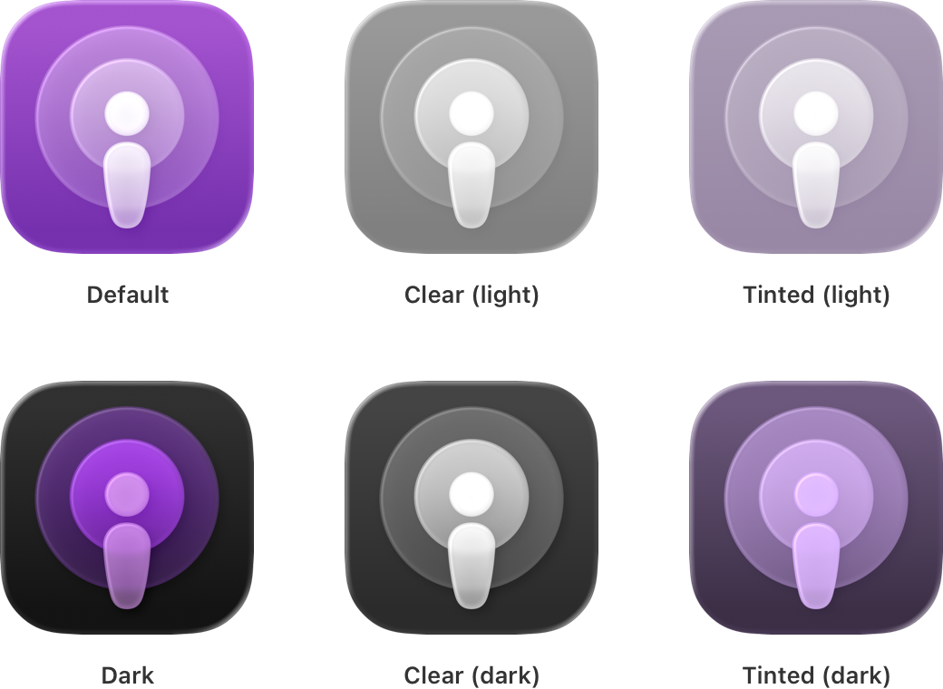
Reimagine your app icon for Liquid Glass. Apply key design principles to help your app icon shine:
- Provide a visually consistent, optically balanced design across the platforms your app supports.
- Consider a simplified design comprised of solid, filled, overlapping semi-transparent shapes.
- Let the system handle applying masking, blurring, and other visual effects, rather than factoring them into your design.


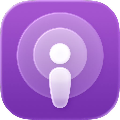
Design using layers. The system automatically applies effects like reflection, refraction, shadow, blur, and highlights to your icon layers. Determine which elements of your design make sense as foreground, middle, and background elements, then define separate layers for them. You can perform this task in the design app of your choice.
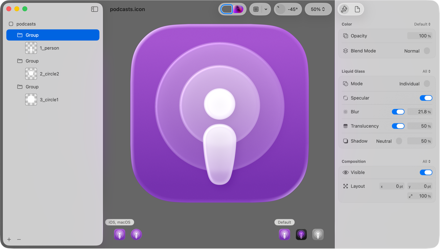
Compose and preview in Icon Composer. Drag and drop app icon layers that you export from your design app directly into the Icon Composer app. Icon Composer lets you add a background, create layer groupings, adjust layer attributes like opacity, and preview your design with system effects and appearances. Icon Composer is available in the latest version of Xcode and for download from Apple Design Resources. To learn more, read Creating your app icon using Icon Composer.
Preview against the updated grids. The system applies masking to produce your final icon shape — rounded rectangle for iOS, iPadOS, and macOS, and circular for watchOS. Keep elements centered to avoid clipping. Irregularly shaped icons receive a system-provided background. See how your app icon looks with the updated grids to determine whether you need to make adjustments. Download these grids from Apple Design Resources.
Controls
Controls have a refreshed look across platforms, and come to life when a person interacts with them. For controls like sliders and toggles, the knob transforms into Liquid Glass during interaction, and Buttons fluidly morph into menus and popovers. The shape of the hardware informs the curvature of controls, so many controls adopt rounder forms to elegantly nestle into the corners of windows and displays. Controls also feature an option for an extra-large size, allowing more space for labels and accents.
Review updates to control appearance and dimensions. If you use standard controls from system frameworks and don’t hard-code their layout metrics, your app adopts changes to shapes and sizes automatically when you rebuild your app with the latest version of Xcode. Review changes to the following controls and any others and make sure they continue to look at home with the rest of your interface:
SwiftUI
UIKit
AppKit
Review your use of color in controls. Be judicious with your use of Color in controls and navigation so they stay legible. If you do apply color to these elements, leverage system colors, or define a custom color with light and dark variants, and an increased contrast option for each variant.
Check for crowding or overlapping of controls. Prefer to use standard spacing metrics instead of overriding them, and avoid overcrowding or layering Liquid Glass elements on top of each other.
Optimize for legibility when content scrolls beneath controls. Scroll views offer a scrollEdgeEffectStyle(_:for:)) that helps maintain sufficient legibility and contrast for controls by obscuring content that scrolls beneath them. System bars like toolbars adopt this behavior by default. If you use a custom bar with elements like controls, text, or icons that have content scrolling beneath them, you can register those views to use a scroll edge effect with these APIs:
SwiftUI
safeAreaBar(edge:alignment:spacing:content:))
UIKit
UIScrollEdgeElementContainerInteraction
Consider aligning the shape of controls with other rounded elements throughout the interface. Across Apple platforms, the shape of the hardware informs the curvature, size, and shape of nested interface elements, including controls, sheets, popovers, windows, and more. Help maintain a sense of visual continuity in your interface by using rounded shapes that are concentric to their containers using these APIs:
SwiftUI
UIKit
Leverage new button styles. Instead of creating buttons with custom Liquid Glass effects, you can adopt the look and feel of the material with minimal code by using one of the following button style APIs:
SwiftUI
UIKit
AppKit
Navigation
Liquid Glass applies to the topmost layer of the interface, where you define your navigation. Key navigation elements like Tab bars and Sidebars float in this Liquid Glass layer to help people focus on the underlying content.
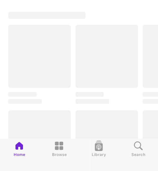
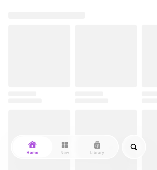
Establish a clear navigation hierarchy. It’s more important than ever for your app to have a clear and consistent navigation structure that’s distinct from the content you provide. Ensure that you clearly separate your content from navigation elements, like tab bars and sidebars, to establish a distinct functional layer above the content layer.
Consider adapting your tab bar into a sidebar automatically. If your app uses a tab-based navigation, you can allow the tab bar to adapt into a sidebar depending on the context by using the following APIs:
SwiftUI
UIKit
UITabBarController.Mode.tabSidebar
Consider using split views to build sidebar layouts with an inspector panel. Split views are optimized to create a consistent and familiar experience for sidebar and inspector layouts across platforms. You can use the following standard system APIs for split views to build these types of layouts with minimal code:
SwiftUI
inspector(isPresented:content:))
UIKit
UISplitViewController.Column.inspector
AppKit
init(inspectorWithViewController:))
Check content safe areas for sidebars and inspectors. If you have these types of components in your app’s navigation structure, audit the safe area compatibility of content next to the sidebar and inspector to help make sure underlying content is peeking through appropriately.
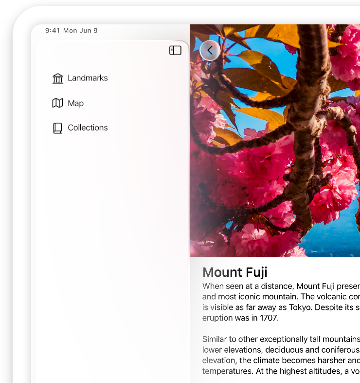
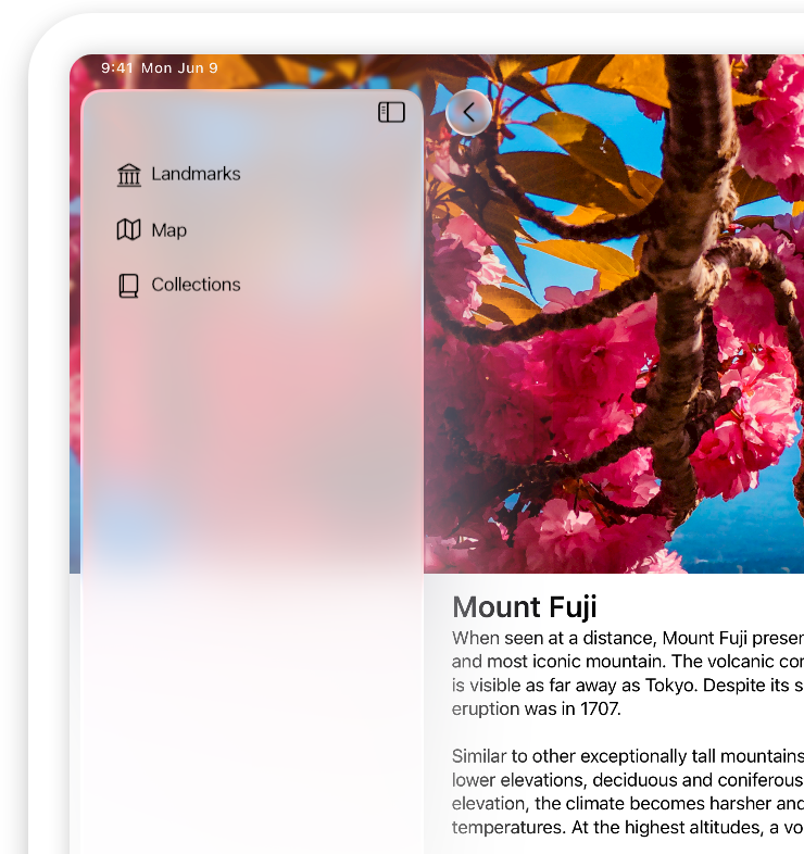
Extend content beneath sidebars and inspectors. A background extension effect creates a sense of extending a background under a sidebar or inspector, without actually scrolling or placing content under it. A background extension effect mirrors the adjacent content to give the impression of stretching it under the sidebar, and applies a blur to maintain legibility of the sidebar or inspector. This effect is perfect for creating a full, edge-to-edge content experience in apps that use split views, such as for hero images on product pages.
SwiftUI
UIKit
AppKit
Choose whether to automatically minimize your tab bar in iOS. Tab bars can help elevate the underlying content by receding when a person scrolls up or down. You can opt into this behavior and configure the tab bar to minimize when a person scrolls down or up. The tab bar expands when a person scrolls in the opposite direction.
SwiftUI
TabView {
    // ...
}
.tabBarMinimizeBehavior(.onScrollDown)
UIKit
tabBarMinimizeBehavior = .onScrollDownMenus and toolbars
Menus have a refreshed look across platforms. They adopt Liquid Glass, and menu items for common actions use icons to help people quickly scan and identify those actions. New to iPadOS, apps also have a The menu bar for faster access to common commands.
Adopt standard icons in menu items. For menu items that perform standard actions like Cut, Copy, and Paste, the system uses the menu item’s selector to determine which icon to apply. To adopt icons in those menu items with minimal code, make sure to use standard selectors.
Match top menu actions to swipe actions. For consistency and predictability, make sure the actions you surface at the top of your contextual menu match the swipe actions you provide for the same item.
Toolbars take on a Liquid Glass appearance, and provide a grouping mechanism for toolbar items, letting you choose which actions to display together.
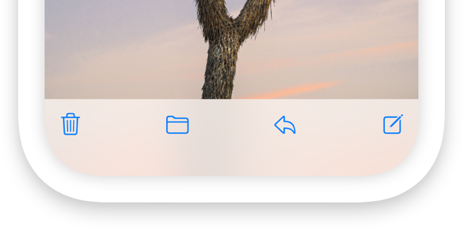
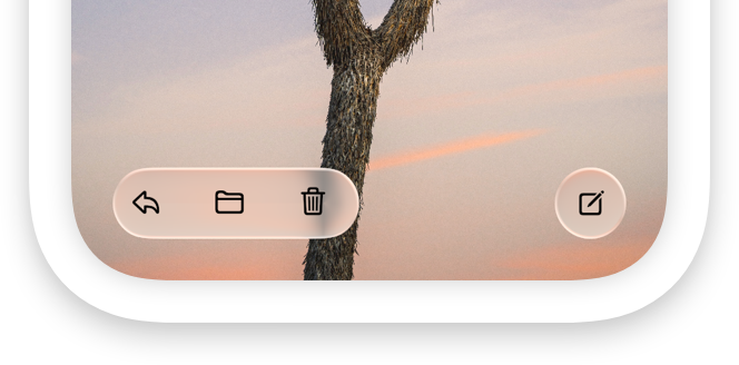
Determine which toolbar items to group together. Group items that perform similar actions or affect the same part of the interface, and maintain consistent groupings and placement across platforms.
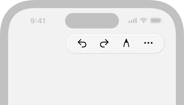
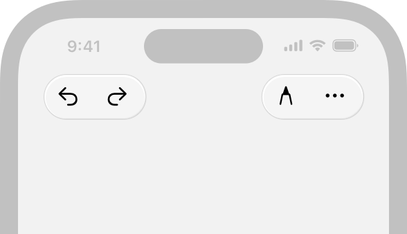
You can create a fixed spacer to separate items that share a background using these APIs:
SwiftUI
UIKit
AppKit
Find icons to represent common actions. Consider representing common actions in toolbars with Icons instead of text. This approach helps declutter the interface and increase the ease of use for common actions. For consistency, don’t mix text and icons across items that share a background.
Provide an accessibility label for every icon. Regardless of what you show in the interface, always specify an accessibility label for each icon. This way, people who prefer a text label can opt into this information by turning on accessibility features like VoiceOver or Voice Control.
Audit toolbar customizations. Review anything custom you do to display items in your toolbars, like your use of fixed spacers or custom items, as these can appear inconsistent with system behavior.
Check how you hide toolbar items. If you see an empty toolbar item without any content, your app might be hiding the view in the toolbar item instead of the item itself. Instead, hide the entire toolbar item, using these APIs:
SwiftUI
UIKit
AppKit
Windows and modals
Windows adopt rounder corners to fit controls and navigation elements. In iPadOS, apps show window controls and support continuous window resizing. Instead of transitioning between specific preset sizes, windows resize fluidly down to a minimum size.
Support arbitrary window sizes. Allow people to resize their window to the width and height that works for them, and adjust your content accordingly.
Use split views to allow fluid resizing of columns. To support continuous window resizing, split views automatically reflow content for every size using beautiful, fluid transitions. Make sure to use standard system APIs for split views to get these animations with minimal code:
SwiftUI
UIKit
AppKit
Use layout guides and safe areas. Make sure you specify safe areas for your content so the system can automatically adjust the window controls and title bar in relation to your content.
Modal views like sheets and action sheets adopt Liquid Glass. Sheets feature an increased corner radius, and half sheets are inset from the edge of the display to allow content to peek through from beneath them. When a half sheet expands to full height, it transitions to a more opaque appearance to help maintain focus on the task.
Check the content around the edges of sheets. Inside the sheet, check for content and controls that might appear too close to rounder sheet corners. Outside the sheet, check that any content peeking through between the inset sheet and display edge looks as you expect.
Audit the backgrounds of sheets and popovers. Check whether you add a visual effect view to your popover’s content view, and remove those custom background views to provide a consistent experience with other sheets across the system.
An Action sheets originates from the element that initiates the action, instead of from the bottom edge of the display. When active, an action sheet also lets people interact with other parts of the interface.
Specify the source of an action sheet. Position an action sheet’s anchor next to the control it originates from. Make sure to set the source view or item to indicate where to originate the action sheet and create the inline appearance.
SwiftUI
confirmationDialog(_:isPresented:titleVisibility:presenting:actions:)-9ibgk)
UIKit
AppKit
beginSheetModal(for:completionHandler:))
Organization and layout
Style updates to Lists and tables help you organize and showcase your content so it can shine through the Liquid Glass layer. To give content room to breathe, organizational components like lists, tables, and forms have a larger row height and padding. Sections have an increased corner radius to match the curvature of controls across the system.
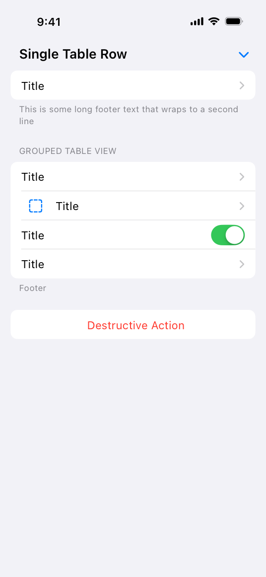
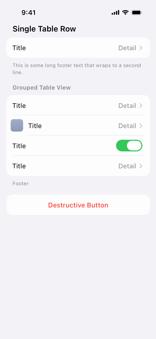
Check capitalization in section headers. Lists, tables, and forms optimize for legibility by adopting title-style capitalization for init(content:header:)). This means section headers no longer render entirely in capital letters regardless of the capitalization you provide. Make sure to update your section headers to title-style capitalization to match your app’s text to this systemwide convention.
Adopt forms to take advantage of layout metrics across platform. Use SwiftUI forms with the grouped to automatically update your form layouts.
Search
Platform conventions for location and behavior of search optimize the experience for each device and use case. To provide an engaging search experience in your app, review these Search fields design conventions.
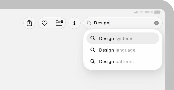
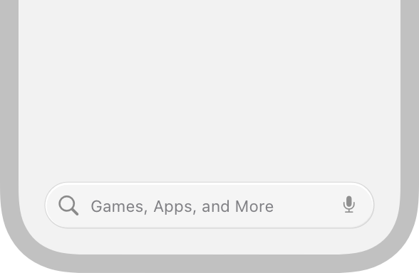
Check the keyboard layout when activating your search interface. In iOS, when a person taps a search field to give it focus, it slides upwards as the keyboard appears. Test this experience in your app to make sure the search field moves consistently with other apps and system experiences.
Use semantic search tabs. If your app’s search appears as part of a tab bar, make sure to use the standard system APIs for indicating which tab is the search tab. The system automatically separates the search tab from other tabs and places it at the trailing end to make your search experience consistent with other apps and help people find content faster.
SwiftUI
Tab(role: .search) {
    // ...
}
UIKit
UISearchTab { _ in
    // ...
}
Platform considerations
Liquid Glass can have a distinct appearance and behavior across different platforms, contexts, and input methods. Test your app across devices to understand how the material looks and feels across platforms.
In watchOS, adopt standard button styles and toolbar APIs. Liquid Glass changes are minimal in watchOS, so they appear automatically when you open your app on the latest release even if you don’t build against the latest SDK. However, to make sure your app picks up this appearance, adopt standard toolbar APIs and button styles from watchOS 10.
In tvOS, adopt standard focus APIs. Across apps and system experiences in tvOS, standard buttons and controls take on a Liquid Glass appearance when focus moves to them. For consistency with the system experience, consider applying these effects to custom controls in your app when they gain focus by adopting the standard focus APIs. Apple TV 4K (2nd generation) and newer models support Liquid Glass effects. On older devices, your app maintains its current appearance.
SwiftUI
UIKit
Combine custom Liquid Glass effects to improve rendering performance. If you apply these effects to custom elements, make sure to combine them using a GlassEffectContainer, which helps optimize performance while fluidly morphing Liquid Glass shapes into each other.
Performance test your app across platforms. It’s a good idea to regularly assess and improve your app’s performance, and building your app with the latest SDKs provides an opportunity to check in. Profile your app to gather information about its current performance and find any opportunities for improving the user experience. To learn more, read Improving your app’s performance.
To update and ship your app with the latest SDKs while keeping your app as it looks when built against previous versions of the SDKs, you can add the UIDesignRequiresCompatibility key to your project’s Info pane.
---
Extracted from Apple DocC JSON by apple-skills tooling. This is unofficial content. All documentation belongs to Apple Inc.
Adopting Liquid Glass videos
Source: https://developer.apple.com/documentation/technologyoverviews/adopting-liquid-glass
Video links extracted from the Apple DocC page. These are kept out of the main doc to avoid bloating default agent context.
- Slider Poster: Poster image Alt: A video showing a slider as its value changes during interaction.
- Segmented control Poster: Poster image Alt: A video showing a segmented control as its selection changes during interaction between two segments: For You and Library.
Navigation: SwiftUI
Article
Applying Liquid Glass to custom views
Configure, combine, and morph views using Liquid Glass effects.
Overview
Interfaces across Apple platforms feature a new dynamic material called Liquid Glass, which combines the optical properties of glass with a sense of fluidity. Liquid Glass is a material that blurs content behind it, reflects color and light of surrounding content, and reacts to touch and pointer interactions in real time. Standard components in SwiftUI use Liquid Glass. Adopt Liquid Glass on custom components to move, combine, and morph them into one another with unique animations and transitions.
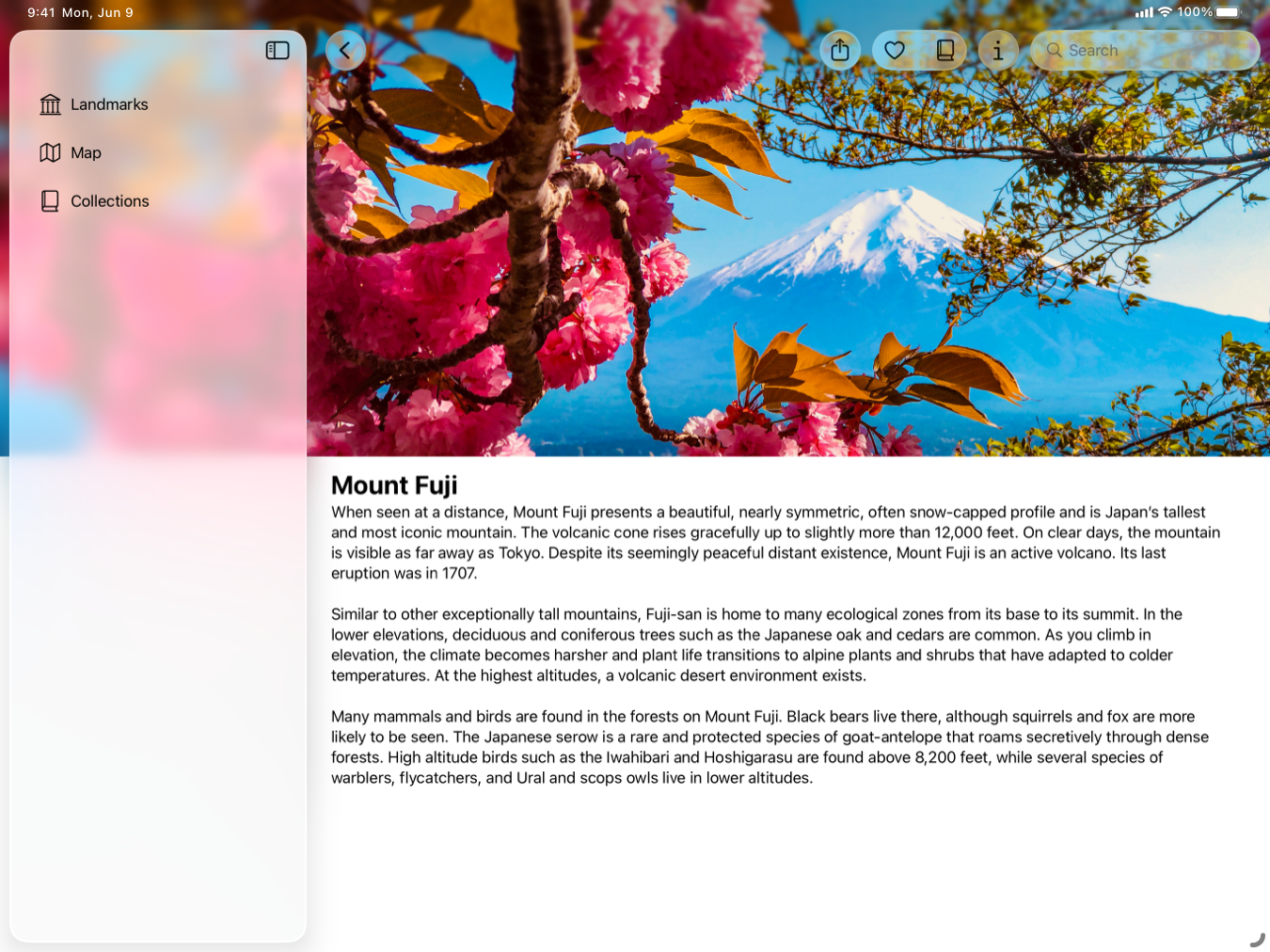
To learn about Liquid Glass and more, see Landmarks: Building an app with Liquid Glass.
Apply and configure Liquid Glass effects
Use the glassEffect(_:in:)) modifier to add Liquid Glass effects to a view. By default, the modifier uses the regular variant of Glass and applies the given effect within a Capsule shape behind the view’s content.
Configure the effect to customize your components in a variety of ways:
- Use different shapes to have a consistent look and feel across custom components in your app. For example, use a rounded rectangle if you’re applying the effect to larger components that would look odd as a
Capsuleor Circle. - Assign a tint color to suggest prominence.
- Add interactive(_:)) to custom components to make them react to touch and pointer interactions. This applies the same responsive and fluid reactions that glass provides to standard buttons.
In the examples below, observe how to apply Liquid Glass effects to a view, use an alternate shape with a specific corner radius, and create a tinted view that responds to interactivity:
Text("Hello, World!")
    .font(.title)
    .padding()
    .glassEffect()

Text("Hello, World!")
    .font(.title)
    .padding()
    .glassEffect(in: .rect(cornerRadius: 16.0))

Text("Hello, World!")
    .font(.title)
    .padding()
    .glassEffect(.regular.tint(.orange).interactive())
Combine multiple views with Liquid Glass containers
Use GlassEffectContainer when applying Liquid Glass effects on multiple views to achieve the best rendering performance. A container also allows views with Liquid Glass effects to blend their shapes together and to morph in and out of each other during transitions. Inside a container, each view with the glassEffect(_:in:)) modifier renders with the effects behind it.
Customize the spacing on the container to control how the Liquid Glass effects behind views interact with one another. The larger the spacing value on the container, the sooner the Liquid Glass effects behind views blend together and merge the shapes during a transition. A spacing value on the container that’s larger than the spacing of an interior HStack, VStack, or other layout container causes Liquid Glass effects to blend together at rest because the views are too close to each other. Animating views in or out causes the shapes to morph apart or together as the space in the container changes.
The glassEffect(_:in:) modifier captures the content to send to the container to render. Apply the glassEffect(_:in:) modifier after other modifiers that affect the appearance of the view.
In the example below, two images are placed close to each other and the Liquid Glass effects begin to blend their shapes together. This creates a fluid animation as components move around each other within a container:
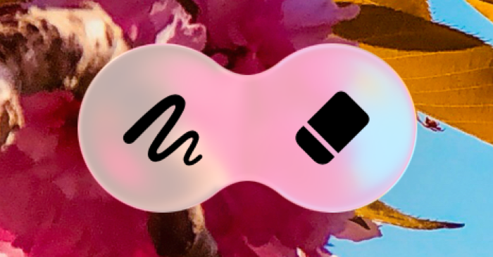
GlassEffectContainer(spacing: 40.0) {
    HStack(spacing: 40.0) {
        Image(systemName: "scribble.variable")
            .frame(width: 80.0, height: 80.0)
            .font(.system(size: 36))
            .glassEffect()

        Image(systemName: "eraser.fill")
            .frame(width: 80.0, height: 80.0)
            .font(.system(size: 36))
            .glassEffect()

            // An `offset` shows how Liquid Glass effects react to each other in a container.
            // Use animations and components appearing and disappearing to obtain effects that look purposeful.
            .offset(x: -40.0, y: 0.0)
    }
}
In some cases, you want the geometries of multiple views to contribute to a single Liquid Glass effect capsule, even when your content is at rest. Use the glassEffectUnion(id:namespace:)) modifier to specify that a view contributes to a unified effect with a particular ID. This combines all effects with a similar shape, Liquid Glass effect, and ID into a single shape with the applied Liquid Glass material. This is especially useful when creating views dynamically, or with views that live outside of a layout container, like an HStack or VStack.
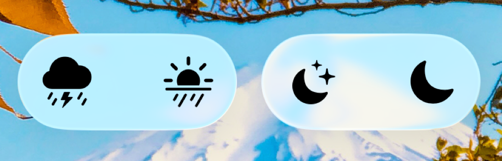
let symbolSet: [String] = ["cloud.bolt.rain.fill", "sun.rain.fill", "moon.stars.fill", "moon.fill"]

GlassEffectContainer(spacing: 20.0) {
    HStack(spacing: 20.0) {
        ForEach(symbolSet.indices, id: \.self) { item in
            Image(systemName: symbolSet[item])
                .frame(width: 80.0, height: 80.0)
                .font(.system(size: 36))
                .glassEffect()
                .glassEffectUnion(id: item < 2 ? "1" : "2", namespace: namespace)
        }
    }
}
Morph Liquid Glass effects during transitions
Morphing effects occur during transitions or animations between views with Liquid Glass effects. Coordinate transitions between views with effects in a container by using the glassEffectID(_:in:)) modifier. GlassEffectTransition allows you to specify the type of transition to use when you want to add or remove effects within a container. For effects you want to add or remove that are positioned within the container’s assigned spacing, the default transition type is matchedGeometry.
If you prefer to have a simpler transition or to create a custom transition, use the materialize transition and withAnimation(_:_:)). Use the materialize transition for effects you want to add or remove that are farther from each other than the container’s assigned spacing. To provide people with a consistent experience, use matchedGeometry and materialize transitions across your apps. The system applies more than opacity changes with the available transition types.
Associate each Liquid Glass effect with a unique identifier within a namespace that the Namespace property wrapper provides. These IDs ensure SwiftUI animates the same shapes correctly when a shape appears or disappears due to view hierarchy changes. SwiftUI uses the spacing provided to the effect container along with the geometry of the shapes themselves to determine when and which appropriate shapes to morph into and out of.
The glassEffectID(_:in:) and glassEffectTransition(_:) modifiers only affect their content during view hierarchy transitions or animations.
In the example below, the eraser image transitions into and out of the pencil image when the isExpanded variable changes. The GlassEffectContainer has a spacing value of 40.0, and the HStack within it has a spacing of 40.0. This morphs the eraser image into the pencil image when the eraser’s nearest edge is less than or equal to the container’s spacing.
@State private var isExpanded: Bool = false
@Namespace private var namespace

var body: some View {
    GlassEffectContainer(spacing: 40.0) {
        HStack(spacing: 40.0) {
            Image(systemName: "scribble.variable")
                .frame(width: 80.0, height: 80.0)
                .font(.system(size: 36))
                .glassEffect()
                .glassEffectID("pencil", in: namespace)

            if isExpanded {
                Image(systemName: "eraser.fill")
                    .frame(width: 80.0, height: 80.0)
                    .font(.system(size: 36))
                    .glassEffect()
                    .glassEffectID("eraser", in: namespace)
            }
        }
    }

    Button("Toggle") {
        withAnimation {
            isExpanded.toggle()
        }
    }
    .buttonStyle(.glass)
}
Optimize performance when using Liquid Glass effects
Creating too many Liquid Glass effect containers and applying too many effects to views outside of containers can degrade performance. Limit the use of Liquid Glass effects onscreen at the same time. Additionally, optimize how your app spends rendering time as people use it. To learn how to improve the performance of your UI, see Explore UI animation hitches and the render loop and Optimize SwiftUI performance with Instruments.
Styling views with Liquid Glass
- Landmarks: Building an app with Liquid Glass Enhance your app experience with system-provided and custom Liquid Glass.
- glassEffect(_:in:)) Applies the Liquid Glass effect to a view.
- interactive(_:)) Returns a copy of the structure configured to be interactive.
- GlassEffectContainer A view that combines multiple Liquid Glass shapes into a single shape that can morph individual shapes into one another.
- GlassEffectTransition A structure that describes changes to apply when a glass effect is added or removed from the view hierarchy.
- GlassButtonStyle A button style that applies glass border artwork based on the button’s context.
- GlassProminentButtonStyle A button style that applies prominent glass border artwork based on the button’s context.
- DefaultGlassEffectShape The default shape applied by glass effects, a capsule.
---
Extracted from Apple DocC JSON by apple-skills tooling. This is unofficial content. All documentation belongs to Apple Inc.
Applying Liquid Glass to custom views videos
Source: https://developer.apple.com/documentation/swiftui/applying-liquid-glass-to-custom-views
Video links extracted from the Apple DocC page. These are kept out of the main doc to avoid bloating default agent context.
- A video showing examples including a Text view with Liquid Glass effects applied, a Text view with a custom shape, corner radius effect, and Liquid Glass effects applied, and a Text view with an orange tint color effect that responds to interactivity, with Liquid Glass effects applied. Poster: Poster image Alt: A video showing examples including a Text view with Liquid Glass effects applied, a Text view with a custom shape, corner radius effect, and Liquid Glass effects applied, and a Text view with an orange tint color effect that responds to interactivity, with Liquid Glass effects applied.
- A video which shows two views, a scribble symbol on the left and a eraser symbol on the right, with Liquid Glass effects morphing in and out of each other as a button below them is pressed. Poster: Poster image Alt: A video which shows two views, a scribble symbol on the left and a eraser symbol on the right, with Liquid Glass effects morphing in and out of each other as a button below them is pressed.
Navigation: SwiftUI
Structure
Glass
Available on: iOS 26.0+, iPadOS 26.0+, Mac Catalyst 26.0+, macOS 26.0+, tvOS 26.0+, watchOS 26.0+
A structure that defines the configuration of the Liquid Glass material.
struct GlassOverview
You provide instances of a variant of Liquid Glass to the glassEffect(_:in:)) view modifier:
Text("Hello, World!")
    .font(.title)
    .padding()
    .glassEffect()
You can combine Liquid Glass effects using a GlassEffectContainer, which supports morphing views with this effect into each other based on the geometry of their associated views.
Conforms To
Instance Methods
- interactive(_:)) Returns a copy of the structure configured to be interactive.
- tint(_:)) Returns a copy of the structure with a configured tint color.
Type Properties
- clear The clear variant of glass.
- identity The identity variant of glass. When applied, your content remains unaffected as if no glass effect was applied.
- regular The regular variant of the Liquid Glass material.
Styling content
- border(_:width:)) Adds a border to this view with the specified style and width.
- foregroundStyle(_:)) Sets a view’s foreground elements to use a given style.
- foregroundStyle(_:_:)) Sets the primary and secondary levels of the foreground style in the child view.
- foregroundStyle(_:_:_:)) Sets the primary, secondary, and tertiary levels of the foreground style.
- backgroundStyle(_:)) Sets the specified style to render backgrounds within the view.
- backgroundStyle An optional style that overrides the default system background style when set.
- ShapeStyle A color or pattern to use when rendering a shape.
- AnyShapeStyle A type-erased ShapeStyle value.
- Gradient A color gradient represented as an array of color stops, each having a parametric location value.
- MeshGradient A two-dimensional gradient defined by a 2D grid of positioned colors.
- AnyGradient A color gradient.
- ShadowStyle A style to use when rendering shadows.
---
Extracted from Apple DocC JSON by apple-skills tooling. This is unofficial content. All documentation belongs to Apple Inc.
Instance Method
glassEffect(_:in:)
Available on: iOS 26.0+, iPadOS 26.0+, Mac Catalyst 26.0+, macOS 26.0+, tvOS 26.0+, watchOS 26.0+
Applies the Liquid Glass effect to a view.
nonisolated func glassEffect(_ glass: Glass = .regular, in shape: some Shape = DefaultGlassEffectShape()) -> some ViewDiscussion
When you use this effect, the system:
- Renders a shape anchored behind a view with the Liquid Glass material.
- Applies the foreground effects of Liquid Glass over a view.
For example, to add this effect to a Text:
Text("Hello, World!")
    .font(.title)
    .padding()
    .glassEffect()
SwiftUI uses the regular variant by default along with a Capsule shape.
SwiftUI anchors the Liquid Glass to a view’s bounds. For the example above, the material fills the entirety of the Text frame, which includes the padding.
You typically use this modifier with a GlassEffectContainer to combine multiple Liquid Glass shapes into a single shape that can morph into one another.
Styling views with Liquid Glass
- Applying Liquid Glass to custom views Configure, combine, and morph views using Liquid Glass effects.
- Landmarks: Building an app with Liquid Glass Enhance your app experience with system-provided and custom Liquid Glass.
- interactive(_:)) Returns a copy of the structure configured to be interactive.
- GlassEffectContainer A view that combines multiple Liquid Glass shapes into a single shape that can morph individual shapes into one another.
- GlassEffectTransition A structure that describes changes to apply when a glass effect is added or removed from the view hierarchy.
- GlassButtonStyle A button style that applies glass border artwork based on the button’s context.
- GlassProminentButtonStyle A button style that applies prominent glass border artwork based on the button’s context.
- DefaultGlassEffectShape The default shape applied by glass effects, a capsule.
---
Extracted from Apple DocC JSON by apple-skills tooling. This is unofficial content. All documentation belongs to Apple Inc.
Navigation: SwiftUI
Structure
GlassEffectContainer
Available on: iOS 26.0+, iPadOS 26.0+, Mac Catalyst 26.0+, macOS 26.0+, tvOS 26.0+, watchOS 26.0+
A view that combines multiple Liquid Glass shapes into a single shape that can morph individual shapes into one another.
@MainActor @preconcurrency struct GlassEffectContainer<Content> where Content : ViewOverview
Use a container with the glassEffect(_:in:)) modifier. Each view with a Liquid Glass effect contributes a shape rendered with the effect to a set of shapes. SwiftUI renders the effects together, improving rendering performance and allowing the effects to interact with and morph into one another.
Configure how shapes interact with one another by customizing the default spacing value of the container. As shapes near one another, their paths start to blend into one another. The higher the spacing, the sooner blending begins as the shapes approach each other.
Conforms To
Initializers
- init(spacing:content:)) Creates a glass effect container with the provided spacing, extracting glass shapes from the provided content.
Styling views with Liquid Glass
- Applying Liquid Glass to custom views Configure, combine, and morph views using Liquid Glass effects.
- Landmarks: Building an app with Liquid Glass Enhance your app experience with system-provided and custom Liquid Glass.
- glassEffect(_:in:)) Applies the Liquid Glass effect to a view.
- interactive(_:)) Returns a copy of the structure configured to be interactive.
- GlassEffectTransition A structure that describes changes to apply when a glass effect is added or removed from the view hierarchy.
- GlassButtonStyle A button style that applies glass border artwork based on the button’s context.
- GlassProminentButtonStyle A button style that applies prominent glass border artwork based on the button’s context.
- DefaultGlassEffectShape The default shape applied by glass effects, a capsule.
---
Extracted from Apple DocC JSON by apple-skills tooling. This is unofficial content. All documentation belongs to Apple Inc.
Navigation: SwiftUI
Sample Code
Landmarks: Displaying custom activity badges
Available on: iOS 26.0+, iPadOS 26.0+, Mac Catalyst 26.0+, macOS 26.0+, Xcode 26.0+
Provide people with a way to mark their adventures by displaying animated custom activity badges.
Overview
The Landmarks app lets people track their adventures as they explore sites around the world. Whether it’s a national park near their home or a far-flung location on a different continent, the app provides a way for people to mark their adventures and receive custom activity badges along the way.
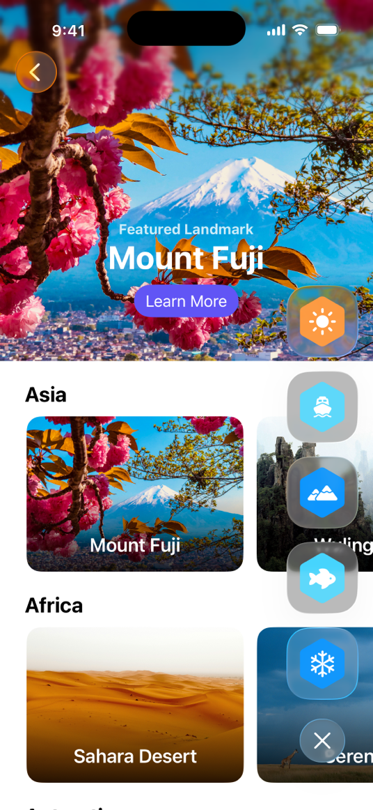
This sample displays the badges in a vertical view that includes a toggle button for showing or hiding the badges. The Landmarks app includes a custom modifier that makes it easier for other views to adopt the badge view. By configuring the badges to use Liquid Glass, the badges gain the advantage of using the morphing animation when you show or hide the badges.
Add a modifier to show badges in other views
To make the badges available in other views, like CollectionsView, the sample uses a custom modifier, ShowBadgesViewModifier, as a ViewModifier. The sample layers the badges over another view using a ZStack, and positions the badge view in the lower trailing corner:
private struct ShowsBadgesViewModifier: ViewModifier {
    func body(content: Content) -> some View {
        ZStack {
            content
            HStack {
                Spacer()
                VStack {
                    Spacer()
                    BadgesView()
                        .padding()
                }
            }
        }
    }
}
The sample extends View by adding the showBadges modifier:
extension View {
    func showsBadges() -> some View {
        modifier(ShowsBadgesViewModifier())
    }
}
Apply Liquid Glass to the toggle button
To create the toggle button, the sample configures a Button using ToggleBadgesLabel which has different system images for the Show and Hide toggle states. To apply Liquid Glass, style the button with the glass modifier:
Button {
    //...
} label: {
    //...
}
.buttonStyle(.glass)
Add Liquid Glass to the badges
To add Liquid Glass to each badge, the sample uses the glassEffect(_:in:)) modifier. To make a custom glass view appearance, the sample specifies a rectangular option with a corner radius:
BadgeLabel(badge: $0)
    .glassEffect(.regular, in: .rect(cornerRadius: Constants.badgeCornerRadius))
Animate the badges using the morph effect
The morph effect is an animation for Liquid Glass views. During this animation, the toggle button and each badge start as a combined view. Then, the button and badges change shape like a liquid as they separate and move from one location to another. In reverse, the toggle button and badges change shape and combine back into one view.
To achieve the Liquid Glass morph effect, the app:
- organizes the badges and toggle button into a GlassEffectContainer
- adds glassEffectID(_:in:)) to each badge
- adds glassEffectID(_:in:)) to the toggle button
- wraps the command that toggles the
isExpandedproperty in withAnimation(_:_:))
// Organizes the badges and toggle button to animate together.
GlassEffectContainer(spacing: Constants.badgeGlassSpacing) {
    VStack(alignment: .center, spacing: Constants.badgeButtonTopSpacing) {
        if isExpanded {
            VStack(spacing: Constants.badgeSpacing) {
                ForEach(modelData.earnedBadges) {
                    BadgeLabel(badge: $0)
                        // Adds Liquid Glass to the badge.
                        .glassEffect(.regular, in: .rect(cornerRadius: Constants.badgeCornerRadius))
                        // Adds an identifier to the badge for animation.
                        .glassEffectID($0.id, in: namespace)
                }
            }
        }

        Button {
            // Animates this button and badges when `isExpanded` changes values.
            withAnimation {
                isExpanded.toggle()
            }
        } label: {
            ToggleBadgesLabel(isExpanded: isExpanded)
                .frame(width: Constants.badgeShowHideButtonWidth,
                       height: Constants.badgeShowHideButtonHeight)
        }
        // Adds Liquid Glass to the button.
        .buttonStyle(.glass)
        #if os(macOS)
        .tint(.clear)
        #endif
        // Adds an identifier to the button for animation.
        .glassEffectID("togglebutton", in: namespace)
    }
    .frame(width: Constants.badgeFrameWidth)
}
App features
- Landmarks: Applying a background extension effect Configure an image to blur and extend under a sidebar or inspector panel.
- Landmarks: Extending horizontal scrolling under a sidebar or inspector Improve your horizontal scrollbar’s appearance by extending it under a sidebar or inspector.
- Landmarks: Refining the system provided Liquid Glass effect in toolbars Organize toolbars into related groupings to improve their appearance and utility.
---
Extracted from Apple DocC JSON by apple-skills tooling. This is unofficial content. All documentation belongs to Apple Inc.
Navigation: SwiftUI
Sample Code
Landmarks: Applying a background extension effect
Available on: iOS 26.0+, iPadOS 26.0+, Mac Catalyst 26.0+, macOS 26.0+, Xcode 26.0+
Configure an image to blur and extend under a sidebar or inspector panel.
Overview
The Landmarks app lets people explore interesting sites around the world. Whether it’s a national park near their home or a far-flung location on a different continent, the app provides a way for people to organize and mark their adventures and receive custom activity badges along the way.
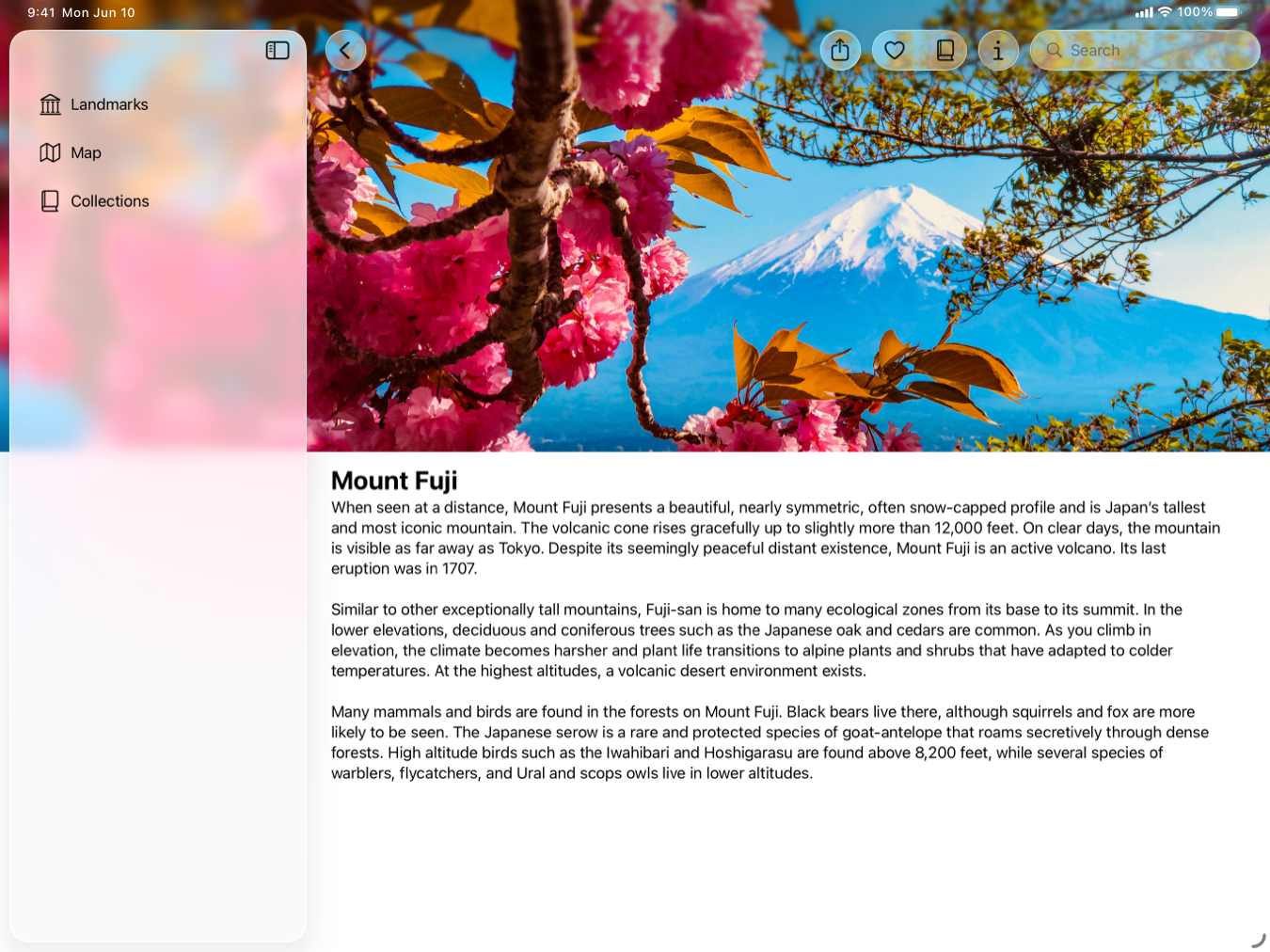
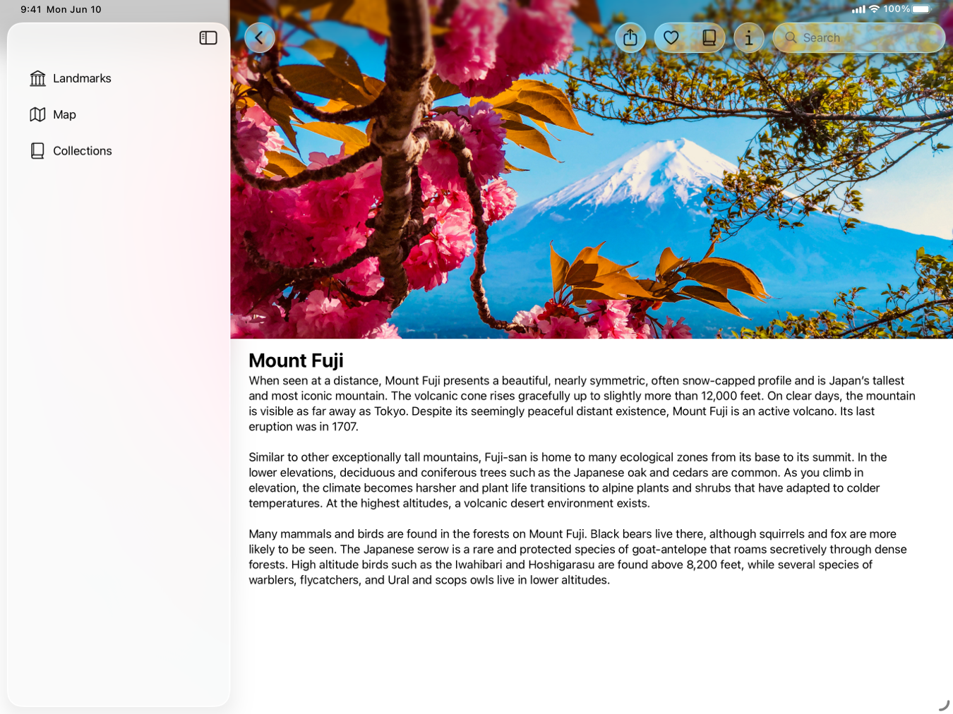
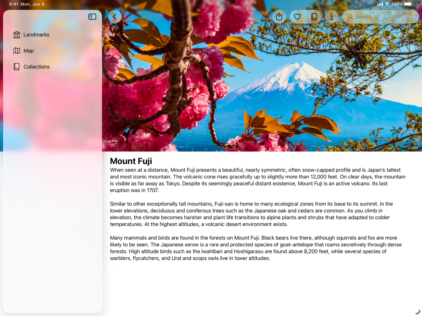
This sample demonstrates how to apply a background extension effect. In the top Landmarks view, the sample applies a background extension effect to the featured image in LandmarksView, and to the main image in LandmarkDetailView. The background extension effect blurs and extends the image under the sidebar or inspector panel when open. The following images show the main image in LandmarkDetailView both with and without the background extension effect.
With
Without
To apply the background extension effect, the sample:
1. Aligns the view to the leading and trailing edges of the containing view. 2. Applies the backgroundExtensionEffect()) modifier to the view. 3. Configures only the image in the background extension, and avoids applying the effect to the title and button in the overlay.
Align the view to the leading and trailing edges
To apply the backgroundExtensionEffect()) to a view, align the leading edge of the view next to the sidebar, and align the trailing edge of the view to the trailing edge of the containing view.
In LandmarksView, the LandmarkFeaturedItemView and the containing LazyVStack and ScrollView don’t have padding. This allows the LandmarkFeaturedItemView to align with the leading edge of the view next to the sidebar.
ScrollView(showsIndicators: false) {
    LazyVStack(alignment: .leading, spacing: Constants.standardPadding) {
        LandmarkFeaturedItemView(landmark: modelData.featuredLandmark!)
            .flexibleHeaderContent()
        //...
    }
}
In LandmarkDetailView, the ScrollView and VStack that contain the main image also don’t have any padding. This allows the main image to align against the leading edge of the containing view.
Apply the background extension effect to the image
In LandmarkDetailView, the sample applies the background extension effect to the main image by adding the backgroundExtensionEffect()) modifier:
Image(landmark.backgroundImageName)
    //...
    .backgroundExtensionEffect()
When the sidebar is open, the system extends the image in the leading direction as follows:
- The system takes a section of the leading end of the image that matches the width of the sidebar.
- The system flips that portion of the image horizontally toward the leading edge and applies a blur to the flipped section.
- The system places the modified section of the image under the sidebar, immediately before the leading edge of the image.
When the inspector is open, the system extends the image in the trailing direction as follows:
- The system takes a section of the trailing end of the image that matches the width of the sidebar.
- The system flips that portion of the image horizontally toward the trailing edge and applies a blur to the flipped section.
- The system places the modified section of the image under the inspector, immediately after the trailing edge of the image.
Configure only the image
In LandmarksView, the LandmarkFeaturedItemView has an image from the featured landmark, and includes a title for the landmark and a button you can click or tap to learn more about that location.
To avoid having the landmark’s title and button appear under the sidebar in macOS, the sample applies the backgroundExtensionEffect()) modifier to the image before adding the overlay that includes the title and button:
Image(decorative: landmark.backgroundImageName)
    //...
    .backgroundExtensionEffect()
    .overlay(alignment: .bottom) {
        VStack {
            Text("Featured Landmark", comment: "Big headline in the main image of featured landmarks.")
                //...
            Text(landmark.name)
                //...
            Button("Learn More") {
                modelData.path.append(landmark)
            }
            //...
        }
        .padding([.bottom], Constants.learnMoreBottomPadding)
    }
App features
- Landmarks: Extending horizontal scrolling under a sidebar or inspector Improve your horizontal scrollbar’s appearance by extending it under a sidebar or inspector.
- Landmarks: Refining the system provided Liquid Glass effect in toolbars Organize toolbars into related groupings to improve their appearance and utility.
- Landmarks: Displaying custom activity badges Provide people with a way to mark their adventures by displaying animated custom activity badges.
---
Extracted from Apple DocC JSON by apple-skills tooling. This is unofficial content. All documentation belongs to Apple Inc.
Navigation: SwiftUI
Sample Code
Landmarks: Building an app with Liquid Glass
Available on: iOS 26.0+, iPadOS 26.0+, Mac Catalyst 26.0+, macOS 26.0+, Xcode 26.0+
Enhance your app experience with system-provided and custom Liquid Glass.
Overview
Landmarks is a SwiftUI app that demonstrates how to use the new dynamic and expressive design feature, Liquid Glass. The Landmarks app lets people explore interesting sites around the world. Whether it’s a national park near their home or a far-flung location on a different continent, the app provides a way for people to organize and mark their adventures and receive custom activity badges along the way. Landmarks runs on iPad, iPhone, and Mac.
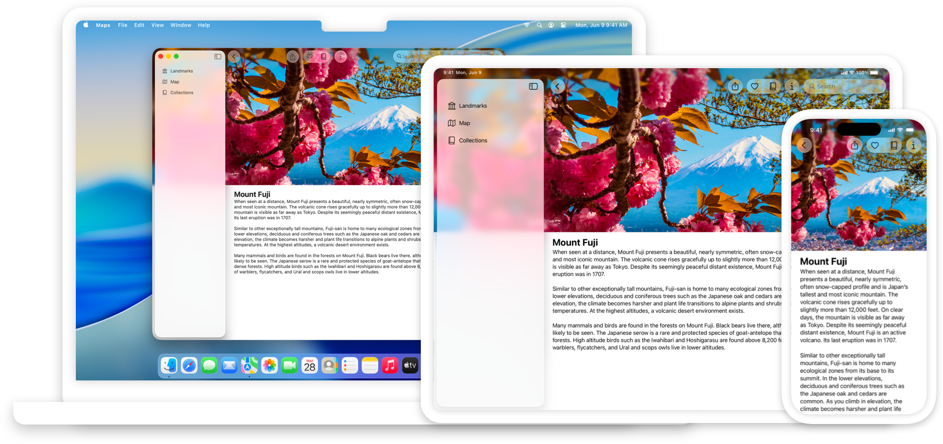
Landmarks uses a NavigationSplitView to organize and navigate to content in the app, and demonstrates several key concepts to optimize the use of Liquid Glass:
- Stretching content behind the sidebar and inspector with the background extension effect.
- Extending horizontal scroll views under a sidebar or inspector.
- Leveraging the system-provided glass effect in toolbars.
- Applying Liquid Glass effects to custom interface elements and animations.
- Building a new app icon with Icon Composer.
The sample also demonstrates several techniques to use when changing window sizes, and for adding global search.
Apply a background extension effect
The sample applies a background extension effect to the featured landmark header in the top view, and the main image in the landmark detail view. This effect extends and blurs the image under the sidebar and inspector when they’re open, creating a full edge-to-edge experience.
To achieve this effect, the sample creates and configures an Image that extends to both the leading and trailing edges of the containing view, and applies the backgroundExtensionEffect()) modifier to the image. For the featured image, the sample adds an overlay with a headline and button after the modifier, so that only the image extends under the sidebar and inspector.
Note: The sample also extends the image beyond the top safe area, and adds logic to interactively extend the image when you scroll down beyond the view’s bounds. While this improves the experience of the image in the app, it isn’t required to implement the background extension effect.
For more information, see Landmarks: Applying a background extension effect.
Extend horizontal scrolling under the sidebar
Within each continent section in LandmarksView, an instance of LandmarkHorizontalListView shows a horizontally scrolling list of landmark views. When open, the landmark views can scroll underneath the sidebar or inspector.
To achieve this effect, the app aligns the scroll views next to the leading and trailing edges of the containing view.
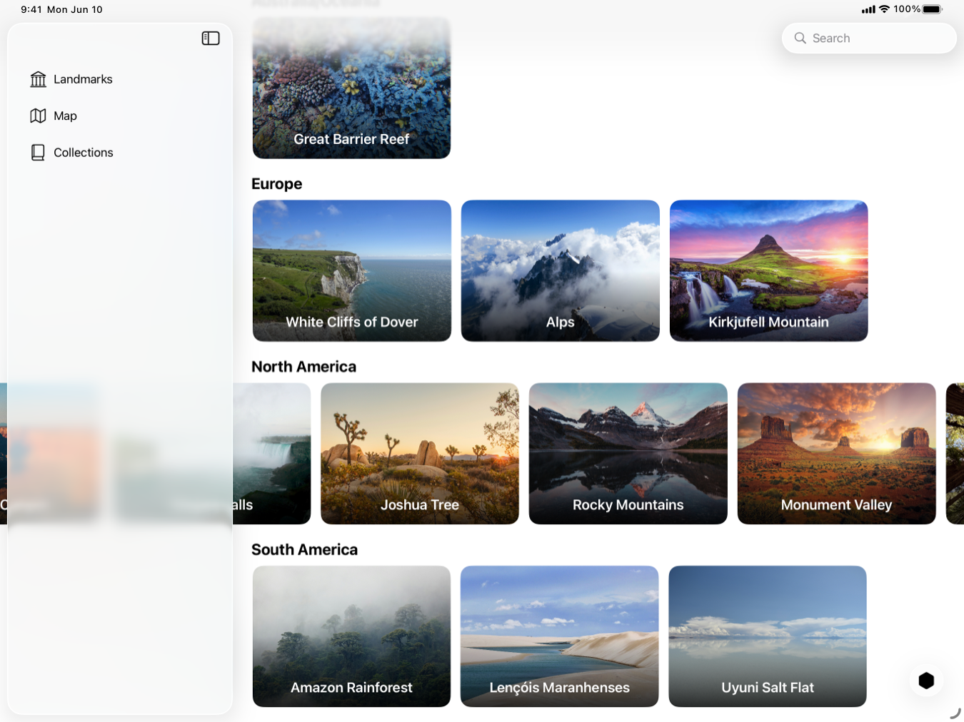
For more information, see Landmarks: Extending horizontal scrolling under a sidebar or inspector.
Refine the Liquid Glass in the toolbar
In LandmarkDetailView, the sample adds toolbar items for:
- sharing a landmark
- adding or removing a landmark from a list of Favorites
- adding or removing a landmark from Collections
- showing or hiding the inspector
The system applies Liquid Glass to toolbar items automatically:
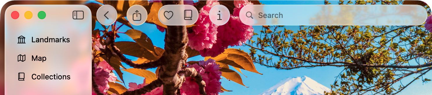
The sample also organizes the toolbar into related groups, instead of having all the buttons in one group. For more information, see Landmarks: Refining the system provided Liquid Glass effect in toolbars.
Display badges with Liquid Glass
Badges provide people with a visual indicator of the activities they’ve recorded in the Landmarks app. When a person completes all four activities for a landmark, they earn that landmark’s badge. The sample uses custom Liquid Glass elements with badges, and shows how to coordinate animations with Liquid Glass.
To create a custom Liquid Glass badge, Landmarks uses a view with an Image to display a system symbol image for the badge. The badge has a background hexagon Image filled with a custom color. The badge view uses the glassEffect(_:in:)) modifier to apply Liquid Glass to the badge.
To demonstrate the morphing effect that the system provides with Liquid Glass animations, the sample organizes the badges and the toggle button into a GlassEffectContainer, and assigns each badge a unique glassEffectID(_:in:)).
For more information, see Landmarks: Displaying custom activity badges. For information about building custom views with Liquid Glass, see Applying Liquid Glass to custom views.
Create the app icon with Icon Composer
Landmarks includes a dynamic and expressive app icon composed in Icon Composer. You build app icons with four layers that the system uses to produce specular highlights when a person moves their device, so that the icon responds as if light was reflecting off the glass. The Settings app allows people to personalize the icon by selecting light, dark, clear, or tinted variants of your app icon as well.
For more information on creating a new app icon, see Creating your app icon using Icon Composer.
For design guidance, see Human Interface Guidelines > App icons.
App features
- Landmarks: Applying a background extension effect Configure an image to blur and extend under a sidebar or inspector panel.
- Landmarks: Extending horizontal scrolling under a sidebar or inspector Improve your horizontal scrollbar’s appearance by extending it under a sidebar or inspector.
- Landmarks: Refining the system provided Liquid Glass effect in toolbars Organize toolbars into related groupings to improve their appearance and utility.
- Landmarks: Displaying custom activity badges Provide people with a way to mark their adventures by displaying animated custom activity badges.
Essentials
- Adopting Liquid Glass Find out how to bring the new material to your app.
- Develop in Swift Develop in Swift Tutorials introduce app development with Swift and Xcode to anyone learning to build apps for Apple platforms.
- SwiftUI updates Learn about important changes to SwiftUI.
---
Extracted from Apple DocC JSON by apple-skills tooling. This is unofficial content. All documentation belongs to Apple Inc.
Navigation: SwiftUI
Sample Code
Landmarks: Extending horizontal scrolling under a sidebar or inspector
Available on: iOS 26.0+, iPadOS 26.0+, Mac Catalyst 26.0+, macOS 26.0+, Xcode 26.0+
Improve your horizontal scrollbar’s appearance by extending it under a sidebar or inspector.
Overview
The Landmarks app lets people explore interesting sites around the world. Whether it’s a national park near their home or a far-flung location on a different continent, the app provides a way for people to organize and mark their adventures and receive custom activity badges along the way.
This sample demonstrates how to extend horizontal scrolling under a sidebar or inspector. Within each continent section in LandmarksView, an instance of LandmarkHorizontalListView shows a horizontally scrolling list of landmark views. When open, the landmark views can scroll underneath the sidebar or inspector.
Configure the scroll view
To achieve this effect, the sample configures the LandmarkHorizontalListView so it touches the leading and trailing edges. When a scroll view touches the sidebar or inspector, the system automatically adjusts it to scroll under the sidebar or inspector and then off the edge of the screen.
The sample adds a Spacer at the beginning of the ScrollView to inset the content so it aligns with the title padding:
ScrollView(.horizontal, showsIndicators: false) {
    LazyHStack(spacing: Constants.standardPadding) {
        Spacer()
            .frame(width: Constants.standardPadding)
        ForEach(landmarkList) { landmark in
            //...
        }
    }
}
App features
- Landmarks: Applying a background extension effect Configure an image to blur and extend under a sidebar or inspector panel.
- Landmarks: Refining the system provided Liquid Glass effect in toolbars Organize toolbars into related groupings to improve their appearance and utility.
- Landmarks: Displaying custom activity badges Provide people with a way to mark their adventures by displaying animated custom activity badges.
---
Extracted from Apple DocC JSON by apple-skills tooling. This is unofficial content. All documentation belongs to Apple Inc.
Navigation: SwiftUI
Sample Code
Landmarks: Refining the system provided Liquid Glass effect in toolbars
Available on: iOS 26.0+, iPadOS 26.0+, Mac Catalyst 26.0+, macOS 26.0+, Xcode 26.0+
Organize toolbars into related groupings to improve their appearance and utility.
Overview
The Landmarks app lets people explore interesting sites around the world. Whether it’s a national park near their home or a far-flung location on a different continent, the app provides a way for people to organize and mark their adventures and receive custom activity badges along the way.
This sample demonstrates how to refine the system provided glass effect in toolbars. In LandmarkDetailView, the sample adds toolbar items for:
- sharing a landmark
- adding or removing a landmark from a list of Favorites
- adding or removing a landmark from Collections
- showing or hiding the inspector
The system applies Liquid Glass to the toolbar items automatically.
Organize the toolbar items into logical groupings
To organize the toolbar items into logical groupings, the sample adds ToolbarSpacer items and passes fixed as the sizing parameter to divide the toolbar into sections:
.toolbar {
    ToolbarSpacer(.flexible)

    ToolbarItem {
        ShareLink(item: landmark, preview: landmark.sharePreview)
    }

    ToolbarSpacer(.fixed)

    ToolbarItemGroup {
        LandmarkFavoriteButton(landmark: landmark)
        LandmarkCollectionsMenu(landmark: landmark)
    }

    ToolbarSpacer(.fixed)

    ToolbarItem {
        Button("Info", systemImage: "info") {
            modelData.selectedLandmark = landmark
            modelData.isLandmarkInspectorPresented.toggle()
        }
    }
}
App features
- Landmarks: Applying a background extension effect Configure an image to blur and extend under a sidebar or inspector panel.
- Landmarks: Extending horizontal scrolling under a sidebar or inspector Improve your horizontal scrollbar’s appearance by extending it under a sidebar or inspector.
- Landmarks: Displaying custom activity badges Provide people with a way to mark their adventures by displaying animated custom activity badges.
---
Extracted from Apple DocC JSON by apple-skills tooling. This is unofficial content. All documentation belongs to Apple Inc.
Navigation: Technologyoverviews
collectionGroup
Liquid Glass
Learn how to design and develop beautiful interfaces that leverage Liquid Glass.
Introduction to Liquid Glass
Interfaces across Apple platforms feature a new dynamic material called Liquid Glass, which combines the optical properties of glass with a sense of fluidity. Learn how to adopt this material and embrace the design principles of Apple platforms to create beautiful interfaces that establish hierarchy, create harmony, and maintain consistency across devices and platforms.
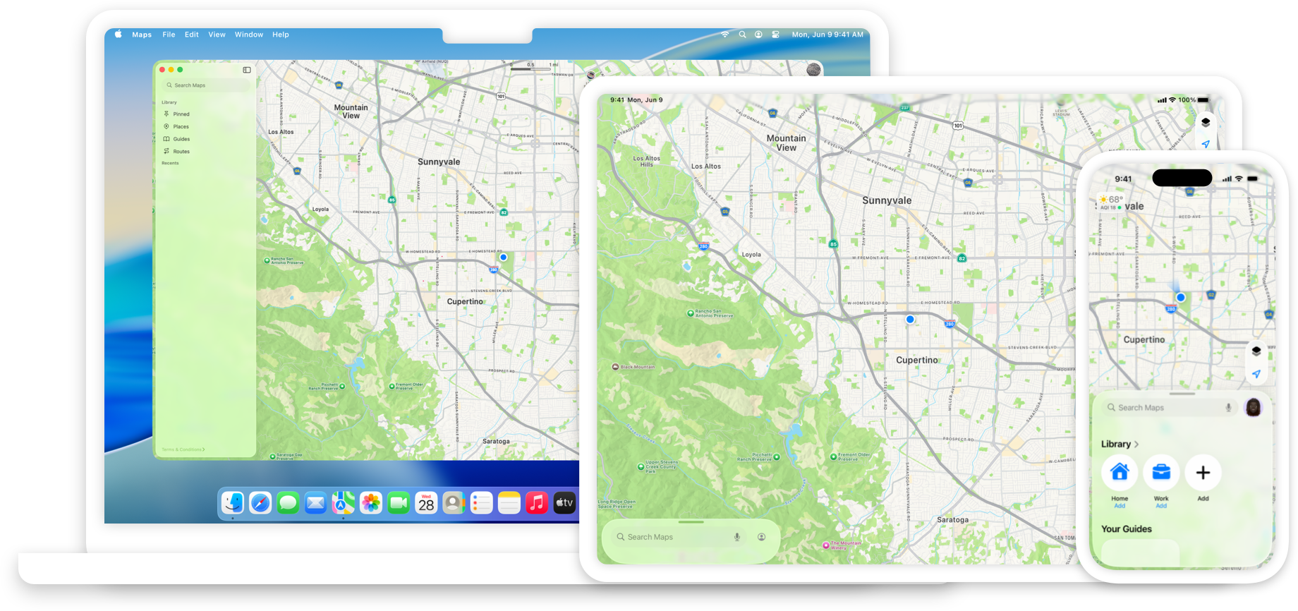
Standard components from SwiftUI, UIKit, and AppKit like controls and navigation elements pick up the appearance and behavior of this material automatically. You can also implement these effects in custom interface elements.
Adopting Liquid Glass
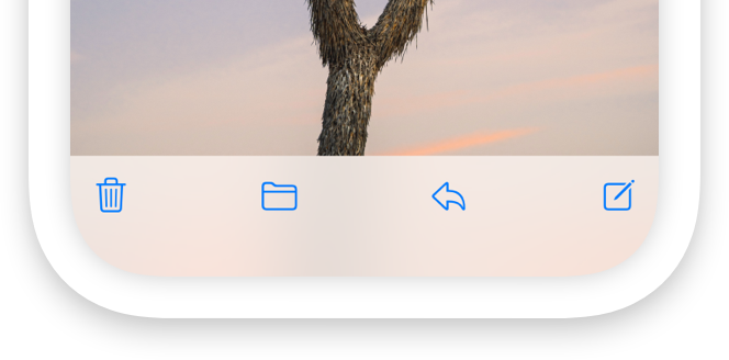
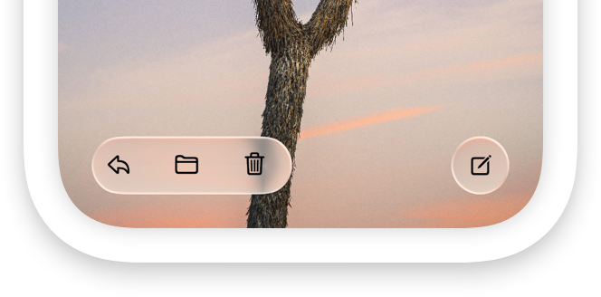
If you have an existing app, adopting Liquid Glass doesn’t mean reinventing your app from the ground up. Start by building your app in the latest version of Xcode to see the changes. Then, follow best practices in your interface to help your app look right at home on Apple platforms.
- Embrace the visual refresh for materials, controls, and app icons.
- Provide a universal navigation and search experience across platforms.
- Ensure your interface’s organization and layout looks consistent with other apps and system experiences.
- Adopt best practices for windows, modals, menus, and toolbars.
- Test your app to ensure it provides a great experience across platforms.
To learn more, read Adopting Liquid Glass.
Sample code
The Landmarks app showcases how to create a beautiful and engaging user experience using SwiftUI and Liquid Glass. Explore how the Landmarks app implements the look and feel of the Liquid Glass material throughout its interface.
- Configure an app icon with Icon Composer.
- Create an edge-to-edge content experience with the background extension effect.
- Enhance the edge-to-edge content experience by extending horizontal scroll views under a sidebar or inspector.
- Make your interface adaptable to changing window sizes.
- Explore search conventions across platforms.
- Apply Liquid Glass effects to custom interface elements and animations.
To learn more, see Landmarks: Building an app with Liquid Glass.
Design principles
The Human Interface Guidelines contains guidance and best practices that can help you design a great experience for any Apple platform. Browse the HIG to discover more about adapting your interface for Liquid Glass.
- Define a layout and choose a navigation structure that puts the most important content in focus.
- Reimagine your app icon with simple, bold layers that offer dimensionality and consistency across devices and appearances.
- Be judicious with your use of color in controls and navigation so they stay legible and allow your content to infuse them and shine through.
- Ensure interface elements fit in with software and hardware design across devices.
- Adopt standard iconography and predictable action placement across platforms.
To learn more, read the Human Interface Guidelines.
Videos
- Meet Liquid Glass - Liquid Glass unifies Apple platform design language while providing a more dynamic and expressive user experience. Get to know the design principles of Liquid Glass, explore its core optical and physical properties, and learn where to use it and why.
- Get to know the new design system - Dive deeper into the new design system to explore key changes to visual design, information architecture, and core system components. Learn how the system reshapes the relationship between interface and content, enabling you to create designs that are dynamic, harmonious, and consistent across devices, screen sizes, and input modes.
- Build a SwiftUI app with the new design - Explore the ways Liquid Glass transforms the look and feel of your app. Discover how this stunning new material enhances toolbars, controls, and app structures across platforms, providing delightful interactions and seamlessly integrating your app with the system. Learn how to adopt new APIs that can help you make the most of Liquid Glass.
- Build a UIKit app with the new design - Update your UIKit app to take full advantage of the new design system. We’ll dive into key changes to tab views, split views, bars, presentations, search, and controls, and show you how to use Liquid Glass in your custom UI. To get the most out of this video, we recommend first watching “Get to know the new design system” for general design guidance.
- Build an AppKit app with the new design - Update your AppKit app to take full advantage of the new design system. We’ll dive into key changes to tab views, split views, bars, presentations, search, and controls, and show you how to use Liquid Glass in your custom UI. To get the most out of this video, we recommend first watching “Get to know the new design system” for general design guidance.
Essentials
- Adopting Liquid Glass Find out how to bring the new material to your app.
---
Extracted from Apple DocC JSON by apple-skills tooling. This is unofficial content. All documentation belongs to Apple Inc.
Liquid Glass Quick Reference
Official links and condensed lookup tables
Official Apple Documentation
Core APIs
| API | URL |
|---|---|
| glassEffect(_:in:) | https://developer.apple.com/documentation/swiftui/view/glasseffect(_:in:) |
| GlassEffectContainer | https://developer.apple.com/documentation/swiftui/glasseffectcontainer/ |
| glassEffectID | https://developer.apple.com/documentation/swiftui/view/glasseffectid(_:in:) |
| Adopting Liquid Glass | https://developer.apple.com/documentation/technologyoverviews/adopting-liquid-glass |
| Applying to Custom Views | https://developer.apple.com/documentation/SwiftUI/Applying-Liquid-Glass-to-custom-views |
Human Interface Guidelines
| Topic | URL |
|---|---|
| Main HIG | https://developer.apple.com/design/human-interface-guidelines/ |
| Materials | https://developer.apple.com/design/human-interface-guidelines/materials |
| App Icons | https://developer.apple.com/design/human-interface-guidelines/app-icons |
| SF Symbols | https://developer.apple.com/design/human-interface-guidelines/sf-symbols |
---
WWDC 2025 Sessions
Design
| Session | ID | Description |
|---|---|---|
| Meet Liquid Glass | 219 | Core overview |
| New look of app icons | 220 | Icon design |
| Icon Composer | 361 | Icon tool tutorial |
| SF Symbols 7 | 337 | Draw animations |
Watch: https://developer.apple.com/videos/play/wwdc2025/[ID]/
Implementation
| Session | ID | Description |
|---|---|---|
| Build SwiftUI app | 323 | SwiftUI walkthrough |
| Build UIKit app | 284 | UIKit walkthrough |
---
Tools & Resources
| Tool | Location |
|---|---|
| Icon Composer | Xcode 26 |
| SF Symbols 7 | https://developer.apple.com/sf-symbols/ |
| Design Resources | https://developer.apple.com/design/resources/ |
| Design Gallery | https://developer.apple.com/design/new-design-gallery/ |
| Design Awards | https://developer.apple.com/design/awards/ |
---
API Quick Reference
Glass Variants
.glassEffect()                    // .regular, .capsule
.glassEffect(.regular)            // Standard controls
.glassEffect(.clear)              // Over media (photos/maps)
.glassEffect(.identity)           // Disabled/conditional
Modifiers
.glassEffect(.regular.tint(.blue))           // Semantic color
.glassEffect(.regular.interactive())          // Press effects
.glassEffect(.regular.tint(.blue).interactive())
Shapes
.glassEffect(.regular, in: .capsule)
.glassEffect(.regular, in: .circle)
.glassEffect(.regular, in: RoundedRectangle(cornerRadius: 16))
.glassEffect(.regular, in: .rect(cornerRadius: .containerConcentric))
Container & Morphing
GlassEffectContainer(spacing: 30) {
    // Glass elements morph within spacing threshold
}

.glassEffectID("id", in: namespace)  // Enable morphing
Sheets
.presentationDetents([.medium, .large])  // Required for glass
.scrollContentBackground(.hidden)         // For Form in sheet
.matchedTransitionSource(id:in:)          // Morph from button
.navigationTransition(.zoom(sourceID:in:))
Toolbar
ToolbarSpacer(.fixed)      // Default spacing
ToolbarSpacer(.flexible)   // Fill available space
ToolbarItemGroup(placement:) { }
Animations
withAnimation(.bouncy) { }
withAnimation(.bouncy(duration: 0.5, extraBounce: 0.2)) { }
SF Symbols
.symbolEffect(.drawOn, value: trigger)
.symbolEffect(.drawOff, value: trigger)
.symbolEffect(.bounce, value: trigger)
---
Accessibility Environment
@Environment(\.accessibilityReduceTransparency) var reduceTransparency
@Environment(\.accessibilityReduceMotion) var reduceMotion
@Environment(\.colorSchemeContrast) var contrast
---
Platform Versions
| Platform | Version |
|---|---|
| iOS | 26 |
| iPadOS | 26 |
| macOS | Tahoe 26 |
| watchOS | 26 |
| tvOS | 26 |
| visionOS | 26 |
| Xcode | 26 |
| macOS (Icon Composer) | Sequoia 15.3+ |
---
Community
Instance Method
glassEffect(_:in:)
Available on: iOS 26.0+, iPadOS 26.0+, Mac Catalyst 26.0+, macOS 26.0+, tvOS 26.0+, watchOS 26.0+
Applies the Liquid Glass effect to a view.
nonisolated func glassEffect(_ glass: Glass = .regular, in shape: some Shape = DefaultGlassEffectShape()) -> some ViewDiscussion
When you use this effect, the system:
- Renders a shape anchored behind a view with the Liquid Glass material.
- Applies the foreground effects of Liquid Glass over a view.
For example, to add this effect to a Text:
Text("Hello, World!")
    .font(.title)
    .padding()
    .glassEffect()
SwiftUI uses the regular variant by default along with a Capsule shape.
SwiftUI anchors the Liquid Glass to a view’s bounds. For the example above, the material fills the entirety of the Text frame, which includes the padding.
You typically use this modifier with a GlassEffectContainer to combine multiple Liquid Glass shapes into a single shape that can morph into one another.
Styling views with Liquid Glass
- Applying Liquid Glass to custom views Configure, combine, and morph views using Liquid Glass effects.
- Landmarks: Building an app with Liquid Glass Enhance your app experience with system-provided and custom Liquid Glass.
- interactive(_:)) Returns a copy of the structure configured to be interactive.
- GlassEffectContainer A view that combines multiple Liquid Glass shapes into a single shape that can morph individual shapes into one another.
- GlassEffectTransition A structure that describes changes to apply when a glass effect is added or removed from the view hierarchy.
- GlassButtonStyle A button style that applies glass border artwork based on the button’s context.
- GlassProminentButtonStyle A button style that applies prominent glass border artwork based on the button’s context.
- DefaultGlassEffectShape The default shape applied by glass effects, a capsule.
---
Extracted from Apple DocC JSON by apple-skills tooling. This is unofficial content. All documentation belongs to Apple Inc.
Instance Method
glassEffectID(_:in:)
Available on: iOS 26.0+, iPadOS 26.0+, Mac Catalyst 26.0+, macOS 26.0+, tvOS 26.0+, watchOS 26.0+
Associates an identity value to Liquid Glass effects defined within this view.
nonisolated func glassEffectID(_ id: (some Hashable & Sendable)?, in namespace: Namespace.ID) -> some ViewDiscussion
You use this modifier with the glassEffect(_:in:)) view modifier and a GlassEffectContainer view. When used together, SwiftUI uses the identifier to animate shapes to and from each other during transitions.
---
Extracted from Apple DocC JSON by apple-skills tooling. This is unofficial content. All documentation belongs to Apple Inc.
Instance Method
scrollEdgeEffectStyle(_:for:)
Available on: iOS 26.0+, iPadOS 26.0+, Mac Catalyst 26.0+, macOS 26.0+, tvOS 26.0+, watchOS 26.0+
Configures the scroll edge effect style for scroll views within this hierarchy.
nonisolated func scrollEdgeEffectStyle(_ style: ScrollEdgeEffectStyle?, for edges: Edge.Set) -> some ViewDiscussion
By default, a scroll view renders an automatic edge effect. Use this modifier to change the scroll edge effect style.
ScrollView {
    LazyVStack {
        ForEach(data) { item in
            RowView(item)
        }
    }
}
.scrollEdgeEffectStyle(.hard, for: .all)
Configuring scroll edge effects
- scrollEdgeEffectHidden(_:for:)) Hides any scroll edge effects for scroll views within this hierarchy.
- ScrollEdgeEffectStyle A structure that defines the style of pocket a scroll view will have.
- safeAreaBar(edge:alignment:spacing:content:)) Shows the specified content as a custom bar beside the modified view.
---
Extracted from Apple DocC JSON by apple-skills tooling. This is unofficial content. All documentation belongs to Apple Inc.
Related skills
 Frontend DesignGenerate distinctive, production-grade frontend interfaces and components that avoid generic AI aesthetics.716k165k
 Web Design GuidelinesAutomatically audit frontend code against the latest Vercel Web Interface Guidelines for consistency, accessibility, and UX quality.498k29.6k
 Lark WhiteboardGenerate valid Lark Whiteboard (Feishu Board) documents with correctly placed connectors, automatic routing, and proper schema compliance directly from agent inst389k16k
 Sleek Design Mobile AppsGenerate mobile app screens and UI from plain English descriptions using the Sleek.design API.315k476
 Design Taste FrontendOverride generic LLM frontend output with intentional, metric-driven UI/UX taste.301k69.4k
 Ui Ux Pro MaxGet instant, high-quality UI/UX decisions, component recommendations, style guidance, and code improvements across web and mobile projects.290k112k
How it compares
Use ios-liquid-glass for native Apple Liquid Glass HIG work; generic frontend-design skills lack iOS material API specifics.
FAQ
Which Apple UI frameworks does ios-liquid-glass cover?
ios-liquid-glass guides Liquid Glass implementation in both SwiftUI and UIKit, covering materials, depth layering, and motion while maintaining legibility on modern iOS releases.
What should developers optimize when using Liquid Glass?
ios-liquid-glass stresses legibility, scroll performance, and system-adaptive behavior so glass surfaces respect Apple HIG conventions instead of static blur that hurts contrast or frame rates.