
Swiftui
- 365 installs
- 297 repo stars
- Updated August 4, 2026
- vabole/apple-skills
swiftui is an Apple-platform agent skill that provides local SwiftUI API references for views, state management, navigation, and adaptive layouts for developers building native apps across iPhone, iPad, Mac, watchOS, and
About
swiftui is a vabole/apple-skills reference package for the SwiftUI framework. It includes 12 downloaded markdown files—swiftui-overview.md at 907KB as a full framework index plus focused references for View protocol modifiers, @State, @Binding, @Environment, @Observable, NavigationStack, NavigationSplitView, TabView, List, Canvas, and GraphicsContext. Agents grep local files first, check sibling Apple skills, then fetch missing pages from sosumi.ai using paths like swiftui/button or swiftui/sheet. The skill description covers iOS 26+ features and adaptive layouts across iPhone, iPad, Mac, watchOS, and visionOS. Developers reach for swiftui when implementing navigation stacks, observable state, lists, sheets, and immediate-mode Canvas drawing without leaving the coding agent.
- Declarative view composition
- Cross-device adaptive layouts
- State and navigation patterns
- Platform HIG-aligned UI
- Animations and accessibility hooks
Swiftui by the numbers
- 365 all-time installs (skills.sh)
- +11 installs in the week ending Aug 5, 2026 (Skillselion tracking)
- Ranked #346 of 1,039 Mobile Development skills by installs in the Skillselion catalog
- Data as of Aug 5, 2026 (Skillselion catalog sync)
npx skills add https://github.com/vabole/apple-skills --skill swiftuiAdd your badge
Show developers this skill is listed on Skillselion. Paste this into your README.

| Installs | 365 |
|---|---|
| repo stars | ★ 297 |
| Last updated | August 4, 2026 |
| Repository | vabole/apple-skills ↗ |
How do you manage state in SwiftUI?
Implement native Apple app UI with SwiftUI views, navigation, state management, animations, and adaptive layouts across iPhone, iPad, Mac, watchOS, and visionOS.
Who is it for?
Apple-platform developers building SwiftUI interfaces who want offline-grepable View, state, and navigation API docs inside the coding agent.
Skip if: UIKit-only legacy projects or Swift concurrency refactoring better handled by the companion swift-concurrency skill.
When should I use this skill?
User asks to build SwiftUI views, NavigationStack flows, @Observable state, adaptive layouts, List screens, or Canvas drawing on Apple platforms.
What you get
SwiftUI views with NavigationStack routing, @State/@Binding/@Observable state, adaptive layouts, List and TabView screens, and Canvas drawing code.
- SwiftUI view implementations
- navigation and state management code
By the numbers
- 12 downloaded local SwiftUI reference markdown files
- swiftui-overview.md framework index at 907KB
Files
SwiftUI Reference
This skill provides access to SwiftUI documentation via downloaded reference files.
Downloaded Reference Files
The following Apple documentation pages are available locally (grep-friendly):
| File | Content |
|---|---|
| swiftui-overview.md | Full SwiftUI framework index (907KB) |
| view-protocol.md | View protocol and all modifiers (59KB) |
| state.md | @State property wrapper |
| binding.md | @Binding property wrapper |
| environment.md | @Environment property wrapper |
| observation.md | @Observable macro (iOS 17+) |
| navigationstack.md | NavigationStack (iOS 16+) |
| navigationsplitview.md | NavigationSplitView |
| tabview.md | TabView |
| list.md | List view |
| canvas.md | Canvas — immediate-mode drawing (iOS 15+) |
| graphicscontext.md | GraphicsContext — drawing API used inside Canvas |
Fetching More Docs
1. Search this skill's local .md files first. 2. If the topic is not here, check the other installed Apple skills you have available by their names, descriptions, or SKILL.md frontmatter, then grep their local files. This is faster and uses less context than fetching new docs from the internet. 3. If no installed skill has the page, use the relevant documentation path from swiftui-overview.md with the sosumi.ai Markdown mirror. For example, /documentation/swiftui/button maps to https://sosumi.ai/documentation/swiftui/button.
Common SwiftUI Doc Paths
| Topic | URL Path |
|---|---|
| Text | swiftui/text |
| Button | swiftui/button |
| Image | swiftui/image |
| VStack | swiftui/vstack |
| HStack | swiftui/hstack |
| ZStack | swiftui/zstack |
| Form | swiftui/form |
| Sheet | swiftui/sheet |
| Alert | swiftui/alert |
| Picker | swiftui/picker |
| Toggle | swiftui/toggle |
| Slider | swiftui/slider |
| ProgressView | swiftui/progressview |
| AsyncImage | swiftui/asyncimage |
| GeometryReader | swiftui/geometryreader |
| ScrollView | swiftui/scrollview |
| LazyVStack | swiftui/lazyvstack |
| LazyHStack | swiftui/lazyhstack |
| NavigationLink | swiftui/navigationlink |
| ToolbarItem | swiftui/toolbaritem |
| Canvas | swiftui/canvas |
| GraphicsContext | swiftui/graphicscontext |
Usage Instructions
1. Check downloaded files first - Grep the local .md files for your topic 2. Use the overview as an index - Search swiftui-overview.md for documentation paths 3. Fetch only when needed - If no installed skill has the page, use sosumi.ai with documentation paths from the overview
Example workflow:
# Looking for info on modifiers?
grep -i "padding" view-protocol.md

# Need full Text documentation? Check the local file first.
grep -i "font" text.md
Sources
Instance Method
alert(_:isPresented:actions:)
Available on: iOS 15.0+, iPadOS 15.0+, Mac Catalyst 15.0+, macOS 12.0+, tvOS 15.0+, visionOS 1.0+, watchOS 8.0+
Presents an alert when a given condition is true, using a text view for the title.
nonisolated func alert<A>(_ title: Text, isPresented: Binding<Bool>, @ViewBuilder actions: () -> A) -> some View where A : ViewParameters
title
The title of the alert.
isPresented
A binding to a Boolean value that determines whether to present the alert. When the user presses or taps one of the alert’s actions, the system sets this value to false and dismisses.
actions
A ViewBuilder returning the alert’s actions.
Discussion
In the example below, a login form conditionally presents an alert by setting the didFail state variable. When the form sets the value to to true, the system displays an alert with an “OK” action.
struct Login: View {
    @State private var didFail = false
    let alertTitle: String = "Login failed."

    var body: some View {
        LoginForm(didFail: $didFail)
            .alert(
                Text(alertTitle),
                isPresented: $didFail
            ) {
                Button("OK") {
                    // Handle the acknowledgement.
                }
            }
    }
}
All actions in an alert dismiss the alert after the action runs. The default button is shown with greater prominence. You can influence the default button by assigning it the defaultAction keyboard shortcut.
The system may reorder the buttons based on their role and prominence.
If no actions are present, the system includes a standard “OK” action. No default cancel action is provided. If you want to show a cancel action, use a button with a role of cancel.
On iOS, tvOS, and watchOS, alerts only support controls with labels that are Text. Passing any other type of view results in the content being omitted.
Presenting an alert
- AlertScene A scene that renders itself as a standalone alert dialog.
- alert(_:isPresented:presenting:actions:)) Presents an alert using the given data to produce the alert’s content and a text view as a title.
- alert(isPresented:error:actions:)) Presents an alert when an error is present.
- alert(_:isPresented:actions:message:)) Presents an alert with a message when a given condition is true using a text view as a title.
- alert(_:isPresented:presenting:actions:message:)) Presents an alert with a message using the given data to produce the alert’s content and a text view for a title.
- alert(isPresented:error:actions:message:)) Presents an alert with a message when an error is present.
---
Extracted from Apple DocC JSON by apple-skills tooling. This is unofficial content. All documentation belongs to Apple Inc.
Navigation: Charts
Structure
AreaMark
Available on: iOS 16.0+, iPadOS 16.0+, Mac Catalyst 16.0+, macOS 13.0+, tvOS 16.0+, visionOS 1.0+, watchOS 9.0+
Chart content that represents data using the area of one or more regions.
@MainActor @preconcurrency struct AreaMarkOverview
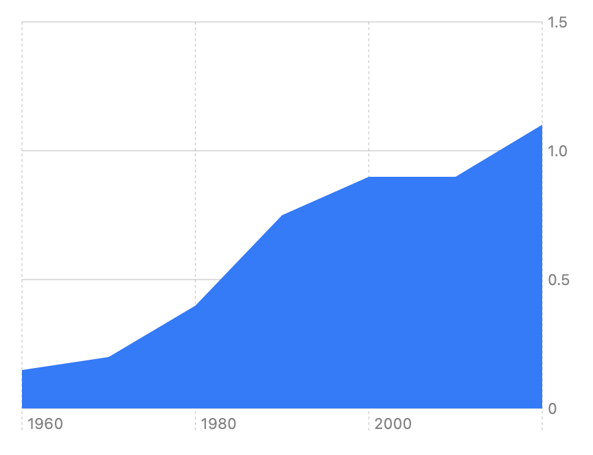
Use AreaMark to represent data as filled regions on a chart. To create a simple area mark chart, plot a date or an ordered string property on the x-axis, and a number on the y-axis. For example, suppose you have data that represents the cost of a cheeseburger over time, stored in an array of Food structures:
let cheeseburgerCost: [Food] = [
    .init(name: "Cheeseburger", price: 0.15, year: 1960),
    .init(name: "Cheeseburger", price: 0.20, year: 1970),
    // ...
    .init(name: "Cheeseburger", price: 1.10, year: 2020)
]

struct Food: Identifiable {
    let name: String
    let price: Double
    let date: Date
    let id = UUID()

    init(name: String, price: Double, year: Int) {
        self.name = name
        self.price = price
        let calendar = Calendar.autoupdatingCurrent
        self.date = calendar.date(from: DateComponents(year: year))!
    }
}
You can create labeled data in the form of PlottableValue instances for each of the x and y inputs to an area mark:
Chart(cheeseburgerCost) { cost in
    AreaMark(
        x: .value("Date", cost.date),
        y: .value("Price", cost.price)
    )
}
The resulting chart automatically scales and labels the axes based on the data, and fills the area under the data points with a default color:
If you want only the line without filling in the area below the line, use LineMark instead.
Add detail with a stacked area chart
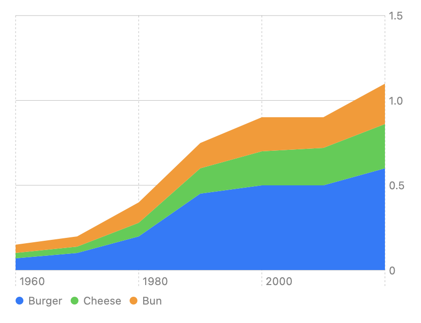
To represent an additional dimension of information, you can create a stacked area chart. For example, suppose you have another data set that represents the same cost data from the previous example, but which is broken into the component costs for the burger, bun, and cheese:
let cheeseburgerCostByItem: [Food] = [
    .init(name: "Burger", price: 0.07, year: 1960),
    .init(name: "Cheese", price: 0.03, year: 1960),
    .init(name: "Bun", price: 0.05, year: 1960),
    .init(name: "Burger", price: 0.10, year: 1970),
    .init(name: "Cheese", price: 0.04, year: 1970),
    .init(name: "Bun", price: 0.06, year: 1970),
    // ...
    .init(name: "Burger", price: 0.60, year: 2020),
    .init(name: "Cheese", price: 0.26, year: 2020),
    .init(name: "Bun", price: 0.24, year: 2020)
]
You can again create an area mark with the data, but in this case add the foregroundStyle(by:)) modifier to create a stacked area chart that divides the information into distinct regions based on the data’s name property:
Chart(cheeseburgerCostByItem) { cost in
    AreaMark(
        x: .value("Date", cost.date),
        y: .value("Price", cost.price)
    )
    .foregroundStyle(by: .value("Food Item", cost.name))
}
The chart automatically assigns a different color to each region, and adds a legend that indicates what each color represents based on the names that you provide to the modifier:
Stack the data in different ways
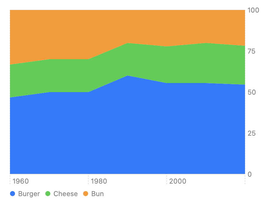
You can highlight different aspects of the data by stacking it in different ways. For example, the previous chart shows the absolute contributions of each ingredient to the cheeseburger’s total cost. To see the relative contributions instead, you can create a normalized chart by setting the area mark’s stacking parameter to normalized:
Chart(cheeseburgerCostByItem) { cost in
    AreaMark(
        x: .value("Date", cost.date),
        y: .value("Price", cost.price),
        stacking: .normalized
    )
    .foregroundStyle(by: .value("Food Item", cost.name))
}
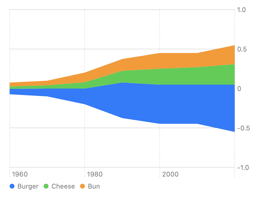
Alternatively, you can use center stacking to create a streamgraph, which shifts the area chart’s baseline to the center of the chart’s plotting area:
Chart(cheeseburgerCostByItem) { cost in
    AreaMark(
        x: .value("Date", cost.date),
        y: .value("Price", cost.price),
        stacking: .center
    )
    .foregroundStyle(by: .value("Food Item", cost.name))
}
Create a range area chart
You can also use area marks to create a range area chart, where you provide an interval to fill in for each data point. To do this, you provide either a date or ordered string category for the x-axis and a range of values for the y-axis, or vice versa. For example, suppose you record the minimum and maximum temperatures every day in a Weather structure:
struct Weather: Identifiable {
    let date: Date
    let maximumTemperature: Double
    let minimumTemperature: Double
    let id: Int
}
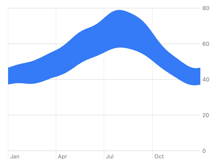
If you load a collection of these structures into a data array, you can use the date on the x-axis, and each day’s minimum and maximum temperature as the start and end points for the y-axis:
Chart(data) { day in
    AreaMark(
        x: .value("Date", day.date),
        yStart: .value("Minimum Temperature", day.minimumTemperature),
        yEnd: .value("Maximum Temperature", day.maximumTemperature)
    )
}
This creates a filled region that’s shaped by the start and end points on each date:
Conforms To
Creating an area mark
- init(x:y:stacking:)) Creates an area mark using the specified horizontal and vertical positions.
- init(x:y:series:stacking:)) Creates an area mark and associates it with the specified series.
Creating a range area chart
- init(x:yStart:yEnd:)) Creates an area mark that plots values with a vertical interval.
- init(x:yStart:yEnd:series:)) Creates an area mark that plots values with a vertical interval and associates it with the specified series.
- init(xStart:xEnd:y:)) Creates an area mark that plots values with a horizontal interval.
- init(xStart:xEnd:y:series:)) Creates an area mark that plots values with a horizontal interval and associates it with the specified series.
Marks
- LineMark Chart content that represents data using a sequence of connected line segments.
- PointMark Chart content that represents data using points.
- RectangleMark Chart content that represents data using rectangles.
- RuleMark Chart content that represents data using a single horizontal or vertical rule.
- BarMark Chart content that represents data using bars.
- SectorMark A sector of a pie or donut chart, which shows how individual categories make up a meaningful total.
---
Extracted from Apple DocC JSON by apple-skills tooling. This is unofficial content. All documentation belongs to Apple Inc.
Navigation: SwiftUI
Structure
AsyncImage
Available on: iOS 15.0+, iPadOS 15.0+, Mac Catalyst 15.0+, macOS 12.0+, tvOS 15.0+, visionOS 1.0+, watchOS 8.0+
A view that asynchronously loads and displays an image.
struct AsyncImage<Content> where Content : ViewOverview
This view uses the shared URLSession instance to load an image from the specified URL, and then display it. For example, you can display an icon that’s stored on a server:
AsyncImage(url: URL(string: "https://example.com/icon.png"))
    .frame(width: 200, height: 200)
Until the image loads, the view displays a standard placeholder that fills the available space. After the load completes successfully, the view updates to display the image. In the example above, the icon is smaller than the frame, and so appears smaller than the placeholder.

You can specify a custom placeholder using init(url:scale:content:placeholder:)). With this initializer, you can also use the content parameter to manipulate the loaded image. For example, you can add a modifier to make the loaded image resizable:
AsyncImage(url: URL(string: "https://example.com/icon.png")) { image in
    image.resizable()
} placeholder: {
    ProgressView()
}
.frame(width: 50, height: 50)
For this example, SwiftUI shows a ProgressView first, and then the image scaled to fit in the specified frame:

Important: You can’t apply image-specific modifiers, like resizable(capInsets:resizingMode:)), directly to anAsyncImage. Instead, apply them to the Image instance that yourcontentclosure gets when defining the view’s appearance.
To gain more control over the loading process, use the init(url:scale:transaction:content:)) initializer, which takes a content closure that receives an AsyncImagePhase to indicate the state of the loading operation. Return a view that’s appropriate for the current phase:
AsyncImage(url: URL(string: "https://example.com/icon.png")) { phase in
    if let image = phase.image {
        image // Displays the loaded image.
    } else if phase.error != nil {
        Color.red // Indicates an error.
    } else {
        Color.blue // Acts as a placeholder.
    }
}
Conforms To
Loading an image
- init(url:scale:)) Loads and displays an image from the specified URL.
- init(url:scale:content:placeholder:)) Loads and displays a modifiable image from the specified URL using a custom placeholder until the image loads.
Loading an image in phases
- init(url:scale:transaction:content:)) Loads and displays a modifiable image from the specified URL in phases.
Loading images asynchronously
- AsyncImagePhase The current phase of the asynchronous image loading operation.
---
Extracted from Apple DocC JSON by apple-skills tooling. This is unofficial content. All documentation belongs to Apple Inc.
Navigation: Charts
Structure
BarMark
Available on: iOS 16.0+, iPadOS 16.0+, Mac Catalyst 16.0+, macOS 13.0+, tvOS 16.0+, visionOS 1.0+, watchOS 9.0+
Chart content that represents data using bars.
@MainActor @preconcurrency struct BarMarkOverview
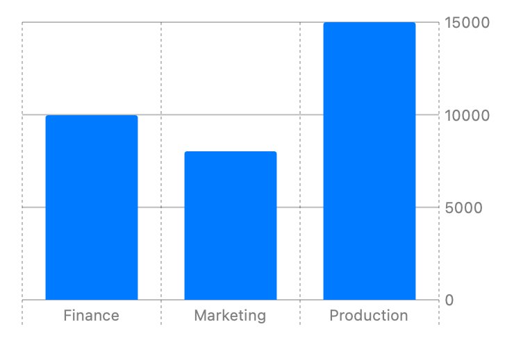
You can create different kinds of bar charts using the BarMark chart content. To create a simple vertical bar chart that plots categories with x positions and numbers with y positions, use init(x:y:width:height:stacking:)). For example, you can display profit by department:
struct Profit {
    let department: String
    let profit: Double
}

let data: [Profit] = [
    Profit(department: "Production", profit: 15000),
    Profit(department: "Marketing", profit: 8000),
    Profit(department: "Finance", profit: 10000)
]

var body: some View {
    Chart(data) {
        BarMark(
            x: .value("Department", $0.department),
            y: .value("Profit", $0.profit)
        )
    }
}
Swift Charts provides several other initializers for BarMark. Below are a few more examples using them. For a full list of initializers see the topic section.
Stacked Bar Chart
BarkMark automatically stacks content when more than one bar maps to the same location. You can see this if you split the profit data up by category:
struct ProfitByCategory {
    let department: String
    let profit: Double
    let productCategory: String
}

let data: [ProfitByCategory] = [
    ProfitByCategory(department: "Production", profit: 4000, productCategory: "Gizmos"),
    ProfitByCategory(department: "Production", profit: 5000, productCategory: "Gadgets"),
    ProfitByCategory(department: "Production", profit: 6000, productCategory: "Widgets"),
    ProfitByCategory(department: "Marketing", profit: 2000, productCategory: "Gizmos"),
    ProfitByCategory(department: "Marketing", profit: 1000, productCategory: "Gadgets"),
    ProfitByCategory(department: "Marketing", profit: 5000, productCategory: "Widgets"),
    ProfitByCategory(department: "Finance", profit: 2000, productCategory: "Gizmos"),
    ProfitByCategory(department: "Finance", profit: 3000, productCategory: "Gadgets"),
    ProfitByCategory(department: "Finance", profit: 5000, productCategory: "Widgets")
]

var body: some View {
    Chart(data) {
        BarMark(
            x: .value("Category", $0.department),
            y: .value("Profit", $0.profit)
        )
    }
}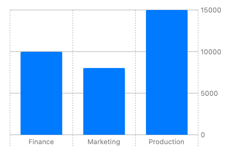
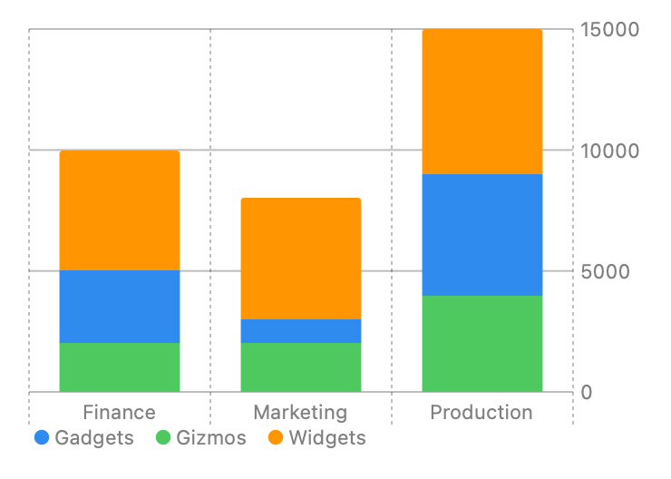
This results in a chart that looks identical to the chart seen in the Overview section because the bars with the same department category are stacked on top of each other. To differentiate the product categories, add a foregroundStyle(by:)) modifer that specifies a visual encoding for the productCategory:
Chart(data) {
    BarMark(
        x: .value("Category", $0.department),
        y: .value("Profit", $0.profit)
    )
    .foregroundStyle(by: .value("Product Category", $0.productCategory))
}
You can use the optional stacking: parameter in the BarMark initializer to modify the stacking mechanism. See MarkStackingMethod for the stacking options.
1D Bar Chart
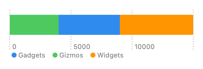
To build a one dimensional chart, use one of the initializers that only requires a PlottableValue for one dimension, like init(x:yStart:yEnd:width:stacking:)) for plotting with x. The example below reuses the data from the previous example to get the production department values:
Chart(data) { // Get the Production values.
    BarMark(
        x: .value("Profit", $0.profit)
    )
    .foregroundStyle(by: .value("Product Category", $0.productCategory))
}
Interval Bar Chart
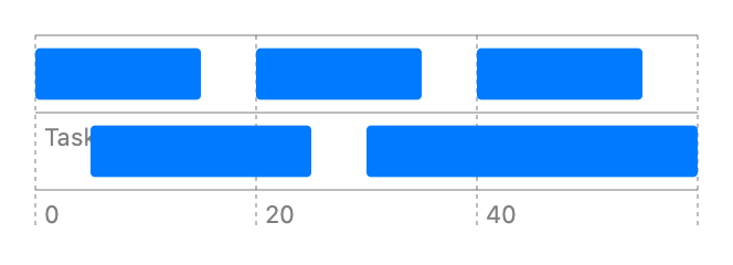
Use BarMark to represent intervals by using the init(xStart:xEnd:y:height:)), init(xStart:xEnd:y:height:stacking:)), init(x:yStart:yEnd:width:)) or init(x:yStart:yEnd:width:stacking:)). The example below displays a Gantt chart by plotting the start and end properties to x positions and the task property to y positions:
struct Job {
    let job: String
    let start: Double
    let end: Double
}

let data: [Job] = [
    Job(job: "Job 1", start: 0, end: 15),
    Job(job: "Job 2", start: 5, end: 25),
    Job(job: "Job 1", start: 20, end: 35),
    Job(job: "Job 1", start: 40, end: 55),
    Job(job: "Job 2", start: 30, end: 60),
    Job(job: "Job 2", start: 30, end: 60)
]

var body: some View {
    Chart(data) {
        BarMark(
            xStart: .value("Start Time", $0.start),
            xEnd: .value("End Time", $0.end),
            y: .value("Job", $0.job)
        )
    }
}
Conforms To
Creating a bar mark
- init(x:yStart:yEnd:width:)) Creates a bar mark that plots values with x and its y interval.
- init(xStart:xEnd:y:height:)) Creates a bar mark that plots values with its x interval and y.
- init(x:y:width:height:stacking:)) Creates a bar mark that plots values with x and y.
- init(xStart:xEnd:yStart:yEnd:)-98wo9) Creates a bar mark that plots values with its x interval and fixed y position.
- init(xStart:xEnd:yStart:yEnd:)-7541n) Creates a bar mark with fixed x interval that plots values with its y interval.
- init(x:y:width:height:stacking:)) Creates a bar mark that plots values with x and y.
- init(x:yStart:yEnd:width:stacking:)) Creates a bar mark that plots a value on x with fixed y interval.
- init(xStart:xEnd:y:height:stacking:)) Creates a bar mark that plots values on y with fixed x interval.
Marks
- AreaMark Chart content that represents data using the area of one or more regions.
- LineMark Chart content that represents data using a sequence of connected line segments.
- PointMark Chart content that represents data using points.
- RectangleMark Chart content that represents data using rectangles.
- RuleMark Chart content that represents data using a single horizontal or vertical rule.
- SectorMark A sector of a pie or donut chart, which shows how individual categories make up a meaningful total.
---
Extracted from Apple DocC JSON by apple-skills tooling. This is unofficial content. All documentation belongs to Apple Inc.
Navigation: SwiftUI
Structure
Binding
Available on: iOS 13.0+, iPadOS 13.0+, Mac Catalyst 13.0+, macOS 10.15+, tvOS 13.0+, visionOS 1.0+, watchOS 6.0+
A property wrapper type that can read and write a value owned by a source of truth.
@frozen @propertyWrapper @dynamicMemberLookup struct Binding<Value>Overview
Use a binding to create a two-way connection between a property that stores data, and a view that displays and changes the data. A binding connects a property to a source of truth stored elsewhere, instead of storing data directly. For example, a button that toggles between play and pause can create a binding to a property of its parent view using the Binding property wrapper.
struct PlayButton: View {
    @Binding var isPlaying: Bool

    var body: some View {
        Button(isPlaying ? "Pause" : "Play") {
            isPlaying.toggle()
        }
    }
}
The parent view declares a property to hold the playing state, using the State property wrapper to indicate that this property is the value’s source of truth.
struct PlayerView: View {
    var episode: Episode
    @State private var isPlaying: Bool = false

    var body: some View {
        VStack {
            Text(episode.title)
                .foregroundStyle(isPlaying ? .primary : .secondary)
            PlayButton(isPlaying: $isPlaying) // Pass a binding.
        }
    }
}
When PlayerView initializes PlayButton, it passes a binding of its state property into the button’s binding property. Applying the $ prefix to a property wrapped value returns its projectedValue, which for a state property wrapper returns a binding to the value.
Whenever the user taps the PlayButton, the PlayerView updates its isPlaying state.
A binding conforms to Sendable only if its wrapped value type also conforms to Sendable. It is always safe to pass a sendable binding between different concurrency domains. However, reading from or writing to a binding’s wrapped value from a different concurrency domain may or may not be safe, depending on how the binding was created. SwiftUI will issue a warning at runtime if it detects a binding being used in a way that may compromise data safety.
Note: To create bindings to properties of a type that conforms to the Observable protocol, use the Bindable property wrapper. For more information, see Migrating from the Observable Object protocol to the Observable macro.
Conforms To
- BidirectionalCollection
- Collection
- Copyable
- DynamicProperty
- Escapable
- Identifiable
- RandomAccessCollection
- Sendable
- SendableMetatype
- Sequence
Creating a binding
- init(_:)) Creates a binding by projecting the base value to a hashable value.
- init(projectedValue:)) Creates a binding from the value of another binding.
- init(get:set:)) Creates a binding with closures that read and write the binding value.
- constant(_:)) Creates a binding with an immutable value.
Getting the value
- wrappedValue The underlying value referenced by the binding variable.
- projectedValue A projection of the binding value that returns a binding.
- subscript(dynamicMember:)) Returns a binding to the resulting value of a given key path.
Managing changes
- id The stable identity of the entity associated with this instance, corresponding to the
idof the binding’s wrapped value. - animation(_:)) Specifies an animation to perform when the binding value changes.
- transaction(_:)) Specifies a transaction for the binding.
- transaction The binding’s transaction.
Subscripts
Default Implementations
Creating and sharing view state
- Managing user interface state Encapsulate view-specific data within your app’s view hierarchy to make your views reusable.
- State A property wrapper type that can read and write a value managed by SwiftUI.
- Bindable A property wrapper type that supports creating bindings to the mutable properties of observable objects.
---
Extracted from Apple DocC JSON by apple-skills tooling. This is unofficial content. All documentation belongs to Apple Inc.
Navigation: SwiftUI
Structure
Button
Available on: iOS 13.0+, iPadOS 13.0+, Mac Catalyst 13.0+, macOS 10.15+, tvOS 13.0+, visionOS 1.0+, watchOS 6.0+
A control that initiates an action.
struct Button<Label> where Label : ViewOverview
You create a button by providing an action and a label. The action is either a method or closure property that does something when a user clicks or taps the button. The label is a view that describes the button’s action — for example, by showing text, an icon, or both.
The label of a button can be any kind of view, such as a Text view for text-only labels:
Button(action: signIn) {
    Text("Sign In")
}
Or a Label view, for buttons with both a title and an icon:
Button(action: signIn) {
    Label("Sign In", systemImage: "arrow.up")
}
For those common cases, you can also use the convenience initializers that take a title string or LocalizedStringKey as their first parameter, and optionally a system image name or ImageResource as their second parameter, instead of a trailing closure:
Button("Sign In", systemImage: "arrow.up", action: signIn)Prefer to use these convenience initializers, or a Label view, when providing both a title and an icon. This allows the button to dynamically adapt its appearance to render its title and icon correctly in containers such as toolbars and menus. For example, on iOS, buttons only display their icons by default when placed in toolbars, but show both a leading title and trailing icon in menus. Defining labels this way also helps with accessibility — for example, applying the labelStyle(_:)) modifier with an iconOnly style to the button will cause it to only visually display its icon, but still use its title to describe the button in accessibility modes like VoiceOver:
Button("Sign In", systemImage: "arrow.up", action: signIn)
    .labelStyle(.iconOnly)
Avoid labels that only use images or exclusively visual components without an accessibility label.
How the user activates the button varies by platform:
- In iOS and watchOS, the user taps the button.
- In macOS, the user clicks the button.
- In tvOS, the user presses “select” on an external remote, like the Siri Remote, while focusing on the button.
The appearance of the button depends on factors like where you place it, whether you assign it a role, and how you style it.
Adding buttons to containers
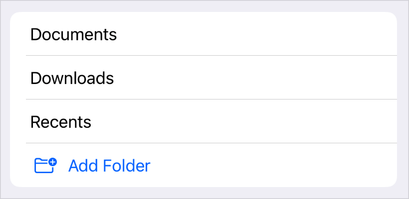
Use buttons for any user interface element that initiates an action. Buttons automatically adapt their visual style to match the expected style within these different containers and contexts. For example, to create a List cell that initiates an action when selected by the user, add a button to the list’s content:
List {
    // Cells that show all the current folders.
    ForEach(folders) { folder in
        Text(folder.title)
    }

    // A cell that, when selected, adds a new folder.
    Button(action: addItem) {
        Label("Add Folder", systemImage: "folder.badge.plus")
    }
}
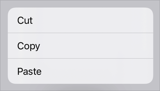
Similarly, to create a context menu item that initiates an action, add a button to the contextMenu(_:)) modifier’s content closure:
.contextMenu {
    Button("Cut", action: cut)
    Button("Copy", action: copy)
    Button("Paste", action: paste)
}
This pattern extends to most other container views in SwiftUI that have customizable, interactive content, like Form instances.
Assigning a role
You can optionally initialize a button with a ButtonRole that characterizes the button’s purpose. For example, you can create a destructive button for a deletion action:
Button("Delete", role: .destructive, action: delete)The system uses the button’s role to style the button appropriately in every context. For example, a destructive button in a contextual menu appears with a red foreground color:
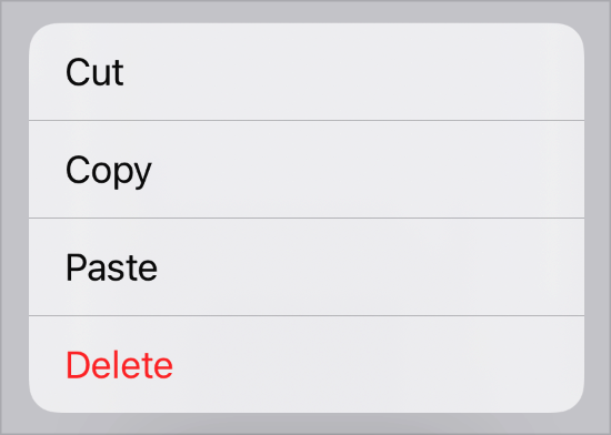
If you don’t specify a role for a button, the system applies an appropriate default appearance.
Styling buttons
You can customize a button’s appearance using one of the standard button styles, like bordered, and apply the style with the buttonStyle(_:)) modifier:
HStack {
    Button("Sign In", action: signIn)
    Button("Register", action: register)
}
.buttonStyle(.bordered)
If you apply the style to a container view, as in the example above, all the buttons in the container use the style:

You can also create custom styles. To add a custom appearance with standard interaction behavior, create a style that conforms to the ButtonStyle protocol. To customize both appearance and interaction behavior, create a style that conforms to the PrimitiveButtonStyle protocol. Custom styles can also read the button’s role and use it to adjust the button’s appearance.
Conforms To
Creating a button
- init(action:label:)) Creates a button that displays a custom label.
- init(_:action:)) Creates a button that generates its label from a localized string key.
- init(_:image:action:)) Creates a button that generates its label from a localized string key and image resource.
- init(_:systemImage:action:)) Creates a button that generates its label from a localized string key and system image name.
Creating a button with a role
- init(role:action:label:)) Creates a button with a specified role that displays a custom label.
- init(_:role:action:)) Creates a button with a specified role that generates its label from a localized string key.
- init(_:image:role:action:)) Creates a button with a specified role that generates its label from a localized string key and an image resource.
- init(_:systemImage:role:action:)) Creates a button with a specified role that generates its label from a localized string key and a system image.
Creating a button from a configuration
- init(_:)) Creates a button based on a configuration for a style with a custom appearance and custom interaction behavior.
Creating a button to perform an App Intent
- init(_:intent:)) Creates a button that performs an
AppIntentand generates its label from a localized string key. - init(intent:label:)) Creates a button that performs an
AppIntent. - init(_:role:intent:)) Creates a button with a specified role that performs an
AppIntentand generates its label from a string. - init(role:intent:label:)) Creates a button with a specified role that performs an
AppIntent. - init(_:image:role:intent:)) Creates a button with a specified role that generates its label from a string and an image resource.
- init(_:systemImage:role:intent:)) Creates a button with a specified role that generates its label from a string and a system image.
Initializers
- init(role:action:)) Creates a button that displays a default label.
Creating buttons
- buttonStyle(_:)) Sets the style for buttons within this view to a button style with a custom appearance and standard interaction behavior.
- buttonBorderShape(_:)) Sets the border shape for buttons in this view.
- buttonRepeatBehavior(_:)) Sets whether buttons in this view should repeatedly trigger their actions on prolonged interactions.
- buttonRepeatBehavior Whether buttons with this associated environment should repeatedly trigger their actions on prolonged interactions.
- ButtonBorderShape A shape used to draw a button’s border.
- ButtonRole A value that describes the purpose of a button.
- ButtonRepeatBehavior The options for controlling the repeatability of button actions.
- ButtonSizing The sizing behavior of
Buttons and other button-like controls.
---
Extracted from Apple DocC JSON by apple-skills tooling. This is unofficial content. All documentation belongs to Apple Inc.
Navigation: SwiftUI
Structure
Canvas
Available on: iOS 15.0+, iPadOS 15.0+, Mac Catalyst 15.0+, macOS 12.0+, tvOS 15.0+, visionOS 1.0+, watchOS 8.0+
A view type that supports immediate mode drawing.
struct Canvas<Symbols> where Symbols : ViewOverview
Use a canvas to draw rich and dynamic 2D graphics inside a SwiftUI view. The canvas passes a GraphicsContext to the closure that you use to perform immediate mode drawing operations. The canvas also passes a CGSize value that you can use to customize what you draw. For example, you can use the context’s stroke(_:with:lineWidth:)) command to draw a Path instance:
Canvas { context, size in
    context.stroke(
        Path(ellipseIn: CGRect(origin: .zero, size: size)),
        with: .color(.green),
        lineWidth: 4)
}
.frame(width: 300, height: 200)
.border(Color.blue)
The example above draws the outline of an ellipse that exactly inscribes a canvas with a blue border:
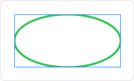
In addition to outlined and filled paths, you can draw images, text, and complete SwiftUI views. To draw views, use the init(opaque:colorMode:rendersAsynchronously:renderer:symbols:)) method to supply views that you can reference from inside the renderer. You can also add masks, apply filters, perform transforms, control blending, and more. For information about how to draw, see GraphicsContext.
A canvas doesn’t offer interactivity or accessibility for individual elements, including for views that you pass in as symbols. However, it might provide better performance for a complex drawing that involves dynamic data. Use a canvas to improve performance for a drawing that doesn’t primarily involve text or require interactive elements.
Conforms To
Creating a canvas
- init(opaque:colorMode:rendersAsynchronously:renderer:)) Creates and configures a canvas.
- init(opaque:colorMode:rendersAsynchronously:renderer:symbols:)) Creates and configures a canvas that you supply with renderable child views.
Managing opacity and color
- isOpaque A Boolean that indicates whether the canvas is fully opaque.
- colorMode The working color space and storage format of the canvas.
Referencing symbols
- symbols A view that provides child views that you can use in the drawing callback.
Rendering
- rendersAsynchronously A Boolean that indicates whether the canvas can present its contents to its parent view asynchronously.
- renderer The drawing callback that you use to draw into the canvas.
Immediate mode drawing
- Add rich graphics to your SwiftUI app Make your apps stand out by adding background materials, vibrancy, custom graphics, and animations.
- GraphicsContext An immediate mode drawing destination, and its current state.
---
Extracted from Apple DocC JSON by apple-skills tooling. This is unofficial content. All documentation belongs to Apple Inc.
Navigation: Charts
Structure
Chart
Available on: iOS 16.0+, iPadOS 16.0+, Mac Catalyst 16.0+, macOS 13.0+, tvOS 16.0+, visionOS 1.0+, watchOS 9.0+
A SwiftUI view that displays a chart.
@MainActor @preconcurrency struct Chart<Content> where Content : ChartContentOverview
To create a chart, instantiate a Chart structure with marks that display the properties of your data. For example, suppose you have an array of ValuePerCategory structures that define data points composed of a category and a value:
struct ValuePerCategory {
    var category: String
    var value: Double
}

let data: [ValuePerCategory] = [
    .init(category: "A", value: 5),
    .init(category: "B", value: 9),
    .init(category: "C", value: 7)
]
You can use BarMark inside a chart to represent the category property as different bars in the chart and the value property as the y value for each bar:
Chart(data, id: \.category) { item in
    BarMark(
        x: .value("Category", item.category),
        y: .value("Value", item.value)
    )
}
This chart initializer behaves a lot like a SwiftUI ForEach, creating a mark — in this case, a bar — for each of the values in the data array:
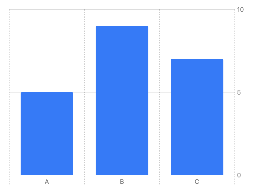
Controlling data series inside a chart
You can compose more sophisticated charts by providing more than one series of marks to the chart. For example, suppose you have profit data for two companies:
struct ProfitOverTime {
    var date: Date
    var profit: Double
}

let departmentAProfit: [ProfitOverTime] = <#Profit array A#>
let departmentBProfit: [ProfitOverTime] = <#Profit array B#>
The following chart creates two different series of LineMark instances with different colors to represent the data for each company. In effect, it moves the ForEach construct from the chart’s initializer into the body of the chart, enabling you to represent multiple different series:
Chart {
    ForEach(departmentAProfit, id: \.date) { item in
        LineMark(
            x: .value("Date", item.date),
            y: .value("Profit A", item.profit),
            series: .value("Company", "A")
        )
        .foregroundStyle(.blue)
    }
    ForEach(departmentBProfit, id: \.date) { item in
        LineMark(
            x: .value("Date", item.date),
            y: .value("Profit B", item.profit),
            series: .value("Company", "B")
        )
        .foregroundStyle(.green)
    }
    RuleMark(
        y: .value("Threshold", 400)
    )
    .foregroundStyle(.red)
}
You indicate which series a line mark belongs to by specifying its series input parameter. The above chart also uses a RuleMark to produce a horizontal line segment that displays a constant threshold value across the width of the chart:
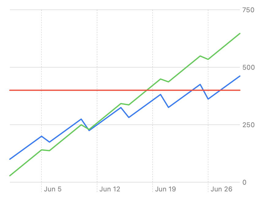
Conforms To
Creating a chart
- init(content:)) Creates a chart composed of any number of data series and individual marks.
- init(_:content:)) Creates a chart composed of a series of identifiable marks.
- init(_:id:content:)) Creates a chart composed of a series of marks.
Supporting types
- body The content and behavior of the chart content.
Charts
- Creating a chart using Swift Charts Make a chart by combining chart building blocks in SwiftUI.
- Visualizing your app’s data Build complex and interactive charts using Swift Charts.
- ChartContent A type that represents the content that you draw on a chart.
- ChartContentBuilder A result builder that you use to compose the contents of a chart.
- Plot A mechanism for grouping chart contents into a single entity.
---
Extracted from Apple DocC JSON by apple-skills tooling. This is unofficial content. All documentation belongs to Apple Inc.
Navigation: SwiftUI
Structure
Color
Available on: iOS 13.0+, iPadOS 13.0+, Mac Catalyst 13.0+, macOS 10.15+, tvOS 13.0+, visionOS 1.0+, watchOS 6.0+
A representation of a color that adapts to a given context.
@frozen struct ColorOverview
You can create a color in one of several ways:
- Load a color from an Asset Catalog:
let aqua = Color("aqua") // Looks in your app's main bundle by default.- Specify component values, like red, green, and blue; hue, saturation, and brightness; or white level:
   let skyBlue = Color(red: 0.4627, green: 0.8392, blue: 1.0)
   let lemonYellow = Color(hue: 0.1639, saturation: 1, brightness: 1)
let steelGray = Color(white: 0.4745) #if os(iOS)
let linkColor = Color(uiColor: .link)
#elseif os(macOS)
let linkColor = Color(nsColor: .linkColor)
#endifSome view modifiers can take a color as an argument. For example, foregroundStyle(_:)) uses the color you provide to set the foreground color for view elements, like text or SF Symbols:
Image(systemName: "leaf.fill")
    .foregroundStyle(Color.green)
Because SwiftUI treats colors as View instances, you can also directly add them to a view hierarchy. For example, you can layer a rectangle beneath a sun image using colors defined above:
ZStack {
    skyBlue
    Image(systemName: "sun.max.fill")
        .foregroundStyle(lemonYellow)
}
.frame(width: 200, height: 100)
A color used as a view expands to fill all the space it’s given, as defined by the frame of the enclosing ZStack in the above example:

SwiftUI only resolves a color to a concrete value just before using it in a given environment. This enables a context-dependent appearance for system defined colors, or those that you load from an Asset Catalog. For example, a color can have distinct light and dark variants that the system chooses from at render time.
Conforms To
- Copyable
- CustomStringConvertible
- Equatable
- Escapable
- Hashable
- Sendable
- SendableMetatype
- ShapeStyle
- Transferable
- View
Creating a color
- init(_:bundle:)) Creates a color from a color set that you indicate by name.
- init(_:)) Creates a constant color with the values specified by the resolved color.
- resolve(in:)) Evaluates this color to a resolved color given the current
context.
Creating a color from component values
- init(hue:saturation:brightness:opacity:)) Creates a constant color from hue, saturation, and brightness values.
- init(_:white:opacity:)) Creates a constant grayscale color.
- init(_:red:green:blue:opacity:)) Creates a constant color from red, green, and blue component values.
- Color.RGBColorSpace A profile that specifies how to interpret a color value for display.
Creating a color from another color
- init(uiColor:)) Creates a color from a UIKit color.
- init(nsColor:)) Creates a color from an AppKit color.
- init(cgColor:)) Creates a color from a Core Graphics color.
Getting standard colors
- black A black color suitable for use in UI elements.
- blue A context-dependent blue color suitable for use in UI elements.
- brown A context-dependent brown color suitable for use in UI elements.
- clear A clear color suitable for use in UI elements.
- cyan A context-dependent cyan color suitable for use in UI elements.
- gray A context-dependent gray color suitable for use in UI elements.
- green A context-dependent green color suitable for use in UI elements.
- indigo A context-dependent indigo color suitable for use in UI elements.
- mint A context-dependent mint color suitable for use in UI elements.
- orange A context-dependent orange color suitable for use in UI elements.
- pink A context-dependent pink color suitable for use in UI elements.
- purple A context-dependent purple color suitable for use in UI elements.
- red A context-dependent red color suitable for use in UI elements.
- teal A context-dependent teal color suitable for use in UI elements.
- white A white color suitable for use in UI elements.
- yellow A context-dependent yellow color suitable for use in UI elements.
Getting semantic colors
- accentColor A color that reflects the accent color of the system or app.
- primary The color to use for primary content.
- secondary The color to use for secondary content.
Modifying a color
- opacity(_:)) Multiplies the opacity of the color by the given amount.
- gradient Returns the standard gradient for the color
self. - mix(with:by:in:)) Returns a version of self mixed with
rhsby the amount specified byfraction. - exposureAdjust(_:)) Returns a new color with an exposure adjustment applied.
- headroom(_:)) Creates a new color with specified HDR content headroom.
Working with high dynamic range (HDR) colors
- resolveHDR(in:)) Evaluates this color to a resolved color with content headroom, given a set of environment values.
- Color.ResolvedHDR A concrete color value, including HDR headroom information.
Describing a color
- description A textual representation of the color.
Comparing colors
- ==(_:_:)) Indicates whether two colors are equal.
- hash(into:)) Hashes the essential components of the color by feeding them into the given hash function.
Deprecated symbols
- cgColor A Core Graphics representation of the color, if available.
Default Implementations
Setting a color
- tint(_:)) Sets the tint color within this view.
---
Extracted from Apple DocC JSON by apple-skills tooling. This is unofficial content. All documentation belongs to Apple Inc.
Instance Method
confirmationDialog(_:isPresented:titleVisibility:actions:)
Available on: iOS 15.0+, iPadOS 15.0+, Mac Catalyst 15.0+, macOS 12.0+, tvOS 15.0+, visionOS 1.0+, watchOS 8.0+
Presents a confirmation dialog when a given condition is true, using a text view for the title.
nonisolated func confirmationDialog<A>(_ title: Text, isPresented: Binding<Bool>, titleVisibility: Visibility = .automatic, @ViewBuilder actions: () -> A) -> some View where A : ViewParameters
title
The title of the dialog.
isPresented
A binding to a Boolean value that determines whether to present the dialog. When the user presses or taps the dialog’s default action button, the system sets this value to false, dismissing the dialog.
titleVisibility
The visibility of the dialog’s title. The default value is Visibility.automatic.
actions
A view builder returning the dialog’s actions.
Discussion
In the example below, a button conditionally presents a confirmation dialog depending upon the value of a bound Boolean variable. When the Boolean value is set to true, the system displays a confirmation dialog with a cancel action and a destructive action.
struct ConfirmEraseItems: View {
    @State private var isShowingDialog = false
    var body: some View {
        Button("Empty Trash") {
            isShowingDialog = true
        }
        .confirmationDialog(
            Text("Permanently erase the items in the trash?"),
            isPresented: $isShowingDialog
        ) {
            Button("Empty Trash", role: .destructive) {
                // Handle empty trash action.
            }
        }
    }
}
All actions in a confirmation dialog will dismiss the dialog after the action runs. The default button will be shown with greater prominence. You can influence the default button by assigning it the defaultAction keyboard shortcut.
The system may reorder the buttons based on their role and prominence.
Dialogs include a standard dismiss action by default. If you provide a button with a role of cancel, that button takes the place of the default dismiss action. You don’t have to dismiss the presentation with the cancel button’s action.
Note: In regular size classes in iOS, the system renders confirmation dialogs as a popover that the user dismisses by tapping anywhere outside the popover, rather than displaying the standard dismiss action.
Getting confirmation for an action
- confirmationDialog(_:isPresented:titleVisibility:presenting:actions:)) Presents a confirmation dialog using data to produce the dialog’s content and a text view for the title.
- dismissalConfirmationDialog(_:shouldPresent:actions:)) Presents a confirmation dialog when a dismiss action has been triggered.
---
Extracted from Apple DocC JSON by apple-skills tooling. This is unofficial content. All documentation belongs to Apple Inc.
Navigation: SwiftUI
Structure
ContentUnavailableView
Available on: iOS 17.0+, iPadOS 17.0+, Mac Catalyst 17.0+, macOS 14.0+, tvOS 17.0+, visionOS 1.0+, watchOS 10.0+
An interface, consisting of a label and additional content, that you display when the content of your app is unavailable to users.
struct ContentUnavailableView<Label, Description, Actions> where Label : View, Description : View, Actions : ViewOverview
It is recommended to use ContentUnavailableView in situations where a view’s content cannot be displayed. That could be caused by a network error, a list without items, a search that returns no results etc.
You create an ContentUnavailableView in its simplest form, by providing a label and some additional content such as a description or a call to action:
ContentUnavailableView {
    Label("No Mail", systemImage: "tray.fill")
} description: {
    Text("New mails you receive will appear here.")
}
The system provides default ContentUnavailableViews that you can use in specific situations. The example below illustrates the usage of the search view:
struct ContentView: View {
    @ObservedObject private var viewModel = ContactsViewModel()

    var body: some View {
        NavigationStack {
            List {
                ForEach(viewModel.searchResults) { contact in
                    NavigationLink {
                        ContactsView(contact)
                    } label: {
                        Text(contact.name)
                    }
                }
            }
            .navigationTitle("Contacts")
            .searchable(text: $viewModel.searchText)
            .overlay {
                if searchResults.isEmpty {
                    ContentUnavailableView.search
                }
            }
        }
    }
}
Conforms To
Getting built-in unavailable views
- search Creates a
ContentUnavailableViewinstance that conveys a search state. - search(text:)) Creates a
ContentUnavailableViewinstance that conveys a search state.
Creating an unavailable view
- init(label:description:actions:)) Creates an interface, consisting of a label and additional content, that you display when the content of your app is unavailable to users.
- init(_:image:description:)) Creates an interface, consisting of a title generated from a localized string, an image and additional content, that you display when the content of your app is unavailable to users.
- init(_:systemImage:description:)) Creates an interface, consisting of a title generated from a localized string, a system icon image and additional content, that you display when the content of your app is unavailable to users.
Supporting types
- SearchUnavailableContent A structure that represents the body of a static placeholder search view.
---
Extracted from Apple DocC JSON by apple-skills tooling. This is unofficial content. All documentation belongs to Apple Inc.
Navigation: SwiftUI
Structure
DisclosureGroup
Available on: iOS 14.0+, iPadOS 14.0+, Mac Catalyst 14.0+, macOS 11.0+, visionOS 1.0+
A view that shows or hides another content view, based on the state of a disclosure control.
struct DisclosureGroup<Label, Content> where Label : View, Content : ViewOverview
A disclosure group view consists of a label to identify the contents, and a control to show and hide the contents. Showing the contents puts the disclosure group into the “expanded” state, and hiding them makes the disclosure group “collapsed”.
In the following example, a disclosure group contains two toggles and an embedded disclosure group. The top level disclosure group exposes its expanded state with the bound property, topLevelExpanded. By expanding the disclosure group, the user can use the toggles to update the state of the toggleStates structure.
struct ToggleStates {
    var oneIsOn: Bool = false
    var twoIsOn: Bool = true
}
@State private var toggleStates = ToggleStates()
@State private var topExpanded: Bool = true

var body: some View {
    DisclosureGroup("Items", isExpanded: $topExpanded) {
        Toggle("Toggle 1", isOn: $toggleStates.oneIsOn)
        Toggle("Toggle 2", isOn: $toggleStates.twoIsOn)
        DisclosureGroup("Sub-items") {
            Text("Sub-item 1")
        }
    }
}
Conforms To
Creating a disclosure group
- init(_:content:)) Creates a disclosure group, using a provided localized string key to create a text view for the label.
- init(content:label:)) Creates a disclosure group with the given label and content views.
- init(_:isExpanded:content:)) Creates a disclosure group, using a provided localized string key to create a text view for the label, and a binding to the expansion state (expanded or collapsed).
- init(isExpanded:content:label:)) Creates a disclosure group with the given label and content views, and a binding to the expansion state (expanded or collapsed).
Disclosing information progressively
- OutlineGroup A structure that computes views and disclosure groups on demand from an underlying collection of tree-structured, identified data.
- disclosureGroupStyle(_:)) Sets the style for disclosure groups within this view.
---
Extracted from Apple DocC JSON by apple-skills tooling. This is unofficial content. All documentation belongs to Apple Inc.
Navigation: SwiftUI
Structure
Environment
Available on: iOS 13.0+, iPadOS 13.0+, Mac Catalyst 13.0+, macOS 10.15+, tvOS 13.0+, visionOS 1.0+, watchOS 6.0+
A property wrapper that reads a value from a view’s environment.
@frozen @propertyWrapper struct Environment<Value>Overview
Use the Environment property wrapper to read a value stored in a view’s environment. Indicate the value to read using an EnvironmentValues key path in the property declaration. For example, you can create a property that reads the color scheme of the current view using the key path of the colorScheme property:
@Environment(\.colorScheme) var colorScheme: ColorSchemeYou can condition a view’s content on the associated value, which you read from the declared property’s wrappedValue. As with any property wrapper, you access the wrapped value by directly referring to the property:
if colorScheme == .dark { // Checks the wrapped value.
    DarkContent()
} else {
    LightContent()
}
If the value changes, SwiftUI updates any parts of your view that depend on the value. For example, that might happen in the above example if the user changes the Appearance settings.
You can use this property wrapper to read — but not set — an environment value. SwiftUI updates some environment values automatically based on system settings and provides reasonable defaults for others. You can override some of these, as well as set custom environment values that you define, using the environment(_:_:)) view modifier.
For the complete list of environment values SwiftUI provides, see the properties of the EnvironmentValues structure. For information about creating custom environment values, see the Entry()) macro.
Get an observable object
You can also use Environment to get an observable object from a view’s environment. The observable object must conform to the Observable protocol, and your app must set the object in the environment using the object itself or a key path.
To set the object in the environment using the object itself, use the environment(_:)) modifier:
@Observable
class Library {
    var books: [Book] = [Book(), Book(), Book()]

    var availableBooksCount: Int {
        books.filter(\.isAvailable).count
    }
}

@main
struct BookReaderApp: App {
    @State private var library = Library()

    var body: some Scene {
        WindowGroup {
            LibraryView()
                .environment(library)
        }
    }
}
To get the observable object using its type, create a property and provide the Environment property wrapper the object’s type:
struct LibraryView: View {
    @Environment(Library.self) private var library

    var body: some View {
        // ...
    }
}
By default, reading an object from the environment returns a non-optional object when using the object type as the key. This default behavior assumes that a view in the current hierarchy previously stored a non-optional instance of the type using the environment(_:)) modifier. If a view attempts to retrieve an object using its type and that object isn’t in the environment, SwiftUI throws an exception.
In cases where there is no guarantee that an object is in the environment, retrieve an optional version of the object as shown in the following code. If the object isn’t available the environment, SwiftUI returns nil instead of throwing an exception.
@Environment(Library.self) private var library: Library?Get an observable object using a key path
To set the object with a key path, use the environment(_:_:)) modifier:
@Observable
class Library {
    var books: [Book] = [Book(), Book(), Book()]

    var availableBooksCount: Int {
        books.filter(\.isAvailable).count
    }
}

@main
struct BookReaderApp: App {
    @State private var library = Library()

    var body: some Scene {
        WindowGroup {
            LibraryView()
                .environment(\.library, library)
        }
    }
}
To get the object, create a property and specify the key path:
struct LibraryView: View {
    @Environment(\.library) private var library

    var body: some View {
        // ...
    }
}
Conforms To
Creating an environment instance
- init(_:)) Creates an environment property to read the specified key path.
Getting the value
- wrappedValue The current value of the environment property.
Accessing environment values
- EnvironmentValues A collection of environment values propagated through a view hierarchy.
---
Extracted from Apple DocC JSON by apple-skills tooling. This is unofficial content. All documentation belongs to Apple Inc.
Navigation: SwiftUI
Structure
Form
Available on: iOS 13.0+, iPadOS 13.0+, Mac Catalyst 13.0+, macOS 10.15+, tvOS 13.0+, visionOS 1.0+, watchOS 6.0+
A container for grouping controls used for data entry, such as in settings or inspectors.
struct Form<Content> where Content : ViewOverview
SwiftUI applies platform-appropriate styling to views contained inside a form, to group them together. Form-specific styling applies to things like buttons, toggles, labels, lists, and more. Keep in mind that these stylings may be platform-specific. For example, forms appear as grouped lists on iOS, and as aligned vertical stacks on macOS.
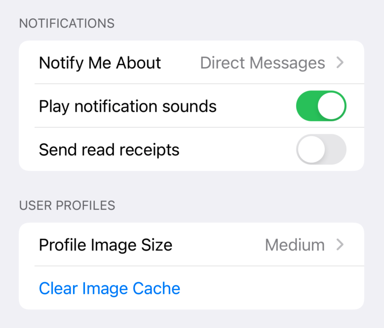
The following example shows a simple data entry form on iOS, grouped into two sections. The supporting types (NotifyMeAboutType and ProfileImageSize) and state variables (notifyMeAbout, profileImageSize, playNotificationSounds, and sendReadReceipts) are omitted for simplicity.
var body: some View {
    NavigationView {
        Form {
            Section(header: Text("Notifications")) {
                Picker("Notify Me About", selection: $notifyMeAbout) {
                    Text("Direct Messages").tag(NotifyMeAboutType.directMessages)
                    Text("Mentions").tag(NotifyMeAboutType.mentions)
                    Text("Anything").tag(NotifyMeAboutType.anything)
                }
                Toggle("Play notification sounds", isOn: $playNotificationSounds)
                Toggle("Send read receipts", isOn: $sendReadReceipts)
            }
            Section(header: Text("User Profiles")) {
                Picker("Profile Image Size", selection: $profileImageSize) {
                    Text("Large").tag(ProfileImageSize.large)
                    Text("Medium").tag(ProfileImageSize.medium)
                    Text("Small").tag(ProfileImageSize.small)
                }
                Button("Clear Image Cache") {}
            }
        }
    }
}
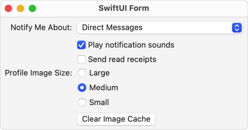
On macOS, a similar form renders as a vertical stack. To adhere to macOS platform conventions, this version doesn’t use sections, and uses colons at the end of its labels. It also sets the picker to use the inline style, which produces radio buttons on macOS.
var body: some View {
    Spacer()
    HStack {
        Spacer()
        Form {
            Picker("Notify Me About:", selection: $notifyMeAbout) {
                Text("Direct Messages").tag(NotifyMeAboutType.directMessages)
                Text("Mentions").tag(NotifyMeAboutType.mentions)
                Text("Anything").tag(NotifyMeAboutType.anything)
            }
            Toggle("Play notification sounds", isOn: $playNotificationSounds)
            Toggle("Send read receipts", isOn: $sendReadReceipts)

            Picker("Profile Image Size:", selection: $profileImageSize) {
                Text("Large").tag(ProfileImageSize.large)
                Text("Medium").tag(ProfileImageSize.medium)
                Text("Small").tag(ProfileImageSize.small)
            }
            .pickerStyle(.inline)

            Button("Clear Image Cache") {}
        }
        Spacer()
    }
    Spacer()
}
Conforms To
Creating a form
- init(content:)) Creates a form with the provided content.
Creating a form from a configuration
- init(_:)) Creates a form based on a form style configuration.
Grouping inputs
- formStyle(_:)) Sets the style for forms in a view hierarchy.
- LabeledContent A container for attaching a label to a value-bearing view.
- labeledContentStyle(_:)) Sets a style for labeled content.
---
Extracted from Apple DocC JSON by apple-skills tooling. This is unofficial content. All documentation belongs to Apple Inc.
Navigation: SwiftUI
Structure
GeometryReader
Available on: iOS 13.0+, iPadOS 13.0+, Mac Catalyst 13.0+, macOS 10.15+, tvOS 13.0+, visionOS 1.0+, watchOS 6.0+
A container view that defines its content as a function of its own size and coordinate space.
@frozen struct GeometryReader<Content> where Content : ViewOverview
This view returns a flexible preferred size to its parent layout.
Conforms To
Creating a geometry reader
Measuring a view
- GeometryReader3D A container view that defines its content as a function of its own size and coordinate space.
- GeometryProxy A proxy for access to the size and coordinate space (for anchor resolution) of the container view.
- GeometryProxy3D A proxy for access to the size and coordinate space of the container view.
- coordinateSpace(_:)) Assigns a name to the view’s coordinate space, so other code can operate on dimensions like points and sizes relative to the named space.
- CoordinateSpace A resolved coordinate space created by the coordinate space protocol.
- CoordinateSpaceProtocol A frame of reference within the layout system.
- PhysicalMetric Provides access to a value in points that corresponds to the specified physical measurement.
- PhysicalMetricsConverter A physical metrics converter provides conversion between point values and their extent in 3D space, in the form of physical length measurements.
---
Extracted from Apple DocC JSON by apple-skills tooling. This is unofficial content. All documentation belongs to Apple Inc.
Navigation: SwiftUI
Structure
GraphicsContext
Available on: iOS 15.0+, iPadOS 15.0+, Mac Catalyst 15.0+, macOS 12.0+, tvOS 15.0+, visionOS 1.0+, watchOS 8.0+
An immediate mode drawing destination, and its current state.
@frozen struct GraphicsContextOverview
Use a context to execute 2D drawing primitives. For example, you can draw filled shapes using the fill(_:with:style:)) method inside a Canvas view:
Canvas { context, size in
    context.fill(
        Path(ellipseIn: CGRect(origin: .zero, size: size)),
        with: .color(.green))
}
.frame(width: 300, height: 200)
The example above draws an ellipse that just fits inside a canvas that’s constrained to 300 points wide and 200 points tall:
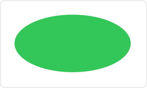
In addition to outlining or filling paths, you can draw images, text, and SwiftUI views. You can also use the context to perform many common graphical operations, like adding masks, applying filters and transforms, and setting a blend mode. For example you can add a mask using the clip(to:style:options:)) method:
let halfSize = size.applying(CGAffineTransform(scaleX: 0.5, y: 0.5))
context.clip(to: Path(CGRect(origin: .zero, size: halfSize)))
context.fill(
    Path(ellipseIn: CGRect(origin: .zero, size: size)),
    with: .color(.green))
The rectangular mask hides all but one quadrant of the ellipse:

The order of operations matters. Changes that you make to the state of the context, like adding a mask or a filter, apply to later drawing operations. If you reverse the fill and clip operations in the example above, so that the fill comes first, the mask doesn’t affect the ellipse.
Each context references a particular layer in a tree of transparency layers, and also contains a full copy of the drawing state. You can modify the state of one context without affecting the state of any other, even if they refer to the same layer. For example you can draw the masked ellipse from the previous example into a copy of the main context, and then add a rectangle into the main context:
// Create a copy of the context to draw a clipped ellipse.
var maskedContext = context
let halfSize = size.applying(CGAffineTransform(scaleX: 0.5, y: 0.5))
maskedContext.clip(to: Path(CGRect(origin: .zero, size: halfSize)))
maskedContext.fill(
    Path(ellipseIn: CGRect(origin: .zero, size: size)),
    with: .color(.green))

// Go back to the original context to draw the rectangle.
let origin = CGPoint(x: size.width / 4, y: size.height / 4)
context.fill(
    Path(CGRect(origin: origin, size: halfSize)),
    with: .color(.blue))
The mask doesn’t clip the rectangle because the mask isn’t part of the main context. However, both contexts draw into the same view because you created one context as a copy of the other:
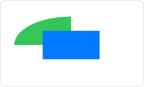
The context has access to an EnvironmentValues instance called environment that’s initially copied from the environment of its enclosing view. SwiftUI uses environment values — like the display resolution and color scheme — to resolve types like Image and Color that appear in the context. You can also access values stored in the environment for your own purposes.
Drawing a path
- stroke(_:with:lineWidth:)) Draws a path into the context with a specified line width.
- stroke(_:with:style:)) Draws a path into the context with a specified stroke style.
- fill(_:with:style:)) Draws a path into the context and fills the outlined region.
- GraphicsContext.Shading A color or pattern that you can use to outline or fill a path.
- GraphicsContext.GradientOptions Options that affect the rendering of color gradients.
Drawing images, text, and views
- draw(_:in:)) Draws a resolved symbol into the context, using the specified rectangle as a layout frame.
- draw(_:in:style:)) Draws a resolved image into the context, using the specified rectangle as a layout frame.
- draw(_:at:anchor:)) Draws a resolved image into the context, aligning an anchor within the image to a point in the context.
Drawing into a new layer
- drawLayer(content:)) Draws a new layer, created by drawing code that you provide, into the context.
Resolving a drawn entity
- resolve(_:)) Gets a version of an image that’s fixed with the current values of the graphics context’s environment.
- resolveSymbol(id:)) Gets the identified child view as a resolved symbol, if the view exists.
- GraphicsContext.ResolvedSymbol A static sequence of drawing operations that may be drawn multiple times, preserving their resolution independence.
- GraphicsContext.ResolvedImage An image resolved to a particular environment.
- GraphicsContext.ResolvedText A text view resolved to a particular environment.
Masking
- clip(to:style:options:)) Adds a path to the context’s array of clip shapes.
- clipToLayer(opacity:options:content:)) Adds a clip shape that you define in a new layer to the context’s array of clip shapes.
- clipBoundingRect The bounding rectangle of the intersection of all current clip shapes in the current user space.
- GraphicsContext.ClipOptions Options that affect the use of clip shapes.
Setting opacity and the blend mode
- opacity The opacity of drawing operations in the context.
- blendMode The blend mode used by drawing operations in the context.
- GraphicsContext.BlendMode The ways that a graphics context combines new content with background content.
Filtering
- addFilter(_:options:)) Adds a filter that applies to subsequent drawing operations.
- GraphicsContext.Filter A type that applies image processing operations to rendered content.
- GraphicsContext.FilterOptions Options that configure a filter that you add to a graphics context.
- GraphicsContext.BlurOptions Options that configure the graphics context filter that creates blur.
- GraphicsContext.ShadowOptions Options that configure the graphics context filter that creates shadows.
Applying transforms
- scaleBy(x:y:)) Scales subsequent drawing operations by an amount in each dimension.
- rotate(by:)) Rotates subsequent drawing operations by an angle.
- translateBy(x:y:)) Moves subsequent drawing operations by an amount in each dimension.
- concatenate(_:)) Appends the given transform to the context’s existing transform.
- transform The current transform matrix, defining user space coordinates.
Drawing with a core graphics context
- withCGContext(content:)) Provides a Core Graphics context that you can use as a proxy to draw into this context.
Accessing the environment
- environment The environment associated with the graphics context.
Instance Methods
- draw(_:options:)) Draws
lineinto the graphics context.
Immediate mode drawing
- Add rich graphics to your SwiftUI app Make your apps stand out by adding background materials, vibrancy, custom graphics, and animations.
- Canvas A view type that supports immediate mode drawing.
---
Extracted from Apple DocC JSON by apple-skills tooling. This is unofficial content. All documentation belongs to Apple Inc.
Navigation: SwiftUI
Structure
Grid
Available on: iOS 16.0+, iPadOS 16.0+, Mac Catalyst 16.0+, macOS 13.0+, tvOS 16.0+, visionOS 1.0+, watchOS 9.0+
A container view that arranges other views in a two dimensional layout.
@frozen struct Grid<Content> where Content : ViewOverview
Create a two dimensional layout by initializing a Grid with a collection of GridRow structures. The first view in each grid row appears in the grid’s first column, the second view in the second column, and so on. The following example creates a grid with two rows and two columns:
Grid {
    GridRow {
        Text("Hello")
        Image(systemName: "globe")
    }
    GridRow {
        Image(systemName: "hand.wave")
        Text("World")
    }
}
A grid and its rows behave something like a collection of HStack instances wrapped in a VStack. However, the grid handles row and column creation as a single operation, which applies alignment and spacing to cells, rather than first to rows and then to a column of unrelated rows. The grid produced by the example above demonstrates this:

Note: If you need a grid that conforms to the Layout protocol, like when you want to create a conditional layout using AnyLayout, use GridLayout instead.
Multicolumn cells
If you provide a view rather than a GridRow as an element in the grid’s content, the grid uses the view to create a row that spans all of the grid’s columns. For example, you can add a Divider between the rows of the previous example:
Grid {
    GridRow {
        Text("Hello")
        Image(systemName: "globe")
    }
    Divider()
    GridRow {
        Image(systemName: "hand.wave")
        Text("World")
    }
}
Because a divider takes as much horizontal space as its parent offers, the entire grid widens to fill the width offered by its parent view.

To prevent a flexible view from taking more space on a given axis than the other cells in a row or column require, add the gridCellUnsizedAxes(_:)) view modifier to the view:
Divider()
    .gridCellUnsizedAxes(.horizontal)
This restores the grid to the width that the text and images require:
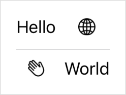
To make a cell span a specific number of columns rather than the whole grid, use the gridCellColumns(_:)) modifier on a view that’s contained inside a GridRow.
Column count
The grid’s column count grows to handle the row with the largest number of columns. If you create rows with different numbers of columns, the grid adds empty cells to the trailing edge of rows that have fewer columns. The example below creates three rows with different column counts:
Grid {
    GridRow {
        Text("Row 1")
        ForEach(0..<2) { _ in Color.red }
    }
    GridRow {
        Text("Row 2")
        ForEach(0..<5) { _ in Color.green }
    }
    GridRow {
        Text("Row 3")
        ForEach(0..<4) { _ in Color.blue }
    }
}
The resulting grid has as many columns as the widest row, adding empty cells to rows that don’t specify enough views:
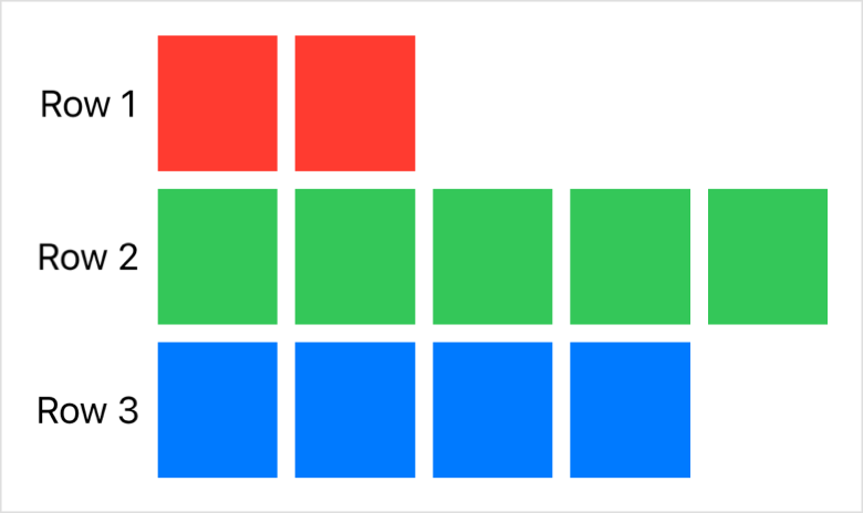
The grid sets the width of all the cells in a column to match the needs of column’s widest cell. In the example above, the width of the first column depends on the width of the widest Text view that the column contains. The other columns, which contain flexible Color views, share the remaining horizontal space offered by the grid’s parent view equally.
Similarly, the tallest cell in a row sets the height of the entire row. The cells in the first column of the grid above need only the height required for each string, but the Color cells expand to equally share the total height available to the grid. As a result, the color cells determine the row heights.
Cell spacing and alignment
You can control the spacing between cells in both the horizontal and vertical dimensions and set a default alignment for the content in all the grid cells when you initialize the grid using the init(alignment:horizontalSpacing:verticalSpacing:content:)) initializer. Consider a modified version of the previous example:
Grid(alignment: .bottom, horizontalSpacing: 1, verticalSpacing: 1) {
    // ...
}
This configuration causes all of the cells to use bottom alignment — which only affects the text cells because the colors fill their cells completely — and it reduces the spacing between cells:
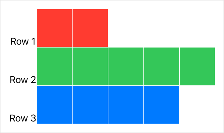
You can override the alignment of specific cells or groups of cells. For example, you can change the horizontal alignment of the cells in a column by adding the gridColumnAlignment(_:)) modifier, or the vertical alignment of the cells in a row by configuring the row’s init(alignment:content:)) initializer. You can also align a single cell with the gridCellAnchor(_:)) modifier.
Performance considerations
A grid can size its rows and columns correctly because it renders all of its child views immediately. If your app exhibits poor performance when it first displays a large grid that appears inside a ScrollView, consider switching to a LazyVGrid or LazyHGrid instead.
Lazy grids render their cells when SwiftUI needs to display them, rather than all at once. This reduces the initial cost of displaying a large scrollable grid that’s never fully visible, but also reduces the grid’s ability to optimally lay out cells. Switch to a lazy grid only if profiling your code shows a worthwhile performance improvement.
Conforms To
Creating a grid
- init(alignment:horizontalSpacing:verticalSpacing:content:)) Creates a grid with the specified spacing, alignment, and child views.
Statically arranging views in two dimensions
- GridRow A horizontal row in a two dimensional grid container.
- gridCellColumns(_:)) Tells a view that acts as a cell in a grid to span the specified number of columns.
- gridCellAnchor(_:)) Specifies a custom alignment anchor for a view that acts as a grid cell.
- gridCellUnsizedAxes(_:)) Asks grid layouts not to offer the view extra size in the specified axes.
- gridColumnAlignment(_:)) Overrides the default horizontal alignment of the grid column that the view appears in.
---
Extracted from Apple DocC JSON by apple-skills tooling. This is unofficial content. All documentation belongs to Apple Inc.
Navigation: SwiftUI
Structure
HStack
Available on: iOS 13.0+, iPadOS 13.0+, Mac Catalyst 13.0+, macOS 10.15+, tvOS 13.0+, visionOS 1.0+, watchOS 6.0+
A view that arranges its subviews in a horizontal line.
@frozen struct HStack<Content> where Content : ViewOverview
Unlike LazyHStack, which only renders the views when your app needs to display them onscreen, an HStack renders the views all at once, regardless of whether they are on- or offscreen. Use the regular HStack when you have a small number of subviews or don’t want the delayed rendering behavior of the “lazy” version.
The following example shows a simple horizontal stack of five text views:
var body: some View {
    HStack(
        alignment: .top,
        spacing: 10
    ) {
        ForEach(
            1...5,
            id: \.self
        ) {
            Text("Item \($0)")
        }
    }
}
Note: If you need a horizontal stack that conforms to the Layout protocol, like when you want to create a conditional layout using AnyLayout, use HStackLayout instead.
Conforms To
Creating a stack
- init(alignment:spacing:content:)) Creates a horizontal stack with the given spacing and vertical alignment.
Statically arranging views in one dimension
- Building layouts with stack views Compose complex layouts from primitive container views.
- VStack A view that arranges its subviews in a vertical line.
---
Extracted from Apple DocC JSON by apple-skills tooling. This is unofficial content. All documentation belongs to Apple Inc.
Navigation: SwiftUI
Structure
Image
Available on: iOS 13.0+, iPadOS 13.0+, Mac Catalyst 13.0+, macOS 10.15+, tvOS 13.0+, visionOS 1.0+, watchOS 6.0+
A view that displays an image.
@frozen struct ImageOverview
Use an Image instance when you want to add images to your SwiftUI app. You can create images from many sources:
- Image files in your app’s asset library or bundle. Supported types include PNG, JPEG, HEIC, and more.
- Instances of platform-specific image types, like UIImage and NSImage.
- A bitmap stored in a Core Graphics CGImage instance.
- System graphics from the SF Symbols set.
The following example shows how to load an image from the app’s asset library or bundle and scale it to fit within its container:
Image("Landscape_4")
    .resizable()
    .aspectRatio(contentMode: .fit)
Text("Water wheel")
You can use methods on the Image type as well as standard view modifiers to adjust the size of the image to fit your app’s interface. Here, the Image type’s resizable(capInsets:resizingMode:)) method scales the image to fit the current view. Then, the aspectRatio(_:contentMode:)) view modifier adjusts this resizing behavior to maintain the image’s original aspect ratio, rather than scaling the x- and y-axes independently to fill all four sides of the view. The article Fitting images into available space shows how to apply scaling, clipping, and tiling to Image instances of different sizes.
An Image is a late-binding token; the system resolves its actual value only when it’s about to use the image in an environment.
Making images accessible
To use an image as a control, use one of the initializers that takes a label parameter. This allows the system’s accessibility frameworks to use the label as the name of the control for users who use features like VoiceOver. For images that are only present for aesthetic reasons, use an initializer with the decorative parameter; the accessibility systems ignore these images.
Conforms To
Creating an image
- init(_:bundle:)) Creates a labeled image that you can use as content for controls.
- init(_:variableValue:bundle:)) Creates a labeled image that you can use as content for controls, with a variable value.
- init(_:)) Initialize an
Imagewith an image resource.
Creating an image for use as a control
- init(_:bundle:label:)) Creates a labeled image that you can use as content for controls, with the specified label.
- init(_:variableValue:bundle:label:)) Creates a labeled image that you can use as content for controls, with the specified label and variable value.
- init(_:scale:orientation:label:)) Creates a labeled image based on a Core Graphics image instance, usable as content for controls.
Creating an image for decorative use
- init(decorative:bundle:)) Creates an unlabeled, decorative image.
- init(decorative:variableValue:bundle:)) Creates an unlabeled, decorative image, with a variable value.
- init(decorative:scale:orientation:)) Creates an unlabeled, decorative image based on a Core Graphics image instance.
Creating a system symbol image
- init(systemName:)) Creates a system symbol image.
- init(systemName:variableValue:)) Creates a system symbol image with a variable value.
Creating an image from another image
- init(uiImage:)) Creates a SwiftUI image from a UIKit image instance.
- init(nsImage:)) Creates a SwiftUI image from an AppKit image instance.
Creating an image from drawing instructions
- init(size:label:opaque:colorMode:renderer:)) Initializes an image of the given size, with contents provided by a custom rendering closure.
Resizing images
- resizable(capInsets:resizingMode:)) Sets the mode by which SwiftUI resizes an image to fit its space.
Specifying rendering behavior
- antialiased(_:)) Specifies whether SwiftUI applies antialiasing when rendering the image.
- symbolRenderingMode(_:)) Sets the rendering mode for symbol images within this view.
- renderingMode(_:)) Indicates whether SwiftUI renders an image as-is, or by using a different mode.
- interpolation(_:)) Specifies the current level of quality for rendering an image that requires interpolation.
- Image.TemplateRenderingMode A type that indicates how SwiftUI renders images.
- Image.Interpolation The level of quality for rendering an image that requires interpolation, such as a scaled image.
Specifying dynamic range
- allowedDynamicRange(_:)) Returns a new image configured with the specified allowed dynamic range.
- allowedDynamicRange The allowed dynamic range for the view, or nil.
- Image.DynamicRange
Instance Methods
- symbolColorRenderingMode(_:)) Sets the color rendering mode of the image.
- symbolVariableValueMode(_:)) Sets the variable value mode mode for symbol images within this view.
- widgetAccentedRenderingMode(_:)) Specifies the how to render an
Imagewhen using theWidgetKit/WidgetRenderingMode/accentedmode.
Enumerations
- Image.Orientation The orientation of an image.
- Image.ResizingMode The modes that SwiftUI uses to resize an image to fit within its containing view.
- Image.Scale A scale to apply to vector images relative to text.
---
Extracted from Apple DocC JSON by apple-skills tooling. This is unofficial content. All documentation belongs to Apple Inc.
Instance Method
inspector(isPresented:content:)
Available on: iOS 17.0+, iPadOS 17.0+, Mac Catalyst 17.0+, macOS 14.0+
Inserts an inspector at the applied position in the view hierarchy.
nonisolated func inspector<V>(isPresented: Binding<Bool>, @ViewBuilder content: () -> V) -> some View where V : ViewParameters
isPresented
A binding to Bool controlling the presented state.
content
The inspector content.
Discussion
Apply this modifier to declare an inspector with a context-dependent presentation. For example, an inspector can present as a trailing column in a horizontally regular size class, but adapt to a sheet in a horizontally compact size class.
struct ShapeEditor: View {
    @State var presented: Bool = false
    var body: some View {
        MyEditorView()
            .inspector(isPresented: $presented) {
                TextTraitsInspectorView()
            }
    }
}
Note: Trailing column inspectors have their presentation state restored by the framework.
See Also: InspectorCommands for including the default inspector commands and keyboard shortcuts.
Presenting an inspector
- inspectorColumnWidth(_:)) Sets a fixed, preferred width for the inspector containing this view when presented as a trailing column.
- inspectorColumnWidth(min:ideal:max:)) Sets a flexible, preferred width for the inspector in a trailing-column presentation.
---
Extracted from Apple DocC JSON by apple-skills tooling. This is unofficial content. All documentation belongs to Apple Inc.
Navigation: SwiftUI
Structure
Label
Available on: iOS 14.0+, iPadOS 14.0+, Mac Catalyst 14.0+, macOS 11.0+, tvOS 14.0+, visionOS 1.0+, watchOS 7.0+
A standard label for user interface items, consisting of an icon with a title.
struct Label<Title, Icon> where Title : View, Icon : ViewOverview
One of the most common and recognizable user interface components is the combination of an icon and a label. This idiom appears across many kinds of apps and shows up in collections, lists, menus of action items, and disclosable lists, just to name a few.
You create a label, in its simplest form, by providing a title and the name of an image, such as an icon from the SF Symbols collection:
Label("Lightning", systemImage: "bolt.fill")You can also apply styles to labels in several ways. In the case of dynamic changes to the view after device rotation or change to a window size you might want to show only the text portion of the label using the titleOnly label style:
Label("Lightning", systemImage: "bolt.fill")
    .labelStyle(.titleOnly)
Conversely, there’s also an icon-only label style:
Label("Lightning", systemImage: "bolt.fill")
    .labelStyle(.iconOnly)
Some containers might apply a different default label style, such as only showing icons within toolbars on macOS and iOS. To opt in to showing both the title and the icon, you can apply the titleAndIcon label style:
Label("Lightning", systemImage: "bolt.fill")
    .labelStyle(.titleAndIcon)
You can also create a customized label style by modifying an existing style; this example adds a red border to the default label style:
struct RedBorderedLabelStyle: LabelStyle {
    func makeBody(configuration: Configuration) -> some View {
        Label(configuration)
            .border(Color.red)
    }
}
For more extensive customization or to create a completely new label style, you’ll need to adopt the LabelStyle protocol and implement a LabelStyleConfiguration for the new style.
To apply a common label style to a group of labels, apply the style to the view hierarchy that contains the labels:
VStack {
    Label("Rain", systemImage: "cloud.rain")
    Label("Snow", systemImage: "snow")
    Label("Sun", systemImage: "sun.max")
}
.labelStyle(.iconOnly)
It’s also possible to make labels using views to compose the label’s icon programmatically, rather than using a pre-made image. In this example, the icon portion of the label uses a filled Circle overlaid with the user’s initials:
Label {
    Text(person.fullName)
        .font(.body)
        .foregroundColor(.primary)
    Text(person.title)
        .font(.subheadline)
        .foregroundColor(.secondary)
} icon: {
    Circle()
        .fill(person.profileColor)
        .frame(width: 44, height: 44, alignment: .center)
        .overlay(Text(person.initials))
}
Conforms To
Creating a label
- init(_:image:)) Creates a label with an icon image and a title generated from a localized string.
- init(_:systemImage:)) Creates a label with a system icon image and a title generated from a localized string.
- init(title:icon:)) Creates a label with a custom title and icon.
- init(_:)) Creates a label representing a family activity application.
- init(_:image:)) Creates a label with an icon image and a title generated from a localized string.
Displaying text
- Text A view that displays one or more lines of read-only text.
- labelStyle(_:)) Sets the style for labels within this view.
---
Extracted from Apple DocC JSON by apple-skills tooling. This is unofficial content. All documentation belongs to Apple Inc.
Navigation: SwiftUI
Structure
LazyHStack
Available on: iOS 14.0+, iPadOS 14.0+, Mac Catalyst 14.0+, macOS 11.0+, tvOS 14.0+, visionOS 1.0+, watchOS 7.0+
A view that arranges its children in a line that grows horizontally, creating items only as needed.
struct LazyHStack<Content> where Content : ViewOverview
The stack is “lazy,” in that the stack view doesn’t create items until it needs to render them onscreen.
In the following example, a ScrollView contains a LazyHStack that consists of a horizontal row of text views. The stack aligns to the top of the scroll view and uses 10-point spacing between each text view.
ScrollView(.horizontal) {
    LazyHStack(alignment: .top, spacing: 10) {
        ForEach(1...100, id: \.self) {
            Text("Column \($0)")
        }
    }
}
Conforms To
Creating a lazy-loading horizontal stack
- init(alignment:spacing:pinnedViews:content:)) Creates a lazy horizontal stack view with the given spacing, vertical alignment, pinning behavior, and content.
Dynamically arranging views in one dimension
- Grouping data with lazy stack views Split content into logical sections inside lazy stack views.
- Creating performant scrollable stacks Display large numbers of repeated views efficiently with scroll views, stack views, and lazy stacks.
- LazyVStack A view that arranges its children in a line that grows vertically, creating items only as needed.
- PinnedScrollableViews A set of view types that may be pinned to the bounds of a scroll view.
---
Extracted from Apple DocC JSON by apple-skills tooling. This is unofficial content. All documentation belongs to Apple Inc.
Related skills
 Xcode Project SetupAutomatically create and configure a new Xcode project with Swift Package Manager dependencies for iOS or macOS agent projects.74.7k392
 Expo Tailwind SetupInstantly configure Tailwind CSS v4 with NativeWind v5 and react-native-css inside an Expo project for universal styling.46.7k2.3kExpo Dev ClientCreate custom development clients for Expo React Native apps that need native modules or Apple-specific targets.45.9k2.3k
 Swiftui Expert SkillGet expert guidance when writing, reviewing, or refactoring SwiftUI views, state, performance, and modern iOS/macOS APIs.27.6k3.3k
 Flutter Apply Architecture Best PracticesEnforce clean layered architecture when creating or refactoring a Flutter mobile application.25.4k2.7kExpo ModuleCreate custom config plugins that safely modify native Android and iOS projects generated by Expo prebuild.25k2.3k
How it compares
Pick swiftui for view layout and navigation references; pair with swift-concurrency when the task mixes UI with async networking or actor-isolated models.
FAQ
What SwiftUI topics does the swiftui skill include locally?
swiftui ships 12 local markdown references covering View protocol modifiers, @State, @Binding, @Environment, @Observable, NavigationStack, NavigationSplitView, TabView, List, Canvas, GraphicsContext, and a 907KB framework overview index.
Which Apple platforms does swiftui cover?
swiftui supports native UI development across iPhone, iPad, Mac, watchOS, and visionOS with adaptive layout guidance and iOS 26+ feature references documented in the skill description.
How do agents find SwiftUI docs not bundled locally?
swiftui directs agents to grep local files and sibling Apple skills first, then fetch additional documentation paths from swiftui-overview.md via the sosumi.ai Apple documentation mirror.