
Uikit
- 200 installs
- 297 repo stars
- Updated August 4, 2026
- vabole/apple-skills
Building or refactoring native iOS screens with UIKit—view controllers, UITableView/UICollectionView, Auto Layout, navigation, and Apple HIG-compliant UI in Swift/Obj-C apps.
About
UIKit skill from vabole/apple-skills guides agents through native iOS interface development: structuring view controllers, composing layouts, wiring navigation, and following Apple design conventions for shippable iPhone and iPad apps.
- Native iOS UI patterns and view-controller architecture
- Auto Layout, stack views, and adaptive layouts
- UITableView, UICollectionView, and navigation flows
- Swift/Objective-C UIKit APIs and Apple HIG alignment
- Performance and accessibility for production iOS screens
Uikit by the numbers
- 200 all-time installs (skills.sh)
- +4 installs in the week ending Jul 27, 2026 (Skillselion tracking)
- Ranked #449 of 1,039 Mobile Development skills by installs in the Skillselion catalog
- Data as of Aug 5, 2026 (Skillselion catalog sync)
npx skills add https://github.com/vabole/apple-skills --skill uikitAdd your badge
Show developers this skill is listed on Skillselion. Paste this into your README.

| Installs | 200 |
|---|---|
| repo stars | ★ 297 |
| Last updated | August 4, 2026 |
| Repository | vabole/apple-skills ↗ |
What it does
Building or refactoring native iOS screens with UIKit—view controllers, UITableView/UICollectionView, Auto Layout, navigation, and Apple HIG-compliant UI in Swift/Obj-C apps.
Files
UIKit Reference
UIKit framework documentation for iOS and iPadOS apps.
Downloaded Reference Files
Search the local files first. uikit-overview.md is the full framework index and is large, so prefer rg over opening it directly.
| File | Content |
|---|---|
| uikit-overview.md | Full UIKit framework index |
| uikit-updates.md | UIKit updates |
| uiapplication.md | UIApplication |
| uiapplicationdelegate.md | UIApplicationDelegate |
| uiwindowscene.md | UIWindowScene |
| uiview.md | UIView |
| uiviewcontroller.md | UIViewController |
| uicontrol.md | UIControl |
| uibutton.md | UIButton |
| uilabel.md | UILabel |
| uiimage.md | UIImage |
| uiimageview.md | UIImageView |
| uicolor.md | UIColor |
| uifont.md | UIFont |
| uiscrollview.md | UIScrollView |
| uitableview.md | UITableView |
| uicollectionview.md | UICollectionView |
| uistackview.md | UIStackView |
| nslayoutconstraint.md | NSLayoutConstraint |
| uinavigationcontroller.md | UINavigationController |
| uitabbarcontroller.md | UITabBarController |
| uisplitviewcontroller.md | UISplitViewController |
| uigesturerecognizer.md | UIGestureRecognizer |
| uialertcontroller.md | UIAlertController |
| uiactivityviewcontroller.md | UIActivityViewController |
| uivisualeffectview.md | UIVisualEffectView |
| uiblureffect.md | UIBlurEffect |
| uihostingcontroller.md | UIHostingController bridge from SwiftUI |
| using-swiftui-with-uikit.md | Using SwiftUI with UIKit |
Fetching More Docs
1. Search this skill's local .md files first. 2. If the topic is not here, check the other installed Apple skills you have available by their names, descriptions, or SKILL.md frontmatter, then grep their local files. This is faster and uses less context than fetching new docs from the internet. 3. If no installed skill has the page, use the relevant documentation path from uikit-overview.md with the sosumi.ai Markdown mirror. For example, /documentation/uikit/uiview maps to https://sosumi.ai/documentation/uikit/uiview.
Some UIKit-adjacent APIs live in other frameworks. For example, UIHostingController is documented under SwiftUI.
Navigation: UIKit
Class
NSLayoutConstraint
Available on: iOS 6.0+, iPadOS 6.0+, Mac Catalyst 13.1+, tvOS 9.0+, visionOS 1.0+
The relationship between two user interface objects that must be satisfied by the constraint-based layout system.
@MainActor class NSLayoutConstraintOverview
Each constraint is a linear equation with the following format:
item1.attribute1 = multiplier × item2.attribute2 + constantIn this equation, attribute1 and attribute2 are the variables that Auto Layout can adjust when solving these constraints. The other values are defined when you create the constraint. For example, if you’re defining the relative position of two buttons, you might say “the leading edge of the second button should be 8 points after the trailing edge of the first button.” The linear equation for this relationship is shown below:
// positive values move to the right in left-to-right languages like English.
button2.leading = 1.0 × button1.trailing + 8.0
Auto Layout then modifies the values of the specified leading and trailing edges until both sides of the equation are equal. Note that Auto Layout does not simply assign the value of the right side of this equation to the left side. Instead, the system can modify either attribute or both attributes as needed to solve for this constraint.
The fact that constraints are equations (and not assignment operators) means that you can switch the order of the items in the equation as needed to more clearly express the desired relationship. However, if you switch the order, you must also invert the multiplier and constant. For example, the following two equations produce identical constraints:
// These equations produce identical constraints
button2.leading = 1.0 × button1.trailing + 8.0
button1.trailing = 1.0 × button2.leading - 8.0
A valid layout is defined as a set of constraints with one and only one possible solution. Valid layouts are also referred to as a nonambiguous, nonconflicting layouts. Constraints with more than one solution are ambiguous. Constraints with no valid solutions are conflicting. For more information on resolving ambiguous and conflicting constraints, see Types of Errors in Auto Layout Guide.
Additionally, constraints are not limited to equality relationships. They can also use greater than or equal to (>=) or less than or equal to (<=) to describe the relationship between the two attributes. Constraints also have priorities between 1 and 1,000. Constraints with a priority of 1,000 are required. All priorities less than 1,000 are optional. By default, all constraints are required (priority = 1,000).
After solving for the required constraints, Auto Layout tries to solve all the optional constraints in priority order from highest to lowest. If it cannot solve for an optional constraint, it tries to come as close as possible to the desired result, and then moves on to the next constraint.
This combination of inequalities, equalities, and priorities gives you a great amount of flexibility and power. By combining multiple constraints, you can define layouts that dynamically adapt as the size and location of the elements in your user interface change. For some example layouts, see Stack Views in Auto Layout Guide.
Inherits From
Conforms To
Creating constraints
- constraints(withVisualFormat:options:metrics:views:)) Creates constraints described by an ASCII art-like visual format string.
- init(item:attribute:relatedBy:toItem:attribute:multiplier:constant:)) Creates a constraint that defines the relationship between the specified attributes of the given views.
Activating and deactivating constraints
- isActive The active state of the constraint.
- activate(_:)) Activates each constraint in the specified array.
- deactivate(_:)) Deactivates each constraint in the specified array.
Accessing constraint data
- firstItem The first object participating in the constraint.
- firstAttribute The attribute of the first object participating in the constraint.
- relation The relation between the two attributes in the constraint.
- secondItem The second object participating in the constraint.
- secondAttribute The attribute of the second object participating in the constraint.
- multiplier The multiplier applied to the second attribute participating in the constraint.
- constant The constant added to the multiplied second attribute participating in the constraint.
- firstAnchor The first anchor that defines the constraint.
- secondAnchor The second anchor that defines the constraint.
Getting the layout priority
- priority The priority of the constraint.
- UILayoutPriority The layout priority is used to indicate to the constraint-based layout system which constraints are more important, allowing the system to make appropriate tradeoffs when satisfying the constraints of the system as a whole.
- NSLayoutConstraint.Priority Layout priority used to indicate the relative importance of constraints, allowing Auto Layout to make appropriate tradeoffs when satisfying the constraints of the system as a whole.
Identifying a constraint
- identifier The name that identifies the constraint.
Controlling constraint archiving
- shouldBeArchived A Boolean value that determines whether the constraint should be archived by its owning view.
Constants
- NSLayoutConstraint.Relation The relation between the first attribute and the modified second attribute in a constraint.
- NSLayoutConstraint.Attribute The part of the object’s visual representation that should be used to get the value for the constraint.
- NSLayoutConstraint.FormatOptions A bit mask that specifies both a part of an interface element to align and a direction for the alignment between two interface elements.
- NSLayoutConstraint.Orientation The layout constraint orientation, either horizontal or vertical, that the constraint uses to enforce layout between objects.
- NSLayoutConstraint.Axis Keys that specify a horizontal or vertical layout constraint between objects.
- NSEdgeInsets A description of the distance between the edges of two rectangles.
- NSLAYOUTCONSTRAINT_H
Constraints
- Positioning content within layout margins Position views so that they aren’t crowded by other content.
- Positioning content relative to the safe area Position views so that they aren’t obstructed by other content.
- UILayoutSupport A set of methods that provide layout support and access to layout anchors.
---
Extracted from Apple DocC JSON by apple-skills tooling. This is unofficial content. All documentation belongs to Apple Inc.
Navigation: UIKit
Class
UIActivityViewController
Available on: iOS 6.0+, iPadOS 6.0+, Mac Catalyst 13.1+, visionOS 1.0+
A view controller that you use to offer standard services from your app.
class UIActivityViewControllerOverview
The system provides several standard services, such as copying items to the pasteboard, posting content to social media sites, sending items via email or SMS, and more. Apps can also define custom services.
Your app is responsible for configuring, presenting, and dismissing this view controller. Configuration for the view controller involves specifying the data objects on which the view controller should act. (You can also specify the list of custom services your app supports.) When presenting the view controller, you must do so using the appropriate means for the current device. On iPad, you must present the view controller in a popover. On iPhone and iPod touch, you must present it modally.
Inherits From
Conforms To
- CVarArg
- CustomDebugStringConvertible
- CustomStringConvertible
- Equatable
- Hashable
- NSCoding
- NSExtensionRequestHandling
- NSObjectProtocol
- NSTouchBarProvider
- Sendable
- SendableMetatype
- UIActivityItemsConfigurationProviding
- UIAppearanceContainer
- UIContentContainer
- UIFocusEnvironment
- UIPasteConfigurationSupporting
- UIResponderStandardEditActions
- UIStateRestoring
- UITraitChangeObservable
- UITraitEnvironment
- UIUserActivityRestoring
Initializing the activity view controller
- init(activityItems:applicationActivities:)) Initializes a new activity view controller object that acts on the specified data.
- init(activityItemsConfiguration:)) Initializes a new activity view controller object that acts on the specified configuration.
- UIActivityItemsConfiguration A configuration that allows a responder to export data through a variety of interactions.
- UIActivityItemsConfigurationReading A set of methods adopted by an object so that the object can act as an activity items configuration.
Accessing the completion handler
- completionWithItemsHandler The completion handler to execute after the activity view controller is dismissed.
- UIActivityViewController.CompletionWithItemsHandler A completion handler to execute after the activity view controller is dismissed.
Excluding specific activity types
- excludedActivityTypes The list of services that should not be displayed.
Excluding specific sections
- excludedActivitySectionTypes Hides some sections of the activity view controller. Default is none
- UIActivitySectionTypes
Elevating a prominent activity
- allowsProminentActivity A Boolean value the system uses to elevate a system activity to make it more prominent.
Deprecated
- completionHandler The completion handler to execute after the activity view controller is dismissed.
- UIActivityViewController.CompletionHandler A completion handler to execute after the activity view controller is dismissed.
Services
- UIActivity An abstract class that you subclass to implement app-specific services.
- UIActivityItemSource A set of methods that an activity view controller uses to retrieve the data items to act on.
- UIActivityItemProvider A proxy for data that passes to an activity view controller.
---
Extracted from Apple DocC JSON by apple-skills tooling. This is unofficial content. All documentation belongs to Apple Inc.
Navigation: UIKit
Class
UIAlertController
Available on: iOS 8.0+, iPadOS 8.0+, Mac Catalyst 13.1+, tvOS, visionOS 1.0+
An object that displays an alert message.
@MainActor class UIAlertControllerOverview
Use this class to configure alerts and action sheets with the message that you want to display and the actions from which to choose. After configuring the alert controller with the actions and style you want, present it using the present(_:animated:completion:)) method. UIKit displays alerts and action sheets modally over your app’s content.
In addition to displaying a message to a user, you can associate actions with your alert controller to give people a way to respond. For each action you add using the addAction(_:)) method, the alert controller configures a button with the action details. When a person taps that action, the alert controller executes the block you provided when creating the action object. The following code shows how to configure an alert with a single action.
Swift
let alert = UIAlertController(title: "My Alert", message: "This is an alert.", preferredStyle: .alert)
alert.addAction(UIAlertAction(title: NSLocalizedString("OK", comment: "Default action"), style: .default, handler: { _ in
NSLog("The \"OK\" alert occured.")
}))
self.present(alert, animated: true, completion: nil)
Objective-C
UIAlertController* alert = [UIAlertController alertControllerWithTitle:@"My Alert"
                               message:@"This is an alert."
                               preferredStyle:UIAlertControllerStyleAlert];

UIAlertAction* defaultAction = [UIAlertAction actionWithTitle:@"OK" style:UIAlertActionStyleDefault
   handler:^(UIAlertAction * action) {}];

[alert addAction:defaultAction];
[self presentViewController:alert animated:YES completion:nil];
When configuring an alert with the UIAlertController.Style.alert style, you can also add text fields to the alert interface. The alert controller lets you provide a block for configuring your text fields prior to display. The alert controller maintains a reference to each text field so that you can access its value later.
Important: The UIAlertController class is intended to be used as-is and doesn’t support subclassing. The view hierarchy for this class is private and must not be modified.
Inherits From
Conforms To
- CVarArg
- Copyable
- CustomDebugStringConvertible
- CustomStringConvertible
- Equatable
- Escapable
- Hashable
- NSCoding
- NSExtensionRequestHandling
- NSObjectProtocol
- NSTouchBarProvider
- Sendable
- SendableMetatype
- UIActivityItemsConfigurationProviding
- UIAppearanceContainer
- UIContentContainer
- UIFocusEnvironment
- UIPasteConfigurationSupporting
- UIResponderStandardEditActions
- UISpringLoadedInteractionSupporting
- UIStateRestoring
- UITraitChangeObservable
- UITraitEnvironment
- UIUserActivityRestoring
Creating an alert controller
- init(title:message:preferredStyle:)) Creates and returns a view controller for displaying an alert.
Configuring the alert
- title The title of the alert.
- message Descriptive text that provides more details about the reason for the alert.
- preferredStyle The style of the alert controller.
- UIAlertController.Style Constants indicating the type of alert to display.
Configuring the user actions
- addAction(_:)) Attaches an action object to the alert or action sheet.
- actions The actions that the user can take in response to the alert or action sheet.
- preferredAction The preferred action for the user to take from an alert.
Configuring text fields
- addTextField(configurationHandler:)) Adds a text field to an alert.
- textFields The array of text fields displayed by the alert.
Configuring alert severity
- severity Indicates the severity of the alert.
- UIAlertControllerSeverity Constants for specifying the severity of an alert in apps built with Mac Catalyst.
Alerts
- Getting the user’s attention with alerts and action sheets Present important information to a person or prompt them about an important choice.
- UIAlertAction An action that can be taken when the user taps a button in an alert.
---
Extracted from Apple DocC JSON by apple-skills tooling. This is unofficial content. All documentation belongs to Apple Inc.
Navigation: UIKit
Class
UIApplication
Available on: iOS 2.0+, iPadOS 2.0+, Mac Catalyst 13.1+, tvOS, visionOS 1.0+
The centralized point of control and coordination for apps running in iOS.
@MainActor class UIApplicationOverview
Every iOS app has exactly one instance of UIApplication (or, very rarely, a subclass of UIApplication). When an app launches, the system calls the UIApplicationMain(_:_:_:_:)-1yub7) function. Among its other tasks, this function creates a singleton UIApplication object that you access using shared.
Your app’s application object handles the initial routing of incoming user events. It dispatches action messages forwarded to it by control objects (instances of the UIControl class) to appropriate target objects. The application object maintains a list of open windows (UIWindow objects), which it can use to retrieve any of the app’s UIView objects.
The UIApplication class defines a delegate that conforms to the UIApplicationDelegate protocol and must implement some of the protocol’s methods. The application object informs the delegate of significant runtime events—for example, app launch, low-memory warnings, and app termination—giving it an opportunity to respond appropriately.
Apps can cooperatively handle a resource, such as an email or an image file, through the open(_:options:completionHandler:)) method. For example, an app that calls this method with an email URL causes the Mail app to launch and display the message.
The APIs in this class allow you to manage device-specific behavior. Use your UIApplication object to do the following:
- Temporarily suspend incoming touch events (beginIgnoringInteractionEvents()))
- Register for remote notifications (registerForRemoteNotifications()))
- Trigger the undo-redo UI (applicationSupportsShakeToEdit)
- Determine whether there is an installed app registered to handle a URL scheme (canOpenURL(_:)))
- Extend the execution of the app so that it can finish a task in the background (beginBackgroundTask(expirationHandler:)) and beginBackgroundTask(withName:expirationHandler:)))
- Schedule and cancel local notifications (scheduleLocalNotification(_:)) and cancelLocalNotification(_:)))
- Coordinate the reception of remote-control events (beginReceivingRemoteControlEvents()) and endReceivingRemoteControlEvents()))
- Perform app-level state restoration tasks (methods in the Managing state restoration task group)
Subclassing notes
Most apps don’t need to subclass UIApplication. Instead, use an app delegate to manage interactions between the system and the app.
If your app must handle incoming events before the system does—a very rare situation—you can implement a custom event or action dispatching mechanism. To do this, subclass UIApplication and override the sendEvent(_:)) and/or the sendAction(_:to:from:for:)) methods. For every event you intercept, after you handle the event, dispatch it back to the system by calling:
super.sendEvent(event)Intercepting events is only rarely required and you should avoid it if possible.
Inherits From
Conforms To
- CVarArg
- CustomDebugStringConvertible
- CustomStringConvertible
- Equatable
- Hashable
- NSObjectProtocol
- NSTouchBarProvider
- Sendable
- SendableMetatype
- UIActivityItemsConfigurationProviding
- UIPasteConfigurationSupporting
- UIResponderStandardEditActions
- UIUserActivityRestoring
Accessing the shared application
- shared The singleton app instance.
Configuring your app’s behavior
- delegate The delegate of the app object.
- UIApplicationDelegate A set of methods to manage shared behaviors for your app.
Registering for remote notifications
- registerForRemoteNotifications()) Registers to receive remote notifications through Apple Push Notification service.
- unregisterForRemoteNotifications()) Unregisters for all remote notifications received through Apple Push Notification service.
- isRegisteredForRemoteNotifications A Boolean value that indicates whether the app is currently registered for remote notifications.
Getting the application state
- applicationState The app’s current state, or that of its most active scene.
- UIApplication.State Constants that indicate the running states of an app.
Getting scene information
- supportsMultipleScenes A Boolean value that indicates whether the app may display multiple scenes simultaneously.
- connectedScenes The app’s currently connected scenes.
- openSessions The sessions whose scenes are either currently active or archived by the system.
Managing a scene’s life cycle
- activateSceneSession(for:errorHandler:)) Asks the system to activate an existing scene or create a new scene and associate it with your app.
- requestSceneSessionDestruction(_:options:errorHandler:)) Asks the system to dismiss an existing scene and remove it from the app switcher.
- requestSceneSessionRefresh(_:)) Asks the system to update any system UI associated with the specified scene.
- UISceneSessionActivationRequest A collection of properties that you use to request activation of a scene.
- UIScene.ActivationRequestOptions An object that contains information you want the system to use when activating the session associated with a scene.
- UISceneDestructionRequestOptions An object you pass to UIKit to permanently remove a scene and its associated session from your app.
Managing background tasks
- backgroundRefreshStatus Indicates whether the app can refresh content when running in the background.
- UIBackgroundRefreshStatus Constants that indicate whether background execution is enabled for the app.
- backgroundRefreshStatusDidChangeNotification A notification that posts when the app’s status for downloading content in the background changes.
- beginBackgroundTask(withName:expirationHandler:)) Marks the start of a task with a custom name that should continue if the app enters the background.
- beginBackgroundTask(expirationHandler:)) Marks the start of a task that should continue if the app enters the background.
- endBackgroundTask(_:)) Marks the end of a specific long-running background task.
- UIBackgroundTaskIdentifier A unique token that identifies a request to run in the background.
- backgroundTimeRemaining The maximum amount of time remaining for the app to run in the background.
Fetching content in the background
- backgroundFetchIntervalMinimum The smallest fetch interval supported by the system.
- backgroundFetchIntervalNever A fetch interval large enough to prevent fetch operations from occurring.
Opening a URL resource
- open(_:options:completionHandler:)) Attempts to asynchronously open the resource at the specified URL.
- canOpenURL(_:)) Returns a Boolean value that indicates whether an app is available to handle a URL scheme.
- UIApplication.OpenExternalURLOptionsKey Options for opening a URL.
Deep linking to custom settings
- openSettingsURLString The URL string you use to deep link to your app’s custom settings in the Settings app.
- openNotificationSettingsURLString The URL string you use to deep link to your app’s notification settings in the Settings app.
- UIApplicationOpenNotificationSettingsURLString A constant that provides the URL string you use to deep link to your app’s notification settings in the Settings app.
- openDefaultApplicationsSettingsURLString The URL string used to select a default app in the Settings app.
Managing the app’s idle timer
- isIdleTimerDisabled A Boolean value that controls whether the idle timer is disabled for the app.
Managing state restoration
- extendStateRestoration()) Tells the app that your code is restoring state asynchronously.
- completeStateRestoration()) Tells the app that your code has finished any asynchronous state restoration.
- ignoreSnapshotOnNextApplicationLaunch()) Prevents the app from using the recent snapshot image during the next launch cycle.
- registerObject(forStateRestoration:restorationIdentifier:)) Registers a custom object for use with the state restoration system.
Providing an app’s shortcut items
- shortcutItems The Home screen dynamic quick actions for your app; available on devices that support 3D Touch.
Accessing protected content
- isProtectedDataAvailable A Boolean value that indicates whether content protection is active.
- protectedDataDidBecomeAvailableNotification A notification that posts when the protected files become available for your code to access.
- protectedDataWillBecomeUnavailableNotification A notification that posts shortly before protected files are locked down and become inaccessible.
Receiving remote control events
- beginReceivingRemoteControlEvents()) Tells the app to begin receiving remote-control events.
- endReceivingRemoteControlEvents()) Tells the app to stop receiving remote-control events.
Accessing the layout direction
- userInterfaceLayoutDirection The layout direction of the user interface.
- UIUserInterfaceLayoutDirection Constants that specify the directional flow of the user interface.
Controlling and handling events
- sendEvent(_:)) Dispatches an event to the appropriate responder objects in the app.
- sendAction(_:to:from:for:)) Sends an action message identified by the selector to a specified target.
- applicationSupportsShakeToEdit A Boolean value that determines whether shaking the device displays the undo-redo user interface.
Managing the app’s icon
- supportsAlternateIcons A Boolean value that indicates whether the app is allowed to change its icon.
- alternateIconName The name of the icon the system displays for the app.
- setAlternateIconName(_:completionHandler:)) Changes the icon the system displays for the app.
Managing the preferred content size
- preferredContentSizeCategory The font sizing option preferred by the user.
- UIContentSizeCategory Constants that indicate the preferred size of your content.
- UIContentSizeCategoryAdjusting A collection of methods that give controls an easy way to adopt automatic adjustment to content category changes.
- didChangeNotification A notification that posts when the user changes the preferred content size setting.
- newValueUserInfoKey A key that reflects the new preferred content size.
Specifying the supported interface orientations
- supportedInterfaceOrientations(for:)) Returns the default set of interface orientations to use for the view controllers in the specified window.
Tracking controls in the run loop
- tracking The mode set while tracking in controls takes place.
Detecting screenshots
- userDidTakeScreenshotNotification A notification that posts when a person takes a screenshot on the device.
Discovering if your app is the default app in a category
- isDefault(_:)) Reports whether this app is the person’s default app in the given category.
- UIApplication.Category Constants that describe the types of apps in the system.
- UIApplication.CategoryDefaultError Errors that can happen when the system checks if your app is the default app in a category.
Deprecated
- Deprecated symbols Review unsupported symbols and their replacements.
Structures
- UIApplication.BackgroundRefreshStatusDidChangeMessage
- UIApplication.DidBecomeActiveMessage
- UIApplication.DidEnterBackgroundMessage
- UIApplication.DidFinishLaunchingMessage
- UIApplication.DidReceiveMemoryWarningMessage
- UIApplication.ProtectedDataDidBecomeAvailableMessage
- UIApplication.ProtectedDataWillBecomeUnavailableMessage
- UIApplication.SignificantTimeChangeMessage
- UIApplication.UserDidTakeScreenshotMessage
- UIApplication.WillEnterForegroundMessage
- UIApplication.WillResignActiveMessage
- UIApplication.WillTerminateMessage
Life cycle
- Managing your app’s life cycle Respond to system notifications when your app is in the foreground or background, and handle other significant system-related events.
- Responding to the launch of your app Initialize your app’s data structures, prepare your app to run, and respond to any launch-time requests from the system.
- UIApplicationDelegate A set of methods to manage shared behaviors for your app.
- Scenes Manage multiple instances of your app’s UI simultaneously, and direct resources to the appropriate instance of your UI.
---
Extracted from Apple DocC JSON by apple-skills tooling. This is unofficial content. All documentation belongs to Apple Inc.
Navigation: UIKit
Protocol
UIApplicationDelegate
Available on: iOS, iPadOS, Mac Catalyst, tvOS, visionOS
A set of methods to manage shared behaviors for your app.
@MainActor protocol UIApplicationDelegate : NSObjectProtocolOverview
Your app delegate object manages your app’s shared behaviors. The app delegate is effectively the root object of your app, and it works in conjunction with UIApplication to manage some interactions with the system. Like the UIApplication object, UIKit creates your app delegate object early in your app’s launch cycle so it’s always present.
Use your app delegate object to handle the following tasks:
- Initializing your app’s central data structures
- Configuring your app’s scenes
- Responding to notifications originating from outside the app, such as low-memory warnings, download completion notifications, and more
- Responding to events that target the app itself, and aren’t specific to your app’s scenes, views, or view controllers
- Registering for any required services at launch time, such as Apple Push Notification service
For more information about how you use the app delegate object to initialize your app at launch time, see Responding to the launch of your app.
Life-cycle management in iOS 12 and earlier
In iOS 12 and earlier, you use your app delegate to manage major life cycle events in your app. Specifically, you use methods of the app delegate to update the state of your app when it enters the foreground or moves to the background.
- For information on what to do when your app enters the foreground, see Preparing your UI to run in the foreground.
- For information on what to do when your app enters the background, see Preparing your UI to run in the background.
- For general information about the life cycle of your app, see Managing your app’s life cycle.
Inherits From
Initializing the app
- application(_:willFinishLaunchingWithOptions:)) Tells the delegate that the launch process has begun.
- application(_:didFinishLaunchingWithOptions:)) Tells the delegate that the launch process is almost done and the app is almost ready to run.
- UIApplication.LaunchOptionsKey The keys you use to access values in the launch options dictionary that the system passes to your app at initialization.
- didFinishLaunchingNotification A notification that posts immediately after the app finishes launching.
Configuring and discarding scenes
- application(_:configurationForConnecting:options:)) Retrieves the configuration data for UIKit to use when creating a new scene.
- application(_:didDiscardSceneSessions:)) Tells the delegate that the user closed one or more of the app’s scenes from the app switcher.
Responding to app life-cycle events
- applicationDidBecomeActive(_:)) Tells the delegate that the app has become active.
- applicationWillResignActive(_:)) Tells the delegate that the app is about to become inactive.
- applicationDidEnterBackground(_:)) Tells the delegate that the app is now in the background.
- applicationWillEnterForeground(_:)) Tells the delegate that the app is about to enter the foreground.
- applicationWillTerminate(_:)) Tells the delegate when the app is about to terminate.
- didBecomeActiveNotification A notification that posts when the app becomes active.
- didEnterBackgroundNotification A notification that posts when the app enters the background.
- willEnterForegroundNotification A notification that posts shortly before an app leaves the background state on its way to becoming the active app.
- willResignActiveNotification A notification that posts when the app is no longer active and loses focus.
- willTerminateNotification A notification that posts when the app is about to terminate.
Responding to environment changes
- applicationProtectedDataDidBecomeAvailable(_:)) Tells the delegate that protected files are available now.
- applicationProtectedDataWillBecomeUnavailable(_:)) Tells the delegate that the protected files are about to become unavailable.
- applicationDidReceiveMemoryWarning(_:)) Tells the delegate when the app receives a memory warning from the system.
- applicationSignificantTimeChange(_:)) Tells the delegate when there is a significant change in the time.
- protectedDataDidBecomeAvailableNotification A notification that posts when the protected files become available for your code to access.
- protectedDataWillBecomeUnavailableNotification A notification that posts shortly before protected files are locked down and become inaccessible.
- didReceiveMemoryWarningNotification A notification that posts when the app receives a warning from the operating system about low memory availability.
- significantTimeChangeNotification A notification that posts when there’s a significant change in time.
Managing app state restoration
- application(_:shouldSaveSecureApplicationState:)) Asks the delegate whether to securely preserve the app’s state.
- application(_:shouldRestoreSecureApplicationState:)) Asks the delegate whether to restore the app’s saved state.
- application(_:viewControllerWithRestorationIdentifierPath:coder:)) Asks the delegate to provide the specified view controller.
- application(_:willEncodeRestorableStateWith:)) Tells your delegate to save any high-level state information at the beginning of the state preservation process.
- application(_:didDecodeRestorableStateWith:)) Tells your delegate to restore any high-level state information as part of the state restoration process.
- stateRestorationBundleVersionKey The version of your app responsible for creating the restoration archive.
- stateRestorationSystemVersionKey The version of the system on which your app created the restoration archive.
- stateRestorationTimestampKey The time your app created the restoration archive.
- stateRestorationUserInterfaceIdiomKey The user interface idiom that was in effect when your app created the restoration archive.
- stateRestorationViewControllerStoryboardKey A reference to the storyboard that contains the view controller.
Downloading data in the background
- application(_:handleEventsForBackgroundURLSession:completionHandler:)) Tells the delegate that events related to a URL session are waiting to be processed.
- UIBackgroundFetchResult Constants that indicate the result of a background fetch operation.
Handling remote notification registration
- application(_:didRegisterForRemoteNotificationsWithDeviceToken:)) Tells the delegate that the app successfully registered with Apple Push Notification service (APNs).
- application(_:didFailToRegisterForRemoteNotificationsWithError:)) Tells the delegate when Apple Push Notification service cannot successfully complete the registration process.
- application(_:didReceiveRemoteNotification:fetchCompletionHandler:)) Tells the app that a remote notification arrived that indicates there is data to be fetched.
Continuing user activity and handling quick actions
- application(_:willContinueUserActivityWithType:)) Tells the delegate if your app takes responsibility for notifying users when a continuation activity takes longer than expected.
- application(_:continue:restorationHandler:)) Tells the delegate that the data for continuing an activity is available.
- application(_:didUpdate:)) Tells the delegate that the activity was updated.
- application(_:didFailToContinueUserActivityWithType:error:)) Tells the delegate that the activity couldn’t be continued.
- application(_:performActionFor:completionHandler:)) Tells the delegate that the user selected a Home screen quick action for your app, except when you’ve intercepted the interaction in a launch method.
Interacting with WatchKit
- application(_:handleWatchKitExtensionRequest:reply:)) Asks the delegate to respond to a request from a paired watchOS app.
Interacting with HealthKit
- applicationShouldRequestHealthAuthorization(_:)) Tells the delegate when your app should ask the user for access to his or her HealthKit data.
Opening a URL-specified resource
- application(_:open:options:)) Asks the delegate to open a resource specified by a URL, and provides a dictionary of launch options.
- UIApplication.OpenURLOptionsKey Keys you use to access values in the options dictionary when opening a URL.
Disallowing specified app extension types
- application(_:shouldAllowExtensionPointIdentifier:)) Asks the delegate to grant permission to use app extensions that are based on a specified extension point identifier.
- UIApplication.ExtensionPointIdentifier A structure that identifies types of extensions.
- keyboard The identifier for custom keyboards.
Handling SiriKit intents
- application(_:handlerFor:)) Asks the delegate for an intent handler capable of handling the specified intent.
Handling CloudKit invitations
- application(_:userDidAcceptCloudKitShareWith:)) Tells the delegate that the app now has access to shared information in CloudKit.
Localizing keyboard shortcuts
- applicationShouldAutomaticallyLocalizeKeyCommands(_:)) Returns a Boolean value that tells the system whether to remap menu shortcuts to support localized keyboards.
Managing interface geometry
- application(_:supportedInterfaceOrientationsFor:)) Asks the delegate for the interface orientations to use for the view controllers in the specified window.
- UIInterfaceOrientation Constants that specify the orientation of the app’s user interface.
- UIInterfaceOrientationMask Constants that specify a view controller’s supported interface orientations.
- invalidInterfaceOrientationException An exception that’s thrown if a view controller or the app returns an invalid set of supported interface orientations.
Providing a window for storyboarding
- window The window to use when presenting a storyboard.
Providing the main entry point
- main()) Provides the top-level entry point for the app.
Deprecated
- applicationDidFinishLaunching(_:)) Tells the delegate when the app has finished launching.
- Deprecated symbols Symbols that are no longer supported.
Life cycle
- Managing your app’s life cycle Respond to system notifications when your app is in the foreground or background, and handle other significant system-related events.
- Responding to the launch of your app Initialize your app’s data structures, prepare your app to run, and respond to any launch-time requests from the system.
- UIApplication The centralized point of control and coordination for apps running in iOS.
- Scenes Manage multiple instances of your app’s UI simultaneously, and direct resources to the appropriate instance of your UI.
---
Extracted from Apple DocC JSON by apple-skills tooling. This is unofficial content. All documentation belongs to Apple Inc.
Navigation: UIKit
Class
UIBlurEffect
Available on: iOS 8.0+, iPadOS 8.0+, Mac Catalyst 13.1+, tvOS, visionOS 1.0+
An object that applies a blurring effect to the content layered behind a visual effect view.
@MainActor class UIBlurEffectOverview
Views that you add to the contentView of a visual effect view aren’t affected by the blur effect.
Inherits From
Conforms To
- CVarArg
- CustomDebugStringConvertible
- CustomStringConvertible
- Equatable
- Hashable
- NSCoding
- NSCopying
- NSObjectProtocol
- NSSecureCoding
- Sendable
- SendableMetatype
Creating a blur effect
- init(style:)) Creates a blur effect with the designated style.
Constants
- UIBlurEffect.Style Blur styles available for blur effect objects.
Visual effects
- UIVisualEffect An initializer for visual effect views and blur and vibrancy effect objects.
- UIVisualEffectView An object that implements some complex visual effects.
- UIVibrancyEffect An object that amplifies and adjusts the color of the content layered behind a visual effect view.
---
Extracted from Apple DocC JSON by apple-skills tooling. This is unofficial content. All documentation belongs to Apple Inc.
Navigation: UIKit
Class
UIButton
Available on: iOS 2.0+, iPadOS 2.0+, Mac Catalyst 13.1+, tvOS, visionOS 1.0+
A control that executes your custom code in response to user interactions.
@MainActor class UIButtonOverview
When you tap a button, or select a button that has focus, the button performs any actions attached to it. You communicate the purpose of a button using a text label, an image, or both. The appearance of buttons is configurable, so you can tint buttons or format titles to match the design of your app. You can add buttons to your interface programmatically or using Interface Builder.

When adding a button to your interface, perform the following steps:
- Set the type of the button at creation time.
- Supply a title string or image; size the button appropriately for your content.
- Connect one or more action methods to the button.
- Set up Auto Layout rules to govern the size and position of the button in your interface.
- Provide accessibility information and localized strings.
Important: An app built with Mac Catalyst running in macOS 11 throws an exception when calling a button’s addGestureRecognizer(_:)) method when buttonType is UIButton.ButtonType.system and the user interface idiom is UIUserInterfaceIdiom.mac.
Respond to button taps
Buttons use the target-action design pattern to notify your app when the user taps the button. Rather than handle touch events directly, you assign action methods to the button and designate which events trigger calls to your methods. At runtime, the button handles all incoming touch events and calls your methods in response.
You connect a button to your action method using the addTarget(_:action:for:)) method or by creating a connection in Interface Builder. The signature of an action method takes one of three forms, as shown in the following code. Choose the form that provides the information that you need to respond to the button tap.
Swift
@IBAction func doSomething()
@IBAction func doSomething(sender: UIButton)
@IBAction func doSomething(sender: UIButton, forEvent event: UIEvent)
Objective-C
- (IBAction)doSomething;
- (IBAction)doSomething:(id)sender;
- (IBAction)doSomething:(id)sender forEvent:(UIEvent*)event;
Configure a button’s appearance
A button’s type defines its basic appearance and behavior. You specify the type of a button at creation time using the init(type:)) method or in your storyboard file. After creating a button, you can’t change its type. The most commonly used button types are the Custom and System types, but use the other types when appropriate.
Note: To configure the appearance of all buttons in your app, use the appearance proxy object. The UIButton class implements the appearance()) class method, which you can use to fetch the appearance proxy for all buttons in your app.
Configure button states
Buttons have five states that define their appearance: default, highlighted, focused, selected, and disabled. When you add a button to your interface, it’s in the default state initially, which means the button is enabled and the user isn’t interacting with it. As the user interacts with the button, its state changes to the other values. For example, when the user taps a button with a title, the button moves to the highlighted state.
When configuring a button either programmatically or in Interface Builder, you specify attributes for each state separately. In Interface Builder, use the State Config control in the Attributes inspector to choose the appropriate state and then configure the other attributes. If you don’t specify attributes for a particular state, the UIButton class provides a reasonable default behavior. For example, a disabled button is normally dimmed and doesn’t display a highlight when tapped. Other properties of this class, such as the adjustsImageWhenHighlighted and adjustsImageWhenDisabled properties, let you alter the default behavior in specific cases.
Provide content
The content of a button consists of a title string or image that you specify. The content you specify is used to configure the UILabel and UIImageView object managed by the button itself. You can access these objects using the titleLabel or imageView properties and modify their values directly. The methods of this class also provide a convenient shortcut for configuring the appearance of your string or image.
Normally, you configure a button using either a title or an image and size the button accordingly. Buttons can also have a background image, which is positioned behind the content you specify. It’s possible to specify both an image and a title for buttons, which results in the appearance shown in the following image. You can access the current content of a button using the indicated properties.
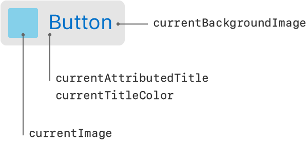
When setting the content of a button, you must specify the title, image, and appearance attributes for each state separately. If you don’t customize the content for a particular state, the button uses the values associated with the Default state and adds any appropriate customizations. For example, in the highlighted state, an image-based button draws a highlight on top of the default image if no custom image is provided.
Customize tint color
You can specify a custom button tint using the tintColor property. This property sets the color of the button image and text. If you don’t explicitly set a tint color, the button uses its superview’s tint color.
Specify edge insets
Use insets to add or remove space around the content in your custom or system buttons. You can specify separate insets for your button’s title (titleEdgeInsets), image (imageEdgeInsets), and both the title and image together (contentEdgeInsets). When applied, insets affect the corresponding content rectangle of the button, which the Auto Layout engine uses to determine the button’s position.
There should be no reason for you to adjust the edge insets for info, contact, or disclosure buttons.
Configure button attributes in Interface Builder
The following table lists the core attributes that you configure for buttons in Interface Builder.
| Attribute | Description |
|---|---|
| Type | The button type. This attribute determines the default settings for many other button attributes. The value of this attribute can’t be changed at runtime, but you can access it using the buttonType property. |
| State Config | The state selector. After selecting a value in this control, changes to the button’s attributes apply to the specified state. |
| Title | The button’s title. You can specify a button’s title as a plain string or attributed string. |
| (Title Font and Attributes) | The font and other attributes to apply to the button’s title string. The specific configuration options depends on whether you specified a plain string or attributed string for the button’s title. For a plain string, you can customize the font, text color, and shadow color. For an attributed string, you can specify alignment, text direction, indentation, hyphenation, and many other options. |
| Image | The button’s foreground image. Typically, you use template images for a button’s foreground, but you may specify any image in your Xcode project. |
| Background | The button’s background image. The background image is displayed behind its title and foreground image. |
The following table lists attributes that affect the button’s appearance.
| Attribute | Description |
|---|---|
| Shadow Offset | The offsets and behavior of the button’s shadow. Shadows affect title strings only. Enable the Reverses on Highlight option to change the highlighting of the shadow when the button state changes to or from the highlighted state. !Image Configure the offsets programmatically using the shadowOffset property of the button’s titleLabel object. Configure the highlighting behavior using the reversesTitleShadowWhenHighlighted property. |
| Drawing | The drawing behavior of the button. !Image When the Shows Touch On Highlight (showsTouchWhenHighlighted) option is enabled, the button adds a white glow to the part of a button that the user touches. !Image When the Highlighted Adjusts Image (adjustsImageWhenHighlighted) option is enabled, button images get darker when it’s in the highlighted state. !Image When the Disabled Adjusts Image (adjustsImageWhenDisabled) option is enabled, the image is dimmed when the button is disabled. |
| Line Break | The line breaking options for the button’s text. Use this attribute to define how the button’s title is modified to fit the available space. |
The following table lists the edge inset attributes for buttons. Use edge inset buttons to alter the rectangle for the button’s content.
| Attribute | Description |
|---|---|
| Edge | The edge insets to configure. You can specify separate edge insets for the button’s overall content, its title, and its image. |
| Inset | The inset values. Positive values shrink the corresponding edge, moving it closer to the center of the button. Negative values expand the edge, moving it away from the center of the button. Access these values at runtime using the contentEdgeInsets, titleEdgeInsets, and imageEdgeInsets properties. |
For information about the button’s inherited Interface Builder attributes, see UIControl and UIView.
Support localization
To internationalize a button, specify a localized string for the button’s title text. (You may also localize a button’s image as appropriate.)
When using storyboards to build your interface, use Xcode’s base internationalization feature to configure the localizations your project supports. When you add a localization, Xcode creates a strings file for that localization. When configuring your interface programmatically, use the system’s built-in support for loading localized strings and resources. For more information about internationalizing your interface, see Internationalization and Localization Guide.
Make buttons accessible
Buttons are accessible by default. The default accessibility traits for a button are Button and User Interaction Enabled.
The accessibility label, traits, and hint are spoken back to the user when VoiceOver is enabled on a device. The button’s title overwrites its accessibility label; even if you set a custom value for the label, VoiceOver speaks the value of the title. VoiceOver speaks this information when a user taps the button once. For example, when a user taps the Options button in Camera, VoiceOver speaks the following:
"Options. Button. Shows additional camera options."
For more information about making iOS controls accessible, see the accessibility information in UIControl. For general information about making your interface accessible, see Accessibility Programming Guide for iOS.
Inherits From
Conforms To
- CALayerDelegate
- CVarArg
- Copyable
- CustomDebugStringConvertible
- CustomStringConvertible
- Equatable
- Escapable
- Hashable
- NSCoding
- NSObjectProtocol
- NSTouchBarProvider
- Sendable
- SendableMetatype
- UIAccessibilityContentSizeCategoryImageAdjusting
- UIAccessibilityIdentification
- UIActivityItemsConfigurationProviding
- UIAppearance
- UIAppearanceContainer
- UIContextMenuInteractionDelegate
- UICoordinateSpace
- UIDynamicItem
- UIFocusEnvironment
- UIFocusItem
- UIFocusItemContainer
- UILargeContentViewerItem
- UIPasteConfigurationSupporting
- UIPopoverPresentationControllerSourceItem
- UIResponderStandardEditActions
- UISpringLoadedInteractionSupporting
- UITraitChangeObservable
- UITraitEnvironment
- UIUserActivityRestoring
Creating buttons
- init(frame:)) Creates a new button with the specified frame.
- init(frame:primaryAction:)) Creates a new button with the specified frame, registers the primary action event, and sets the title and image to the action’s title and image.
- init(coder:)) Creates a new button with data in an unarchiver.
Creating buttons of a specific type
- init(type:)) Creates and returns a new button of the specified type.
- init(type:primaryAction:)) Creates a new button with the specified type, registers the primary action event, and sets the title and image to the action’s title and image.
- UIButton.ButtonType Specifies the style of a button.
Creating system buttons
- systemButton(with:target:action:)) Creates and returns a system type button with specified image, target, and action.
Creating buttons from a configuration object
- init(configuration:primaryAction:)) Creates a new button with the specified configuration and registers the primary action event.
- UIButton.Configuration A configuration that specifies the appearance and behavior of a button and its contents.
Managing the appearance with a configuration object
- configuration The configuration for the button’s appearance.
- automaticallyUpdatesConfiguration A Boolean value that determines whether the button configuration changes when button’s state changes.
- setNeedsUpdateConfiguration()) Requests the system update the button configuration.
- updateConfiguration()) Updates the button configuration in response to a button state change.
- configurationUpdateHandler A closure that executes when the button state changes.
- UIButton.ConfigurationUpdateHandler A closure to update the configuration of a button.
Managing the title
- titleLabel A view that displays the value of the
currentTitleproperty for a button. - title(for:)) Returns the title associated with the specified state.
- setTitle(_:for:)) Sets the title to use for the specified state.
- attributedTitle(for:)) Returns the styled title associated with the specified state.
- setAttributedTitle(_:for:)) Sets the styled title to use for the specified state.
- titleColor(for:)) Returns the title color used for a state.
- setTitleColor(_:for:)) Sets the color of the title to use for the specified state.
- titleShadowColor(for:)) Returns the shadow color of the title used for a state.
- setTitleShadowColor(_:for:)) Sets the color of the title shadow to use for the specified state.
Managing images and tint color
- backgroundImage(for:)) Returns the background image used for a button state.
- image(for:)) Returns the image used for a button state.
- setBackgroundImage(_:for:)) Sets the background image to use for the specified button state.
- setImage(_:for:)) Sets the image to use for the specified state.
- preferredSymbolConfigurationForImage(in:)) Returns the preferred symbol configuration for a button state.
- setPreferredSymbolConfiguration(_:forImageIn:)) Sets the preferred symbol configuration for a button state.
- tintColor The tint color to apply to the button title and image.
Specifying the role
- role The role of the button.
- UIButton.Role Constants that describe the role of the button.
Specifying the behavioral style
- behavioralStyle The style that determines how the button behaves.
- preferredBehavioralStyle The preferred behavioral style.
- UIBehavioralStyle Constants that indicate how a control behaves in apps built with Mac Catalyst.
Getting the current state
- buttonType The button type.
- currentTitle The current title that is displayed on the button.
- currentAttributedTitle The current styled title that is displayed on the button.
- currentTitleColor The color used to display the title.
- currentTitleShadowColor The color of the title’s shadow.
- currentImage The current image displayed on the button.
- currentBackgroundImage The current background image displayed on the button.
- currentPreferredSymbolConfiguration The current symbol size, style, and weight.
- imageView The button’s image view.
- subtitleLabel The label that displays the text of the subtitle.
Supporting pointer interactions
- isPointerInteractionEnabled A Boolean that enables pointer interaction.
- isHovered A Boolean value that indicates whether a pointer effect is active.
- pointerStyleProvider A closure that returns the pointer style to use when the pointer hovers over the button.
- UIButton.PointerStyleProvider A type alias defining a closure that returns a pointer style to apply to a button.
- UIButtonPointerStyleProvider A type alias defining a block that returns a pointer style to apply to a button.
Supporting menu and toggle buttons
- menu A menu that the button displays.
- isHeld A Boolean value that indicates whether the button menu is visible.
- changesSelectionAsPrimaryAction A Boolean value that indicates whether the button tracks a selection, either through a menu or a toggle.
- preferredMenuElementOrder The preferred menu-element ordering strategy for the menu.
Deprecated
- Deprecated symbols Symbols that buttons no longer support.
Controls
- Responding to control-based events using target-action Handle user input by connecting buttons, sliders, and other controls to your app’s code using the target-action design pattern.
- UIControl The base class for controls, which are visual elements that convey a specific action or intention in response to user interactions.
- UIColorWell A control that displays a color picker.
- UIDatePicker A control for inputting date and time values.
- UIPageControl A control that displays a horizontal series of dots, each of which corresponds to a page in the app’s document or other data-model entity.
- UISegmentedControl A horizontal control that consists of multiple segments, each segment functioning as a discrete button.
- UISlider A control for selecting a single value from a continuous range of values.
- UIStepper A control for incrementing or decrementing a value.
- UISwitch A control that offers a binary choice, such as on/off.
---
Extracted from Apple DocC JSON by apple-skills tooling. This is unofficial content. All documentation belongs to Apple Inc.
Navigation: UIKit
Class
UICollectionView
Available on: iOS 6.0+, iPadOS 6.0+, Mac Catalyst 13.1+, tvOS, visionOS 1.0+
An object that manages an ordered collection of data items and presents them using customizable layouts.
@MainActor class UICollectionViewOverview
When you add a collection view to your user interface, your app’s main job is to manage the data associated with that collection view. The collection view gets its data from the data source object, stored in the collection view’s dataSource property. For your data source, you can use a UICollectionViewDiffableDataSource object, which provides the behavior you need to simply and efficiently manage updates to your collection view’s data and user interface. Alternatively, you can create a custom data source object by adopting the UICollectionViewDataSource protocol.
Data in the collection view is organized into individual items, which you can group into sections for presentation. An item is the smallest unit of data you want to present. For example, in a photos app, an item might be a single image. The collection view presents items onscreen using a cell, which is an instance of the UICollectionViewCell class that your data source configures and provides.
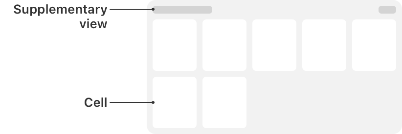
In addition to its cells, a collection view can present data using other types of views. These supplementary views can be, for example, section headers and footers that are separate from the individual cells but still convey information. Support for supplementary views is optional and defined by the collection view’s layout object, which is also responsible for defining the placement of those views.
Besides embedding a UICollectionView in your user interface, you use the methods of the collection view to ensure that the visual presentation of items matches the order in your data source object. A UICollectionViewDiffableDataSource object manages this process automatically. If you’re using a custom data source, then whenever you add, delete, or rearrange data in your collection, you use the methods of UICollectionView to insert, delete, and rearrange the corresponding cells.
You also use the collection view object to manage the selected items, although for this behavior the collection view works with its associated delegate object.
Layouts
A layout object defines the visual arrangement of the content in the collection view. A subclass of the UICollectionViewLayout class, the layout object defines the organization and location of all cells and supplementary views inside the collection view. Although it defines their locations, the layout object doesn’t actually apply that information to the corresponding views. The collection view applies layout information to the corresponding views because the creation of cells and supplementary views involves coordination between the collection view and your data source object. The layout object is like another data source, except it provides visual information instead of item data.
You typically specify a layout object when you create a collection view, but you can also change the layout of a collection view dynamically. The layout object is stored in the collectionViewLayout property. Setting this property directly updates the layout immediately, without animating the changes. If you want to animate the changes, call the setCollectionViewLayout(_:animated:completion:)) method instead.
To create an interactive transition — one that is driven by a gesture recognizer or touch events — use the startInteractiveTransition(to:completion:)) method to change the layout object. That method installs an intermediate layout object, which works with your gesture recognizer or event-handling code to track the transition progress. When your event-handling code determines that the transition is finished, it calls the finishInteractiveTransition()) or cancelInteractiveTransition()) method to remove the intermediate layout object and install the intended target layout object.
For more information, see Layouts.
Cells and supplementary views
The collection view’s data source object provides both the content for items and the views used to present that content. When the collection view first loads its content, it asks its data source to provide a view for each visible item. The collection view maintains a queue or list of view objects that the data source has marked for reuse. Instead of creating new views explicitly in your code, you always dequeue views.
There are two methods for dequeueing views. The one you use depends on which type of view has been requested:
- Use the dequeueReusableCell(withReuseIdentifier:for:)) to get a cell for an item in the collection view.
- Use the dequeueReusableSupplementaryView(ofKind:withReuseIdentifier:for:)) method to get a supplementary view requested by the layout object.
Before you call either of these methods, you must tell the collection view how to create the corresponding view if one doesn’t already exist. For this, you must register either a class or a nib file with the collection view. For example, when registering cells, you use the register(_:forCellWithReuseIdentifier:)-3vaho) method to register a class or the register(_:forCellWithReuseIdentifier:)-6z6t4) method to register a nib file. As part of the registration process, you specify the reuse identifier that identifies the purpose of the view. This is the same string you use when dequeueing the view later.
After dequeueing the appropriate view in your data source method, configure its content and return it to the collection view for use. After getting the layout information from the layout object, the collection view applies it to the view and displays it.
Data prefetching
Collection views provide two prefetching techniques you can use to improve responsiveness:
- Cell prefetching prepares cells in advance of the time they’re required. When a collection view requires a large number of cells simultaneously — for example, a new row of cells in grid layout — the cells are requested earlier than the time required for display. Cell rendering is therefore spread across multiple layout passes, resulting in a smoother scrolling experience. Cell prefetching is enabled by default.
- Data prefetching provides a mechanism whereby you’re notified of the data requirements of a collection view in advance of the requests for cells. This is useful if the content of your cells relies on an expensive data loading process, such as a network request. Assign an object that conforms to the UICollectionViewDataSourcePrefetching protocol to the prefetchDataSource property to receive notifications of when to prefetch data for cells.
Reorder items interactively
Collection views allow you to move items around based on user interactions. Typically, the order of items in a collection view is defined by your data source. If you allow users to reorder items, you can configure a gesture recognizer to track the user’s interactions with a collection view item and update that item’s position.
To begin the interactive repositioning of an item, call the beginInteractiveMovementForItem(at:)) method of the collection view. While your gesture recognizer is tracking touch events, call the updateInteractiveMovementTargetPosition(_:)) method to report changes in the touch location. When you’re done tracking the gesture, call the endInteractiveMovement()) or cancelInteractiveMovement()) method to conclude the interactions and update the collection view.
During user interactions, the collection view invalidates its layout dynamically to reflect the current position of the item. If you do nothing, the default layout behavior repositions the items for you, but you can customize the layout animations if you want. When interactions finish, the collection view updates its data source object with the new location of the item.
The UICollectionViewController class provides a default gesture recognizer that you can use to rearrange items in its managed collection view. To install this gesture recognizer, set the installsStandardGestureForInteractiveMovement property of the collection view controller to true.
Interface Builder attributes
The following table lists the attributes that you configure for collection views in Interface Builder.
| Attribute | Description |
|---|---|
| Items | The number of prototype cells. This property controls the specified number of prototype cells for you to configure in your storyboard. Collection views must always have at least one cell and may have multiple cells for displaying different types of content or for displaying the same content in different ways. |
| Layout | The layout object to use. Use this control to select between the UICollectionViewFlowLayout object and a custom layout object that you define. !Image When the flow layout is selected, you can also configure the scrolling direction for the collection view’s content and whether the flow layout has header and footer views. Enabling header and footer views adds reusable views to your storyboard that you can configure with your header and footer content. You can also create those views programmatically. !Image When a custom layout is selected, you must specify the UICollectionViewLayout subclass to use. |
When the Flow layout is selected, the Size inspector for the collection view contains additional attributes for configuring flow layout metrics. Use those attributes to configure the size of your cells, the size of headers and footers, the minimum spacing between cells, and any margins around each section of cells. For more information about the meaning of the flow layout metrics, see UICollectionViewFlowLayout.
Internationalization
A collection view has no direct content of its own to internationalize. Instead, you internationalize the cells and reusable views of the collection view. For more information about internationalization, see Localization.
Accessibility
A collection view has no content of its own to make accessible. If your cells and reusable views contain standard UIKit controls such as UILabel and UITextField, you can make those controls accessible. When a collection view changes its onscreen layout, it posts the layoutChanged notification.
For general information about making your interface accessible, see Accessibility for UIKit.
Inherits From
Conforms To
- CALayerDelegate
- CVarArg
- Copyable
- CustomDebugStringConvertible
- CustomStringConvertible
- Equatable
- Escapable
- Hashable
- NSCoding
- NSObjectProtocol
- NSTouchBarProvider
- Sendable
- SendableMetatype
- UIAccessibilityIdentification
- UIActivityItemsConfigurationProviding
- UIAppearance
- UIAppearanceContainer
- UICoordinateSpace
- UIDataSourceTranslating
- UIDynamicItem
- UIFocusEnvironment
- UIFocusItem
- UIFocusItemContainer
- UIFocusItemScrollableContainer
- UILargeContentViewerItem
- UIPasteConfigurationSupporting
- UIPopoverPresentationControllerSourceItem
- UIResponderStandardEditActions
- UISpringLoadedInteractionSupporting
- UITraitChangeObservable
- UITraitEnvironment
- UIUserActivityRestoring
Creating a collection view
- init(frame:collectionViewLayout:)) Creates a collection view object with the specified frame and layout.
- init(coder:)) Creates a collection view object from data in a given unarchiver.
Providing the collection view data
- dataSource The object that provides the data for the collection view.
- UICollectionViewDiffableDataSource The object you use to manage data and provide cells for a collection view.
- UICollectionViewDataSource The methods adopted by the object you use to manage data and provide cells for a collection view.
- Building high-performance lists and collection views Improve the performance of lists and collections in your app with prefetching and image preparation.
Prefetching collection view cells and data
- isPrefetchingEnabled A Boolean value that indicates whether cell and data prefetching are enabled.
- prefetchDataSource The object that acts as the prefetching data source for the collection view, receiving notifications of upcoming cell data requirements.
- UICollectionViewDataSourcePrefetching A protocol that provides advance warning of the data requirements for a collection view, allowing the triggering of asynchronous data load operations.
Managing collection view interactions
- delegate The object that acts as the delegate of the collection view.
- UICollectionViewDelegate The methods adopted by the object you use to manage user interactions with items in a collection view.
Creating cells
- UICollectionView.CellRegistration A registration for the collection view’s cells.
- dequeueConfiguredReusableCell(using:for:item:)) Dequeues a configured reusable cell object.
- register(_:forCellWithReuseIdentifier:)-3vaho) Registers a class for use in creating new collection view cells.
- register(_:forCellWithReuseIdentifier:)-6z6t4) Registers a nib file for use in creating new collection view cells.
- dequeueReusableCell(withReuseIdentifier:for:)) Dequeues a reusable cell object located by its identifier.
Creating headers and footers
- UICollectionView.SupplementaryRegistration A registration for the collection view’s supplementary views.
- dequeueConfiguredReusableSupplementary(using:for:)) Dequeues a configured reusable supplementary view object.
- register(_:forSupplementaryViewOfKind:withReuseIdentifier:)-661io) Registers a class for use in creating supplementary views for the collection view.
- register(_:forSupplementaryViewOfKind:withReuseIdentifier:)-9hn73) Registers a nib file for use in creating supplementary views for the collection view.
- dequeueReusableSupplementaryView(ofKind:withReuseIdentifier:for:)) Dequeues a reusable supplementary view located by its identifier and kind.
Configuring the background view
- backgroundView The view that provides the background appearance.
Changing the layout
- collectionViewLayout The layout used to organize the collected view’s items.
- setCollectionViewLayout(_:animated:)) Changes the collection view’s layout and optionally animates the change.
- setCollectionViewLayout(_:animated:completion:)) Changes the collection view’s layout and notifies you when the animations complete.
- startInteractiveTransition(to:completion:)) Changes the collection view’s current layout using an interactive transition effect.
- finishInteractiveTransition()) Tells the collection view to finish an interactive transition by installing the intended target layout.
- cancelInteractiveTransition()) Tells the collection view to cancel an interactive transition and return to its original layout object.
- UICollectionView.LayoutInteractiveTransitionCompletion The completion block called at the end of an interactive transition for a collection view.
Getting the state of the collection view
- numberOfSections The number of sections displayed by the collection view.
- numberOfItems(inSection:)) Fetches the count of items in the specified section.
- visibleCells An array of visible cells currently displayed by the collection view.
Inserting, moving, and deleting Items
- insertItems(at:)) Inserts new items at the specified index paths.
- moveItem(at:to:)) Moves an item from one location to another in the collection view.
- deleteItems(at:)) Deletes the items at the specified index paths.
Inserting, moving, and deleting sections
- insertSections(_:)) Inserts new sections at the specified indexes.
- moveSection(_:toSection:)) Moves a section from one location to another in the collection view.
- deleteSections(_:)) Deletes the sections at the specified indexes.
Reordering items interactively
- beginInteractiveMovementForItem(at:)) Initiates the interactive movement of the item at the specified index path.
- updateInteractiveMovementTargetPosition(_:)) Updates the position of the item within the collection view’s bounds.
- endInteractiveMovement()) Ends interactive movement tracking and moves the target item to its new location.
- cancelInteractiveMovement()) Ends interactive movement tracking and returns the target item to its original location.
Managing drag interactions
- dragDelegate The delegate object that manages the dragging of items from the collection view.
- UICollectionViewDragDelegate The interface for initiating drags from a collection view.
- hasActiveDrag A Boolean value that indicates whether items were lifted from the collection view and have not yet been dropped.
- dragInteractionEnabled A Boolean value that indicates whether the collection view supports dragging content.
Managing drop interactions
- dropDelegate The delegate object that manages the dropping of items into the collection view.
- UICollectionViewDropDelegate The interface for handling drops in a collection view.
- hasActiveDrop A Boolean value that indicates whether the collection view is currently tracking a drop session.
- reorderingCadence The speed at which items in the collection view are reordered to show potential drop locations.
- UICollectionView.ReorderingCadence Constants indicating the speed at which collection view items are reorganized during a drop.
Selecting cells
- indexPathsForSelectedItems The index paths for the selected items.
- selectItem(at:animated:scrollPosition:)) Selects the item at the specified index path and optionally scrolls it into view.
- deselectItem(at:animated:)) Deselects the item at the specified index.
- allowsSelection A Boolean value that indicates whether users can select items in the collection view.
- allowsMultipleSelection A Boolean value that determines whether users can select more than one item in the collection view.
- allowsSelectionDuringEditing A Boolean value that determines whether users can select cells while the collection view is in editing mode.
- allowsMultipleSelectionDuringEditing A Boolean value that controls whether users can select more than one cell simultaneously in editing mode.
- selectionFollowsFocus A Boolean value that triggers an automatic selection when focus moves to a cell.
Putting the collection view into edit mode
- isEditing A Boolean value that determines whether the collection view is in editing mode.
Locating items and views in the collection view
- indexPathForItem(at:)) Gets the index path of the item at the specified point in the collection view.
- indexPathsForVisibleItems An array of the visible items in the collection view.
- indexPath(for:)) Gets the index path of the specified cell.
- cellForItem(at:)) Gets the cell object at the index path you specify.
- indexPathsForVisibleSupplementaryElements(ofKind:)) Gets the index paths of all visible supplementary views of the specified type.
- supplementaryView(forElementKind:at:)) Gets the supplementary view at the specified index path.
- visibleSupplementaryViews(ofKind:)) Gets an array of the visible supplementary views of the specified kind.
Getting layout information
- layoutAttributesForItem(at:)) Gets the layout information for the item at the specified index path.
- layoutAttributesForSupplementaryElement(ofKind:at:)) Gets the layout information for the specified supplementary view.
Scrolling an item into view
- scrollToItem(at:at:animated:)) Scrolls the collection view contents until the specified item is visible.
- UICollectionView.ScrollPosition Constants that indicate how to scroll an item into the visible portion of the collection view.
- UICollectionView.ScrollDirection Constants that indicate the direction of scrolling for the layout.
Animating multiple changes to the collection view
- performBatchUpdates(_:completion:)) Animates multiple insert, delete, reload, and move operations as a group.
Reloading content
- hasUncommittedUpdates A Boolean value that indicates whether the collection view contains drop placeholders or is reordering its items as part of handling a drop.
- reconfigureItems(at:)) Updates the data for the items at the index paths you specify, preserving the existing cells for the items.
- reloadData()) Reloads all of the data for the collection view.
- reloadSections(_:)) Reloads the data in the specified sections of the collection view.
- reloadItems(at:)) Reloads just the items at the specified index paths.
Identifying collection view elements
- UICollectionView.ElementCategory Constants specifying the type of view.
- elementKindSectionFooter A supplementary view that identifies the footer for a given section.
- elementKindSectionHeader A supplementary view that identifies the header for a given section.
Working with focus
- allowsFocus A Boolean value that determines whether the collection view allows its cells to become focused.
- allowsFocusDuringEditing A Boolean value that determines whether the collection view allows its cells to become focused in edit mode.
- selectionFollowsFocus A Boolean value that triggers an automatic selection when focus moves to a cell.
- remembersLastFocusedIndexPath A Boolean value that indicates whether the collection view automatically assigns the focus to the item at the last focused index path.
Managing context menus
- contextMenuInteraction The collection view’s context menu interaction.
Resizing self-sizing cells
- selfSizingInvalidation The mode that the collection view uses for invalidating the size of self-sizing cells.
- UICollectionView.SelfSizingInvalidation Constants that describe modes for invalidating the size of self-sizing collection view cells.
Instance Methods
- indexPath(forSupplementaryView:)) Gets the index path of the specified supplementary view.
View
- UICollectionViewController A view controller that specializes in managing a collection view.
---
Extracted from Apple DocC JSON by apple-skills tooling. This is unofficial content. All documentation belongs to Apple Inc.
Navigation: UIKit
Class
UIColor
Available on: iOS 2.0+, iPadOS 2.0+, Mac Catalyst 13.1+, tvOS, visionOS 1.0+, watchOS 2.0+
An object that stores color data and sometimes opacity.
class UIColorOverview
Use color to customize your app’s appearance, communicate status, and help people visualize data. To learn more about using color in your apps, see Human Interface Guidelines.
UIColor provides a list of class properties that create adaptable and fixed colors such as blue, green, purple, and more. UIColor also offers properties to specify system-provided colors for UI elements such as labels, text, and buttons. You can create color objects by specifying color component values such as RGB, hue, and saturation. You can also create colors from other color objects and even create a pattern-based color from an image.
Important: Most developers have no need to subclass UIColor. The only time subclassing might be necessary is if you require support for additional color spaces or color models. If you do subclass, the properties and methods you add must be safe to use from multiple threads.
Inherits From
Conforms To
- CVarArg
- Copyable
- CustomDebugStringConvertible
- CustomStringConvertible
- Equatable
- Escapable
- Hashable
- NSCoding
- NSCopying
- NSItemProviderReading
- NSItemProviderWriting
- NSObjectProtocol
- NSSecureCoding
- Sendable
- SendableMetatype
Getting existing colors
- UI element colors Choose colors for UI elements such as labels, text, backgrounds, and links.
- Standard colors Define standard color objects for specific shades, such as red, blue, green, black, white, and more.
- Color creation Load colors from asset catalogs and create colors from raw component values.
Applying the color to the drawing environment
- Customizing drawings Create custom colors and patterns for drawing in your app.
- set()) Sets the color of subsequent stroke and fill operations to the color that the receiver represents.
- setFill()) Sets the color of subsequent fill operations to the color that the receiver represents.
- setStroke()) Sets the color of subsequent stroke operations to the color that the receiver represents.
Getting the color information
- Determining color values with color spaces Change the system’s interpretation of a color value for display by selecting a color space.
- cgColor The Quartz color that corresponds to the color object.
- ciColor The Core Image color that corresponds to the color object.
- getHue(_:saturation:brightness:alpha:)) Returns the components that form the color in the HSB color space.
- getRed(_:green:blue:alpha:)) Returns the components that form the color in the RGB color space.
- getWhite(_:alpha:)) Returns the grayscale components of the color.
- linearExposure The linear brightness multiplier that was applied when generating this color. Colors created with an exposure by UIColor create CGColors that are tagged with a contentHeadroom value. While CGColors created without a contentHeadroom tag will return 0 from CGColorGetHeadroom, UIColors generated in a similar fashion return a linearExposure of 1.0.
- accessibilityName A localized description of the color for accessibility attributes.
Resolving a dynamically generated color
- resolvedColor(with:)) Returns the version of the current color that results from the specified traits.
Working with color prominence
- prominence
- withProminence(_:)) Returns the version of the current color that results from applying the specified prominence.
- UIColor.Prominence A type that indicates the prominence of a color in the interface.
Working with high dynamic range (HDR) colors
- applyingContentHeadroom(_:)) Reinterpret the color by applying a new
contentHeadroomwithout changing the color components. Changing thecontentHeadroomredefines the color relative to a different peak white, changing its behavior under tone mapping and the result of callingstandardDynamicRangeColor. The new color will have acontentHeadroom>= 1.0. - standardDynamicRange In some cases it is useful to recover the color that was base SDR color that was exposed to generate the given HDR color. If a color’s
linearExposureis >1, then this will return the base SDR color.
Initializers
- init(CGColor:)-58l83)
- init(CGColor:)-9d9vs)
- init(CIColor:)-2b5ik)
- init(CIColor:)-5fqhu)
- init(coder:))
- init(named:in:compatibleWith:))
Default Implementations
---
Extracted from Apple DocC JSON by apple-skills tooling. This is unofficial content. All documentation belongs to Apple Inc.
Related skills
 Xcode Project SetupAutomatically create and configure a new Xcode project with Swift Package Manager dependencies for iOS or macOS agent projects.74.7k392
 Expo Tailwind SetupInstantly configure Tailwind CSS v4 with NativeWind v5 and react-native-css inside an Expo project for universal styling.46.7k2.3kExpo Dev ClientCreate custom development clients for Expo React Native apps that need native modules or Apple-specific targets.45.9k2.3k
 Swiftui Expert SkillGet expert guidance when writing, reviewing, or refactoring SwiftUI views, state, performance, and modern iOS/macOS APIs.27.6k3.3k
 Flutter Apply Architecture Best PracticesEnforce clean layered architecture when creating or refactoring a Flutter mobile application.25.4k2.7kExpo ModuleCreate custom config plugins that safely modify native Android and iOS projects generated by Expo prebuild.25k2.3k